Download presentation
Presentation is loading. Please wait.

1
Technology Training 1

2
http://www.belladesoto.us/ http://www.belladesoto.us/ http://www.thomasedison.org/ http://www.thomasedison.org/ http://www.laeyeworks.com/ http://www.laeyeworks.com/ http://www.billyconnolly.com/ http://www.billyconnolly.com/ 2

3
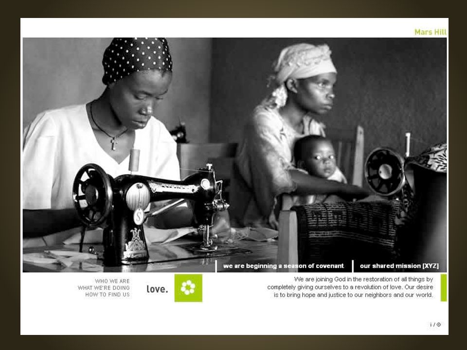
Is more than “looking good” Satisfies at least one of four user needs: They want/need information They want/need to make a purchase/donation. They want/need to be entertained. They want/need to be part of a community.

4
Preplan Plan & Organize DesignRevise From site structure to front-end design 4

5
Who? What? Where? Why? And How? 5 PurposeUsersFormatContent

6
Why a website? Share information (photo albums, profiles, calendars) Gather data, materials, or money (surveys, forms, shopping carts, etc) Facilitate collaboration, discussion, and creation of ideas (wikis, blogs, forums) Purpose
 Gather data, materials, or money (surveys, forms, shopping carts, etc) Facilitate collaboration, discussion, and creation of ideas (wikis, blogs, forums) Purpose.")
7
Who are they and why would they use your site? They want/need information They want/need to make a purchase/donation They want/need to be entertained They want/need to be part of a community Users

8
What is your content? “Heroin Content” Web writing basics ▪ Shorter is better ▪ Use search keywords ▪ Drive user action ▪ Proofread Get a second opinion Content

9
How will you deliver your content? Dictated mostly by Purpose and Content Happens mostly in Plan and Organize phase Blogs, surveys, Google Calendar, YouTube, social networking (Facebook, Twitter, etc.) Format
 Format.")
10
Common Mistakes Site Maps Print vs. Web Marketing

11
Lack of purpose Too much material Navigational failure Print-to-web Common Mistakes

14
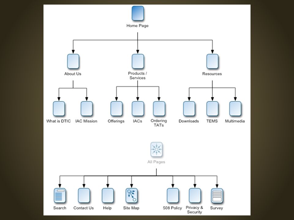
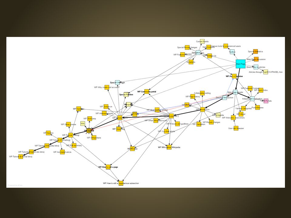
Site maps show site architecture Group pages » Categories » Primary Navigation Organize material based on users’ needs No dead-end pages

17
All navigation must answer: Where am I? Where have I been? Where can I go next? Where's the Home Page? Where's the Home Home Page?

18
PRINT Linear Non-linear WEB Author- driven Reader- driven

19
How will users learn about your site? How does website tie into marketing plans? Social networking?

20
Mockups, Layout, and Accessibility

21
Elements that get in the way Mystery Meat Navigation Not enough contrast Visual elements vs. text Common Mistakes

24
(Mis)Using visual elements instead of text Limits accessibility of screen readers Not search-engine friendly Increases page size and load time Harder to edit
Using visual elements instead of text Limits accessibility of screen readers Not search-engine friendly Increases page size and load time Harder to edit")
25
Graphical mockup Use graphics editor to test design and layout Functional prototype/wireframe Link pages together to test navigation

26
Heavy vs. light elements Balance Dark vs. light, large vs. small, smooth vs. rough Contrast Create visual hierarchy Emphasis Patterns and consistency Rhythm Group like-elements together Unity

27
Disability Device Independence Usability 27

28
WEB CONTENT ACCESSIBILITY GUIDELINES Text Alternatives Alternatives for Time- based Media Well-timed Adaptable Distinguishable Keyboard Accessible Avoid Seizures Navigable Readable Predictable Input Assistance Compatible 28

29
Validators, Simulators, and Guinea Pigs

30
QUANTITATIVE Validators Check for broken links Compare to web standards Simulators Mobile device simulators Search Engine Optimization Tools (SEOs) Cross-platform check Firefox, Safari, IE, Opera, Chrome, etc. Mac OS X, Vista, XP, Linux, etc. QUALITATIVE Friends Colleagues Designers/Developers User testing Focus groups Surveys

31
Create/find new content regularly Replace images Verify external links are active Look for broken links Solicit user input Check marketing outlets

32
Technology Training scu.edu/training 32

Similar presentations


 www.w3.org/WAI/ IMPORTANT: Instructions Please read carefully the Instructions for.>")


. Keyword Research After closely monitoring the competitors we have come up with the business keywords that.>")


