Download presentation
Presentation is loading. Please wait.

1
A WORD ABOUT AESTHETICS

2
Aesthetics Aesthetics is not directly about usability – Aesthetics is how “pretty” or “pleasing” it is – Usability is how well people can use it But it is possible for apps to be so tragically ugly that their very ugliness hurts usability – See www.webpagesthatsuck.com for exampleswww.webpagesthatsuck.com

3
Classic elements of design From a design standpoint, these are the only things that you get to control: – Line – Shape – Space – Color – Texture And that's it!

4
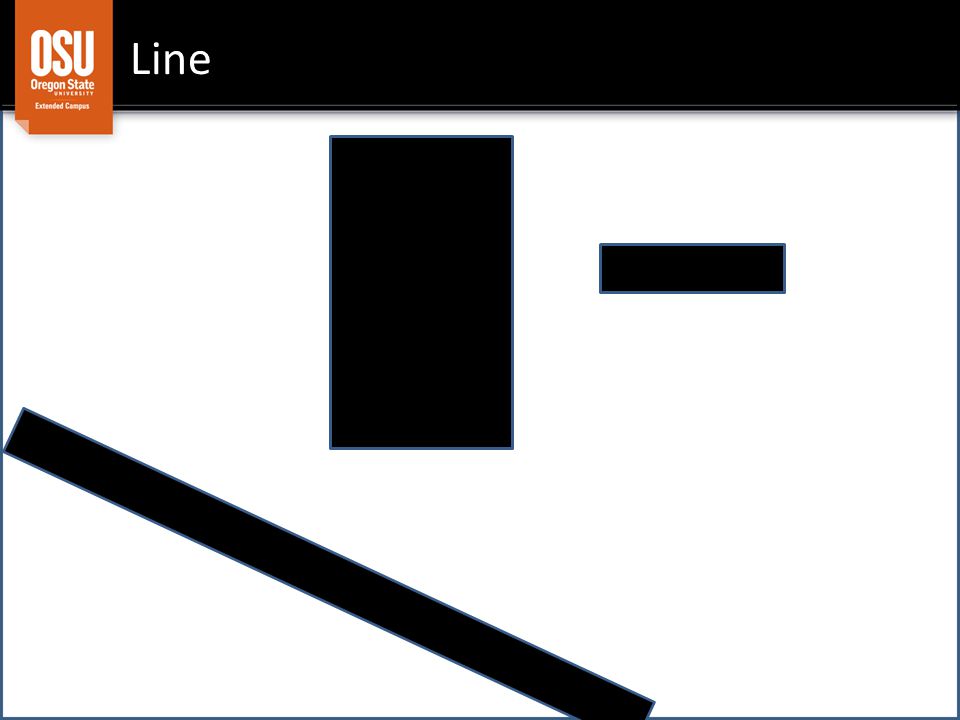
Line Lines can be pleasing or annoying, therefore, they can aid or detract from aesthetics.

5
Line

7
Lines can be pleasing or annoying, they can aid or detract from aesthetics. therefore,

8
Shape Shapes with roughly 1:1.6 shape are soothing – So are circles, curve, smooth edges Shapes with sharp and odd corners can be a bit stressful but can be very useful for drawing attention.

9
Space Content is aesthetically pleasing if it – Comfortably fills the space – Avoids crowding the space – Is balanced within the space – And is separated by space from less-related content

10
Six possible page designs. Which one uses space most aesthetically?

11
Color Color can be used – In harmony to create comfort E.g., what colors "go together" well – In a manner consistent with its context E.g., matching color meanings to content (GO OSU!) – In an unobtrusive fashion to fade into background E.g., black text on white background is "ordinary" – In disharmony to draw attention E.g., red text on white background can indicate an error
 – In an unobtrusive fashion to fade into background E.g., black text on white background is ordinary – In disharmony to draw attention E.g., red text on white background can indicate an error")
12
Texture Texture is the surface quality – What it would "feel like" if touched – Can be used to create feelings virtually E.g., www.apple.com "feels" like a Mac or an iPad – Can also refer to the texture of sound E.g., a disturbing sound to indicate an error

13
Principles for using design elements Be minimal Present a visual balance Design with a focal point in mind Rely on harmonious colors Only emphasize what matters – Visual weight, color, typography, whitespace Use motion and sound very sparingly Elicit a reaction

14
Be minimal Minimize the number of lines, size of shapes, amount of space consumed, and amount & intensity of color & texture Benefits: – Improved aesthetics – Improved usability – Faster download – Lower bandwidth utilization

15
Present a visual balance The page should not "feel" as if it's all on the left side, or all on the right side of the screen. – Visual weight = qualitative sum of lines, pointiness of shapes, size of shapes, amount of space consumed, intensity & amount of color & texture "Rule of thirds" (using halves also sometimes looks good) – Divide your page into thirds, then into thirds, then into thirds, etc Each side should have approximately the same visual weight as the other side
 – Divide your page into thirds, then into thirds, then into thirds, etc Each side should have approximately the same visual weight as the other side.")
16
Examples of fairly well balanced pages

17
Design with a focal point in mind What do you want users to focus on? – Both visually and mentally? I have a thing here (it's identified in the blue) and there's subordinate stuff beneath it. This or that?
 and there s subordinate stuff beneath it. This or that .")
18
Rely on harmonious colors Three basic options for choosing mutually harmonious colors – Two colors opposite from one another on the color wheel (complementary colors) – Three or four colors spaced equally around the color wheel (triads and tetrads) – Three colors equally spaced but near each other (analogic) Two helpful tools – http://colorschemedesigner.com/ http://colorschemedesigner.com/ – https://kuler.adobe.com/ https://kuler.adobe.com/
 – Three or four colors spaced equally around the color wheel (triads and tetrads) – Three colors equally spaced but near each other (analogic) Two helpful tools – –")
19
Rely on harmonious colors You also want colors that are harmonious with the context – red: aggression, war, error – orange: warm, eagerness – brown: wholesome, natural – yellow: cheerful, weak – green: energy, life – blue: trustworthy – purple: important, royal

20
Example: Pick the best color scheme for a site that describes local organic food.

21
Only emphasize what matters Deviate from the rules above when you want to draw attention – Add visual weight by bolding, using color – Make headings more legible & striking by using sans-serif fonts (i.e., fonts without curly-cues ) – Use whitespace to set off things that matter – Use motion (very very sparingly) to highlight things that are very very important
 – Use whitespace to set off things that matter – Use motion (very very sparingly) to highlight things that are very very important")
22
FYI, fonts available on most browsers Arial Comic Sans MS Courier New Georgia Impact Times New Roman Trebuchet MS Verdana Your main serif font Your main sans-serif font

23
Elicit a reaction Use images with colors and textures that elicit a reaction – To buy a product – To sympathize – To get angry – To take some action that you want You can get free images from Flickr (Creative Commons) – be sure to give credit where due.
 – be sure to give credit where due.")
24
Examples of great web sites www.apple.com – Notice the… Minimalism Visual balance Use of harmonious colors Visual emphasis on what matters most Lack of visual emphasis on what matters least The attempt to provoke a desire to be just as cool as Apple thinks its products are

25
Examples of great web sites www.google.com – Notice the… Minimalism Visual balance Use of harmonious colors Visual emphasis on what matters most Lack of visual emphasis on what matters least The attempt to make you think that using Google products is fun

26
Example of a good web site www.oregonstate.edu – Notice the… Absence of any sense of minimalism The moderate level of visual balance The use of many colors, some of which are harmonious and some of which clash for no obvious reason Visual emphasis on a few key messages (top of screen) Somewhat less visual emphasis on low priority content The attempt to make you think OSU has got a TON of exciting, interesting stuff going on (and it does!)
 Somewhat less visual emphasis on low priority content The attempt to make you think OSU has got a TON of exciting, interesting stuff going on (and it does!)")
Similar presentations


 FORM (3-D) SHAPE (2-D) FORM (3-D) VALUE VALUE COLOR COLOR TEXTURE TEXTURE SPACE SPACE.>")


