Download presentation
Presentation is loading. Please wait.

1
Research Methods & Design in Psychology Lecture 3 Descriptives & Graphing Lecturer: James Neill

2
Overview Univariate descriptives & graphs Non-parametric vs. parametric Non-normal distributions Properties of normal distributions Graphing relations b/w 2 and 3 variables

3
Empirical Approach to Research A positivistic approach ASSUMES: the world is made up of bits of data which can be ‘measured’, ‘recorded’, & ‘analysed’ Interpretation of data can lead to valid insights about how people think, feel and behave

4
What do we want to Describe? Distributional properties of variables: Central tendency(ies) Shape Spread / Dispersion
 Shape Spread / Dispersion.")
5
Basic Univariate Descriptive Statistics Central tendency Mode Median Mean Spread Interquartile Range Range Standard Deviation Variance Shape Skewness Kurtosis

6
Basic Univariate Graphs Bar Graph – Pie Chart Stem & Leaf Plot Boxplot Histogram

7
Measures of Central Tendency Statistics to represent the ‘centre’ of a distribution – Mode (most frequent) – Median (50 th percentile) – Mean (average) Choice of measure dependent on – Type of data – Shape of distribution (esp. skewness)
.")
8
Measures of Central Tendency XXX?Ratio XXXInterval XXOrdinal XNominal MeanMedianMode

9
Measures of Dispersion Measures of deviation from the central tendency Non-parametric / non-normal: range, percentiles, min, max Parametric: SD & properties of the normal distribution

10
Measures of Dispersion XXXRatio X?XXInterval XOrdinal Nominal SDPercentile s Range, Min/Max

11
Describing Nominal Data Frequencies – Most frequent? – Least frequent? – Percentages? Bar graphs – Examine comparative heights of bars – shape is arbitrary Consider whether to use freqs or %s

12
Frequencies Number of individuals obtaining each score on a variable Frequency tables graphically (bar chart, pie chart) Can also present as %
 Can also present as %")
13
Frequency table for sex

14
Bar chart for frequency by sex

15
Pie chart for frequency by sex

16
Bar chart: Do you believe in God?

17
Bar chart for cost by state

18
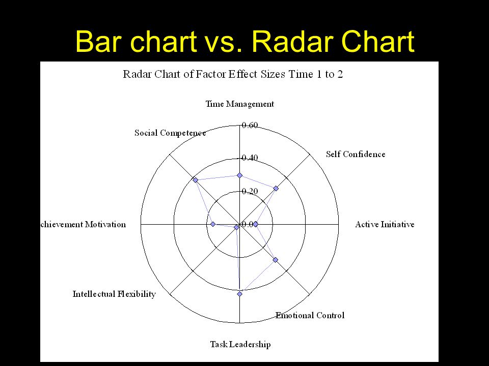
Bar chart vs. Radar Chart

20
Mode Most common score - highest point in a distribution Suitable for all types of data including nominal (may not be useful for ratio) Before using, check frequencies and bar graph to see whether it is an accurate and useful statistic.
 Before using, check frequencies and bar graph to see whether it is an accurate and useful statistic.")
21
Describing Ordinal Data Conveys order but not distance (e.g., ranks) Descriptives as for nominal (i.e., frequencies, mode) Also maybe median – if accurate/useful Maybe IQR, min. & max. Bar graphs, pie charts, & stem-&-leaf plots

22
Stem & Leaf Plot Useful for ordinal, interval and ratio data Alternative to histogram

23
Box & whisker Useful for interval and ratio data Represents min. max, median and quartiles

24
Describing Interval Data Conveys order and distance, but no true zero (0 pt is arbitrary). Interval data is discrete, but is often treated as ratio/continuous (especially for > 5 intervals) Distribution (shape) Central tendency (mode, median) Dispersion (min, max, range) Can also use M & SD if treating as continuous
 Distribution (shape) Central tendency (mode, median) Dispersion (min, max, range) Can also use M & SD if treating as continuous.")
25
Describing Ratio Data Numbers convey order and distance, true zero point - can talk meaningfully about ratios. Continuous Distribution (shape – skewness, kurtosis) Central tendency (median, mean) Dispersion (min, max, range, SD)
 Central tendency (median, mean) Dispersion (min, max, range, SD).")
26
Univariate data plot for a ratio variable

27
The Four Moments of a Normal Distribution Mean <-SkewSkew->

28
The Four Moments of a Normal Distribution Four mathematical qualities (parameters) allow one to describe a continuous distribution which as least roughly follows a bell curve shape: 1 st = mean (central tendency) 2 nd = SD (dispersion) 3 rd = skewness (lean / tail) 4 th = kurtosis (peakedness / flattness)
 allow one to describe a continuous distribution which as least roughly follows a bell curve shape: 1 st = mean (central tendency) 2 nd = SD (dispersion) 3 rd = skewness (lean / tail) 4 th = kurtosis (peakedness / flattness)")
29
Mean (1 st moment ) Average score Mean = X / N Use for ratio data or interval (if treating it as continuous). Influenced by extreme scores (outliers)
.")
30
Standard Deviation (2 nd moment ) SD = square root of Variance = (X - X) 2 N – 1 Standard Error (SE) = SD / square root of N
 SD = square root of Variance = (X - X) 2 N – 1 Standard Error (SE) = SD / square root of N")
31
Skewness (3 rd moment ) Lean of distribution +ve = tail to right -ve = tail to left Can be caused by an outlier Can be caused by ceiling or floor effects Can be accurate (e.g., the number of cars owned per person)
 Lean of distribution +ve = tail to right -ve = tail to left Can be caused by an outlier Can be caused by ceiling or floor effects Can be accurate (e.g., the number of cars owned per person)")
32
Skewness (3 rd moment ) Negative skew Positive skew
 Negative skew Positive skew")
33
Ceiling Effect

34
Floor Effect

35
Kurtosis (4 th moment ) Flatness or peakedness of distribution +ve = peaked -ve = flattened Be aware that by altering the X and Y axis, any distribution can be made to look more peaked or more flat – so add a normal curve to the histogram to help judge kurtosis
 Flatness or peakedness of distribution +ve = peaked -ve = flattened Be aware that by altering the X and Y axis, any distribution can be made to look more peaked or more flat – so add a normal curve to the histogram to help judge kurtosis")
36
Kurtosis (4 th moment ) Red = Positive (leptokurtic) Blue = negative (platykurtic)
 Red = Positive (leptokurtic) Blue = negative (platykurtic)")
37
Key Areas under the Curve for Normal Distributions For normal distributions, approx. +/- 1 SD = 68% +/- 2 SD ~ 95% +/- 3 SD ~ 99.9%

38
Areas under the normal curve

39
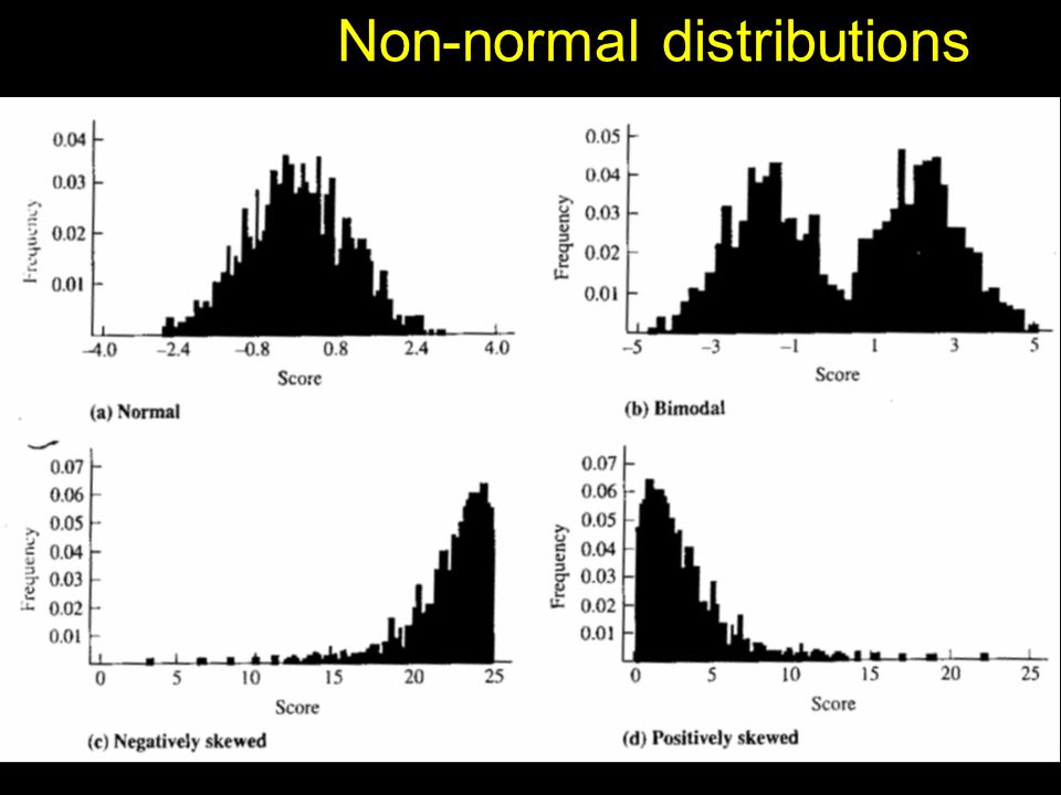
Types of Non-normal Distribution Bi-modal Multi-modal Positively skewed Negatively skewed Flat (platykurtic) Peaked (leptokurtic)
 Peaked (leptokurtic)")
40
Non-normal distributions

42
Rules of Thumb in Judging Severity of Skewness & Kurtosis View histogram with normal curve Deal with outliers Skewness / kurtosis 1 Skewness / kurtosis significance tests

43
Histogram of weight

44
Histogram of daily calorie intake

45
Histogram of fertility

46
Example ‘normal’ distribution 1

47
Example ‘normal’ distribution 2

48
Example ‘normal’ distribution 3

49
Example ‘normal’ distribution 4

50
Example ‘normal’ distribution 5

51
Skewed Distributions & the Mode, Median & Mean +vely skewed mode < median < mean Symmetrical (normal) mean = median = mode -vely skewed mean < median < mode
 mean = median = mode -vely skewed mean < median < mode")
52
Effects of skew on measures of central tendency

53
More on Graphing (Visualising Data)
")
54
Edward Tufte Graphs: Reveal data Communicate complex ideas with clarity, precision, and efficiency

55
Tufte's Guidelines 1 Show the data Substance rather than method Avoid distortion Present many numbers in a small space Make large data sets coherent

56
Tufte's Guidelines 2 Encourage eye to make comparisons Reveal data at several levels Purpose: Description, exploration, tabulation, decoration Closely integrated with statistical and verbal descriptions

57
Tufte’s Graphical Integrity 1 Some lapses intentional, some not Lie Factor = size of effect in graph size of effect in data Misleading uses of area Misleading uses of perspective Leaving out important context Lack of taste and aesthetics

58
Tufte's Graphical Integrity 2 Trade-off between amount of information, simplicity, and accuracy “It is often hard to judge what users will find intuitive and how [a visualization] will support a particular task” (Tweedie et al)
![Tufte s Graphical Integrity 2 Trade-off between amount of information, simplicity, and accuracy It is often hard to judge what users will find intuitive and how [a visualization] will support a particular task (Tweedie et al)](http://images.slideplayer.com/15/4666240/slides/slide_58.jpg "Tufte s Graphical Integrity 2 Trade-off between amount of information, simplicity, and accuracy It is often hard to judge what users will find intuitive and how [a visualization] will support a particular task (Tweedie et al)")
59
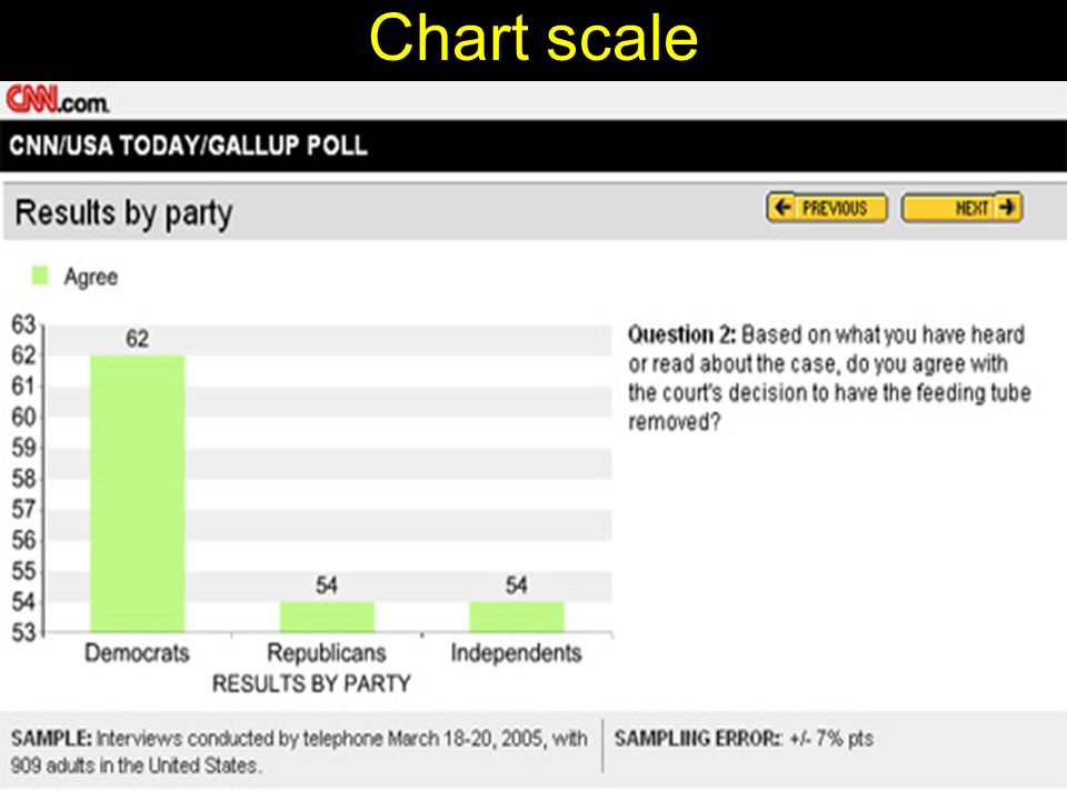
Chart scale

62
Types of Graphs

63
Cleveland’s Hierarchy

64
Volume

65
Food Aid Received by Developing Countries

66
Percentage of Doctors Devoted Solely to Family Practice in California 1964-1990

67
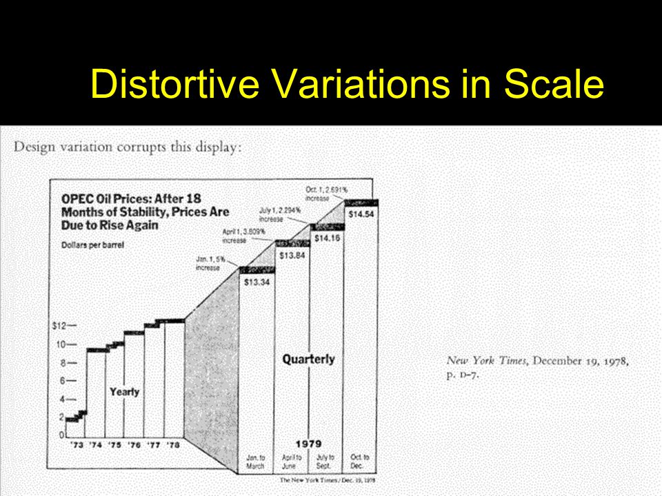
Distortive Variations in Scale

69
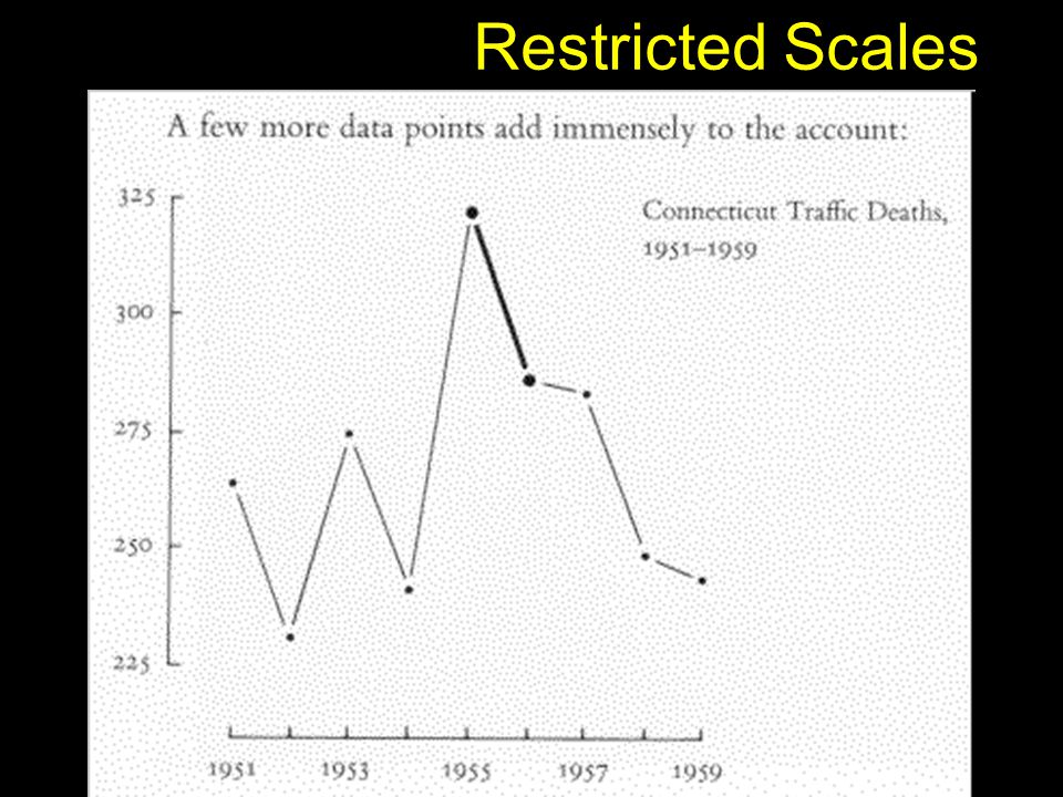
Restricted Scales

71
Example Graphs Depicting the Relationship between Two Variables (Bivariate)
")
72
People Histogram

73
Separate Graphs

74
Example Graphs Depicting the Relationship between Three Variables (Multivariate)
")
75
Clustered bar chart

76
19 th vs. 20 th century causes of death

77
Demographic distribution of age

78
Where partners first met

79
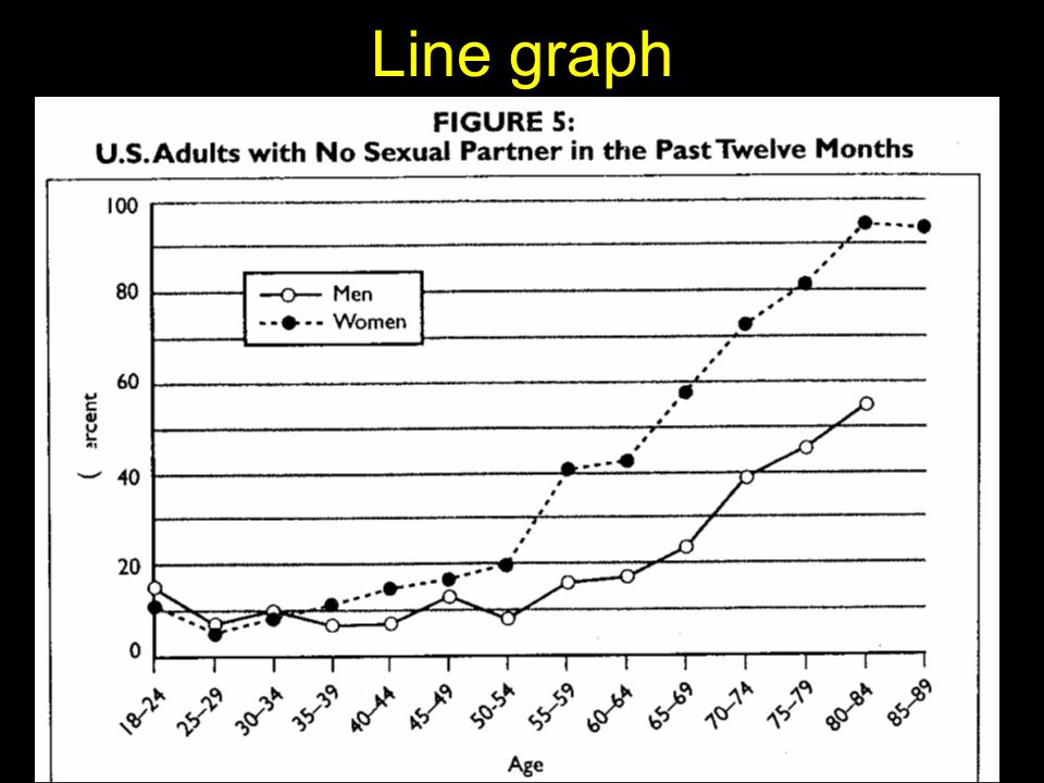
Line graph

81
Causes of Mortality

82
Bivariate Normality

83
Exampes of More Complex Graphs

84
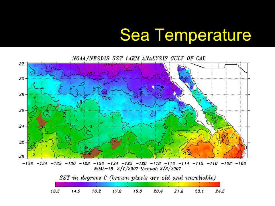
Sea Temperature

86
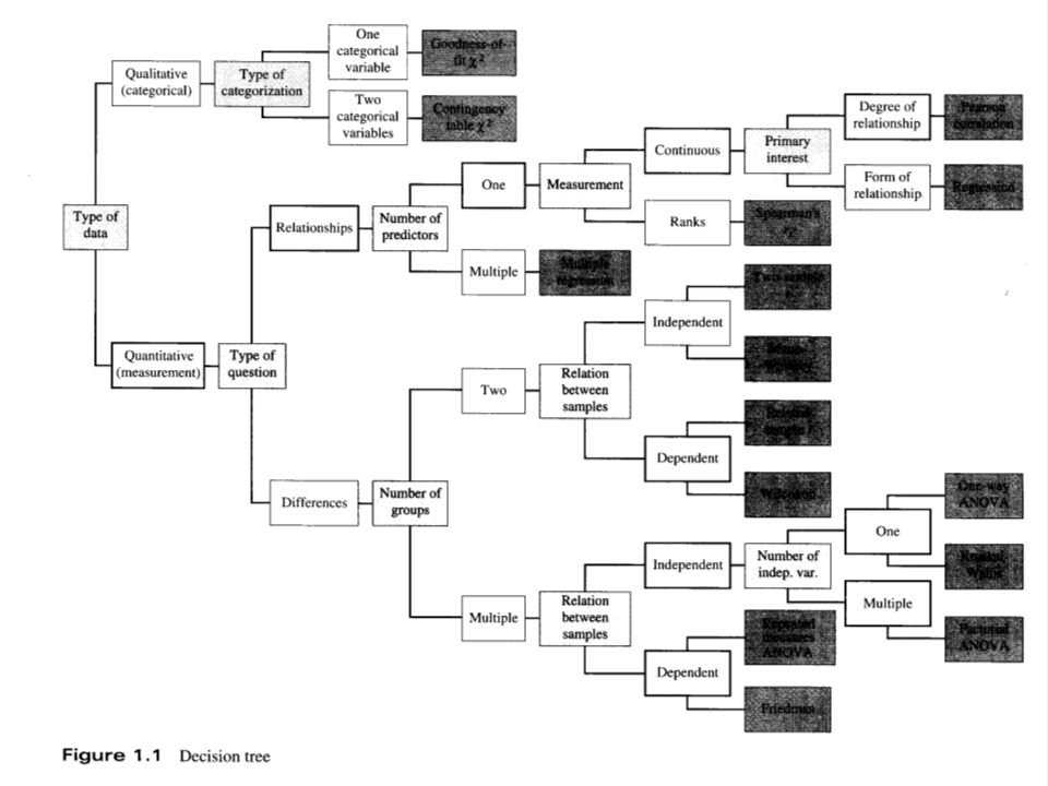
Inferential Statistical Analaysis Decision Making Tree

88
Links Presenting Data – Statistics Glossary v1.1 - http://www.cas.lancs.ac.uk/glossary_v1.1/presdata.html http://www.cas.lancs.ac.uk/glossary_v1.1/presdata.html A Periodic Table of Visualisation Methods - http://www.visual- literacy.org/periodic_table/periodic_table.htmlhttp://www.visual- literacy.org/periodic_table/periodic_table.html Gallery of Data Visualization Univariate Data Analysis – The Best & Worst of Statistical Graphs - http://www.csulb.edu/~msaintg/ppa696/696uni.htmhttp://www.csulb.edu/~msaintg/ppa696/696uni.htm Pitfalls of Data Analysis – http://www.vims.edu/~david/pitfalls/pitfalls.htm http://www.vims.edu/~david/pitfalls/pitfalls.htm Statistics for the Life Sciences – http://www.math.sfu.ca/~cschwarz/Stat- 301/Handouts/Handouts.html http://www.math.sfu.ca/~cschwarz/Stat- 301/Handouts/Handouts.html

Similar presentations


 MSIS 111 Prof. Nick Dedeke.>")

: Analysing data.>")


