Download presentation
Presentation is loading. Please wait.

1
RTE Cereal Consumption Trends in the 90s What Sells Cereals and Where?
By Jim Eales

2
Goal To examine the changes in cereal sales across regions of the US in the 90s by the nutritional content of the cereals.

3
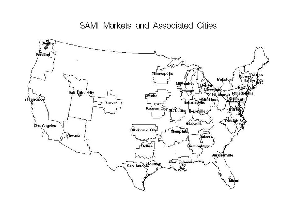
Grocery Marketing Data 1990
Sales Area Marketing, Inc (SAMI), a former product-tracking services division of Arbitron. Warehouse withdrawals 54 Markets made up of US counties Covers 85% of US branded grocery sales Indices measuring sales per household for 160 RTE Cereals
, a former product-tracking services division of Arbitron. Warehouse withdrawals. 54 Markets made up of US counties. Covers 85% of US branded grocery sales. Indices measuring sales per household for 160 RTE Cereals.")
5
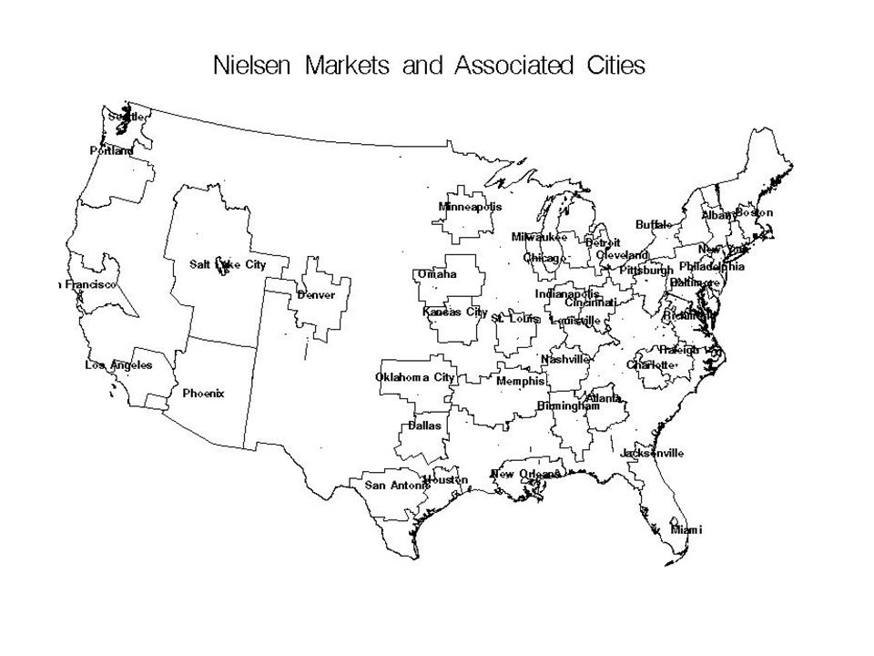
Grocery Marketing Data 1999
Nielsen Homescan data from 7195 households 6068 of which are in Nielsen “Scantrack” Markets. Counties making up each Nielsen Scantrack Market are given in Market Scope. Fortunately, our library had the 1999 edition. Each household’s purchases from various product “modules” including RTE Cereal can be used to calculate sales per household indices for each market.

7
Methods Determined cereals which I could identify as common to both sets of data. Turned out to be 77 cereals, that I could identify. There are probably others.

8
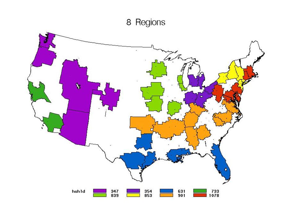
Problem Changes in the sales indexes from 1990 to 1999 were too big to be believed. Some of the Scantrack markets have only as little as 5 households in the Homescan sample.

9
Solution I aggregated SAMI and Nielsen markets up to 8 super regions (California, West, E North Central, W. North Central, Mid South, Deep South, Northeast, and New York). Minimum number of Nielsen households is now about 350 and the average is 700.
. Minimum number of Nielsen households is now about 350 and the average is 700.")
10
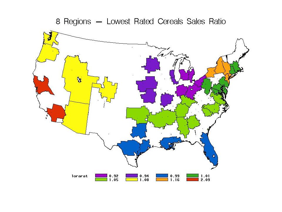
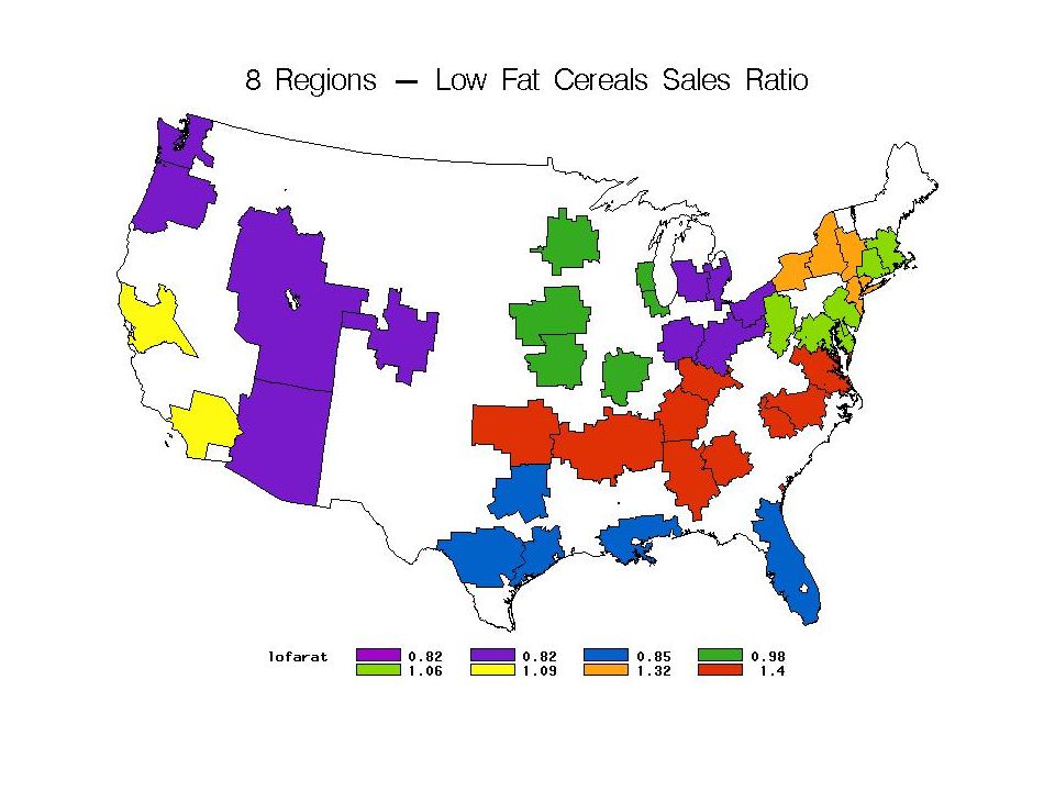
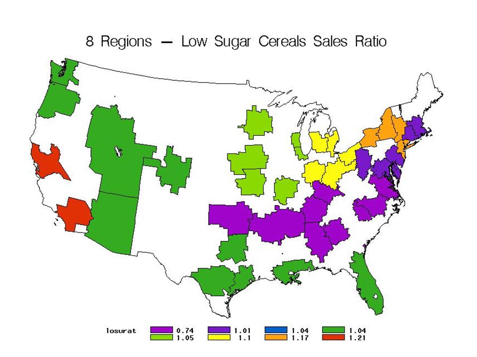
Map Color Schemes I use the spectrum of colors for each map starting at least violet through indigo, blue, green, light green, yellow, orange, and red. For example…

12
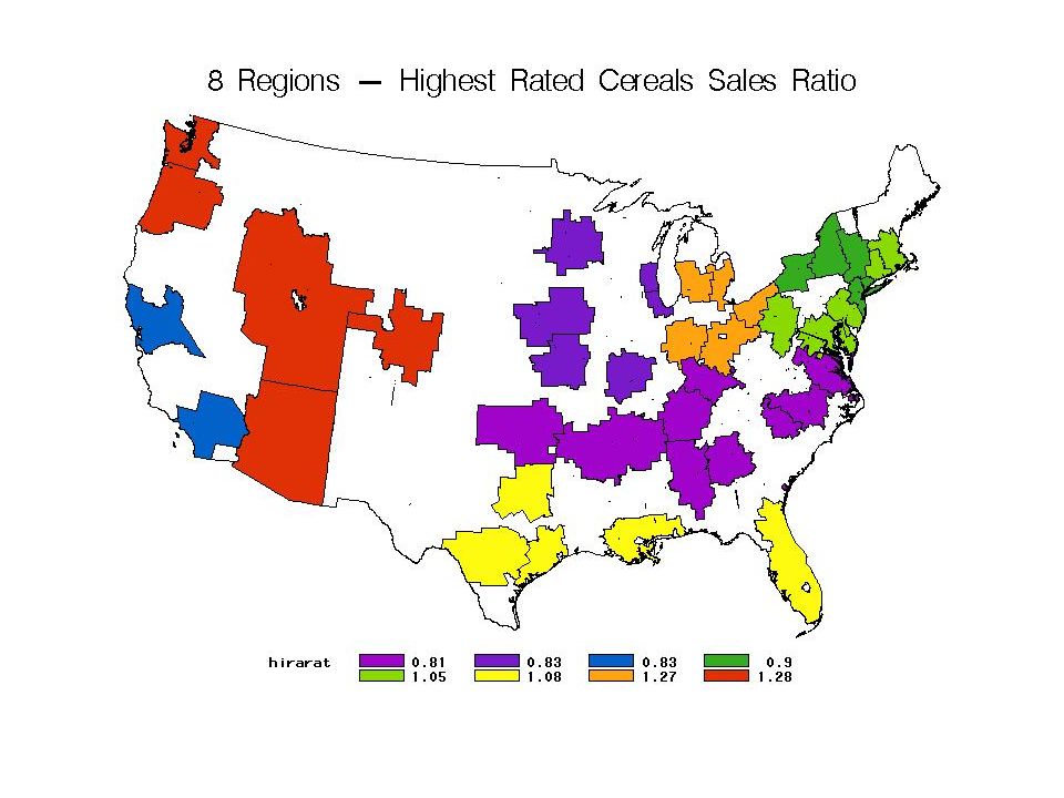
I then ranked cereals by ratings or nutrient content and identified the top (or bottom) 10 cereals.
I calculated an index of sales per household for these 10 cereals for SAMI and for Nielsen. I then took the ratio (Nielsen/SAMI). If the ratio is less (greater) than one for a region then sales per household declined (increased) between 1990 and 1999.
. If the ratio is less (greater) than one for a region then sales per household declined (increased) between 1990 and")
13
Consumer Reports Rated cereals based on nutrition (October, 1986)
I used the information on DASL to get ratings. Ratings are weighted averages of: protein, fat, fiber, sugar, and sodium.

14
Highest Rated Cereals Rating Special K 50.1 Oat Bran 50.5 Grape Nuts 51.3 Nutri Grain 54.7 Heath Valley 55.4 Puffed Rice 60.9 Uncle Sam 62.2 Puffed Wheat 68.9 All Bran 69.8 Fiber One 87.9

16
Lowest Rated Cereals Rating Cap'n Crunch 20.2 Cap'n Crunch Christmas Cap'n Crunch with Crunch Berries 20.7 Frankenberry 21.1 Cinnamon Toast 21.2 Boo Berry 21.3 Count Chocula 23.0 Cap'n Crunch Peanut Butter 23.1 Fruity Pebbles 23.2 Trix 23.8

18
Nutrients

19
Low Fat Cereals Fat (g) Health Valley Cornflakes 0.1 Post Toasties Sun Flakes Frosted Flakes 0.15 Corn Pops 0.22 Malt-O-Meal Puffed Rice 0.27 Quaker Puffed Rice Corn Chex Double Chex

21
Low Sodium Cereals Sodium (mg) Malt-O-Meal Puffed Rice 1.5 Malt-O-Meal Puffed Wheat Quaker Puffed Rice Quaker Puffed Wheat Health Valley 49 Uncle Sam 62 All Bran 77 Cracklin Oat Bran 86 Quaker Oat Bran 109 Corn Pops 116

23
High Fiber Cereals Fiber (g) Fiber One 14 (58%) All Bran 10 Uncle Sam 6 Bran Flakes 5 Crunchy Bran Skinner Raisin Bran 4 Post Raisin Bran Kelloggs Raisin Bran Multi Bran Chex Cracklin Oat Bran

25
Low Sugar Cereals Sugar (g) Fiber One Nutri Grain Malt-O-Meal Puffed Rice Quaker Puffed Rice Malt-O-Meal Puffed Wheat 0.4 Quaker Puffed Wheat Uncle Sam 0.5 Malt-O-Meal Toasty Os 1.0 Cheerios 1.3 Cornflakes 2.2

27
High Sugar Cereals Sugar (g) Apple Jacks 15 Froot Loops 14 Frankenberry Count Chocula Cocoa Puffs Boo Berry Corn Pops Cocoa Crisp Cap'n Crunch w Crunch Berries 13 Fruity Pebbles

29
Summary Cereal Characteristic Regions Increasing Highest-Lowest Ratios
Biggest Increase Decrease Highest Rated 4 0.4 West Mid South Lowest Rated 5 1.17 California E North Cent Low Fat 0.58 E North Cent & West Low Sodium 3 0.8 High Fiber 0.65 Low Sugar 7 0.47 High Sugar 1.26

30
Summary Low Sodium cereals increased in the most regions.
Lowest Rated & High Sugar had the biggest differences in ratios. Regions with the biggest changes are: California, West, East North Central, and Mid South.

31
Conclusions Nutrition doesn’t seem to be playing a big role in cereal consumption, probably because “bad” cereals are often healthier than the alternatives. The difference between Low & High Sugar cereals is over stated because of added sugar. Probably the biggest asset RTE cereal continues to enjoy is convenience.

Similar presentations


 doesn’t care who made commodity products Commodity products are sold on price.>")


 True B) False.>")
