Download presentation
Presentation is loading. Please wait.

2
Griffy Field Teams and Water Sample IDs

3
Data Analysis and Presentation (2010) TemppHSpCRedoxDOAlkalinityF-F- Cl - NO 2- Br - NO 3- PO 4 3- SO 4 2- Ca 2+ Mg 2+ Na + K+K+ ( o C)(µS/cm)(mV)(mg/L) GRIFFY LAKE – 7 Sept 2010 Boat House Dock B123.07.94590141.1165.90.1249.40.941.2118.1835.0712.5838.2511.35 Boat House Dock #20.1222.71.481.721.8011.0441.1411.9034.7511.48 inlet sample 1 - JB22.08.105564.4159.30.2846.50.911.1618.3758.0220.5224.302.07 Inlet sample 1 group A0.1054.40.030.0416.5550.509.0313.601.88 Inlet Group A0.0175.00.1513.2814.395.3917.651.45 "Pond" group A30.47.8921516.954.291.80.020.130.1010.2414.625.3916.501.91 Causeway Group 2 B25.06.71637120.08.5148.60.0463.20.240.330.5132.2736.429.0226.604.50 Causeway 225.06.96530155.60.0955.10.170.230.3030.9442.8510.2430.505.99
 TemppHSpCRedoxDOAlkalinityF-F- Cl - NO 2- Br - NO 3- PO 4 3- SO 4 2- Ca 2+ Mg 2+ Na + K+K+ ( o C)(µS/cm)(mV)(mg/L) GRIFFY LAKE – 7 Sept 2010 Boat House Dock B Boat House Dock # inlet sample 1 - JB Inlet sample 1 group A Inlet Group A Pond group A Causeway Group 2 B Causeway")
4
Milliequivalents can be expressed in milligram units (mg). To convert grams to milligrams, multiply the value by 1,000. Milliequivalents can be calculated using millimoles (mmol). The equation to calculate mEq from mmol is mEq = mmol x V. In this case, the unit of measurement is millimole (mmol), not grams. A milliequivalent is defined as 1/1000 of an equivalent of a chemical element, radical or compound. Its abbreviation is "mEq" or "meq". The Milliequivalent (meq/l), Units of Equivalent Weight An equivalent is the amount of an anion or cation species needed to add or remove one mole of electrons from a system. Concentration in meq/l = ----------------------------------------------- Concentration in mg/L * valence F.W. of the ion
. The equation to calculate mEq from mmol is mEq = mmol x V. In this case, the unit of measurement is millimole (mmol), not grams. A milliequivalent is defined as 1/1000 of an equivalent of a chemical element, radical or compound. Its abbreviation is mEq or meq . The Milliequivalent (meq/l), Units of Equivalent Weight An equivalent is the amount of an anion or cation species needed to add or remove one mole of electrons from a system. Concentration in meq/l = Concentration in mg/L * valence F.W. of the ion.")
5
Converting Ionic Concentrations to Units of Equivalent Weight (meq/l) Concentration in meq/l = ----------------------------------------------- Concentration in mg/L * valence F.W. of the ion Ion Conc. (mg/l) ValenceF.W. Conc. (meq/l) Ca +2 151+240.087.53 Mg +2 23+224.311.90 Na +1 165+122.997.18 K +1 19+139.100.49 Total meq/l cations:17.10 HCO 3 -1 40161.026.57 SO 4 -2 58-296.061.21 Cl -1 34535.459.73 Total meq/l anions:17.51
 ValenceF.W. Conc. (meq/l) Ca Mg Na K Total meq/l cations:17.10 HCO SO Cl Total meq/l anions:")
6
EMP balances: Total meq/l cations: 17.10 meq/l Total meq/l anions: 17.51 meq/l Difference: 0.41 meq/l difference = 2.39% difference = 2.42% An acceptable analyses will have a %-difference that is less than 10% Though, less than 5% is best. Indicates you have accounted for all the major ions in the system and have a “complete” analysis. If balance is off, not accounting for an ion such as Fe, Si, Al, or OH, incorrect dilutions, very dilute samples, math errors, contamination

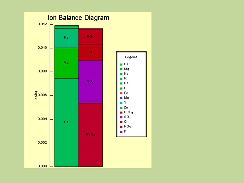
7
Stiff Diagram Stiff diagrams are graphical representation of water chemical analyses, first developed by H.A. Stiff in 1951. A polygonal shape is created from three or four parallel horizontal axes extending on either side of a vertical zero axis. Cations are plotted in milliequivalents per liter on the left side of the zero axis, one to each horizontal axis, and anions are plotted on the right side. Stiff patterns are useful in making a rapid visual comparison between water from different sources. ADVANTAGES Can help visualize ionically related waters from which a flow path can be determined, or; If the flow path is known, to show how the ionic composition of a water body changes over space and/or time. DISADVANTAGE Only one analysis per plot. Stiff Diagram –sample 3A Na Ca MgSO 4 HCO 3 Cl 0 Other possible pairs: Fe NO 3 K NO 3 Fe CO 3

8
Application of Stiff Diagrams Abbott, M., 2008, Final Report: Evaluation Groundwater Chemistry in Gonzales County, Texas and Technical and Educational Assistance to Groundwater Conservation Districts in Texas: US EPA. Figure 7. Stiff diagrams for samples from the Queen City and Sparta Aquifer Systems Figure 5. Stiff diagrams annotated on an engineering plan map of Horsetooth Dam that show different chemistry (polygon shapes) for each piezometer located in the embankment and alluvium. Craft, D., 1999, Summary and Interpretation of Chemistry Data for Reservoir, Seeps, and Groundwater from Horsetooth Dam, Colorado-Big Thompson Project, Ft. Collins, Colorado, Technical Memorandum D-8290/99- 001, U.S. Bureau of Reclamation, Dam Safety Office, Denver, Colorado. A. B.
 for each piezometer located in the embankment and alluvium. Craft, D., 1999, Summary and Interpretation of Chemistry Data for Reservoir, Seeps, and Groundwater from Horsetooth Dam, Colorado-Big Thompson Project, Ft. Collins, Colorado, Technical Memorandum D-8290/ , U.S. Bureau of Reclamation, Dam Safety Office, Denver, Colorado. A. B..")
9
Abbott, M., 2008, Final Report: Evaluation Groundwater Chemistry in Gonzales County, Texas. EPA Report

10
Craft, 1999. Horsetooth Dam, Colorado-Big Thompson Project, Ft. Collins, Colorado

11
Piper Diagram A piper diagram is a graphical representation of the chemistry of a water sample or samples. The cations and anions are shown by separate ternary plots. The apexes of the cation plot are calcium, magnesium and sodium plus potassium cations. The apexes of the anion plot are sulfate, chloride and carbonate plus bicarbonate anions. The two ternary plots are then projected up onto a diamond. The diamond is a matrix transformation of a graph of the anions and cations. In Piper diagrams the concentrations are expressed as %meq/L. Figure 1-7 from Kehew (2001). Classification of hydrochemical facies using the Piper plot.
. Classification of hydrochemical facies using the Piper plot..")
12
Ion Conc. (mg/l) ValenceF.W. Conc. (meq/l) (% meq/l) Ca +2 151+240.087.5344.34 Mg +2 23+224.311.9011.21 Na +1 165+122.997.1841.99 K +1 19+139.100.492.46 Total meq/l cations:17.10100 HCO 3 -1 40161.026.5737.52 SO 4 -2 58-296.061.216.91 Cl -1 34535.459.7355.57 Total meq/l anions:17.51100 % meq/l
 (% meq/l) Ca Mg Na K Total meq/l cations: HCO SO Cl Total meq/l anions: % meq/l.")
13
Ion Conc. (mg/l) ValenceF.W. Conc. (meq/l) (% meq/l) Ca +2 151+240.087.5344.34 Mg +2 23+224.311.9011.21 Na +1 165+122.997.1841.99 K +1 19+139.100.492.46 Cations
 (% meq/l) Ca Mg Na K Cations.")
14
Ion Conc. (mg/l) ValenceF.W. Conc. (meq/l) (% meq/l) HCO 3 -1 40161.026.5737.52 SO 4 -2 58-296.061.216.91 Cl -1 34535.459.7355.57 Anions
 (% meq/l) HCO SO Cl Anions.")
15
Projection into the upper diamond- shaped field

16
ADVANTAGES Many water analyses can be plotted on the same diagram. Can be used to classify waters by hydrochemical facies. Can be used to identify mixing of waters. Can track changes through space and temporal relationships. DISADVANTAGES Concentrations are renormalized. Cannot easily accommodate waters where other cations or anions may be significant. Figure 1-7 from Kehew (2001). Classification of hydrochemical facies using the Piper plot.
. Classification of hydrochemical facies using the Piper plot..")
17
Figure 3: Piper diagram (Piper, 1944) showing regional mixing trends. Fields show localized well-defined regional and subregional mixing trends. Important end- member compositions and high-volume springs of the Colorado Plateau region. Crossey, LJ, Karlstrom, KE, Springer, AE, Newell, D, Hilton, DR, Fischer, T, 2009, Degassing of mantle-derived CO 2 and He from springs in the southern Colorado Plateau region—Neotectonic connections and implications for groundwater systems Geological Society of America Bulletin, 121:1034-1053. McLin, SG, 1986, Evaluation of Aquifer Contamination from Salt Water Disposal Wells: Proceedings of the Oklahoma Academy of Science, 66: 53-61. Figure 2: Piper plot of historical background (letters) and site (numbers) water quality analysis.. A. B. Application of Piper Diagrams
 and site (numbers) water quality analysis.. A. B. Application of Piper Diagrams.")
18
Durov Diagram Primary: Cations (i.e. Na + K, Ca and Mg) and Anions (i.e. Cl, HCO 3 and SO 4 ), and total cations vs. total anions only. Expanded: TDS and pH added Source: RockWare Inc., http://www.rockware.com/product/gallery.php?id=150 TDS (mg/L) pH Cations (norm) Anions (norm) Data points Total Cations vs. Total Anions
, and total cations vs. total anions only. Expanded: TDS and pH added Source: RockWare Inc., id=150 TDS (mg/L) pH Cations (norm) Anions (norm) Data points Total Cations vs. Total Anions.")
19
Durov Diagram Description/ Type of data : a composite plot consisting of 2 ternary diagrams where the cations of interest are plotted against the anions of interest (data is normalized to 100%); sides form a binary plot of total cation vs. total anion concentrations (this plot can be contoured); expanded version includes TDS (mg/L) and pH data added to the sides of the binary plot to allow further comparisons. Use: to graphically illustrate cation/anion concentrations, relative to TDS and pH. – For example, using Griffy Lake samples IC and AAS data, we can plot the ion concentrations, then calculate the TDS from our specific conductivity field measurements, and use the pH field measurements. Because we sampled at several locations (i.e. causeway, pond, etc.), we can use those as data groups to see if there are any spatial variations in water chemistry, and if so, could they be related to a different TDS content, different pH, or both. Example case studies: – Vermeulen, P., and Usher, B., 2009, The effect of graben structures on the migration of groundwater contaminants at an industrial site: Environmental Geology, 58:739-749. Different water chemistry in aquifers on the opposite sides of graben structures – Petalas, C.P., and Diamantis, I.B., 1999, Origin and distribution of saline groundwaters in the upper Miocene aquifer system, coastal Rhodope area, northeastern Greece: Hydrogeology Journal, 7:305-316. Variations in ionic compositions of saline vs. fresh water
; expanded version includes TDS (mg/L) and pH data added to the sides of the binary plot to allow further comparisons. Use: to graphically illustrate cation/anion concentrations, relative to TDS and pH. – For example, using Griffy Lake samples IC and AAS data, we can plot the ion concentrations, then calculate the TDS from our specific conductivity field measurements, and use the pH field measurements. Because we sampled at several locations (i.e. causeway, pond, etc.), we can use those as data groups to see if there are any spatial variations in water chemistry, and if so, could they be related to a different TDS content, different pH, or both. Example case studies: – Vermeulen, P., and Usher, B., 2009, The effect of graben structures on the migration of groundwater contaminants at an industrial site: Environmental Geology, 58: Different water chemistry in aquifers on the opposite sides of graben structures – Petalas, C.P., and Diamantis, I.B., 1999, Origin and distribution of saline groundwaters in the upper Miocene aquifer system, coastal Rhodope area, northeastern Greece: Hydrogeology Journal, 7: Variations in ionic compositions of saline vs. fresh water.")
20
Durov Diagrams Durov SA, 1948, Natural waters and graphic representation of their compositions. Dokl Akad Nauk SSSR 59:87–90. The intersection of lines extended from the two sample points on the triangle to the central rectangle gives a point that represents the major-ion compositions on a percentage basis. From this point, lines extending to the adjacent scaled rectangles provide for representations of the analyses in terms of two parameters selected from various possibilities, such as total major- ion concentrations, total dissolved solids, ionic strength, specific conductance, hardness, total dissolved inorganic carbon, or pH.

21
Expanded Durov Diagram D. K. Chadha, 1999, A proposed new diagram for geochemical classification of natural waters and interpretation of chemical data: Hydrogeology Journal 7:431–439. cations anions

22
Schoeller Diagram A Schoeller Diagram is a semi-logarithmic diagram of the concentrations of the main ionic constituents in water (SO 4, HCO 3, Cl, Mg, Ca, Na/K) in equivalents per million per kg of solution (mEq/kg). An equivalent is the amount of an anion or cation species needed to add or remove one mole of electrons from a system. Converting data in mg/L to milliequivalents: Multiply mg/L by one over the milliequivalent weight (which can be looked up in tables). This gives mEq/L, using mg/kg will yield mEq/kg Milliequivalent weight= (atomic weight)/(valence state x 1000) Concentrations of each ion in each sample are represented by points on six equally spaced lines and points are connected by a line. The diagram gives absolute concentration, but the line also gives the ratio between two ions in the same sample If a line joining two points representing ionic concentrations in a single sample is parallel to another line joining a second set of concentrations from another sample, the ratio of those ions in those samples are equal.
. This gives mEq/L, using mg/kg will yield mEq/kg Milliequivalent weight= (atomic weight)/(valence state x 1000) Concentrations of each ion in each sample are represented by points on six equally spaced lines and points are connected by a line. The diagram gives absolute concentration, but the line also gives the ratio between two ions in the same sample If a line joining two points representing ionic concentrations in a single sample is parallel to another line joining a second set of concentrations from another sample, the ratio of those ions in those samples are equal..")
23
Schoeller Diagram Studies that utilize Schoeller diagrams : Chemical quality of waters Groundwater/Surface water studies, hydrology in general Waste Water potentially from any Economic Geology related Industry (oil, mining, etc) or runoff from agriculture Mineral exploration Barbiéro, L., et al. Geochemistry of water and ground water in the Nhecolândia, Pantanal of Mato Grosso, Brazil: variability and associated processes. Wetlands, v. 22, no. 3 (2002), pp. 528-540. Investigated possibility that saline and freshwater lakes in Pantanal remain connected by a sub-surface aquifer. Van Voast, Wayne A. Geochemical signature of formation waters associated with coalbed methane. American Association of Petroleum Geologists (AAPG) Bulletin, v. 87, no. 4 (April 2003), pp. 667–676. Described typical chemistry of water associated with coalbed methane that can be an exploration tool, regardless of formation lithology or age. Hill, C. Geology of Carlsbad Cavern and other caves in the Guadalupe Mountains, New Mexico, and Texas. New Mexico Bureau of Mines & Mineral Resources Bulletin 117 (1987). Huizar A., et al. (1998) 'Patterns of groundwater hydrochemistry in Apan-Tochac sub-basin, Mexico / Hydrochimie des eaux souterraines du sous-bassin Apan-Tochac, Mexique'. Hydrological Sciences Journal, 43: 5, 669 - 685. Figure 5 (Barbiero et al 2002). Schoeller diagram of three representative fresh (a) and concentrated (b) waters. 1: Corixo; 2: Negro River; 3: Lagoa; 4 and 5: Water table in cordilheira; 6: Salina.
, pp Investigated possibility that saline and freshwater lakes in Pantanal remain connected by a sub-surface aquifer. Van Voast, Wayne A. Geochemical signature of formation waters associated with coalbed methane. American Association of Petroleum Geologists (AAPG) Bulletin, v. 87, no. 4 (April 2003), pp. 667–676. Described typical chemistry of water associated with coalbed methane that can be an exploration tool, regardless of formation lithology or age. Hill, C. Geology of Carlsbad Cavern and other caves in the Guadalupe Mountains, New Mexico, and Texas. New Mexico Bureau of Mines & Mineral Resources Bulletin 117 (1987). Huizar A., et al. (1998) Patterns of groundwater hydrochemistry in Apan-Tochac sub-basin, Mexico / Hydrochimie des eaux souterraines du sous-bassin Apan-Tochac, Mexique . Hydrological Sciences Journal, 43: 5, Figure 5 (Barbiero et al 2002). Schoeller diagram of three representative fresh (a) and concentrated (b) waters. 1: Corixo; 2: Negro River; 3: Lagoa; 4 and 5: Water table in cordilheira; 6: Salina..")
24
Schoeller Diagram cationsanions [semi-logarithmic axis]
![Schoeller Diagram cationsanions [semi-logarithmic axis]](http://images.slideplayer.com/14/4335677/slides/slide_24.jpg "Schoeller Diagram cationsanions [semi-logarithmic axis]")
25
Radial Plot What is a radial plot? A radial plot is a diagram used to compare samples or values against each other, according to a standard measurement. The circular plot type allows you to easily see how values compare based on the shape of each section of plot. What type of data is used? In this plot, the data shows milliequivalents/kilogram (meq/l) for various ions and compounds.
 for various ions and compounds..")
26
Radial Plot What kinds of studies? Studies that involve direct comparisons: – Ionic concentrations – Wind speed and velocity – Seasonal plant productivity – Fission track dating – Mineral availability Examples Mixing phase of sea water and fresh water Wind direction and frequency Example citations: Escolero. et all. Geochemistry of the Hydrogeological Reserve of Meridia, Yucatan, Mexico. Universidad Nacional Autonoma de Mexico. 2005. Garcia et all. Effects of Wind on Background Particle Concentrations at Truck Freight Terminals. J Occup Environ Hyg. 2007.

27
Time Series - pH Plot description This plot describes the relationship between pH values and dates between Aug 3rd and Aug 25th in 2003. The pH values were kind of scattered, ranging from 6.75 to 7.05, with an average of 6.9. The pH kept increasing for the first six days and arrived at the highest value (7.05) on Aug 7th and Aug 8th, followed by a continuous decrease until Aug 11th. On Aug 13th, the pH values rose again and stayed at 6.95 for the following 7 days. The pH then declined and went through several fluctuations and reached the lowest value on Aug 24th. Type of data The data used in the plot was the directly measured pH without any transformation. Many other characteristic parameters, such as temperature, conductivity, alkalinity and so on, can also be plot as functions of time series. This plot is probably the environmental monitoring result of the pH variation in a river, a lake or a wastewater discharge outlet.
 on Aug 7th and Aug 8th, followed by a continuous decrease until Aug 11th. On Aug 13th, the pH values rose again and stayed at 6.95 for the following 7 days. The pH then declined and went through several fluctuations and reached the lowest value on Aug 24th. Type of data The data used in the plot was the directly measured pH without any transformation. Many other characteristic parameters, such as temperature, conductivity, alkalinity and so on, can also be plot as functions of time series. This plot is probably the environmental monitoring result of the pH variation in a river, a lake or a wastewater discharge outlet..")
28
Time Series - pH Types of studies in which pH, or other similar data, is examined over time Evaluating ocean acidification Effects of rising sea surface temperature on pH through time Carbonate concentrations Monitoring seasonal cycles that affect pH, pCO 2, and salinity Buffering capacity of a system through time Also used frequently in fields outside of water chemistry Economics (ie the stock market) Quantum physics Mortality rates Population studies
 Quantum physics Mortality rates Population studies")
29
Time Series Specific Studies R. A. Quick and A. E. Ogden, Hydrochemistry as a means of Delineating Groundwater flow patterns in the Edward’s Aquifer, San Marcos, Texas, U.S.A. Researchers plotted pH, temperature, dissolved oxygen, discharge, sulfate, and conductance, over the twelve month duration of their study to determine the parameters of a series of aquifer springs. The study was aimed at investigating the validity of a model that suggested the spring would cease to flow in 2020. In this process, researchers discovered that there are actually two chemically unique groups of springs and that discharge had a more profound role in altering water chemistry for one group as opposed to the other. Bredemeier, Dohrenbusch, and Murach, Response of soil water chemistry and fine-roots to clean rain in a spruce forest ecosystem at Solling, FRG In the Solling experimental forest in central Germany a clean rain roof experiment is conducted in a 60 year old Norway Spruce (Picea abies KARST.) stand. In this experiment with application of artificially prepared pre-industrial throughfall there is now a time series of soil water chemistry data from about 2 yr of pre-experiment and 3.5 yr of manipulation treatment.
 stand. In this experiment with application of artificially prepared pre-industrial throughfall there is now a time series of soil water chemistry data from about 2 yr of pre-experiment and 3.5 yr of manipulation treatment..")
30
Time Series Time Variable [ Julian days, calendar dates, hours, minutes, seconds, years, decades, etc.]
![Time Series Time Variable [ Julian days, calendar dates, hours, minutes, seconds, years, decades, etc.]](http://images.slideplayer.com/14/4335677/slides/slide_30.jpg "Time Series Time Variable [ Julian days, calendar dates, hours, minutes, seconds, years, decades, etc.]")
31
Box and Whisker plot Box and Whisker is a summary plot of 5 statistics: minimum, maximum, median and the lower and upper quartiles. Mean is sometimes shown as well. Multiples plots can be connected to show the variance of data over time or compared to other sites to show differences.

32
Box and Whisker Plot It is often used in Environmental Chemistry to show water quality variance over time, between areas, and in concentration studies. – Allows comparison range, median, spread, etc more conclusion can be drawn than from a time plot Examples – Knudson, A.C., M.E. Gunter, 2002, Sedimentary Phosphorites—An Example: Phosphoria Formation, Southeastern Idaho, U.S.A.: Reviews in Mineralogy and Geochemistry, v. 48, no. 1, p. 363-389. – Lmeida, C.A., et al., 2010, Mineral Paragenesis, Alteration, and Geochemistry of the Two Types of Gold Ore and the Host Rocks from the Carlin-Type Deposits in the Southern Part of the Goldstrike Property, Northern Nevada: Implications for Sources of Ore-Forming Elements, Ore Geologic Society, v. 105, no. 1, p. 971-1004.

33
Box and Whisker Plot combined in a Time Series Plot

Similar presentations


![Karst Chemistry I. Definitions of concentration units Molality m = moles of solute per kilogram of solvent Molarity [x]= moles of solute per kilogram.](/14/4335485/big_thumb.jpg "Karst Chemistry I. Definitions of concentration units Molality m = moles of solute per kilogram of solvent Molarity [x]= moles of solute per kilogram.>")


 - dissolves solids and gases readily (“universal solvent”) Addition of dissolved.>")


