Download presentation
Presentation is loading. Please wait.

1
CS 131 - Web Design II Spring 2012 at JCU Stefano Gazziano - sgazziano@johncabot.edu

2
CS 131 - Web Design II Fall 2011 at JCU - sgazziano@johncabot.edu Our Program this year: 1. Layouts (frozen, liquid, jello), Templates how to choose and use 2. Elements of Javascript, interactivity 3. Content Management Systems: Joomla, Plone, Wordpress. Professional tools for web design (dreamweaver) 4. Pre-production, Organizing a web site information, Information ARchitecture (IA), IA Diagrams 5. Colors and emotional impact 6. Smart navigation, accessibilty and usability 7. Search Engine Optimization, site analytics 8. Web 2.0 tools: user created content, communities, blog in business. 9. Future trends: 3d Internet, “future Internet”, convergence, mobile Internet. Students will set up a web site using professional tools and available CMS as a course project. LEARNING OUTCOMES: On completion of the course a student should be able to 1. Apply the technology behind modern professional web design and development 2. Utilize the standard tools for web design: CMS, Web editors 3. Develop and validate web sites conform to usability and accessibility W3C rules; 4. Apply Design Principles to Website design
, Templates how to choose and use 2. Elements of Javascript, interactivity 3. Content Management Systems: Joomla, Plone, Wordpress. Professional tools for web design (dreamweaver) 4. Pre-production, Organizing a web site information, Information ARchitecture (IA), IA Diagrams 5. Colors and emotional impact 6. Smart navigation, accessibilty and usability 7. Search Engine Optimization, site analytics 8. Web 2.0 tools: user created content, communities, blog in business. 9. Future trends: 3d Internet, future Internet , convergence, mobile Internet. Students will set up a web site using professional tools and available CMS as a course project. LEARNING OUTCOMES: On completion of the course a student should be able to 1. Apply the technology behind modern professional web design and development 2. Utilize the standard tools for web design: CMS, Web editors 3. Develop and validate web sites conform to usability and accessibility W3C rules; 4. Apply Design Principles to Website design.")
3
CS 131 - Web Design II Fall 2011 at JCU - sgazziano@johncabot.edu Layouts (frozen, liquid, jello), Templates how to choose and use The "BOX" model - 1 Control every aspect of the box with CSS: the size of the padding around the content, whether or not the element has a border (as well as what kind and how large), and how much margin there is between your element and other elements.
, Templates how to choose and use The BOX model - 1 Control every aspect of the box with CSS: the size of the padding around the content, whether or not the element has a border (as well as what kind and how large), and how much margin there is between your element and other elements.")
4
CS 131 - Web Design II Fall 2011 at JCU - sgazziano@johncabot.edu Layouts (frozen, liquid, jello), Templates how to choose and use The "BOX" model - 2
, Templates how to choose and use The BOX model - 2")
5
CS 131 - Web Design II Fall 2011 at JCU - sgazziano@johncabot.edu Layouts (frozen, liquid, jello), Templates how to choose and use The "BOX" model - 3
, Templates how to choose and use The BOX model - 3")
6
CS 131 - Web Design II Fall 2011 at JCU - sgazziano@johncabot.edu Layouts (frozen, liquid, jello), Templates how to choose and use The "BOX" model - 4
, Templates how to choose and use The BOX model - 4")
7
CS 131 - Web Design II Fall 2011 at JCU - sgazziano@johncabot.edu Layouts (frozen, liquid, jello), Templates how to choose and use The "BOX" model - 5 The box model may look simple with just the content, some padding, a border, and margins. But when you combine these all together there are endless ways you can determine the layout of an element with its internal spacing (padding) and the spacing around it (margins). Take a look at just a few examples of how you can vary your elements.
 and the spacing around it (margins). Take a look at just a few examples of how you can vary your elements..")
8
CS 131 - Web Design II Fall 2011 at JCU - sgazziano@johncabot.edu Layouts (frozen, liquid, jello), Templates how to choose and use
, Templates how to choose and use")
9
CS 131 - Web Design II Fall 2011 at JCU - sgazziano@johncabot.edu Layouts (frozen, liquid, jello), Templates how to choose and use
, Templates how to choose and use")
10
CS 131 - Web Design II Fall 2011 at JCU - sgazziano@johncabot.edu Layouts (frozen, liquid, jello), Templates how to choose and use
, Templates how to choose and use")
11
CS 131 - Web Design II Fall 2011 at JCU - sgazziano@johncabot.edu Layouts (frozen, liquid, jello), Templates how to choose and use
, Templates how to choose and use")
12
CS 131 - Web Design II Fall 2011 at JCU - sgazziano@johncabot.edu Layouts (frozen, liquid, jello), Templates how to choose and use The "BOX" model - a look at the code
, Templates how to choose and use The BOX model - a look at the code")
13
CS 131 - Web Design II Fall 2011 at JCU - sgazziano@johncabot.edu Layouts (frozen, liquid, jello), Templates how to choose and use FLOW & FLOAT Flow is what the browser uses to lay out a page of XHTML elements. The browser starts at the top of any XHTML file and follows the flow of elements from top to bottom, displaying each element it encounters. And, just considering the block elements for a moment, it puts a linebreak between each one. So the first element in a file is displayed first, then a linebreak, followed by the second element, then a linebreak, and so on, from the top of your file to the bottom. That’s flow.

14
CS 131 - Web Design II Fall 2011 at JCU - sgazziano@johncabot.edu Layouts (frozen, liquid, jello), Templates how to choose and use FLOW & FLOAT
, Templates how to choose and use FLOW & FLOAT")
15
CS 131 - Web Design II Fall 2011 at JCU - sgazziano@johncabot.edu Layouts (frozen, liquid, jello), Templates how to choose and use FLOW & FLOAT
, Templates how to choose and use FLOW & FLOAT")
16
CS 131 - Web Design II Fall 2011 at JCU - sgazziano@johncabot.edu Layouts (frozen, liquid, jello), Templates how to choose and use FLOW & FLOAT - combined together makes a "LAYOUT"
, Templates how to choose and use FLOW & FLOAT - combined together makes a LAYOUT")
17
CS 131 - Web Design II Fall 2011 at JCU - sgazziano@johncabot.edu Layouts (frozen, liquid, jello), Templates how to choose and use Liquid and Frozen Designs Designs are called liquid layouts because they expand to fill whatever width we resize the browser to. These layouts are useful because, by expanding, they fill the space available and allow users to make good use of their screen space. Sometimes, however, it is more important to have your layout locked down so that when a user resizes the screen, your design still looks as it should. There are a couple of layouts that work like this, but let’s start with frozen layouts. Frozen layouts lock the elements down, frozen to the page, so they can’t move at all, and so we avoid a lot of issues that are caused by the window expanding.

18
CS 131 - Web Design II Fall 2011 at JCU - sgazziano@johncabot.edu Layouts (frozen, liquid, jello), Templates how to choose and use Frozen layout code changes
, Templates how to choose and use Frozen layout code changes")
19
CS 131 - Web Design II Fall 2011 at JCU - sgazziano@johncabot.edu Layouts (frozen, liquid, jello), Templates how to choose and use Jello layout code changes The frozen layout has some benefits, but it also just plain looks bad when you widen the browser. But we’ve got a fix, and it’s a common design you’ll see on the Web. This design is between frozen and liquid, and it has a name to match: Jello. Jello layouts lock down the width of the content area in the page, but center it in the browser.

20
CS 131 - Web Design II Fall 2011 at JCU - sgazziano@johncabot.edu Templates how to choose and use

21
CS 131 - Web Design II Fall 2011 at JCU - sgazziano@johncabot.edu Templates how to choose and use

22
CS 131 - Web Design II Fall 2011 at JCU - sgazziano@johncabot.edu Templates how to choose and use

23
CS 131 - Web Design II Fall 2011 at JCU - sgazziano@johncabot.edu Templates how to choose and use

24
CS 131 - Web Design II Fall 2011 at JCU - sgazziano@johncabot.edu Templates how to choose and use A website template is a design used for the physical appearance or facade of your website. It is a layout that can be used to display content and information for a simple website, or used as a neat package in which to program additional features, such as scripts and databases. However a website template in itself does not contain any scripts or databases, and thus it will not “operate” the services of a “functioning” website without additional work. To restate the above, a website template will not run your dating service, nor will it include search features, membership databases, or have a back end administration for updating your website by default. These are all the functions of website scripts that are often found in “turnkey websites” and other “content management systems”, which are referred to as CMS's for short. If you require a ready to go solution that includes features such as the above, then a better solution for you may be a turnkey website from Built2Go.com(http://www.built2go.com/) or a CMS Template from ThemeStock.com (http://www.themestock.com/).(http://www.built2go.com/)(http://www.themestock.com/) However, a website template is helpful for the design and look of your content based website, or as a foundation in which to add your own scripts. This means if you would like to set up or redesign an informational website that simply displays content and consists of any number of linked pages, then it is very easy to add your content to a professional looking design that perfectly matches the theme of your website. Alternatively, if you are a programmer, developer, or if you have hired a programmer or developer that can provide your website with functionality, then a web template will be helpful in providing a clean and professional design that can easily integrate with any type of programming and on any type of platform. Therefore, website templates will benefit any number of individuals from first time webmasters to advanced developers that require an attractive appearance in which to apply their own website content or website programming.

25
CS 131 - Web Design II Fall 2011 at JCU - sgazziano@johncabot.edu Templates how to choose and use Templates: "pre-designed" or "pre-programmes" websites availables to be customized. fast way to set up a web site. available as HTML or most common CMS use and customization depend on programming environment Exercise : select a Coffeecup Template and modify it. (later in the course we will use CMS templates, too)
.")
26
CS 131 - Web Design II Fall 2011 at JCU - sgazziano@johncabot.edu Javascript - w3school tutorial we will follow the tutorial for Javascript now w3school tutorial

27
CS 131 - Web Design II Fall 2011 at JCU - sgazziano@johncabot.edu Javascript - new developments: AJAX (for a complete description see WIKIPEDIA) WIKIPEDIA The term Ajax has come to represent a broad group of web technologies that can be used to implement a web application that communicates with a server in the background, without interfering with the current state of the page. In the article that coined the term Ajax, [1] Jesse James Garrett explained that the following technologies are incorporated: [1]Jesse James Garrett HTML or XHTML and CSS for presentation HTMLXHTMLCSS the Document Object Model (DOM) for dynamic display of and interaction with dataDocument Object Model XML for the interchange of data, and XSLT for its manipulation XMLXSLT the XMLHttpRequest object for asynchronous communicationXMLHttpRequest JavaScript to bring these technologies together JavaScript Since then, however, there have been a number of developments in the technologies used in an Ajax application, and the definition of the term Ajax. In particular, it has been noted that JavaScript is not the only client-side scripting language that can be used for implementing an Ajax application; other languages such as VBScript are also capable of the required functionality. [2][9] (However, JavaScript is the most popular language for Ajax programming due to its inclusion in and compatibility with the majority of modern web browsers.) Also, XML is not required for data interchange and therefore XSLT is not required for the manipulation of data. JavaScript Object Notation (JSON) is often used as an alternative format for data interchange, [10] although other formats such as preformatted HTML or plain text can also be used. [11]VBScript [2][9]JavaScript Object Notation [10] [11]
 for dynamic display of and interaction with dataDocument Object Model XML for the interchange of data, and XSLT for its manipulation XMLXSLT the XMLHttpRequest object for asynchronous communicationXMLHttpRequest JavaScript to bring these technologies together JavaScript Since then, however, there have been a number of developments in the technologies used in an Ajax application, and the definition of the term Ajax. In particular, it has been noted that JavaScript is not the only client-side scripting language that can be used for implementing an Ajax application; other languages such as VBScript are also capable of the required functionality. [2][9] (However, JavaScript is the most popular language for Ajax programming due to its inclusion in and compatibility with the majority of modern web browsers.) Also, XML is not required for data interchange and therefore XSLT is not required for the manipulation of data. JavaScript Object Notation (JSON) is often used as an alternative format for data interchange, [10] although other formats such as preformatted HTML or plain text can also be used. [11]VBScript [2][9]JavaScript Object Notation [10] [11].")
28
CS 131 - Web Design II Fall 2011 at JCU - sgazziano@johncabot.edu Javascript - new developments: DOM Document Object Model The Document Object Model (DOM) is a cross-platform and language-independent convention for representing and interacting with objects in HTML, XHTML and XML documents.[1] Aspects of the DOM (such as its "Elements") may be addressed and manipulated within the syntax of the programming language in use. The public interface of a DOM is specified in its application programming interface (API). The XML DOM defines a standard for accessing and manipulating XML. The DOM is a W3C (World Wide Web Consortium) standard. The DOM defines a standard for accessing documents like XML and HTML: "The W3C Document Object Model (DOM) is a platform and language-neutral interface that allows programs and scripts to dynamically access and update the content, structure, and style of a document." The DOM is separated into 3 different parts / levels: Core DOM - standard model for any structured document XML DOM - standard model for XML documents HTML DOM - standard model for HTML documents The DOM defines the objects and properties of all document elements, and the methods (interface) to access them. A web browser is not obliged to use DOM in order to render an HTML document. However, the DOM is required by JavaScript scripts that wish to inspect or modify a web page dynamically. In other words, the Document Object Model is the way JavaScript sees its containing HTML page and browser state. See DOM on W3SCHOOL or DOM in WIKIPEDIA DOM on W3SCHOOLDOM in WIKIPEDIA
![CS Web Design II Fall 2011 at JCU - Javascript - new developments: DOM Document Object Model The Document Object Model (DOM) is a cross-platform and language-independent convention for representing and interacting with objects in HTML, XHTML and XML documents.[1] Aspects of the DOM (such as its Elements ) may be addressed and manipulated within the syntax of the programming language in use.](http://images.slideplayer.com/14/4291082/slides/slide_28.jpg "The public interface of a DOM is specified in its application programming interface (API). The XML DOM defines a standard for accessing and manipulating XML. The DOM is a W3C (World Wide Web Consortium) standard. The DOM defines a standard for accessing documents like XML and HTML: The W3C Document Object Model (DOM) is a platform and language-neutral interface that allows programs and scripts to dynamically access and update the content, structure, and style of a document. The DOM is separated into 3 different parts / levels: Core DOM - standard model for any structured document XML DOM - standard model for XML documents HTML DOM - standard model for HTML documents The DOM defines the objects and properties of all document elements, and the methods (interface) to access them. A web browser is not obliged to use DOM in order to render an HTML document. However, the DOM is required by JavaScript scripts that wish to inspect or modify a web page dynamically. In other words, the Document Object Model is the way JavaScript sees its containing HTML page and browser state. See DOM on W3SCHOOL or DOM in WIKIPEDIA DOM on W3SCHOOLDOM in WIKIPEDIA.")
29
CS 131 - Web Design II Fall 2011 at JCU - sgazziano@johncabot.edu Javascript exercises - 1 Write a script asking name and last name to user before the page is loaded. Call a dialog window (type prompt) that shows "Welcome" + name + lastname and date and time. The bottom of the page (footer) must always show "Welcome" + name + lastname and date and time Make a decent HTML !!
 that shows Welcome + name + lastname and date and time. The bottom of the page (footer) must always show Welcome + name + lastname and date and time Make a decent HTML !!.")
30
CS 131 - Web Design II Fall 2011 at JCU - sgazziano@johncabot.edu Javascript exercises - 2 Ask the user font size and color for tags p, body, h1 ask the user bkgcolor for tag body Automatically derive font sizes for tags h2 and h3 from tag h1 as defined by user Generate an internal style sheet using these specifications

31
CS 131 - Web Design II Fall 2011 at JCU - sgazziano@johncabot.edu Javascript - Further readings Javascript A Beginners's Guide, III ed, John Pollack, McGraw Hill 2010. USD 26. Head First JavaScript A Learner's Companion to JavaScript By Michael Morrison Publisher:O'Reilly Media

32
HTMLHTML 5 and Javascript HTML5 is a superset of HTML 4.01 (meaning practically everything in it is still supported in HTML5) and all you need to do is know how to specify your doctype and the rest of the tags in the element to get started with HTML5. XHTML 2 was a dead-end. Everyone who wrote real web pages hated it. XHTML reinvented the way we write markup for a web page, and would have made all the pages already out there obsolete.

33
w

37
Transition to HTML5 and Javascript - 1

38
Transition to HTML5 and Javascript - 2

39
Transition to HTML5 and Javascript - 3

40
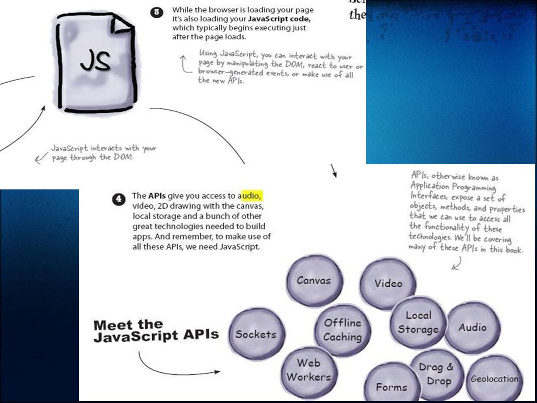
HTML5 needs Javascript With HTML5 things are changing: web pages are becoming rich experiences (and full blown applications) that have behavior, are updated on the fly, and interact with the user. Building these kinds of pages requires a fair bit of programming and if you’re going to write code for the browser, there’s only one game in town: JavaScript.

43
HTML5 is markup + JavaScript APIs + CSS,

44
HTML5 is the newest version of HTML. It introduces simplified tags, new semantic and media elements, and relies on a set of JavaScript libraries that enable web applications. XHTML is no longer the standard for web pages. Developers and the W3C decided to keep extending and improving HTML instead. The new, simpler HTML5 doctype is supported by older browsers—they use standards mode when they see this doctype. The type attribute is no longer needed in the tag or in a stylesheet link to CSS. JavaScript and CSS are now the defaults. The tag used for specifying thecharacter set has been simplified to include only the character encoding.

45
HTML5 is markup + JavaScript APIs + CSS, UTF-8 is now the standard charset in use on the Web. ƒƒ Making changes to the doctype and tag won’t break your pages in older browsers. HTML5’s new elements are a superset of HTML 4 elements, which means older pages will continue to work in modern browsers. The HTML5 standard won’t be officially complete until 2014, but most modern browsers will support it long before then (many support it now!). HTML5 introduces elements that add new semantics to your pages, giving you more options for creating web page structure than we had with HTML 4.01.
. HTML5 introduces elements that add new semantics to your pages, giving you more options for creating web page structure than we had with HTML")
46
HTML5 is markup + JavaScript APIs + CSS, Many of the new features in HTML5 require JavaScript to make the most of them. Using JavaScript, you can interact with the DOM—the Document Object Model. The DOM is the browser’s internal representation of a web page. Using JavaScript, you can access elements, change elements, and add new elements to the DOM. A JavaScript API is an “Application Programming Interface.” APIs make it possible to control all aspects of HTML5, like 2D drawing, video playback, and more. JavaScript is one of the most popular languages in the world. JavaScript implementations have improved dramatically in recent years. You’ll be able to detect whether a new feature is supported in a browser and gracefully degrade the experience if not. CSS is the style standard for HTML5; many people include CSS when they use the term “HTML5” to describe the family of technologies used to create web applications.

47
The way Javascript works

48
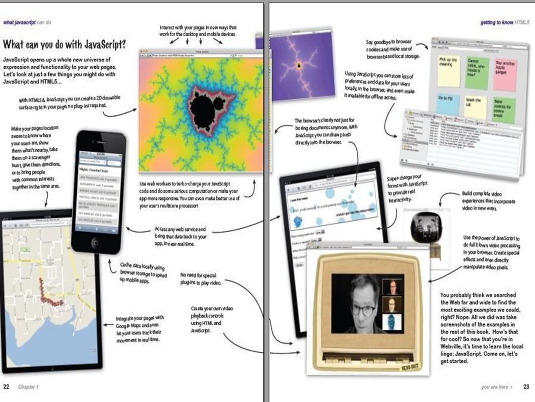
What can you do with JavaScript? Once you’ve got a page with a element (or a reference to a separate JavaScript file), you’re ready to start coding. JavaScript is a full-fledged programming language and you can do pretty much anything with it you can with other languages, and even more because we’re programming inside a web page!
, you’re ready to start coding. JavaScript is a full-fledged programming language and you can do pretty much anything with it you can with other languages, and even more because we’re programming inside a web page!.")
49
What can you do with JavaScript?

50
How to bake your own DOM

51
What is a DOM

52
DOM at work

55
Test drive the planets Planets var planet = document.getElementById("greenplanet"); planet.innerHTML = "Red Alert: hit by phaser fire!"; Green Planet All is well Red Planet Nothing to report Blue Planet All systems A-OK
; planet.innerHTML = Red Alert: hit by phaser fire! ; Green Planet All is well Red Planet Nothing to report Blue Planet All systems A-OK")
57
You can’t mess with the DOM until the page has fully loaded. But how do you tell the browser to execute your code only after it’s loaded? To tell the browser to wait before executing code we’re going to use two parts of JavaScript you haven’t seen much of yet: the window object, and a function. We’ll get to the details of both these later; for now, just go with it so you can get the code to work. Update your JavaScript code like this:

59
DOM abilities

60
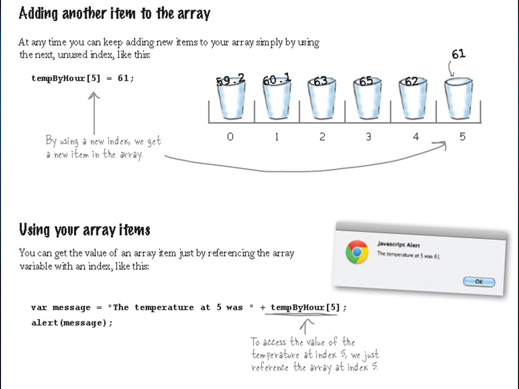
Arrays: multiple value variables

62
CS 131 - Web Design II Fall 2011 at JCU - sgazziano@johncabot.edu CMS - Content Management System A web content management system (WCMS) is a software system that provides website authoring, collaboration, and administration tools designed to allow users with little knowledge of web programming languages or markup languages to create and manage website content with relative ease. A robust WCMS provides the foundation for collaboration, offering users the ability to manage documents and output for multiple author editing and participation.websiteprogramming languagesmarkup languages Most systems use a database to store page content, metadata, and other information assets that might be needed by the system.databasemetadata A presentation layer displays the content to website visitors based on a set of templates. The templates are sometimes XSLT files. [1]templatesXSLT [1] Most systems use server side caching to improve performance. This works best when the WCMS is not changed often but visits happen regularly.server side caching Administration is typically done through browser-based interfaces, but some systems require the use of a fat client.fat client A WCMS allows non-technical users to make changes to a website with little training. A WCMS typically requires a systems administrator and/or a web developer to set up and add features, but it is primarily a website maintenance tool for non-technical staff.

63
CS 131 - Web Design II Fall 2011 at JCU - sgazziano@johncabot.edu CMS - Content Management System Most Common CMS - Facebook - Wordpress - Joomla - Plone - Media Wiki - Microsoft Share Point

64
CS 131 - Web Design II Fall 2011 at JCU - sgazziano@johncabot.edu CMS - Word PressWord Press

65
Assignments - A wordpress website published on wordpress.com using their CMS, topic of your choise. Upload straight to Wordpress then let me know your URL - A Web Design project for the CS web server. Best work will be used as CS Dept web site, in case (as I expect) there more than one very good project, I will rotate the homepages. Upload on your own directory via FTP then we'll discuss the results. Requirements are "at least" implement all the actual functions of of computerscience.johncabot.edu i.e. student portfolio links, message area, FB snippet, mail to teacher....
 there more than one very good project, I will rotate the homepages. Upload on your own directory via FTP then we ll discuss the results. Requirements are at least implement all the actual functions of of computerscience.johncabot.edu i.e. student portfolio links, message area, FB snippet, mail to teacher.....")
66
CS 131 - Web Design II Fall 2011 at JCU - sgazziano@johncabot.edu CMS - Joomla Joomla

67
CS 131 - Web Design II Fall 2011 at JCU - sgazziano@johncabot.edu CMS - Joomla Joomla - quoted as the most popular open source CMS (content management system). With 2.7 percent of the Web running on Joomla, the software is used by individuals, small & medium- sized businesses, and large organizations worldwide to easily create & build a variety of websites & web- enabled applications. Local v/s Web CMS

68
CS 131 - Web Design II Fall 2011 at JCU - sgazziano@johncabot.edu CMS - Joomla Joomla - quoted as the most popular open source CMS (content management system). With 2.7 percent of the Web running on Joomla, the software is used by individuals, small & medium- sized businesses, and large organizations worldwide to easily create & build a variety of websites & web- enabled applications. Local v/s Web CMS

69
New CS server at JCU A new, and real webserver has been activated to serve the Web Design classes Host: computerscience.johncabot.edu Username and password: your usual JCU credentials FTP service active MS Internet Information Server CS131 Contest is open for the best web page :)
")
70
e-marketing your website SEO: Search Engine Optimization writing what Google wants to see SMO: Social Media Optimization a.k.a. Web Reputation Management viral information, targeted ads, fora posts SEM: Search Engine Marketing crawling, indexing, processing, ranking Analytics insights into your website traffic Conversion getting your prospect to do what you want them to do

71
SEO: Search Engine Optimization writing what Google wants to see be high in Google ranking let users find what you offer when they search for it 1 - Google Rules It's the ranking in Google that counts 2 - Follow Google rules The Google Webmaster Guidelines 3 - Be realistic Want your website to be first in the search for "Beautiful Girls" ?? Just forget it.

72
2 - Follow Google rules The Google Webmaster GuidelinesThe Google Webmaster Guidelines - Use explanatory names for the page web design course at JCU University Rome Italy i.e. include keywords in - Forget about tags is irrelevant now - Update website frequently, and let it be visited by non unique IP's, spread your link into high ranking websoites (blogs are ok) - and mention words and matches same words in text, Be reasonable - excesses are considered cheating and punished harshly by Google
 - and mention words and matches same words in text, Be reasonable - excesses are considered cheating and punished harshly by Google.")
73
When your site is ready: - Submit it to Google at http://www.google.com/addurl.html. - Submit a Sitemap using Google Webmaster Tools. Google uses your Sitemap Sitemap to learn about the structure of your site and to increase our coverage of your webpages. - Make sure all the sites that should know about your pages are aware your site is online.

74
Google bot "bumps" - things NOT to do What is Googlebot? Googlebot is Google's web crawling bot (sometimes also called a "spider"). Crawling is the process by which Googlebot discovers new and updated pages to be added to the Google index. See Google Webmasters Tools Help DON'T: - use more than 100 unique links in the same page - use more than 2 dyn links - put page more than 3 click links away from home page - require "session id" or "registration" cookies - split the page into frames - redirect before showing contents - use forms to submit, drop down menus, search boxes, login required
. Crawling is the process by which Googlebot discovers new and updated pages to be added to the Google index. See Google Webmasters Tools Help DON T: - use more than 100 unique links in the same page - use more than 2 dyn links - put page more than 3 click links away from home page - require session id or registration cookies - split the page into frames - redirect before showing contents - use forms to submit, drop down menus, search boxes, login required.")
76
Web Reputation Management Reverse SEO: not putting your web site high in ranking, but push down other "negative" web sites. Define exactly the keyword (search term) you want them to plunge down in seaches (e.g. "my name") Produce optimized and differentiated content focused on that search term (always "my name"...) Update, and visit using "onion routing" to reach online anonimity (e.g. use TOR network)TOR network Wait 2-3 months...
 you want them to plunge down in seaches (e.g. my name ) Produce optimized and differentiated content focused on that search term (always my name ...) Update, and visit using onion routing to reach online anonimity (e.g. use TOR network)TOR network Wait 2-3 months....")
77
Mobile CSS Add an alternate stylesheet for mobile devices. Really. You don’t even have to include any styles — the very presence of a mobile-specific stylesheet will override all styles from your screen stylesheet, thereby simplifying the presentation of your site. Including a mobile-specific stylesheet is as easy as uploading a blank.css file and adding the following code to the of your web pages:

78
Mobile CSS The key here is the media="handheld" attribute, which tells browsers to apply the linked stylesheet to all mobile devices. This method isn’t perfect, especially considering the difficulty of testing on the millions of different mobile devices currently available. For example, the Windows Mobile browser will not apply media="handheld" stylesheets if a media="screen" stylesheet is also included.

79
Mobile CSS The trick to getting Windows Mobile to recognize handheld stylesheets is to capitalize the media attribute value for the screen stylesheet: Notice the capital “S” in “Screen”? That’s all it takes to get handheld stylesheets working in Windows Mobile browsers.

80
Apply Mobile style The amount of styling is entirely up to you — you design your mobile pages as elaborately or as minimally as desired. As mentioned, by merely including the mobile stylesheet, you will have effectively neutralized any full-size screen styles that you may have had in place. Thus, as you start out, you will see something similar to this:

81
Mobile style hints Mobile browsers are usually pretty tiny, so you will want to maximize every pixel of available screen space. One way of doing this involves eliminating extraneous margins and padding from around the and elements. Just 3-pixel bit of padding to give the content just enough breathing room. While we’re at it, let’s ensure we’ve got a clean white background and some nicely contrasting text color: html, body { background: #fff; padding: 3px; color: #000; margin: 0; }

82
Mobile style hints To keep things basic, we can add a simple, sans-serif font with a decent font-size and line height: html, body { font: 12px/15px sans-serif; background: #fff; padding: 3px; color: #000; margin: 0; }

83
Mobile style hints - Mind your floats An important thing to keep in mind as you implement a new handheld stylesheet is that all of the content will appear in linear order in a single column down the length of the page. Floated items such as sidebars, callouts, and other items will appear either above or below your main content, depending on the order of appearance in the source code. This is a good thing, especially considering the extremely narrow screen- widths of most mobile devices. To include a floated sidebar would require users to scroll horizontally as well as vertically. As you may know, horizontal scrolling sucks, especially when working on the go. So keep this in mind before re-floating anything in your handheld stylesheet. To be extra cautious, the truly paranoid can add this to their mobile styles: * { float: none; }

84
Mobile style hints There is no width Any explicit widths (those set in pixels or ems) that you set in your mobile stylesheet will probably do more harm than good, especially considering the extreme variation in screen widths across devices. Specifying a width for your content may result in proper display in a few devices, but there inevitably will be many more that will require horizontal scrolling to display the content. A good solution is to either specify your widths in percentages or avoid specifying widths except where required for layout purposes (e.g., for small graphics, etc.).
..")
85
Mobile style hints - Eliminate clutter only display what is absolutely necessary or essential. Keeping things simple is one of the primary goals when designing for small screens. On a full-size web page, you’ve got plenty of room for lots of buttons, badges, advertisements, photos, and anything else that tickles your fancy. The question you need to ask yourself is, “how much of this content is necessary for my mobile visitors?” Only you can make that decision, but there are a few questions that may help you think through the process: What are mobile visitors looking for? What information do they want/need? Do mobile visitors have time/interest in all of my tedious sidebar content? With a barebones stylesheet, which elements are clearly superfluous? Which navigational elements are absolutely necessary? Which are redundant? Are there entire regions of my page that would be better off not displayed?

86
Mobile style hints - Eliminate clutter First, reset everything to default mobile styles. Most mobile visitors are here for one thing: content. Thus, there is no need for a sidebar or a super-footer. Maybe display a small logo, some header nav, and a small footer. To hide the unwanted elements, add the following to CSS: #sidebar, #footer { display: none; }

87
Mobile style hints - Slim down heading elements On many mobile devices, heading text frequently appears to be heavily overweighted (new word), especially text within and elements. To alleviate this issue, we can add the following CSS to our handheld stylesheet: h1, h2, h3, h4, h5, h6 { font-weight: normal; }

88
Mobile style hints - Control your images Chances are that many of your images exceed the width of most mobile browsers, which may or may not automatically resize them. We can apply a maximum-width to images that will help insure their proper scaling in supportive browsers. The trick is choosing a max-width that accommodates the widest variety of mobile devices. As an example, here is how to apply a max- width of 250px for all images in our main content : #content img { max-width: 250px; }

89
Mobile style hints - Front and center Centering headings, footer credits, and other information is a useful way to bring a sense of organization and balance to your mobile presentation. Here is an easy way to do so:.center { width: 100% !important; text-align: center; }

90
Mobile style hints - Link me deadly Links are perhaps the most important element on the mobile page. When easily identifiable, links help visitors navigate easily and efficiently. When poorly styled or otherwise obscure, links are essentially useless, leaving your visitors groping in the dark for their next move. Thus it is good practice to emulate conventional link appearance with an underline, distinguished color, and perhaps a slightly contrasting background color to boot. a:link, a:visited { text-decoration: underline; color: #0000CC; } a:hover, a:active { text-decoration: underline; color: #660066; }

91
Mobile style hints - comprehensive /* mobile styles */ @media handheld { html, body { font: 12px/15px sans-serif; background: #fff; padding: 3px; color: #000; margin: 0; } #sidebar, #footer { display: none; } h1, h2, h3, h4, h5, h6 { font-weight: normal; } #content img { max-width: 250px; }.center { width: 100% !important; text-align: center; } a:link, a:visited { text-decoration: underline; color: #0000CC; } a:hover, a:active { text-decoration: underline; color: #660066; }

92
Mobile CSS - documentation http://www.w3.org/Mobile/http://www.w3.org/Mobile/ - the W3C Mobile Initiative

93
Mobile CSS - documentation http://www.w3.org/Mobile/http://www.w3.org/Mobile/ - the W3C Mobile Initiative

94
Mobile CSS - documentation Cameron Moll presented on Mobile Web Design: slides (PDF) http://www.w3.org/2006/07/Mobile_Web_Design.pdf Dominique Hazael-Massieux presented on W3C Mobile Web Best Practices: slides http://www.w3.org/2006/Talks/mwibp- webinar/Overview.html#(1) David Calhoun's Developer Blog http://davidbcalhoun.com/2010/using-mobile-specific-html-css- javascript
 Dominique Hazael-Massieux presented on W3C Mobile Web Best Practices: slides webinar/Overview.html#(1) David Calhoun s Developer Blog javascript")
Similar presentations


 Lecture # 5 HyperText Markup Language (HTML) 1.>")
. Cascading Style Sheets With the explosive growth of the World Wide Web, designers and programmers quickly explored and reached.>")


