Download presentation
Presentation is loading. Please wait.

1
Developing A Supply-Side/ Public-Choice Synthesis Supply-Side Fundamentals for Tax Reform Presented at The Heritage Foundation October 17, 2000 By Lawrence A. Hunter

2
CHART 1

3
Chart 1: Art Laffer observed that there are two rates at which the government gets no stuff for its taxing efforts – Zero and 100 percent. He connected the dots in between and the Laffer Curve was created. Two fundamental considerations where taxes are concerned: What Stuff is taxed – i.e., what’s the tax base; How much of the Stuff does the government confiscate – i.e., what’ the tax rate; The more Stuff is taxed, the less Stuff you get; and The less Stuff is taxed, the more of it you get.

4
CHART 2

5
Chart 2: I don’t know why Art put the independent variable—the tax rate—along the y axis, so I always reorient the curve so the tax rate is along the x axis where it belongs. Laffer’s observation was not new, indeed it is derivative of a fundamental concept of economics—diminishing returns. In fact, the concept was well understood by America’s Founding Fathers: Hamilton in Federalist # 22: “It is a signal advantage of taxes on articles of consumption [what today are called tariffs and sales and excise taxes] that they contain in their own nature a security against excess. They prescribe their own limit, which cannot be exceeded without defeating the end proposed--that is, an extension of the revenue. When applied to this object, the saying is as just as it is witty that, ‘in political arithmetic, two and two do not always make four.’ If duties are too high, they lessen the consumption; the collection is eluded; and the product to the treasury is not so great as when they are confined within proper and moderate bounds. This forms a complete barrier against any material oppression of the citizens by taxes of this class [i.e., indirect taxes], and is itself a natural limitation of the power of imposing them.” This analysis implies that if we decide to enact some version of a flat income tax or a consumed income tax or a cash-flow tax collected like an income tax, which are less sensitive to the tax rate, some “constitutional” rule would be more important than if we opted for a national sales tax, which “contains in its own nature a security against excess.”

6
Laffer Curve is a fine heuristic, especially when the top tax rate is 70 percent as it was back in 1980. But, it doesn’t suffice to inform comprehensive tax reform. Moreover, the Media and demand-siders parodied the Laffer Curve to ridicule Reaganonomics. George Bush the Elder called it Voodoo Economics and George W. has yet to say “we’re all supply siders now.” Supply-side economists played into their opponents’ hands by making a fundamental mistake early on. Jude Wanniski, a former editorial writer at the WSJ was supply-side economics’ chief propagandist and in a famous article in 1978 in the Public Interest he made an heroic assumption: “Revenues and Production are maximized at point E,” he contended. “It is the task of the statesman to determine the location of point E, and follow its variations as closely as possible.” The reason Jude made this mistake is that he did not analyze the more fundamental, underlying relationship between production/output and taxes. As we will see in just a moment, the Laffer Curve is a derivative of this relationship and completely determined by it. The relationship I am talking about is the relationship between the tax base and the tax rate, not between revenues and the tax rate.

7
CHART 3

8
Chart 3: I call this the Rahn Curve because when I first met Richard Rahn back at the US Chamber of Commerce, he was always emphasizing that it was output that we were seeking to maximize, not revenues, and he drew a version of this curve to make the point. Over the past 15 years or so there has been considerable research on this relationship, some by Richard. Richard always focused on spending rather than the tax rate, but under a balanced budget constraint, they reduce to the same thing. I have drawn an arbitrary Rahn Curve—notice there are no specific tax rates—and the truth is, there exists an entire family of Rahn Curves depending upon circumstances and the tax base. Remember, Alexander Hamilton’s words. He was making the point about taxes on consumption because he wanted to justify the constitutional provision (apportionment) limiting the federal government’s ability to levy “direct” taxes, i.e., income and property taxes, over and above the natural constraint of the Laffer Curve. In terms of a supply-side analysis, Hamilton would argue that where consumption taxes are concerned, the Laffer Curve is narrow and skewed to the left, i.e., quite sensitive to the rate at which consumption is taxed. Whereas in the case of income taxes, it is more symmetric or even skewed to the right and quite wide, i.e., not so sensitive to the tax rate, which makes them require “constitutional” constraints to keep them within reason. We will return to the implications of this insight in a moment, because this is one of the most important considerations to think about regarding tax reform circa 2000. But first, I want to show how the Laffer Curve is really derivative of the Rahn Curve.
 limiting the federal government’s ability to levy direct taxes, i.e., income and property taxes, over and above the natural constraint of the Laffer Curve. In terms of a supply-side analysis, Hamilton would argue that where consumption taxes are concerned, the Laffer Curve is narrow and skewed to the left, i.e., quite sensitive to the rate at which consumption is taxed. Whereas in the case of income taxes, it is more symmetric or even skewed to the right and quite wide, i.e., not so sensitive to the tax rate, which makes them require constitutional constraints to keep them within reason. We will return to the implications of this insight in a moment, because this is one of the most important considerations to think about regarding tax reform circa But first, I want to show how the Laffer Curve is really derivative of the Rahn Curve..")
9
CHART 4

10
Chart 4 (Example 1). For any given Rahn Curve, the Laffer Curve can be derived by multiplying every possible tax rate times the amount of output determined by the Rahn Curve at that rate. If you plot that curve, it will look like the red curve in Example 1. In this instance, I have drawn the Rahn Curve so that output is maximized at a 13 percent tax rate, resulting in a revenue- maximizing rate of 26 percent. (I assume that each marginal tax dollar below the output-maximizing tax rate is spent efficiently by the government, i.e., so as to yield the largest increase in output. We will see why that is a reasonable assumption in a minute and when inefficient “pork-barrel” spending is likely to arise in a democracy.) Example 1 also illustrates why Jude was wrong in his conjecture that the revenue-maximizing tax rate is the point at which production is maximized. Here maximizing revenues at a tax rate of 26 percent reduces output by some 27 percent.
 Example 1 also illustrates why Jude was wrong in his conjecture that the revenue-maximizing tax rate is the point at which production is maximized. Here maximizing revenues at a tax rate of 26 percent reduces output by some 27 percent..")
11
CHART 5

12
Chart 5 (Example 2). But, of course, depending upon the preferences of the electorate and the nature of the tax base, the Rahn Curve might look quite different than Example 1. In Example 2, for example, output is maximized at an 18 percent tax rate, which yields a revenue-maximizing tax rate of 39 percent. Notice how maximizing revenues at 39 percent in this example results in a 25 percent reduction in output. Why is all of this important? Look at the range of tax rates between the output- maximizing rate and the revenue-maximizing rate. In this range, all of the productive and efficient ways government can spend tax revenue have been exhausted. Beyond the tax rate that maximizes output, taxes can be raised but because the use of the revenue cannot be put to the general welfare, only to the benefit of special interests, politicians must play “pork-barrel” politics, i.e., increase taxes on a minority of the population to bestow government goodies on a small majority or a coalition of minorities. It is here that supply-side economics meets public choice economics. The range between these two maximizing tax rates creates a range for pure rent seeking by politicians. Even though economic output is reduced by 25 percent in this example by raising tax rates from 18 percent to 39 percent, the additional revenues that flow into the treasury in this range can be used to buy votes. This is the very essence of concentrated benefits (derived from government spending financed by the revenues raised in this range) and diffuse costs (the lost output that people do not directly observe that results in an overall lower standard of living. And, the reduced standard of living is greater than the benefits concentrated on favored constituencies.
 and diffuse costs (the lost output that people do not directly observe that results in an overall lower standard of living. And, the reduced standard of living is greater than the benefits concentrated on favored constituencies..")
13
CHART 6

14
Chart 6. Larry Lindsey illustrated why this is the case with the concept of the “excess burden of taxation.” Larry Lindsey explained the relationship depicted in the Rahn Curve in a conventional micro-economic analysis in which he focused on the “excess burden” of taxation. The excess burden of a tax is the loss in the taxpayer’s well-being above and beyond the taxes he pays; there is no offsetting gain to the government from the loss in taxpayer well being resulting from having to pay the taxes. Along the x axis is pre-tax income. The diagonal line determines for any given tax rate along the y axis, how much pre-tax income an individual will demand. At no tax, the individual will demand, i.e., work to earn, Y 1 income, and the government will receive no tax revenue. It the government institutes a tax at a tax rate of T 1 the individual’s demand for pretax income will fall to Y 2, and the government will raise (T 1 x Y 1 ) in tax revenue (the rate times the base), which is illustrated by the rectangle. But notice, the little triangle represents a loss in income that is neither picked up in tax revenue by the government nor in after-tax income by the individual. Larry also used this framework to argue that Jude was wrong in his assertion that the revenue-maximizing rate maximizes production. But Larry did not draw out the implications of his observations on excess burden nor did he seem to comprehend the nature of the Rahn Curve. In fact, he contented himself with showing that the marginal excess burden of raising an additional dollar of revenue approaches infinity as the tax rate gets close to the revenue-maximizing rate. I’ll return to this at the end of my presentation.
 in tax revenue (the rate times the base), which is illustrated by the rectangle. But notice, the little triangle represents a loss in income that is neither picked up in tax revenue by the government nor in after-tax income by the individual. Larry also used this framework to argue that Jude was wrong in his assertion that the revenue-maximizing rate maximizes production. But Larry did not draw out the implications of his observations on excess burden nor did he seem to comprehend the nature of the Rahn Curve. In fact, he contented himself with showing that the marginal excess burden of raising an additional dollar of revenue approaches infinity as the tax rate gets close to the revenue-maximizing rate. I’ll return to this at the end of my presentation..")
15
CHART 7

16
Chart 7. Finally, in Example 3, output is maximized at a 33 percent tax rate, with a revenue-maximizing rate of 60 percent. What might account for such a relationship? Jude makes the point that when a nation is at war, it may be quite willing to maximize output at a very high tax rate. Korea after WWII comes to mind as to why the public tolerated the top tax rate remaining at 70 percent. And, we also should not over look the fact that the American welfare state based on rent seeking began to take hold in the 1950s.

17
CHART 8

18
Chart 8. I have just thrown this chart in to illustrate that the derived Laffer Curve looks like one would expect. Now, before going any further, I want to discuss an important fact that has been overlooked by supply-side economists. In fact, I would state it as a basic theorem of political economy that can go a long way to integrating supply side economics and public choice economics. § Theorem: Under reasonable circumstances, the revenue- maximizing tax rate always exceeds the output-maximizing tax rate.

19
CHART 9

20
Chart 9. The proposition to disprove is Jude’s Conjecture (he stated it as a theorem) that production is maximized at the revenue-maximizing tax rate. I won’t go into the details of the proof of this proposition but inspecting a couple of graphs gives you the insight you need. In this example, it is obvious how even with a very steep output curve with a very low output- maximizing tax rate—10 percent—the revenue- maximizing rate is still higher—17 percent in this case.
 that production is maximized at the revenue-maximizing tax rate. I won’t go into the details of the proof of this proposition but inspecting a couple of graphs gives you the insight you need. In this example, it is obvious how even with a very steep output curve with a very low output- maximizing tax rate—10 percent—the revenue- maximizing rate is still higher—17 percent in this case..")
21
CHART 10

22
Chart 10. At the other extreme, even with the output curve skewed far to the right and an extraordinarily high output-maximizing tax rate (about 91 percent), the revenue-maximizing rate is still higher (93 percent). The following slides present the formal proof of the theorem and the implications that flow from it.
, the revenue-maximizing rate is still higher (93 percent). The following slides present the formal proof of the theorem and the implications that flow from it..")
23
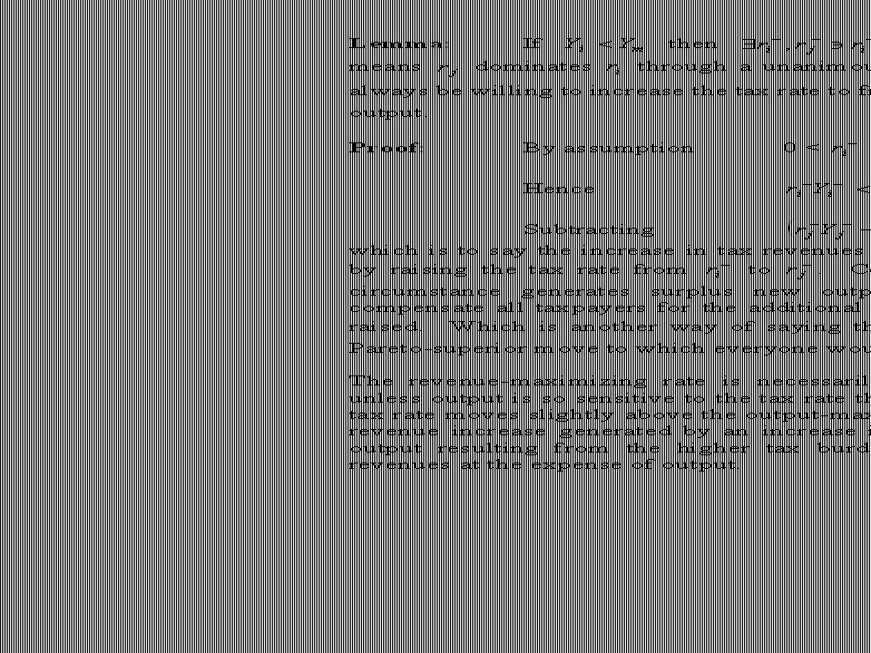
CHART 11

26
CHART 12

27
In order for the revenue-maximizing tax rate to equal the output- maximizing rate, Y + must lie beneath and to the left of the graph, r +. In Diagram 2, the thick red line graphing the power function Y + = is the envelope that establishes the boundary on the family of all possible output curves satisfying the condition required for the Conjecture to be true. The thin red [horizontal] solid line below this envelope is the graph of the revenue [Laffer] curve generated by it, which means that the red line traces out the boundary on the family of all possible revenue [Laffer] curves that satisfy the condition making the Conjecture true. Notice from the depiction of the Laffer Curve boundary that the output curve synonymous with the boundary condition does not itself satisfy the Condition of the Conjecture since in the case of the boundary, R + = R m, r +, which violates (1).
..")
28
Diagram 2 establishes the relationship between output and revenue that is required for the output-maximizing and the revenue-maximizing tax rates to be the same. The Condition an output function must satisfy to meet the terms of the Conjecture demands that output be hyper-sensitive to changes in the tax rate near the output-maximizing rate. This is verified by the fact that a power function with an exponent of -1 has a infinitely negative first derivative at its asymptote (r m in this case), which means output falls dramatically for small increases in the tax rate above the output-maximizing rate. The thick blue dashed line in Diagram 2 represents one arbitrary output function that satisfies the conditions of the Conjecture, and it’s associated Laffer Curve is depicted by the thin blue gray line below it. Notice that the revenue-maximizing tax rate lies on a cusp of the Laffer Curve. The practical implications of this result are enormous.
, which means output falls dramatically for small increases in the tax rate above the output-maximizing rate. The thick blue dashed line in Diagram 2 represents one arbitrary output function that satisfies the conditions of the Conjecture, and it’s associated Laffer Curve is depicted by the thin blue gray line below it. Notice that the revenue-maximizing tax rate lies on a cusp of the Laffer Curve. The practical implications of this result are enormous..")
30
CHART 13

31
Chart 13. We now can examine Dynamic v. Static revenue estimating. In this chart, the green dashed horizontal line across the top represents the Rahn Curve under the basic assumption of static revenue estimating, namely that output remains unaffected by a change in the tax rate. The pink diagonal line represents the degenerate case of the Laffer Curve under this assumption. Revenue is determined by multiplying the tax rate, whatever it may be, times the constant output. Notice, revenues are zero at a zero tax rate and 100 percent of output at a 100 percent tax rate. Superimposed on the static Rahn Curve is a dynamic Rahn Curve—the turquoise dashed curve—and its derivative Laffer Curve—the solid red line. Notice what happens in each case if the tax rate is reduced 18.2 percent, from 55 percent to 45 percent. Under static revenue methodology assumption—that output is unaffected by tax rates—revenue falls proportionately by 18.2 percent. In dynamic case, I have intentionally chosen an instance where the tax rate reduction takes place on the up side of the Laffer Curve. Therefore, revenues do in fact decline when the tax rate is reduced, but notice that because output also is declining with a rising tax rate, though not as fast as revenues, the revenue loss from the tax rate reduction is roughly half that estimated under the static assumption. Indeed, I would argue that what happened after the 1986 tax reform was that we altered the tax based in an inefficient manner—raising capital gains tax rates and lengthening depreciation schedules—and lowered the rate sufficiently that given the new tax base it was below the revenue-maximizing rate but still considerably above the output-maximizing rate. The 1986 reform effort left the tax rate in the rent-seeking range and points out the dangers of trading off lower rates in exchange for damaging the base. It sets us up for a perfect “bait and switch” routine, which is exactly what happened under George Bush the Elder and Bill Clinton. We got stuck with the ill-defined tax base and the rates were raised back toward the revenue-maximizing point.

32
CHART 14

33
Chart 14. I have adapted Larry’s graphic demonstration to apply to a dynamic Rahn Curve to illustrate that below the output- maximizing point, it is possible to get a consensus on tax increases and why once the tax rate exceeds the output- maximizing point, rent seeking sets in with a vengeance. In micro-economic terms, this depiction of the Rahn Curve represents a backward sloping demand curve. Larry had focused on the Excess Burden of a Tax. But there is also a symmetric concept on the up-side of the Rahn Curve in which there is an absolute loss to taxpayers over and above the revenue lost to government when the tax rate is set below the output-maximizing rate. I’ve called it the “Burden Deficiency.”

34
CHART 15

35
Chart 15. This chart combines the concept of excess burden and burden deficiency in the same graphic, complete with a Laffer Curve.

Similar presentations


) and market supply curve (Q.>")


