Download presentation
Presentation is loading. Please wait.

1
Fifteen: Overview of Total Quality Tools
MAJOR TOPICS Total Quality Tools Defined The Pareto Chart Cause-and-Effect Diagrams Check Sheets Histograms Scatter Diagrams Run Charts and Control Charts Stratification Some Other Tools Introduced Management’s Role in Tool Deployment

2
Fifteen: Overview of Total Quality Tools
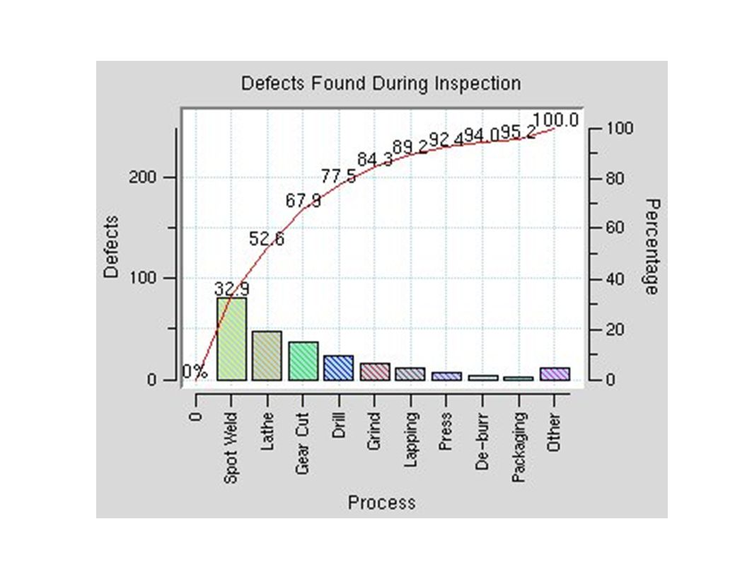
Pareto charts are useful for separating the important from the trivial. They are named after Italian economist and sociologist Vilfredo Pareto. Pareto charts are important because they can help an organization decide where to focus limited resources. On a Pareto chart, data are arrayed along an X-axis and a Y-axis.

3
Pareto charts The Pareto principle suggests that most effects come from relatively few causes. In quantitative terms: 80% of the problems come from 20% of the causes (machines, raw materials, operators etc.); 80% of the wealth is owned by 20% of the people etc. Therefore effort aimed at the right 20% can solve 80% of the problems. Double (back to back) Pareto charts can be used to compare 'before and after' situations. General use, to decide where to apply initial effort for maximum effect.
; 80% of the wealth is owned by 20% of the people etc. Therefore effort aimed at the right 20% can solve 80% of the problems. Double (back to back) Pareto charts can be used to compare before and after situations. General use, to decide where to apply initial effort for maximum effect.")
4
Pareto charts There are six common steps to prepare a Pareto Diagram:
Decide which data should be shown on your chart. Decide on the time period for which you will collect the data. Collect your data on a worksheet (e.g., from budgets, or from cost reports). Construct your Pareto Diagram from the data you collected. Arrange the data cells in descending order from the left of the graph. Add the information to make your chart readable to other people.
. Construct your Pareto Diagram from the data you collected. Arrange the data cells in descending order from the left of the graph. Add the information to make your chart readable to other people.")
6
cause-and-effect diagram
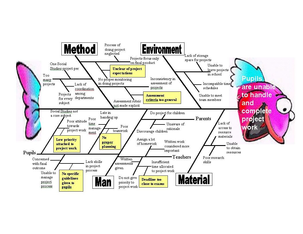
The cause-and-effect diagram was developed by the late Dr. Kaoru Ishikawa, a noted Japanese quality expert; others have thus called it the Ishikawa diagram. Its purpose is to help identify and isolate the causes of problems. It is the only one of the seven basic quality tools that is not based on statistics.

7
cause-and-effect diagram

8
cause-and-effect diagram

10
Histograms Histograms have to do with variability. Two kinds of data are commonly associated with processes: attributes data and variables data. An attribute is something that the output product of the process either has or does not have. Variables data are data that result when something is measured. A histogram is a measurement scale across one axis and a frequency of like measurements on the other.

11
Histograms Frequency Measurements

12
Histograms

13
Histograms In this abbreviated example, a bowler wants to improve her game. Her scores, collected over a six-week period, look like this: Week 1: 96, 130, 100 Week 2: 150, 135, 115 Week 3: 145, 148, 120 Week 4: 155, 110, 125 Week 6: 175, 135, 140 The cell widths will be 20 points. These cells of scores have this distribution: = 3 = 3 = 6 = 2 = 3

14
Histograms

16
Histograms

17
Check Sheets The check sheet is a tool that facilitates collection of relevant data, displaying it in a visual form easily understood by the brain. Check sheets make it easy to collect data for specific purposes and to present it in a way that automatically converts it into useful information. A Check Sheet is a data recording form that has been designed to readily interpret results from the form itself. It needs to be designed for the specific data it is to gather. Used for the collection of quantitative or qualitative repetitive data. Adaptable to different data gathering situations. Minimal interpretation of results required. Easy and quick to use. No control for various forms of bias - exclusion, interaction, perception, operational, non-response, estimation. David Goetsch Quality Management, 5e Copyright ©2006 by Pearson Education, Inc. Upper Saddle River, New Jersey All rights reserved.

18
Check Sheets How to Construct:
Clearly define the objective of the data collection. Determine other information about the source of the data that should be recorded, such as shift, date, or machine. Determine and define all categories of data to be collected. Determine the time period for data collection and who will collect the data. Determine how instructions will be given to those involved in data collection. Design a check sheet by listing categories to be counted. Pilot the check sheet to determine ease of use and reliability of results. Modify the check sheet based on results of the pilot.

19
Check Sheets Tips: Use Ishikawa diagrams or Brainstorming to determine categories to be used on the check sheet. Construct an operational definition of each category to ensure data collected is consistent. Make check sheet as clear and easy to use as possible. Spend adequate time explaining the objective of the data collection to those involved in recording the data to ensure the data will be reliable. Data collected in this format facilitates easy Pareto analysis.

20
Scatter Diagrams The scatter diagram is arguably the simplest of the seven basic quality tools. It is used to determine the correlation between two variables. It can show a positive correlation, a negative correlation, or no correlation.

21
Scatter Diagrams

22
Scatter Diagrams

23
Scatter Diagrams

24
Scatter Diagrams

25
Flight delays at Midway
A Services Example Flight delays at Midway Cause and Effect Diagrams Check Sheets Pareto Analysis

26
Problem: Delayed Flights
No one is sure why, but plenty of opinions “Management by Fact” CI Tools we will use: Fishbone diagram Check sheets Pareto analysis

27
Cause and Effect Diagram
ASKS: What are the possible causes? Root cause analysis — open and narrow phases

28
Generic C&E Diagram

29
Midway C&E diagram

30
Check Sheets (root cause analysis -- closed phase) Event: Day 1 Day 2
Late arrival II I Gate occupied Too few agents Accepting late passengers III (root cause analysis -- closed phase)
")
31
Pareto Analysis (sorted histogram)
Late passengers 100 Late arrivals Late baggage to aircraft 85 70 Weather 65 Other (160)
")
32
Percent of each out of 480 total incidents ...
Late passengers 21% Late arrivals 18% Late baggage to aircraft 15% Weather 14% Other 33%

33
Run Charts and Scatter Plots
Measure Run Time Variable Y Scatter Variable X

34
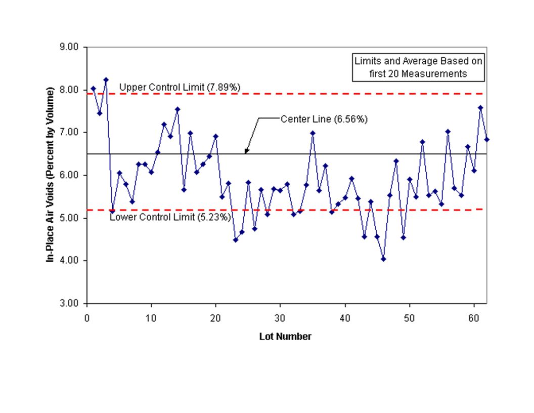
Control Charts In the context of the seven total quality tools, run charts and control charts are typically thought of as being one tool together. The control chart is a more sophisticated version of the run chart. The run chart records the output results of a process over time. For this reason, the run chart is sometimes called a trend chart. The weakness of the run chart is that it does not tell whether the variation is the result of special causes or common causes. This weakness gave rise to the control chart.

35
Control Charts

36
Control Charts

37
Control Charts Data are plotted just as they are on a run chart, but a lower control limit, an upper control limit, and a process average are added. The plotted data stays between the upper control limit and lower control limit while varying about the center line or average only so long as the variation is the result of common causes such as statistical variation.

38
Control Charts In general, control charts are used to plot production values and variation over time. These charts can then be analyzed to determine if changes in production values or variation are due to the inherent variability of the process or a specific correctable cause. Control charts for variables are fairly straightforward and can be quite useful in material production and construction situations. Four popular control charts within the manufacturing industry are Control chart for variables. Control chart for attributes. Cumulative sum control chart. Exponentially weighted moving average (EWMA) control chart.
 control chart.")
39
Control Charts Control chart for variables. In variable sampling, measurements are monitored as continuous variables. Because they retain and use actual measurement data, variable sampling plans retain more information per sample than do attribute sampling plans (Freeman and Grogan, 1998). This implies that compared to attribute sampling, it takes fewer samples to get the same information. Because of this, most statistical acceptance plans use variable sampling. Control chart for attributes. This chart is used when a number cannot easily represent the quality characteristic. Therefore, each item is classified as "conforming" or "nonconforming" to the particular specification for the quality characteristic being examined. These charts look similar to control charts for variables but are based on a binomial distribution instead of a normal distribution. Two of the most common attribute control charts are for fraction nonconforming and defects.
. This implies that compared to attribute sampling, it takes fewer samples to get the same information. Because of this, most statistical acceptance plans use variable sampling. Control chart for attributes. This chart is used when a number cannot easily represent the quality characteristic. Therefore, each item is classified as conforming or nonconforming to the particular specification for the quality characteristic being examined. These charts look similar to control charts for variables but are based on a binomial distribution instead of a normal distribution. Two of the most common attribute control charts are for fraction nonconforming and defects.")
Similar presentations


 2009 John Wiley & Sons, Inc.>")

