Download presentation
Presentation is loading. Please wait.

1
Chapter 3 Analysis and Measurements of Issues and Risk

2
This chapter focuses on measurements and analysis of issues and risk in IT,projects, and work. In the last chapter, you saw that tracking and managing issues not only are good for preventing failure, but also aid in preventing major problems before they worsen. Keep in mind that the basis for the analysis are the issues databases.

3
We have some specific political goals in this chapter. Alert managers and others to problems in advance so that there are no surprises. Identify issues early so as to have more time for solutions or to be able to take action faster. Increase issues awareness to make people more realistic about the work. Deal with issues more openly.

4
This chapter contains a number of measurements and charts relating to issues and risk. How should you use these? You should use them just as we do when we enter an organization to evaluate their projects. You can employ the issues analysis methods here to predict which projects will be or are in the greatest peril. With these tools and methods, you have in effect an early warning system of risk.

5
PROBLEMS WITH STANDARD MEASUREMENTS Let’s start with a project. It has a budget and a schedule. So you could track budget versus actual and schedule versus actual. That is what everyone does. However, as you saw in the first chapter, the costs of the project that do not include labor are normally included at the start of the work. You need the hardware, network, and software so that you can do development, testing, and integration. The rest of the costs are labor hours. Labor in many projects peaks during development. If you look at the cost distribution of a construction project, the acquisition cost for the land is up front. Material and labor costs continue throughout most of the rest of the schedule. Even after the basic structure is assembled, there is the build-out and fi nish work. Consider building a house. A high percentage of the cost is in building the kitchens and bathrooms.

6
Turn your attention now to schedule versus planned. The schedule looks fi ne. Then, suddenly, the project schedule slips. What happened? Here are some common events. There was a problem. People tried to deal with and it failed. The schedule is adjusted. Time is lost. There is less time to deal with the issue. The problem is more visible due to delay in the schedule. There is more pressure. You could appear to be a bad manager, since you were surprised. In standard projects, concepts such as activity-based costing and earned value and cost make a great deal of sense. They really can reveal what is going on overall and can help pin down problems. If things go wrong, then there are often added material and labor costs. It is different in IT. Since most of the costs have been incurred early, the remainder of the project consumes labor hours.

7
Now let’s make a switch in terminology. We and you should never call a project involving IT an IT project unless it deals totally with infrastructure. The reason is political. If you call a project an IT project, then the users may opt out and will not feel accountable for benefits. However, here it is simpler to call it an IT project.

8
In an IT project if something goes wrong, it tends to happen later in the work. When you are gathering requirements, doing design, or acquiring software packages, there is not much risk. In truth you do not know enough yet. You don’t know in the IT project whether: The requirements are really right. You can get unpleasant surprises when you deliver the system or even a prototype. The software package does not cover enough of the business work, so you have to invent shadow systems or attempt to modify the package. The integration between the new system and existing software comeslater. Testing can reveal many bad surprises. Users can resist change. Training can induce resistance as well as create new requirements, evenwith the best of efforts

9
Try all you want with any method you choose and you can still have some of these things happen. The same applies to maintenance and enhancement. You ask a programmer for an estimate of effort to carry out something other than a minor change. The programmer says, “Two weeks.” The programmer works on the change, and you return a week and a half later. Then what? The programmer tells you that things are not as simple as he first thought. Alternatively, the programmer may tell you that he had to work on other, higher-priority work. In enhancements in construction, you typically find out about the problem early, when walls are broken and the old electrical or plumbing is disconnected and removed.

10
Figure 1.2 showed that the risk in IT projects occurs at the back end due to resistance to change, data conversion, testing, and integration. By having an early awareness of issues and pursuing active issues management you have a higher likelihood of moving the risk to the left or earlier. It is similar to testing: The earlier you uncover a software bug, the more time you have to fix it. Based on this discussion, the traditional measures of budget versus actual and actual schedule versus plan are trailing indicators of problems. Let’s take an example. Suppose you have a very simple and stupid project of three tasks — A, B, and C. Suppose they are in series or sequential so that A precedes B and B precedes C.

11
Now suppose that A is completed and took 40 hours, B takes 20 hours and is half done, and C is not started and takes 40 hours. Using the standard measures, this simple IT project is 50% complete. Nothing appears wrong. Now suppose you knew that A had no issues and hence no risk. However, B and C have issues and risk. It is now a different picture. Look at the mathematics and you see. All of the remaining work (100%) has issues and risk. You have completed only 10 out of 60 hours with risk (16.7%). Earned risk is 10 hours. This IT project is in trouble.
 has issues and risk. You have completed only 10 out of 60 hours with risk (16.7%). Earned risk is 10 hours. This IT project is in trouble..")
12
MANAGEMENT CRITICAL PATH The same problems apply to the mathematical critical path. As you know, the critical path is the longest path in the project such that if anything is delayed on the path, the project is delayed. Many managers can spend hours looking at the critical path to try and shorten the project. But what if each of the tasks on the critical path has no issues or risk? It is difficult to shorten them. Other tasks not on the critical path may have issues. What is likely to happen? The issues will not be addressed. The tasks will slip and stretch out. They will then suddenly appear on the critical path as a surprise. Another bad surprise!

13
Here is another simple example. Consider the GANTT chart in Figure 3.1. The critical path is shown in the tasks with vertical lines in the bars. Now turn to Figure 3.2. This chart highlights different tasks. They are shown in tasks with a black line in the middle. Which of these figures is more revealing? Each is useful, but the second one is key. It shows the tasks with risk. The management critical paths of a project are all of the paths through the project that contain risky tasks. More precisely, you could define a percentage and then consider all paths in which the percent of work with risk on the path is above that threshold level.

14
These charts were produced using Microsoft Project. This is the most popular project management software on the market. For us it offers two major features. The fi rst is that you can link projects using OLE (Object Linking and Embedding). The second is that behind Microsoft Project is a database that can be customized. To use Microsoft Project to deal with risk and issues, here are some customized fields for tasks. Flag 1: This is a yes or no fi eld that indicates that the task has an open issue. So you turn on the fl ag if an issue for that task is still active. When all issues for the task have been resolved, you can turn the fl ag to off, or no. Flag 2: This is a yes or no fi eld indicating that a milestone contains issues or is risky. Text 1: This is a fi eld in which you can put the numbers of the issues. Text 2: This is a fi eld in which you can place the numbers of the lessons learned.
. The second is that behind Microsoft Project is a database that can be customized. To use Microsoft Project to deal with risk and issues, here are some customized fields for tasks. Flag 1: This is a yes or no fi eld that indicates that the task has an open issue. So you turn on the fl ag if an issue for that task is still active. When all issues for the task have been resolved, you can turn the fl ag to off, or no. Flag 2: This is a yes or no fi eld indicating that a milestone contains issues or is risky. Text 1: This is a fi eld in which you can put the numbers of the issues. Text 2: This is a fi eld in which you can place the numbers of the lessons learned..")
15
With Microsoft Project you can filter the project tasks so that only summary tasks and tasks with issues and risk appear. This is a very useful political tool because it can show management how issues extend across the life of the project. Experience reveals that this can make managers more realistic. The most important use of the GANTT chart is to show the urgency of the issues. That is the real goal of the chart in Figure 3.2. You can yell and scream all you want about the need to resolve an issue, but until you show the GANTT chart with the issues, it is difficult, if not impossible, to prove it. If you wanted to show the impact if one issue were not resolved, you can filter the project tasks to include summary tasks, the tasks pertaining to the specific issue, and the tasks that depend on these detailed tasks.

16
Notice also that this completes the linkage between issues and the schedule. In Chapter 2 the project issues contain fields for projects and tasks. Now you can see that customizing the project management software database allows you to find the relevant issues and lessons learned for the tasks.

17
Management Critical Path Figure 3.1 Simple GANTT Chart

18
Figure3.2 GANTT Chart Highlighting Risky Tasks

19
MULTIPLE PROJECT ANALYSIS The IT group typically has a number of projects going on simultaneously. These projects share the same resources. They also share some of the same issues, if you have implemented Microsoft Project in a standardized, customized form across all projects. Next, all projects have to share the same resource pool. Using OLE, you can now link all of the individual projects into a common project fi le. Thus, any change or update to one project results in automatic updating of the common database. From this you can extract different views and use the filters. Let’s consider another simple example. Suppose that two projects are combined and linked. Then you can filter on this combined project based on summary tasks and tasks with issues and risk. Doing this might get you a chart such as that in Figure 3.3. Note here that the numbers of the issues are shown next to the bars of the risky tasks.

20
The analysis does not end here. After you have shown this GANTT chart, the next step is to explain the impact of the issues on the projects. Here you can develop a table such as that in Figure 3.4. What goes in the table? Each table entry is the impact of the issue on the project. Now you can zoom in on one issue. Go back to the combined GANTT chart of all tasks from the multiple projects. Filter on the summary tasks and those that involve the one issue you want to cover. This will show the impact of the issue in terms of schedule.

21
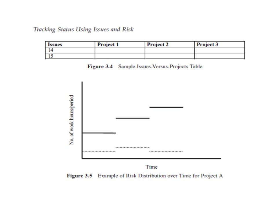
TRACKING STATUS USING ISSUES AND RISK You want to be able to track outstanding issues, how much of the risk you have gotten through, and how much of the remaining work has risk. Here are some measures. Age of the oldest outstanding major issue. Each issue has a discovery date. If an issue was discovered on 1 July and still is unresolved on 15 July, the issue has an age of 15 days. Usually, the longer a major issue remains unresolved, the worse the situation is. Why? Because the team has to make assumptions about the outcome of the issue in order to continue work. Sometimes the outcome of the issue is not what was predicted. This can wreak havoc with the schedule and the work. What is “major” here is subjective, but you can rely on your experience to sort this out. The use of this measure is evident. If one project has several very old unresolved issues and another has none, you can see where you should concentrate your efforts.

24
Percentage of remaining work with issues and risk. You can get at this in Microsoft Project by filtering on risky tasks in the future or active tasks. Then you can select the Resource Usage view. This can be exported to a spreadsheet. Do the same for the overall project and you can get the percentage. This is a key measure for comparing project performance and also a good way for managers to direct their problem-solving time. Earned risk. You are familiar with earned work and earned cost. Earned risk is similar. You can use filtering and the Resource Usage view to get the number of hours of work associated with completed tasks with issues to calculate earned risk. Earned risk is useful in comparing multiple projects. Distribution of risk and issues over time. Each period of time, such as a month or a week, has a total number of hours of work. In this period some lesser number of hours is associated with risk. So you can plot the distribution of risk over time.

25
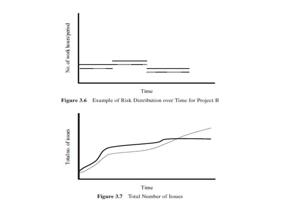
Let’s consider two examples. In Figure 3.5 you can see the distribution of one project (A) over time. Figure 3.6 contains the distribution of a second project (B). In each figure the solid line indicates the total number of hours of work in the period. The dotted line indicates the number of hours of work associated with risky tasks or tasks with issues. As you can see, Project A has more hours and so is the larger project. Normally, management would give more attention to this project because of size. However, this is fundamentally wrong. You should give more attention to Project B since more of its work is risky.
 over time. Figure 3.6 contains the distribution of a second project (B). In each figure the solid line indicates the total number of hours of work in the period. The dotted line indicates the number of hours of work associated with risky tasks or tasks with issues. As you can see, Project A has more hours and so is the larger project. Normally, management would give more attention to this project because of size. However, this is fundamentally wrong. You should give more attention to Project B since more of its work is risky..")
27
TOTAL ISSUES This section and the next four generate graphs that can easily be obtained from the project issues database of Chapter 2. It is useful to plot the total number of issues that surface in a project. Figure 3.7 contains two graphs. The solid curve represents a fairly typical case in which the number of issues rises and then levels off. Toward the end there are not too many new issues. The dotted curve reveals a project in trouble. The number of issues keeps growing. Not good. The project will either fail or be in very serious difficulty.

28
OPEN ISSUES Open issues can be more revealing than the total number of issues. Figure 3.8 plots the number of open issues over time. The solid line represents a good project. The number of open issues initially rises as more issues are discovered. Then it drops as issues are solved. It continues to drop until implementation, when it rises again with some of the issues we discussed earlier. Then it falls off. Issues discovered at the end got a lot of effort and attention to resolve quickly. The dotted line characterizes a project in trouble. While the number of open issues rises and then falls, the number of open issues does not fall rapidly. Then the number of open issues increases. Watch out — failure is ahead.

29
Figure 3.8 is useful to compare multiple projects or even to analyze one project. You can see by the rate of decline how the project is coping with issues. Moreover, when the number of open issues starts to increase, you know there are problems. This is an early warning system.

30
UNCONTROLLED VERSUS CONTROLLED OPEN ISSUES In the previous two chapters, we identifi ed various types of risk. Some of these were controllable within the project and IT; others were external to the work. Using the project issues database, you can construct the charts in Figure 3.9. Here you see a project in trouble. The controlled issues behave well. Even though there are more open ones overall, they are still solved in the end. The dotted line for the uncontrolled issues tells a different story. There the number of open, uncontrolled issues grows toward the end.

31
AGING OF OPEN ISSUES You can create the charts in Figure 3.10 from the project issues database. Each issue has a discovery date. You can plot the percentage of open issues by discovery date over time. In this case, the percentage of issues that are open and that were just discovered is 100%. In a successful project this percentage declines as you go back in time. This is indicated by the solid line. The dotted line is quite different. Here you can see a bubble in the past. This represents several significant issues that remain unresolved. Use this chart to compare projects, and you should get a great deal of management interest.

33
AVERAGE TIME TO RESOLVE ISSUES Another way to compare project performance is based on the average time to solve an issue. Figure 3.11 gives two charts. The solid line indicates a well behaved project. The average time rises as the project leader and others deal with issues. Then it drops as they get better at dealing with issues. It increases slightly as implementation approaches. Issues found toward the end are resolved fast. The dotted line typifies a project in trouble. The average time for issue resolution drops but then rises. This reveals that it is taking longer to resolve the later-discovered issues. You can use this approach to compare the time to resolve issues by type. Alternatively, you can compare uncontrolled and controlled issues. Politically, you can use these charts to show project leaders how they are doing in managing issues.

35
DISTRIBUTION OF OPEN ISSUES BY TYPE It is useful to assess IT work based on the number of open issues by type. Figure 3.12 gives the distribution for two projects. Note that such a snapshot can be created at any time. Thus, it may not be the case that these are two projects. The charts could be the same project at different points in time. The difference between the two projects is more than academic. For the solid-line project, the open issues are mainly uncontrolled. The opposite is true of the dotted-line project. You can use this chart to zero in on which projects need more attention than others. There is another use of this chart. Suppose you are comparing several potential projects. One method of comparison is to assess the likely issues and problems each will face. Since you identified these potential issues when the projects were conceived, you can develop Figure 3.12 for these potential projects. This is a good aid in project selection.

37
ISSUES BY TYPE OVER TIME Let’s consider three types of issues: technical, process, and user. You can plot the number of issues by each type by discovery date over time. The result is shown in Figure 3.13. Here the technical issues often appear first. This is shown by the solid line. Many are known at the start. Next, process issues, such as exceptions and shadow systems, make their appearance (shown by the dotted line). Toward the end you have resistance to change and other related issues (the dashed line). This chart provides management with a better understanding of issues and shows that uncontrolled issues often appear later, another reason why projects fail.
. Toward the end you have resistance to change and other related issues (the dashed line). This chart provides management with a better understanding of issues and shows that uncontrolled issues often appear later, another reason why projects fail..")
38
SELECTION OF ISSUES FOR DECISIONS AND ACTIONS At any given time you must decide among the open issues which ones to make decisions and take actions on. Figure 3.14 can help you do this. Here the axes are the importance of the issue and the time urgency. You then place each issue by number in the fi gure. Note that the placement is subjective. This is good because you can get other IT staff and managers to participate and discuss urgency and importance through the diagram. In the diagram you will want to address the issues in the quadrants where the oval is. Why? Because of time urgency. In the diagram you would address issues 7 and 17, since they are more urgent. Issue 22 can wait, since it is not urgent. Collect more information on this one. The remaining issue, number 10, can wait as well.

39
This approach allows you to group less important issues with more important ones. This can make decision making on issues easier. Another benefi t is that you are showing management that you are not trying to take on all issues. The diagram changes over time. Some issues may get solved and disappear. Others may not change. Still others can become more time urgent or important. You can create snapshots of issues at different times and then construct a slide show. It is like a star show at a planetarium, in which the stars move on the ceiling. This can be very effective.

41
PERSPECTIVE ON DIFFERENT ISSUES Over time, using the issues databases, you have collected data across a variety of IT projects and work. It is then very useful to analyze issue performance across time and work. For each issue, you can develop the following measurements. Number of work hours that the issue has applied in the past year Percentage of total work associated with the issue over time Distribution of issues across processes. Here you can associate the IT work with key processes. Then you can calculate the percentage of the work with issues associated with each process.

42
Budget for the work Expenses for the work Planned schedule for the work Actual schedule for the work Planned benefi ts for the work Actual benefi ts achieved from the work Total number of issues surfaced Mixture of issues by type Average time to resolve an issue Average time to resolve an uncontrollable issue Average time to solve an issue by type Number of unresolved issues at the end of the work Number of unresolved issues at the end of the work by type Figure 3.15 Performance Measures on Work and Projects

43
Distribution of issues across different business units or departments Distribution of total hours in issues by type How do you employ this information? One thing to do is to rank the issues by their impact on the work. This would show which issues tend to recur often. This is useful in finding the issues that should be addressed systematically. Another application is to rank the issues by business unit or process. This reveals which organizations or business processes have the most problems.

44
PROJECT EVALUATION For the projects completed in the past year or years, a valuable action is to compare their relative performance. You can combine standard measures with the ones on issues. A list is given in Figure 3.15. You can get some useful results. For example, you might be able to demonstrate that benefits achieved versus planned correlated to the number of uncontrollable issues and the time to resolve issues. Another application is to compare the budget versus actual cost and the average time to solve issues. It seems logical that if it takes much longer to resolve issues, the cost will be higher.

45
PROJECT TERMINATION IT projects and work often get terminated on subjective grounds. Many projects linger because no one has the will or the method to kill them. It is difficult to terminate a project in which you have poured a great deal of time, money, and resources. The tendency is to keep it going in the hopes that things will get better. A more systematic and organized approach is to analyze the projects in term of issue and risk performance. If the project is behaving badly, then you have better and more credible grounds for termination. Here are some guidelines for termination.

46
The mix of unresolved issues is strongly biased toward uncontrolled issues. The trend in open issues is not good. The average time to resolve issues has not dropped. More issues are being discovered each day or week. Old, open, unresolved major issues remain.

47
CONCLUSIONS Many articles and books talk about risk and issues. They often dissociate issues from risk. We have shown that they are deeply intertwined. Next, much of the discussion in the literature is fuzzy and subjective. The framework for effective issues and risk management was laid out in the previous chapter. This chapter presented to you a variety of methods for analyzing and assessing risk and issues in a more structured way that will garner more user, management, and IT support.

Similar presentations


: Outliers Fall, 2008.>")


