Download presentation
Presentation is loading. Please wait.

1
Presented by Katherine Fraser VISUALIZING DATA USING MICROSOFT POWER VIEW

2
I.What is data visualization? II.Examples of data visualization III.Single variable vs. multivariate data IV.Types of data visualizations V.Tools used to visualize information VI.Demos using Excel Power View PRESENTATION OVERVIEW

3
Data Visualization is the effort to make information easily perceptible by humans, enabling insight. Half of the human brain is devoted to processing visual information. Information Design: the practice of presenting information in a way that fosters efficient and effective understanding of it, specifically for graphic design for displaying information effectively (Wikipedia) Using pictures, symbols, colors, and words to communicate ideas, illustrate information or express relationships visually.... add seeing to reading to make complex data easier to understand (John Emerson, backspace.com) Edward Tufte: concepts of graphic excellence and chartjunk DATA VISUALIZATION
 Using pictures, symbols, colors, and words to communicate ideas, illustrate information or express relationships visually.... add seeing to reading to make complex data easier to understand (John Emerson, backspace.com) Edward Tufte: concepts of graphic excellence and chartjunk DATA VISUALIZATION.")
12
1.Show quantitative comparisons 2.Show causality/explanation by placing the data in an appropriate context (not time series) 3.Use multivariate analysis 4.Integrate evidence: words, numbers, images, diagrams 5.Document your source to provide credibility 6.Have content. Analytical presentations stand or fall based on their content. EDWARD TUFTE: SIX FUNDAMENTAL PRINCIPLES OF ANALYTICAL DESIGN

13
BAR CHARTS: SINGLE VARIABLE DATA

14
SCATTER PLOT: MULTIVARIATE DATA

15
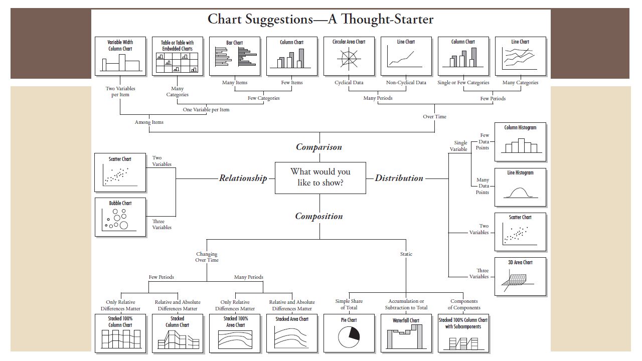
Charts Bar charts and column charts Line charts Scatter plot Sparklines Pie charts To use or not to use? Data-ink ratio Small multiples Maps Treemaps TYPES OF DATA VISUALIZATION

16
Bar charts can be vertical or horizontal, may be stacked Graphics should tend toward the horizontal, i.e., be greater in length than in height; Left-to-right comprehension Horizon analogy Ease of labeling Emphasis on causal influence Bullet graphs (vs. gauges) BAR CHARTS
 BAR CHARTS.")
18
Stephanie Evergreen & Gavin McMahon, http://makeapowerfulpoint.com/

19
HORIZONTAL STACKED BAR CHART

20
CLUSTERED BAR CHARTS Stephanie Evergreen & Gavin McMahon, http://makeapowerfulpoint.com/

21
LINE CHARTS: COMPARING DATA

22
Consists of complex ideas communicated with clarity, precision, and efficiency. “Graphical elegance is often found in simplicity of design and complexity of data.” Gives the viewer the greatest number of ideas in the shortest time with the least ink in the smallest space (data-ink ratio) Is nearly always multivariate Requires telling the truth about the data EDWARD TUFTE: GRAPHICAL EXCELLENCE
 Is nearly always multivariate Requires telling the truth about the data EDWARD TUFTE: GRAPHICAL EXCELLENCE.")
23
NON-DATA INK

24
SMALL, NON-COMPARATIVE DATA Data Availability Policies: What do authors have to provide? Descriptions65.5% Programs62.1% Code51.7% Datasets89.7%

25
CHARTJUNK

26
Small, high-resolution graphics usually embedded in a full context of words, numbers, images. Shows recent changes in relation to many past changes (context) and reduces recency bias EDWARD TUFTE: SPARKLINES
 and reduces recency bias EDWARD TUFTE: SPARKLINES.")
27
EXCEL 2013 New Features Quick Analysis—options for analyzing data such as totals and sparklines Recommended charts—subset of chart types appropriate to the data selected Chart Tools—Design and Layout tabs Pivot tables—good for aggregations Power View—data visualization tool

28
Tufte, “Given their low data-density and failure to order numbers along a visual dimension, pie charts should never be used.” Jen Underwood, “Most often, pie charts are misused to communicate part-to-whole scenarios where line or bar charts would be much more effective.” Pie charts are intended to display proportions of a whole within a single, small data set. Although humans are good at comparing linear distances along a scale—like bar graphs—pie charts don’t bring those skills to bear. We tend to underestimate acute angles, overestimate obtuse angles, and take horizontally bisected angles as much larger than their vertical counterparts. PIE CHARTS

30
An analog visual image is easier to process rapidly than is a number; one is mentally processed as an image and the other as text. The basic rule is that a digital display works best when a value with high precision is required, while analog works best when rate-of- change or relationship to a limit is required. Work with control-panel operations: people who had to read digital gauges had a harder time keeping a clear image of the overall situation. They knew the individual values, but had a much lower sense of how the overall system was performing. A good design must minimize mental transformation or calculations, such as calculating how close a reading is to the high or low value. Taken from Professional Writing course “Technical Editing and Production”, Michael J. Albers, East Carolina University ANALOG VS. DIGITAL

31
HOW MUCH TIME HAS ELAPSED

34
NOT A PIE CHART

36
Same graphical structure repeated Inherently multivariate and inevitably comparative Constancy of design helps user focus on changes in data Do work adjacent in space not serial in time (spread over multiple pages) EDWARD TUFTE: SMALL MULTIPLES
 EDWARD TUFTE: SMALL MULTIPLES")
40
Use geographic data to compare a variable across a map Examples: unemployment rate by state or the number of persons on the various floors of a building MAPS A choropleth map has shaded or patterned areas in proportion to the measurement of the statistical variable being displayed, such as population density or per- capita income.

42
Invented by researcher Ben Shneiderman in 1991 Multiple boxes concentrically nested inside of each other The area of a given box represents the quantity it represents A treemap is a compact and intuitive interface for mapping an entity and its constituent parts TREEMAPS

45
Data visualizations require more work by a user in order to find patterns and insight; more complex and involve analysis. Infographics are a quick and popular way of communicating that insight; fast, timely, with the aim of presenting information rather than analyzing it too deeply. Three parts of all infographics 1.The visual consists of colors and graphics. “Theme” graphics represent the data and “reference” graphics point to additional data. 2.Statistics and facts usually serve as the content for infographics. 3.Infographics should provide insight into the data that they are presenting. Tools: Visual.ly, Photoshop INFOGRAPHICS

46
Examples: Food Safety Food Safety Fracking Fracking Healthcare literacy Healthcare literacy Weather forecast Weather forecast INFOGRAPHICS

47
DATA VISUALIZATION TOOLS Formatted, printable reports vs. ad hoc, data discovery tools Static reports: good for embedding in presentations or web pages Miscrosoft SSRS (Reporting Services) Crystal Reports High Charts Data discovery: fewer formatting options, allows for on-the-fly data analysis Tableau Excel Power View SAP Lumira D3 (open source) http://d3js.org/http://d3js.org/ Why get data visualization software? If you already have an OLAP or Big Data source, or a managed BI data source and you need a specialized tool or if you have data simple enough to analyze directly
 Crystal Reports High Charts Data discovery: fewer formatting options, allows for on-the-fly data analysis Tableau Excel Power View SAP Lumira D3 (open source) Why get data visualization software. If you already have an OLAP or Big Data source, or a managed BI data source and you need a specialized tool or if you have data simple enough to analyze directly.")
48
Features delivered via Excel Power Query “Data Discovery and Access” SSIS (ETL tool) Power Pivot “Modeling and Analysis” SSAS (in-memory storage) Power View and Power Map “Visualization” SSRS Power View requires ProPlus version MICROSOFT POWER BI
 Power Pivot Modeling and Analysis SSAS (in-memory storage) Power View and Power Map Visualization SSRS Power View requires ProPlus version MICROSOFT POWER BI")
49
EXCEL POWER VIEW: DEMO Excel demo Power Query to import data PowerPivot to store data Power View to visualize data Tiles/Cards Scatterplot

50
EXCEL POWER VIEW: DEMO Excel demo Power View to visualize data Matrix view, small multiples Scatterplot Map

51
Edward Tufte “The Visual Display of Quantitative Information” David McCandless, informationisbeautiful.net Jer Thorp, Data Artist for NY Times, TED Talk @blprnt Jen Stirrup, Microsoft MVP @jenstirrup Naomi Robbins “Creating More Effective Graphs” Alberto Cairo, theFunctionalArt.com Stephen Few, dashboard design Nathan Yau, flowingdata.com datajournalismhandbook.org vizualize.tumblr.com DATA VISUALIZATION PEOPLE

52
Katherine Fraser fraserk@gmail.com fraserk@gmail.com @sqlsassy THANK YOU!

Similar presentations