Download presentation
Presentation is loading. Please wait.

2
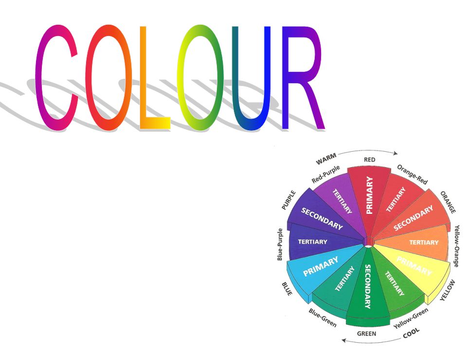
Primary Colours The Primary colours are red, yellow and blue. The work in various combinations to produce all the other colours present in the colour wheel. Secondary Colours The secondary colours are purple, orange and green are made by equally mixing two primary colours together. Eg- red and yellow make orange. Tertiary Colours Tertiary colours are created when a primary colour and a secondary colour are mixed together in equal quantities. Eg- red and orage make red-orange.

3
Red, yellows and oranges are warm colours. They are also known as advancing colours because they appear to be closer to the viewer than other colours. Contrast occurs when colours opposite each other in the colour wheel are used together. Contrast is eye-catching and makes objects stand out. These are also known as complementary. Harmony is created when the colours close together on the outside of the colour wheel are used together. For example blue and green create a relaxing image. Blues, greens and purples are known as cool colours. They seem to appear further away; receding colours.

4
Tone is the term used to describe how strong or weak a colour is. All colours can be produced in a full range of tones, from strong to weak. When rendering you use the technique of applying tones to your drawing. Tints and Shades help designers by increasing the colour options they can use. Designers rarely work with pure colours. Instead, they use tints and shades to create different moods and feelings. To make a tint you add white to a colour. Pastel colours give the impression of softness. To make a shade you add grey or black. Dark shades make objects look heavy.

9
Different colours create different moods and feelings. Designers make use of this by selecting colours which help to support the atmosphere they want to create. As a symbol, for example in flags To give instructions, such as in traffic lights To show group identity (team colours) To organise and identify (Colour coding) To promote business with company logos and corporate colours. To promote sales through packaging.
 To organise and identify (Colour coding) To promote business with company logos and corporate colours. To promote sales through packaging..")
10
If you use colour creatively, it can make an enormous difference to the impact of a layout. It is important to consider colour combinations not just individual colours When used well, colour combinations can: make a product stand out Give an layout visual impact Unify a layout (tie it together) Connect with target market Suggests a mood
 Connect with target market Suggests a mood.")
11
too many colours Work against eachother The product of a chair gets lost within the poster No unity No harmony Contrast is conflicting Use of colour scheme; matches the colours in the product. Only 4 colours used unifies layout Colours harmonise the layout Relaxed mood

12
N:\Your Personality Color.mht

Similar presentations


 VALUE: is the lightness or darkness of a color (maroon is a dark value.>")


. INTENSITY -brightness.>")


