Download presentation
Presentation is loading. Please wait.

1
What is data journalism and how can I begin doing it? Get this presentation: http://tinyurl.com/datajourn Rosanne Scholl, Ph.D.

2
My Goals Persuade you to make data part of journalism education Give an overview of practices, tools and skills with examples, including those accessible to beginners Give a “lay of the land” so you know what’s out there to explore Remember to say “data are” not “data is”

4
What is data journalism? Enterprise reporting – And some newsrooms have data teams that can respond to breaking news events Using data to help uncover and tell stories – Data is a collection of systematically measured values It is not necessarily: – Big data – Data visualization

6
Is data journalism new? Computer-assisted reporting goes back to the 1960s – Older terms include computer-assisted reporting and data-driven journalism But data has changed

7
Good Examples for Quality Distraction http://www.bbc.co.uk/news/uk-16030644 http://www.cjr.org/currents/the_buzz.php http://project.wnyc.org/commute-times-us/embed.html#6.00/33.431/- 89.280 http://www.theguardian.com/data http://fivethirtyeight.com/datalab/ctrl-%E2%86%90-traveling-salesmen- kissing-and-political-fan-fiction/ Get this presentation: http://tinyurl.com/datajourn

8
Skills 1.Traditional newsgathering 2.Sourcing and evaluating data 3.Numeracy and analyzing data 4.Infographics and data visualization 5.Traditional storytelling 6.Evaluating your reach 7.Ethics of Data Journalism Gathering the News Reporting the News Professional Development

9
GATHERING THE NEWS

10
Traditional Newsgathering

11
The data journalism beat Data specialists and regular staff Stories that arise in the realm of data Stories that can only now be told because of data

12
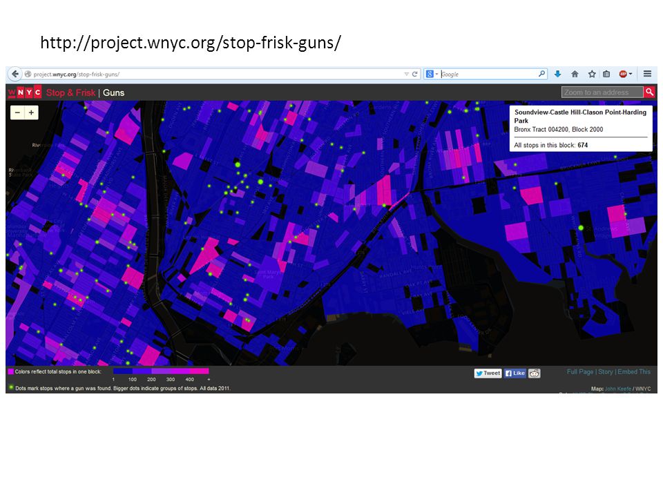
Reporting On Objectionable Business Practices

13
http://project.wnyc.org/stop-frisk-guns/
14
Sourcing Data Open data movement Government sources – Municipal and state transparency efforts – Census – Open records requests Scraping web data – Python and SQL

15
Sourcing Data NICAR – https://www.ire.org/nicar/ https://www.ire.org/nicar/ – $70 a year – Offers data and premium Tableau crowdsourcing Partnerships, partnerships, partnerships Want more? – http://datajournalismhandbook.org/1.0/en/getting_data_0.html http://datajournalismhandbook.org/1.0/en/getting_data_0.html

16
Evaluating Data Questions to ask about polls and surveys Understanding how and when to combine multiple datasets, eg. Census data and voting registration data Nate Silver’s original model…. Made a genre of prognosticators obsolete

17
Numeracy

18
Numeracy Examples Population of the U.S.: 316 million Bill Gates’ net worth: $82,000 million (=82 billion) Apple’s annual revenue: $170 billion Annual federal budget deficit: $650 billion
 Apple’s annual revenue: $170 billion Annual federal budget deficit: $650 billion")
19
Numeracy Examples Teens who receive a comprehensive education about sex are 50 percent less likely to have an unintended pregnancy than those who receive sex educations that are abstinence-only or contraception-only programs* – 2.9% of teenage girls give birth – 50% more likely => 5.8% of non-comprehensively educated give birth – 50 percentage points more likely => 52.9% of non- comprehensively educated give birth! *Sexuality Information and Education Council of the United States

20
Data Analysis Using Excel to count occurrences or average values within categories Using statistics packages to test claims of relationships or differences Using programming to create an interactive database to allow search for stories Flexibility, creativity, and entrepreneurship

21
Want More about Data Analysis? Free short course on being skeptical about statistics from “the world’s first data visualization critic”: – http://www.3nightsdone.org/course/15/info/ http://www.3nightsdone.org/course/15/info/ Free short course from Poynter and AAPOR for journalists about evaluating the quality of polls and survey research: – http://www.newsu.org/courses/understanding- and-interpreting-polls-2012 http://www.newsu.org/courses/understanding- and-interpreting-polls-2012

22
REPORTING THE NEWS

23
Infographics Infographics illustrate and engage Using Adobe Illustrator CC to create beautiful graphics that convey a variety of information, some of it numerical

25
Want More about Infographics? Books: http://www.amazon.com/dp/1616892862/ http://www.amazon.com/The-Best-American-Infographics- 2014/dp/0547974515/ref=pd_sim_b_2?ie=UTF8&refRID=0W16EBKE3WTP2S19JV6Q http://www.amazon.com/The-Best-American-Infographics- 2014/dp/0547974515/ref=pd_sim_b_2?ie=UTF8&refRID=0W16EBKE3WTP2S19JV6Q http://www.amazon.com/Design-Information-Introduction-Histories- Visualizations/dp/1592538061/ref=pd_sim_b_5?ie=UTF8&refRID=0W16EBKE3WTP2S19JV6Q http://www.amazon.com/Design-Information-Introduction-Histories- Visualizations/dp/1592538061/ref=pd_sim_b_5?ie=UTF8&refRID=0W16EBKE3WTP2S19JV6Q http://www.amazon.com/Knowledge-Beautiful-Impossible-Invisible-Connections- Visualized/dp/0062188224/ref=pd_sim_b_6?ie=UTF8&refRID=0W16EBKE3WTP2S19JV6Q http://www.amazon.com/Knowledge-Beautiful-Impossible-Invisible-Connections- Visualized/dp/0062188224/ref=pd_sim_b_6?ie=UTF8&refRID=0W16EBKE3WTP2S19JV6Q

26
Data Visualization Infographics illustrate but dataviz illuminates – Infographics make data attractive, easily understandable – Dataviz makes inaccessible data accessible, easily understandable Static vs dynamic Graphic Design, Excel, Tableau, Google Fusion Table, IBM’s Many Eyes, map tools, R

27
http://50yearsofchange.com/

30
http://www.washingtonpost.com/blogs/wonkblog/wp/2014/10/02/want-do-do- what-you-love-and-get-paid-for-it-choose-one-of-these-majors/

31
Types of Visualizations A very incomplete list: – Interactive text databases – Bar charts to compare levels – Bubble charts on 2 axes to show 3 variables – Line graph showing change over time – Trees to show hierarchical relationships – Maps: chloropleth, cartogram, proportional dots – Cluster diagrams to show spatial distribution – Network visualization to show relationships

32
The First Rule of Dataviz Junk in, junk out Or: beauty is only skin deep Or: You can’t help readers understand something you don’t understand, and you might be the best available expert on your own data… so you should be a data analysis ninja before becoming a dataviz ninja

33
http://xkcd.com/1138/

35
Want More on Data Visualization? http://www.tableausoftware.com/products/desktop http://www.thefunctionalart.com/ http://www.census.gov/dataviz/ http://flowingdata.com/ http://www.vizworld.com http://junkcharts.typepad.com/junk_charts/small_multiples/ http://researcher.watson.ibm.com/researcher/view_group.ph p?id=3419 http://researcher.watson.ibm.com/researcher/view_group.ph p?id=3419 #dataviz

36
Traditional Storytelling Bring the story to life Explain complex concepts to non-experts Provide context for the meaning of the data Especially for broadcast, which (today) relies on visualization less than text-based media
 relies on visualization less than text-based media")
37
PROFESSIONAL DEVELOPMENT

38
Delivering the News

39
Ethics of Data Journalism Journalism norms and routines Survey researcher code of ethics Data industry ethics:

40
Want More? Self-Teach Tastes and tools are changing quickly, so there’s space for you to be an entrepreneur Read this: http://datajournalismhandbook.org/ 1.0/en/index.html http://datajournalismhandbook.org/ 1.0/en/index.html A good starter project: – Download census data from your state or locality: http://www.census.gov/2010census/ news/press-kits/summary-file-1.html http://www.census.gov/2010census/ news/press-kits/summary-file-1.html – Find out where women narrow the paygap with men, or the size of families of different national origins in different places – Then use www.draw.io or Google Data Fusion to map what you findwww.draw.io Teaching Data Journalism Courses should cover the life-cycle of data: – Getting it – Evaluating it – Understanding it – Communicating it – Contextualizing it Can be taught at any level of complexity: – You don’t have to understand all kinds of data before telling the story of particular data

41
Licensing Note Images* used in this presentation are tagged as licensed for non-commercial reuse – You can find such images for your own work by searching at google.com/images and then clicking “Search Tools > Usage Rights” – *Except Orbitz and Upworthy logos, memes of skeptical baby and Yoda, and screenshots from WNYC and WaPo My use of copyrighted images is “fair use” in this educational setting – Additionally, criticism applies to logos and transformative use applies to memes

42
Thank you! @RosanneScholl Get this presentation : http://tinyurl.com/datajourn

Similar presentations


.>")


