Download presentation
Presentation is loading. Please wait.

1
Histograms! Histograms group data that is close together into “classes” and shows how many or what percentage of the data fall into each “class”. It is important that no data value belongs to more than one “class” so it is important that we clearly label the classes in our histogram on the horizontal axis. The vertical axis must indicate if we are showing counts or percentages and scaled appropriately.

2
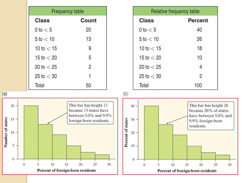
How to make a histogram Divide the range of your data into equal sized groups called classes Define the range of each class Count how many values fall into each class (or find the percentage in each class Each bar should be equal width and the height reflects the count or percentage Do not skip classes with no values in them. The data ranges from 1.2 to 27.2 so we’ll make our classes be 5 wide which will give us 6 classes. We will include the bottom value in each class: 0 to < to < to < to < to < to <30

4
Class Size in a Histogram
Just like stemplots, we want to find the right number of classes to show a good picture of the data. Too few classes result in a “skyscraper” effect where all the data lies in just a few classes. Too many classes will “flatten” the data and give many short bars in the histogram. Use your judgment as to how many classes are needed to give a clear picture of the distribution of the data.

5
Warnings About Histograms
Don’t confuse Histograms with Bar Graphs Don’t use counts in a frequency table as data Use percents instead of counts when comparing distributions with a different number of observations. Just because a graph looks nice doesn’t make it a meaningful display of data

6
Histograms on Calculators
Grab your TI-83+/84+

7
Describing Quantitative Data with Numbers
Section 1.3

8
The Mean The mean is the sum of all the values in the data divided by the number of observations (n) in the data set. How it’s written on the formula sheet

9
Mean as the “Balancing Point”
The mean of a distribution is sometimes thought of as the “balancing point” of the distribution. The mean tells us how large each observation would be if the total were split equally among all the observations

10
Ruler Activity “Hey Brian… find a better act-tiv-i-tee”

11
The Median (M) The median is the midpoint of the data with half the data values below it and half the values above. It is also referred to as the 50th percentile. How to find the median Arrange the values from lowest to highest Find the value with half the data above and below it Middle number if odd number of observations Average of the middle two numbers if there are an even number of observations

12
Comparing Mean and Median
The mean and median of a roughly symmetric distribution are close together. If the distribution is exactly symmetric the mean and median will be equal. In a skewed distribution, the mean will be further toward the skewed tail than the median Mean > Median indicates a right skewed distr. Mean < Median indicates a left skewed distr.

14
Choosing the Best Measure of Center
If the data is roughly symmetric, the mean is the preferable measure of center. If the data is skewed the mean will be distorted by the extreme values in the data so the Median is a more accurate portrayal of the “typical” value and should be used as the measure of center.

15
Measuring Spread: IQR The 1st Quartile (Q1) is the median of the lower half of the data not including the median. The 3rd Quartile (Q3)is the median of the upper half of the data not including the median. The interquartile range (IQR) is a measure of center that is used with the Median and is found by: IQR = Q3 - Q1 This gives us the spread for the middle 50% of the data so a single extreme value won’t have much of an effect on it like it would for the range.
is the median of the upper half of the data not including the median. The interquartile range (IQR) is a measure of center that is used with the Median and is found by: IQR = Q3 - Q1. This gives us the spread for the middle 50% of the data so a single extreme value won’t have much of an effect on it like it would for the range.")
16
The interquartile range (IQR) would be:
*remember IQR always goes with the Median as the measure of center and is used for skewed data.

17
Identifying Outliers – 1.5xIQR Rule
If an observation falls more than 1.5 times the interquartile range ABOVE THE Q3 , we call it an outlier. If an observation falls more than 1.5 times the interquartile range BELOW THE Q1 , we call it an outlier. It is an outlier if: Data value > Q (IQR) Data value < Q (IQR)
 Data value < Q (IQR)")
18
Homework Revised Page 47:51-59 odds, 60, all Page 70: odds

Similar presentations


 © 2006 Prentice-Hall, Inc. Chap 2-1 What is a Frequency Distribution? A frequency distribution is a list or a.>")

