Download presentation
Presentation is loading. Please wait.

1
Histograms EQ: What conclusions can be drawn from a histogram? What can a histogram tell you about the spread of a data set? BOP DWP - Mr. Adams had 24 guests at his house for a party. Each guest brought one item. • One-third of the guests brought drinks. • One-fourth of the guests brought a dessert. • The rest of the guests brought chips. How many guests brought chips?

2
DWP - Mr. Adams had 24 guests at his house for a party
DWP - Mr. Adams had 24 guests at his house for a party. Each guest brought one item. • One-third of the guests brought drinks. • One-fourth of the guests brought a dessert. • The rest of the guests brought chips. How many guests brought chips?

3
Concept/Vocabulary Word
Definition Cluster a group of things or persons close together Distribution The arrangement of values in a data set Frequency Table A list of items or intervals that shows the number of times, or frequency, with which they occur. Gap a break or opening Histogram A display that shows the distribution of numeric data. The range of data values, divided into intervals, is displayed on the horizontal axis. The vertical axis shows frequency. interval is a set of real numbers with the property that any number that lies between two numbers in the set is also included in the set Peak being at the point of maximum frequency, intensity, use, etc.

4
A bar graph can be used to display and compare data
A bar graph can be used to display and compare data. The scale of a bar graph should include all the data values and be easily divided into equal intervals. Hundreds of different languages are spoken around the world. The graph shows the numbers of native speakers of four languages.

5
PUT THESE STEPS IN YOUR STUDY GUIDE!
A histogram is a bar graph that shows the frequency of data within equal intervals. There is no space between the bars in a histogram. Follow these steps to make a histogram: Step 1: Make a frequency table of the data. Be sure to use equal intervals. Step 2: Choose an appropriate scale and interval for the vertical axis. The greatest value on the scale should be at least as great as the greatest frequency. Step 3: Draw a bar graph for each interval. The height of the bar is the frequency for that interval. Bars must touch but not overlap. Step 4: Label the axes and give the graph a title. PUT THESE STEPS IN YOUR STUDY GUIDE!

6
Example 3: Making a Histogram
Course 2 1-4 Bar Graphs and Histograms Example 3: Making a Histogram The table below shows the number of hours students watch TV in one week. Make a histogram of the data. Step 1: Make a frequency table of the data. Be sure to use equal intervals. 6 /// 7 //// //// 8 /// 9 //// 1 // 2 //// 3 //// //// 4 //// / 5 //// /// Number of Hours of TV Frequency Number of Hours of TV 1–3 15 4–6 17 7–9 17

7
1-4 Bar Graphs and Histograms
Course 2 1-4 Bar Graphs and Histograms Example 3 Continued Step 2: Choose an appropriate scale and interval for the vertical axis. The greatest value on the scale should be at least as great as the greatest frequency. 20 16 12 8 4 1–3 Frequency Number of Hours of TV 15 4–6 17 7–9

8
1-4 Bar Graphs and Histograms
Course 2 1-4 Bar Graphs and Histograms Example 3 Continued Step 3: Draw a bar graph for each interval. The height of the bar is the frequency for that interval. Bars must touch but not overlap. 20 16 12 8 4 1–3 Frequency Number of Hours of TV 15 4–6 17 7–9

9
1-4 Bar Graphs and Histograms
Course 2 1-4 Bar Graphs and Histograms Additional Example 3 Continued Step 4: Label the axes and give the graph a title. Hours of Television Watched 20 16 12 8 4 1–3 Frequency Number of Hours of TV 15 4–6 17 7–9 Frequency 1–3 4–6 7–9 Hours

10
PUT FINAL GRAPH IN YOUR STUDY GUIDE!
Construct A Histogram Mrs. Pittman gave her class a history test. The class of 16 students had the following scores: 75, 80, 65, 80, 95, 85, 65, 80, 90, 80, 70, 85, 90, 70, 85, 70 Follow the steps to create a histogram. PUT FINAL GRAPH IN YOUR STUDY GUIDE!

11
Grade range Frequency 60-69 70-79 80-89 90-99
Step 1 - Make a Frequency Table Grade range Frequency 60-69 70-79 80-89 90-99 Step 2: Choose an appropriate scale and interval for the vertical axis. The greatest value on the scale should be at least as great as the greatest frequency.

12
Step 3: Draw a bar graph for each interval
Step 3: Draw a bar graph for each interval. The height of the bar is the frequency for that interval. Bars must touch but not overlap. Step 4: Label the axes and give the graph a title.

13
The graph below shows the results of a
survey of 390 families. How many of the families in the survey have more than three children? A. 120 B. 130 C. 140 D. 260

14
The graph below shows the results of a survey of 390 families.

15
CC Investigation Grade Six Page 53 #13-15
Holt Course 2 Lesson 1-4 Practice Allow students to work in pairs to complete Problem 5.2 Part B. Have students put frequency tables and histograms on poster paper. Hang them in the class to compare and contrast. We are looking for groups that used different intervals to talk about similarities and differences between the histograms. When having this discussion, be sure to talk about the distribution of the data as well as if students have gaps in their histograms what that may represent and where they think the data clusters and peaks are. Have them go back and fill in or make any adjustments to their vocabulary list.

16
On a separate sheet of paper, construct frequency tables and histograms for
the following problems. Turn in for a class work grade. CC Investigations Basketball Tournament The table shows the winning scores in the first round of the basketball tournament. 90 69 70 89 62 97 64 68 79 67 77 66 65 99 82 100 81 78 53 80 86 73 72 52

17
What are the greatest and least winning scores?
Divide the range of the data into equal intervals that will be represented by bars on the histogram. Give the range for each interval. Explain why you chose that number of intervals. Make a table to show the frequency of scores in each interval. 5. Make a histogram of the data. Draw a bar for each interval to represent the frequency. 6. Summarize what the histogram show about the data.

18
2. Ages of mall shoppers 23 33 21 18 17 45 40 12 31 27 29 24 19 25 36 38 20 3. Class grades on a history exam 97 84 93 76 87 100 92 90 70 85 83 99 89 91 96 74 73 80 See page 48 in CC Investigations for sample histograms.

19
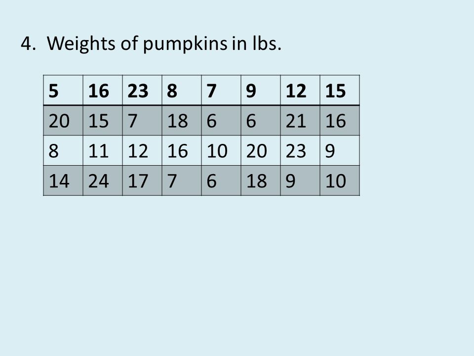
4. Weights of pumpkins in lbs.
5 16 23 8 7 9 12 15 20 18 6 21 11 10 14 24 17
20
Interval Frequency 51-60 2 61-70 11 71-80 10 81-90 6 91-100 3
Answers for basketball tournament 100; 51 51-60, 61-70, 71-80, 81-90, Five intervals divides the data into enough groups without making a histogram that is too large. 4. Interval Frequency 51-60 2 61-70 11 71-80 10 81-90 6 91-100 3

21
EXIT TICKET What are the SIMILARITIES and DIFFERENCES between bar
graphs and histograms?

22
Correct all problems on geometry handouts
EXIT TICKET: What are the SIMILARITIES and DIFFERENCES between bar graphs and histograms? Homework: Correct all problems on geometry handouts completed in class last week. It was checked on Friday for a class work grade. Make all corrections on a separate sheet of paper. Staple corrections to the top of the original papers. All corrections are due on Wednesday.

23
Complete workbook page 4
Did you note this information in your chart? The difference is that a bar graph represents individual pieces of data where the histogram represents intervals of data. The bar graph usually has spaces between the bars where the histogram has the bars adjacent to each other. Both should have a title, the labels for the axes, and scale for the axes. Complete workbook page 4

Similar presentations


