Download presentation
Presentation is loading. Please wait.

1
by Tachelle Nettles Designing Visuals for Instruction Fall 2010

4
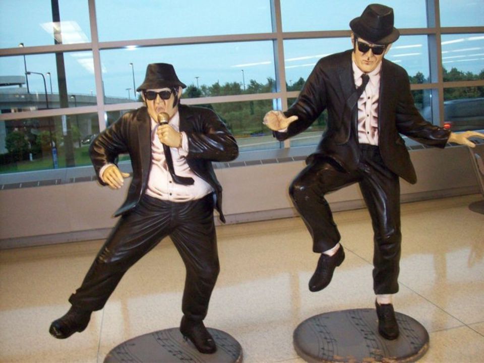
For this picture I selected the background and used a filter from the Sketch folder. The filter I selected was the Chalk and Charcoal. Changing the background allowed the two figures to have a type of pop out effect. Theyre in color as if in the spotlight.

7
This is a picture I took in front of an hotel in Las Vegas. I am in the lower right hand corner in front of the Lion. I gave the statues a more humanlike quality by changing their face color so that it doesnt blend in with the hair. I distorted my body to appear as if I was being eaten by the lion. Below are the changes. Trees and sky- I used the dry brush from the Artistic Folder. Size: 6, Detail: 8, Texture: 2 Man on Left – Craquelure 3, 9, 8 Man on Right – I used the halftone pattern from the sketch folder. Dot pattern 1, 4 Lion – I used the water paper from the sketch folder, 9, 79, 57 Me – I used the twirl for my body and spherize from the Distort folder.

10
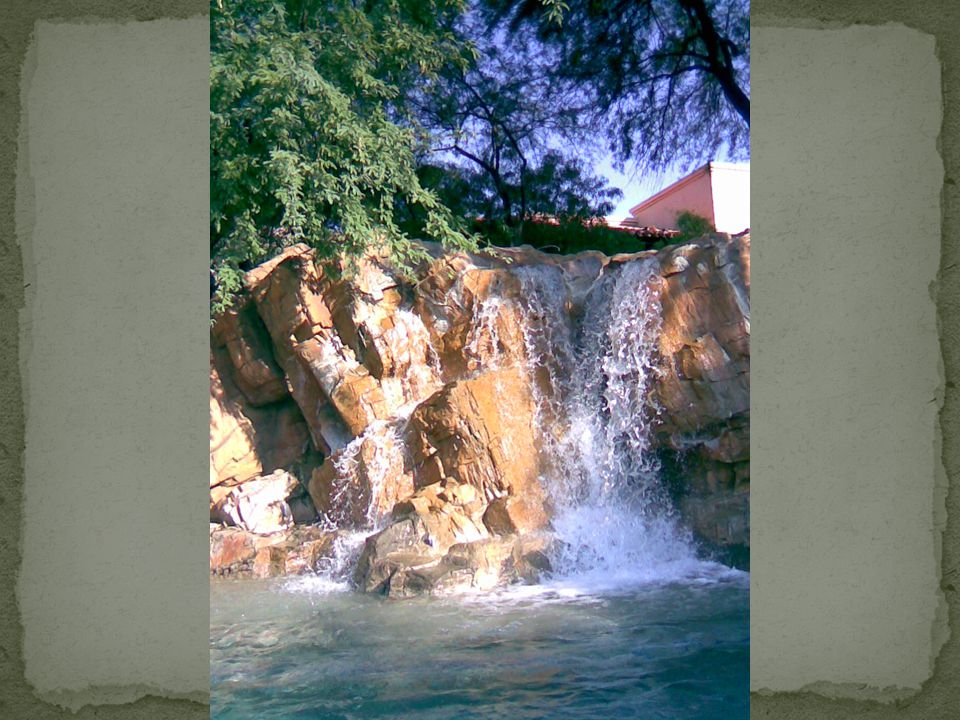
This picture was taken of a fountain in front of an hotel in Arizona. I used the Ocean Ripple filter on the waterfall and the water. I changed the effect 2, 9 on the fall and 10, 2o for the water. For the trees I used the Spatter filter 8, 6.

13
This is another picture taken in Vegas. The picture is from inside one of the hotels. I decided to make the frogs stand out a bit more and have the background look like a old painting. Texture Craquelure 15 6 9 -Background Artistic Plastic Wrap 7 13 2 - Frogs

16
This picture was taken at the Cleveland Metroparks Zoo. In the original picture the enormous elephants seemed to blend in with the background and go unnoticed. I adjusted the hue and saturation of the rock in front of the elephant because the color was very close to that of the elephant. I then used poster edges filter to make the elephant more defined and stand out a bit more. The last change I made was using the pinch filter in the distort folder and bring the elephant forward a bit. The pinch was -93.

19
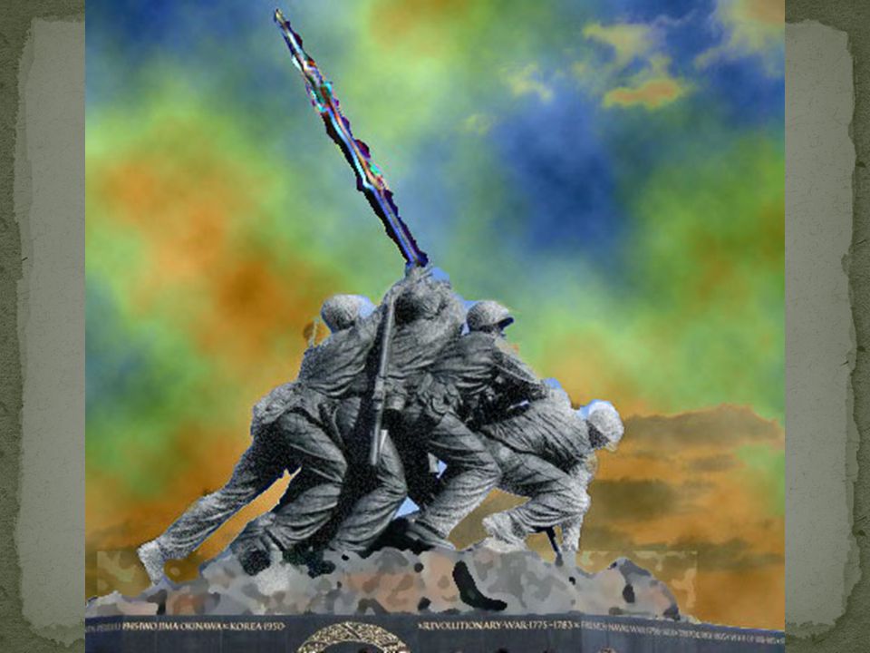
This picture was taken in Washington D.C. I first sharpened the group in the image using the smart sharpen filter but decided to crop them out afterwards. The filters I used created a very heroic feel. Rocks - Artistic: Sponge Soldiers -Distort: Diffuse Glow 6, 10, 15 Flag – Stylize: Glowing Edges Sky – Render: Difference clouds 2x

22
This is another image taken in Las Vegas outside of The Venetian hotel. The filter came out of the Sketch folder and was the Conte` Crayon. The filter gives the image an old fashion look.

Similar presentations


![This picture is a __________________ [ ]poster [ ]painting [ ]photograph 2). It was taken on Tuesday 11 September 2001, in New York, just after the World.](/15/4593049/big_thumb.jpg "This picture is a __________________ [ ]poster [ ]painting [ ]photograph 2). It was taken on Tuesday 11 September 2001, in New York, just after the World.>")


, Paint Programs, and Scanning Dr. Warren C. Weber Cal Poly Pomona.>")


