Download presentation
Presentation is loading. Please wait.

1
The pictures of Statistics

2
Central Tendencies - Mean – Median – Mode - Statistics -

3
Statistics are numerical facts and figures. For instance: The largest earthquake measured 9.2 on the Richter scale. Men are at least 10 times more likely than women to commit murder. One in every 8 South Africans is HIV positive. By the year 2020, there will be 15 people aged 65 and over for every new baby born.

4
Just like hearing a piece conversation out of context, some statistical facts can lead to wrong conclusions. What is wrong with this conclusion? A new advertisement for Ben and Jerry's ice cream introduced in late May of last year resulted in a 30% increase in ice cream sales for the following three months. Thus, the advertisement was effective.

5
A major flaw in this problem is that ice cream consumption generally increases in the months of June, July, and August regardless of advertisements. In this case the increased temperature is probably more responsible for the increase in sales than the ad campaign was.

6
The more churches in a city, the more crime there is. Thus, more churches lead to more crime. Solution A major flaw is that both increased churches and increased crime rates can be explained by larger populations. In bigger cities, there are both more churches and more crime. This problem, In this case a third variable can cause both situations; however people erroneously believe that there is a causal relationship between the two primary variables rather than recognize that a third variable can cause both.

7
The first step is to learn to think about the situation. Second, look at what is really causing the correlation. Look at the whole picture! Central Tendencies Draw a plot

8
To understand the whole picture of statistics we start with the raw data and organize it into forms to make it more understandable. For one variable data we use dot plots, histograms, and box plots.

9
Bar Graph – Box Plot – Dot Plot – Histogram - Interquartile Range – Lower Quartile – Quartile – Range – Upper Quartile -

10
Or this: Also called a pictograph.

11
Dot plots are representations of the number of data entries for different categories. So whether we use dots, pictures or bars they make the fall into this same category of a representational statistical plot. Also, called a bar graph

13
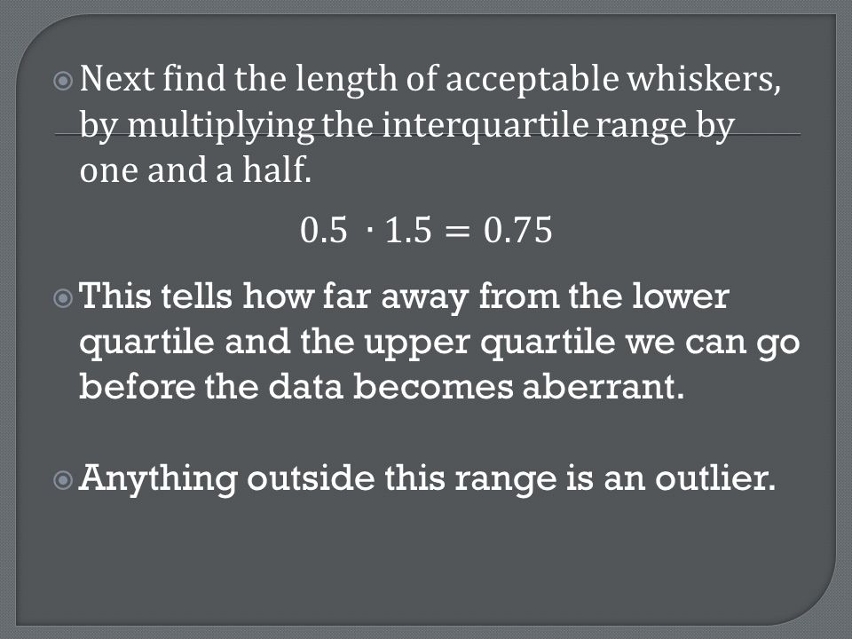
In a histogram: Area of the rectangles is the most important part. So group range is very important for showing the distribution accurately. (graph paper is best for this) The groups must be touching. No values can be left out and no overlapping of values in different groups.
 The groups must be touching. No values can be left out and no overlapping of values in different groups..")
14
These are sometimes called Box and Whisker plots. They are the best for really looking at the how the data values relate to the whole picture.

15
Suppose you were to catch and measure the length of 13 fish in a lake: 12, 13, 5, 8, 9, 20, 16, 14, 14, 6, 9, 12, 12 A box and whisker plot is based on the medians. The first step is to rewrite the data in order, from smallest length to largest: 5, 6, 8, 9, 9, 12,12, 12, 13, 14, 14, 16, 20 Now find the median of all the numbers. median

16
The next step is to find the lower quartile which is sometimes called the lower median. This is the middle of the numbers lower than the median In this case the median falls between 8 and 9 so it will be 8.5 Median Lower Quartile 8.5

17
Now find the upper quartile or upper median. This is the middle of the upper six numbers. In this case the upper quartile falls the two numbers on each side of the upper median are the same, so the upper quartile is 14. Median Lower Quartile 8.5 Upper Quartile 14

18
First you will need to draw a number line that extends far enough in both directions to include all the numbers in your data:

19
Draw vertical lines above the median, lower quartile and upper quartile. Draw connecting horizontal lines to form the box.

20
Finally, the whiskers extend out to the data's lower extreme and upper extreme, and your done. But what does it mean? What information about the data does this graph give you?

21
We can see from the graph that the lengths of the fish were as small as 5 cm, and as long as 20 cm. This gives you the range of the data... 15. You also know the median, or middle value was 12cm. Since the median and quartiles represent the middle points, they split the data into four equal parts. In other words: one quarter of the fish are less than 8.5 cm. one quarter of the fish are between 8.5 and 12 cm. one quarter of the fish are between 12 and 14 cm. one quarter of the fish are greater than 14 cm.

22
Outliers and standard deviation Statistics Part 3

23
Extremely high or extremely low numbers compared to the rest of the data are called outliers. Outliers can represent a problem with quality control for businesses. For example, one year I was doing statistics with peanut M&M’s. I handed a small package out to each student for them to graph the distribution of the colors.

24
One package contained only one M&M. This aberrant package was an outlier when compared to the number of candies in the other packages. This was clearly a mistake, but it made us think about some questions. What if this happened often? Would customers be happy? How can outliers like this affect businesses? What can outliers like this mean in other situations, like test scores?

25
Some times outliers are obvious, but other times they are not. Statisticians use a formula to find them First take the interquartile range and multiply it by 1.5. This will tell you how long each whisker should be. Any data values outside this distance are outliers.

26
A cereal company packages bags of granola. A quality control manager tested 15 random bags for weight. Are there any outliers in this data? What does this data mean for your company? 10.2, 14.1, 14.4. 14.4, 14.4, 14.5, 14.5, 14.6, 14.7, 14.7, 14.7, 14.9, 15.1, 15.9, 16.4 (Hint: start with building a box plot)
.")
27
To find the Interquartile Range subtract the lower quartile from the upper quartile.

29
This means that every bag that has less than 13.65 ounces or more than 15.65 ounces are not acceptable. By comparing the data entries we can see which numbers are outliers. 10.2, 14.1, 14.4. 14.4, 14.4, 14.5, 14.5, 14.6, 14.7, 14.7, 14.7, 14.9, 15.1, 15.9, 16.4

30
In statistics we often look at clusters of data as well as the extremes. It is also very important that we look at how spread out the data is. Why? In a box and whisker plot, we get an idea of the spread by looking at how stretched out the box and whiskers are. But another way is to look at how close data is to average is to calculate the Standard Deviation

31
Deviation means how far from the normal something is. A small deviation means you are close to average. A large one indicates you are really far out. The Standard Deviation of a data set is the measure of how spread out the values are. A small SD means the numbers are clustered, but a big SD can mean the numbers don’t have a close relationship.

32
The formula is easy: it is the square root of the Variance. So now you ask, "What is the Variance?" The Variance is defined as: The average of the squared differences from the Mean. Don’t worry it makes more sense after you’ve done it.

33
You and your friends have just measured the heights of your dogs (in millimeters):
:")
34
The heights (at the shoulders) are: 600mm, 470mm, 170mm, 430mm and 300mm.
 are: 600mm, 470mm, 170mm, 430mm and 300mm.")
36
So now we now the variance is 21,704 Hey, what’s that funny σ thing? It’s a lower case sigma. It’s the symbol for Standard Deviation.

37
Standard Deviation: σ = √21,704 ≈ 147.32... ≈ 147 (to the nearest mm)
")
38
So, using the Standard Deviation we have a "standard" way of knowing what is normal, and what is extra large or extra small. Rottweilers are larger than average and Dachshunds are smaller than average.

Similar presentations


 we are interested in how to describe the entire set without listing all the elements.>")
 can have a big affect.>")

 MDM 4U.>")


>")