Download presentation
Presentation is loading. Please wait.

1
Warm Up! Write down objective and homework in agenda Lay out homework (Box Plot & Outliers wkst) Homework (comparing data sets) Get a Calculator!!
 Homework (comparing data sets) Get a Calculator!!.")
2
Warm UP Directions: For each of the following arguments, determine whether the conclusion drawn is valid and explain why or why not. If the conclusion is not valid, include a simple counterexample that illustrates that the conclusion drawn does not necessarily follow from the information given. A real estate agent notes that the mean housing price for an area is $125,780 and concludes that half of the houses in the area cost more than that. The mean cost of the five business trips that a businessman took last month is $600. So the total cost of his trips must have been $3000. The median cost of the five business trips that a businesswoman took last month is $600. So the total cost of her trips must have been $3000.

3
Comparing Types of Peanut Butter

4
Comparing Peanut Butters Listed below are the quality rating values of natural peanut butters: 34, 40, 52, 57, 57, 60, 60, 63, 67, 69, 69, 69, 71, 89 The data values for regular peanut butter are as follows: 11, 23, 23, 26, 29, 31, 31, 33, 34, 34, 35, 40, 40, 43, 45, 46, 49, 54, 54, 60, 76, 83, 83

5
Side-by-Side Boxplots Using technology, create side-by-side boxplots.

6
How to make side by side Box Plots Enter the first Box Plot like normal Type the second set of data in List 2 For the second box plot, make sure your Plot 2 is turned ON (2 nd, y = ), and the box plot type is selected On that same screen, make sure x list: L2 Zoom 9 Graph Transfer your sketches to your paper
, and the box plot type is selected On that same screen, make sure x list: L2 Zoom 9 Graph Transfer your sketches to your paper")
7
Comparing Peanut Butters Listed below are the quality rating values of natural peanut butters: 34, 40, 52, 57, 57, 60, 60, 63, 67, 69, 69, 69, 71, 89 The data values for regular peanut butter are as follows: 11, 23, 23, 26, 29, 31, 31, 33, 34, 34, 35, 40, 40, 43, 45, 46, 49, 54, 54, 60, 76, 83, 83

8
Creating Histograms Using technology, create a histogram of each set of data. Make sure you use the same scale for each!

9
How to make side by side Histograms Enter the first Histogram like normal Type the second set of data in List 2 For the second histogram, make sure your Plot 2 is turned ON (2 nd, y = ), and the histogram type is selected On that same screen, make sure xlist: L2 Zoom 9 Graph (Will be on top of each other) Transfer your sketches to your paper (Use the trace button)
, and the histogram type is selected On that same screen, make sure xlist: L2 Zoom 9 Graph (Will be on top of each other) Transfer your sketches to your paper (Use the trace button)")
10
Record the five-number summary for each in the table below. Calculate the IQR for each set of data and record in the table.

11
Calculate the mean and standard deviation for each set of data and record below.

12
Comparing Types of Peanut Butter Statistic Natural Peanut Butter Regular Peanut Butter Min 3411 Q1Q1 5731 M 61.540 Q3Q3 6954 Max 8983 IQR 1223 mean61.242.7 standard deviation13.618.8 Natural Regular Natural Peanut Butter Outliers: 34, 89

13
Comparing the Distribution Which measure of center and spread would be most appropriate to use to describe these two sets of data? Explain. It would be most appropriate to use the median and the IQR since the Natural Peanut Butter Quality Ratings data set has outliers. Note that since there are outliers on both ends of the data set, they balance out their effects on the mean and thus the value of the mean, 61.2, is close to the value of the median, 61.5. However, the outliers do inflate the value of the standard deviation, 13.6, as compared to the IQR of 12.

14
Comparing the Distribution Compare the two data sets in context. Be sure to address shape, center, spread, and outliers. Which type of peanut butter is better? The distribution of quality ratings for natural peanut butter is slightly skewed to the left as evidenced by the longer whisker on the left side of the box. The distribution of the quality ratings for regular peanut butter is fairly symmetrical. Natural peanut butter has higher quality ratings than regular peanut butter with a median of 61.5 points for natural vs. 40 points for regular. The ratings for regular peanut butter are more spread out, ranging from 11 points to 83 points, and therefore less consistent than the ratings for natural peanut butter which ranges from 34 to 89 points. This can also be seen in the spread of the middle 50% of the data: the spread of the middle for regular peanut butter is 23 points but the spread of the middle for natural peanut butter is 12 points. Overall, natural peanut butter has higher quality ratings.

15
Compare the distribution of the following box plots Who are better students; males or females?

16
Sample Answer Of COURSE women are better students!! Just kidding…kind of ;)
")
17
Real Sample Answer The shape of men’s GPA scores is skewed left (or mound). Women’s GPA is mound shaped, The average GPA of men is 2.4, while the average GPA of women is 2.6 Both men and women’s GPA can by anywhere from 1.0 to 4.0. Most men, 50%, have a GPA of 1.8 – 3.3, while most women, 50%, have a GPA of 2.0 – 3.0. Women appear to be more consistent in their grades, while men tend to have a larger range.

18
Which measure of center and spread would be most appropriate to use to describe these two sets of data? Explain. It would be most appropriate to use the median and the IQR since the Natural Peanut Butter Quality Ratings data set has outliers. Note that since there are outliers on both ends of the data set, they balance out their effects on the mean and thus the value of the mean, 61.2, is close to the value of the median, 61.5. However, the outliers do inflate the value of the standard deviation, 13.6, as compared to the IQR of 12. Compare the two data sets in context. Be sure to address shape, center, spread, and outliers. Which type of peanut butter is better? The distribution of quality ratings for natural peanut butter is slightly skewed to the left as evidenced by the longer whisker on the left side of the box. The distribution of the quality ratings for regular peanut butter is fairly symmetrical. Natural peanut butter has higher quality ratings than regular peanut butter with a median of 61.5 points for natural vs. 40 points for regular. The ratings for regular peanut butter are more spread out, ranging from 11 points to 83 points, and therefore less consistent than the ratings for natural peanut butter which ranges from 34 to 89 points. This can also be seen in the spread of the middle 50% of the data: the spread of the middle for regular peanut butter is 23 points but the spread of the middle for natural peanut butter is 12 points. Overall, natural peanut butter has higher quality ratings.

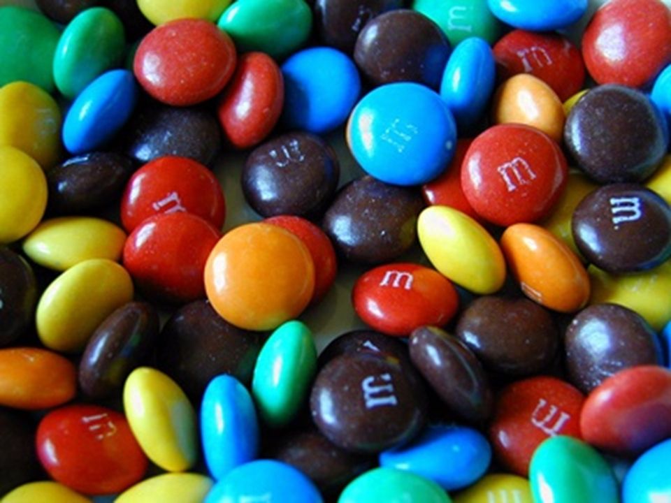
20
M & M’s You will each receive one fun size bad of m&m’s – DO NOT EAT ANY! Sort the M&M’s in your package by color. Count and record how many you have of each color. Count and record the number of M&M’s from your package which are defective: misshapen, broken, no letter printed, attached to another candy, etc. With your partner, create a chart for you and your partners combined m&m colors and another for the defective ones

21
M & M’s With your partner, find the mean, upper quartile, lower quartile and standard deviation for total candy, number imperfect, and for each color. That makes 3 sets of data!

22
M & M’s Based on your data, plan the “ideal” bag of M&M’s: How many in the bag? How many imperfect in the bag? How many of each color? Explain why this bag of M&M’s is ideal.

23
M & M’s The total number of colors in the entire class The total number of defects in the entire class

24
M & M’s Find the mean, upper quartile, lower quartile and standard deviation for the class for total candy, number imperfect, and for each color. Compare the statistics from your groups’ data to that of the whole class. Discuss how the class data differs from the “ideal” bag you planned.

25
Compare & Contrast The miles per gallon for city travel of ten cars and ten SUVs are given below:

26
For each category, find the following information The minimum MPG: The maximum MPG: The range: The mean: The median: The lower quartile: The upper quartile: The interquartile range: The standard deviation: Outliers:

27
Compare and contrast the data How are they different? How are they the same? Compare and contrast the measures of center and the measure of spread. Compare and contrast outliers or lack thereof Compare and contrast distribution shape Explain how your data would change if you were to combine the two categories

Similar presentations


>")


 Homework (Review Sheet) Get a Calculator!!>")


 The table displays the number of videos rented. Number of Videos Rented Number of Families 316 414 611 82 104 a. How many families.>")

