Download presentation
Presentation is loading. Please wait.

1
Topic 3: Introduction to Statistics Algebra 1

2
Table of Contents 1.Introduction to Statistics & Data 2.Graphical Displays 3.Two-Way Tables 4.Describing Distributions: Shape, Skew & Center 5.Measures of Spread

3
What is the Study of Statistics?! Statistics is the science of data. Statistics is the mathematic discipline thatinvolves collecting and analyzing data.

4
Collecting Data We collect data through observation, surveys and experiments. We can collect two different types of data: – Categorical – Quantitative

5
Data Collected Categorical Variable - Usually an adjective -Rarely a number Examples: -Gender -Race -Grade in School (Freshmen, Soph, Jr., Sr.) -Zip Code Quantitative Variable -Always a number -Must be able to find the mean of the numbers Examples: -Weight -Height -Amount of money in wallet -Age
 -Zip Code Quantitative Variable -Always a number -Must be able to find the mean of the numbers Examples: -Weight -Height -Amount of money in wallet -Age")
6
Categorical or Quantitative? 1. Survey about whether student buy lunch from the cafeteria or bring lunch from home, doesn’t eat lunch, etc. 2. Experiment where we measure how tall a plant grows. 3. Observation where we count how many people are in each car leaving school. 4. Survey about each student’s shoe size.

7
Graphical Displays of Data

8
Displaying Data We can display data in a variety of ways. Based on the type of data collected (categorical or quantitative) and the amount of data we select the best style of graph.
 and the amount of data we select the best style of graph..")
9
Displaying Categorical Data Pie Chart: Bar Graph:

10
Displaying Quantitative Data Dotplot Histogram Boxplot

11
Dotplots – Each data value is shown as a dot above itslocation on a number line. Number of Goals Scored Per Game by the 2004 US Women’s Soccer Team 30278243511453113 33212224356155115

12
1.Draw a horizontal axis (a number line) and label it with the variable name. 2.Scale the axis from the minimum to the maximum value. 3.Mark a dot above the location on the horizontal axis corresponding to each data value. How to Make a Dotplot

13
Let’s Practice…

14
Histograms – Looks like a bar graph, but the bars musttouch! – X-axis labeled with number ranges

15
1) Divide the range of data into classes of equal sizes. 2) Find the count (frequency) of individuals in each class. 3) Label and scale your axes and draw the histogram. The height of the bar equals its frequency. Adjacent bars should touch, unless a class contains no individuals. How to Make a Histogram
 Find the count (frequency) of individuals in each class. 3) Label and scale your axes and draw the histogram. The height of the bar equals its frequency. Adjacent bars should touch, unless a class contains no individuals. How to Make a Histogram.")
16
Let’s Practice…

17
Box and Whisker Plots A box plot is a graphical display of the minimum, first quartile, median, third quartile, and maximum. The term "box plot" comes from the fact that the graph looks like a rectangle with lines extending from the top and bottom.

18
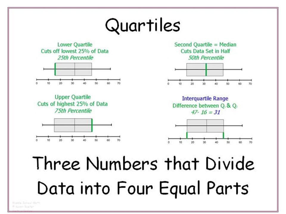
Quartiles We can divide data in quartiles Quartiles are divisions representing 25% of the data.

20
How to Calculate Quartiles To calculate the quartiles: 1)Arrange the observations in increasing order and locate the median M. 2)The first quartile Q 1 is the median of the observations located to the left of the median in the ordered list. 3)The third quartile Q 3 is the median of the observations located to the right of the median in the ordered list.
The first quartile Q 1 is the median of the observations located to the left of the median in the ordered list. 3)The third quartile Q 3 is the median of the observations located to the right of the median in the ordered list..")
21
Let’s Practice… Calculate the 1 st, 2 nd (median) and 3 rd quartiles for the following data sets: 1. 15, 17, 16, 15, 18, 19, 15, 20, 18 2. 5, 8, 9, 7, 6, 9, 8,7, 10, 11, 4

22
Interquartile Range (IQR)
")
23
Let’s Practice: Find the Quartiles and calculate the IQR. 103052540201015302015208515651560 4045 Travel times to work for 20 randomly selected Miami Residents:

25
Simple Box & Whisker Plot

26
How to Make a Simple Box & Whisker Plot 1.Draw a number line. 2.Mark the median, Quartile 1 and Quartile 3. 3.Draw a box around Q1 and Q3. 4.Mark the lowest and highest values with a dot. 5.Draw whiskers from the end of each box to the dot.

27
Let’s Practice: Create a Box and Whisker Plot. 253026302926222324232528 Quiz Scores:

28
Modified Box & Whisker Plot

29
Modified Box & Whisker plots highlight outliers. Outliers are extreme values. Can be much higher or lower than the rest of the data. Outliers

30
How to Determine Outliers 1.Calculate IQR. 2.Calculate lower fence Q1 – (1.5 * IQR) 3.Calculate upper fence. Q3 + (1.5 * IQR) 4.Outliers are any values outside of the fences.
 3.Calculate upper fence. Q3 + (1.5 * IQR) 4.Outliers are any values outside of the fences..")
31
How to Make a Modified Box & Whisker Plot 1.Draw a number line. 2.Mark the median, Quartile 1 and Quartile 3. 3.Draw a box around Q1 and Q3. 4.Find outliers 5.Mark the lowest and highest non-outlier values with a dot. 6.Draw whiskers from the end of each box to the dot. 7.Draw a dot for the outliers.

32
Let’s Practice: Create a Modified Box & Whisker Plot. 103052540201015302015208515651560 4045 Travel times to work for 20 randomly selected Miami Residents:

33
Let’s Practice:

34
Let’s Practice… Identify the median, Q1 and Q3, and the IQR. 1. 2.

35
Let’s Practice… Identify the median, Q1 and Q3, and the IQR. If you had to pick one career, which one would you pick and why? (Must be a statistical reason!) In tens of thousands of dollars.
 In tens of thousands of dollars..")
36
Let’s Practice…

37
Two-Way Tables

38
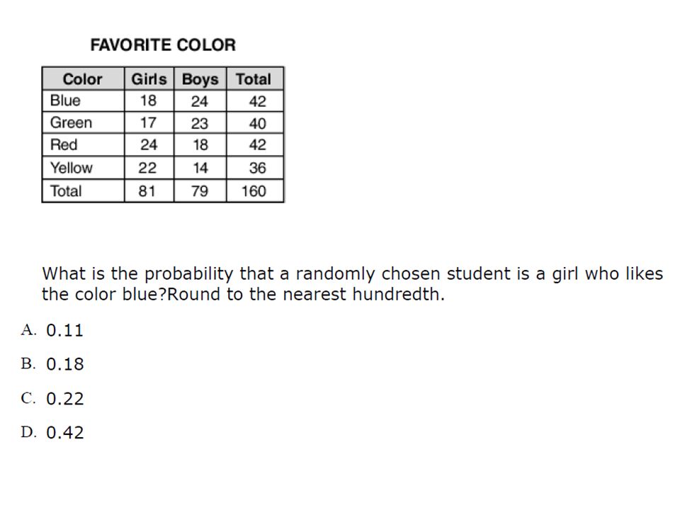
Two-Way Tables : describe two categorical variables, organizing counts according to a row variable and acolumn variable.When a dataset involves two categorical variables, webegin by examining the counts or percents in variouscategories for one of the variables.

39
Let’s Practice… 1.What proportion of students have red hair? 2.What proportion of students have brown eyes and hair? 3.What proportion of students have blue eyes and either red or blond hair?

40
Let’s Practice… 4. What proportion of students have not brown eyes and black hair? 5. What proportion of students with blond hair have blue eyes? 6. What proportion of students with hazel eyes have a hair color other than brown?

41
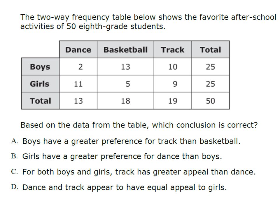
Let’s Practice… 1. What proportion of students that ride the school bus aremembers of two or more clubs?2. What proportion of students that are members of no clubsdo not ride the school bus?3. What proportion of students that do not ride the school busare members of at least one club? Member of No Clubs Member of One Club Member of 2 or More ClubsTotal Rides the School Bus553320108 Does not Ride Bus164482142 Total7177102250

45
Describing Distributions: Shape, Skew & Center

46
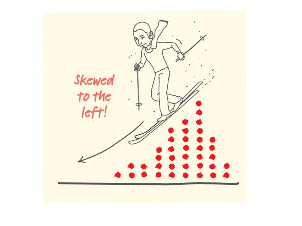
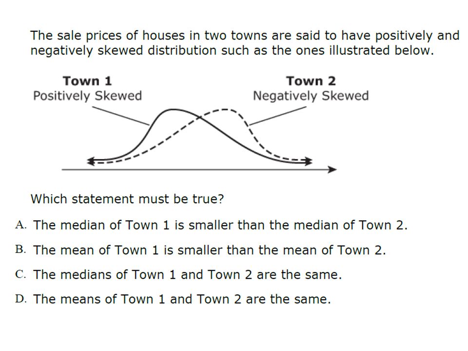
Different Shapes of Distributions Distributions can be described as: – Roughly symmetric – Skewed right – Skewed left

47
Shape Definitions: Symmetric: if the right and left sides of the graph are approximately mirror images of each other. Skewed to the right (right-skewed) if the right side of the graph is much longer than the left side. Skewed to the left (left-skewed) if the left side of the graph is much longer than the right side. Symmetric Skewed-left Skewed-right
 if the right side of the graph is much longer than the left side. Skewed to the left (left-skewed) if the left side of the graph is much longer than the right side. Symmetric Skewed-left Skewed-right.")
49
Skew in Box Plots

50
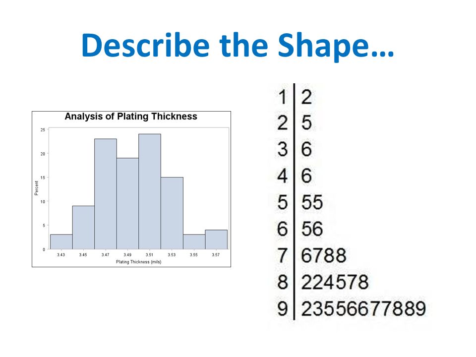
Describe the Shape…

52
Other Ways to Describe Shape : Unimodal Bimodal Multimodal

53
Measures of Center Measures of Center = Mean and Median Type of DistributionBest Measure of Center SymmetricMean Skewed RightMedian Skewed LeftMedian

54
Why?!?!

55
Which Measure of Center?

57
Measures of Spread Standard Deviation, IQR and Range

58
Standard Deviation Standard deviation is a number used to tell how measurements for a group are spread out from the mean.

59
A relatively low standard deviation value indicates that the data points tend to be very close to the mean. A relatively high standard deviation value indicates that the data points are spread out over a large range of values. Standard Deviation

60
Below are dotplots of three different distributions, A, B, and C. Which one has the largest standard deviation? Justify your answer.

61
Measures of Spread Measures of Center = IQR, Range and Standard Deviation Type of DistributionBest Measure of Center SymmetricStandard Deviation Range Skewed RightIQR Skewed LeftIQR

62
Which Measure of Spread?

64
Let’s Practice.. Mr. Morris gave his algebra class a test, the results of which are listed below. 68, 92, 74, 75, 86, 90, 92, 81, 60, 82, 77, 80 Shania was absent on the day of the test and had to take the test late. She earned a score of 99. Which measure of the class's test results did Shania's score most change? A. IQRB. Mean C. MedianD. Range

Similar presentations


 the mean must be less than the.>")


