Download presentation
Presentation is loading. Please wait.

2
This material was copy righted in 1965 by Interchemical Corporation 67 West 44th Street New York, NY 10036 All attempts to contact them have gone unanswered. All searches on the web turn up void. 8 July 2K+1 Dick Heckathorn

3
What The Color Blind See Most color-blind people confuse the colors red and green. To them they look like nearly identical grays, as shown on the right half of the demonstration.

4
Simultaneous Contrast Background colors affect foreground colors in many unexpected ways. Both arrows are the same shade of grey. Note the difference in hue and lightness because they are on different background colors.

5
Simultaneous Contrast Although this is a continuous ring of the same color grey, you can change its color by placing your finger or a pencil along the line separating the red and blue.

6
Simultaneous Contrast The two light blue colors in the demonstration appear different but are actually printed with the same color ink.

7
Simultaneous Contrast All of the “leaves” in the demonstration appear to be about the same grey color. Actually, the leaves on the yellow panel match the light grey side of the flower pot. The leaves on the maroon panel match the dark grey side of the flower pot.

8
Contrast Stripe Effect Colors on a non- uniform background are subject to many unexpected changes. The blue areas in the pattern are pained with exactly the same color ink. To observe heightened effects look at it from a distance.

9
Spreading Effect Divide the illustration in half by placing your finger or a pencil between the black and white grills. The red behind the black grill will look different from the red behind the white grill.

10
Vibration Look steadily at the demonstration. Complementary colors of equal lightness and high saturation have a tendency to make each other appear more brilliant. To some this is a visually disturbing effect.

11
Chromatic Black and White Hold the demonstration an inch or two from your eyes and you will see streaks of different colors next to the black lines.

12
Spots Before Your Eyes Flickering gray spots appear as you glance at the checkered pattern. Look at one particular gray spot and it disappears. Keep staring to see other effects.

13
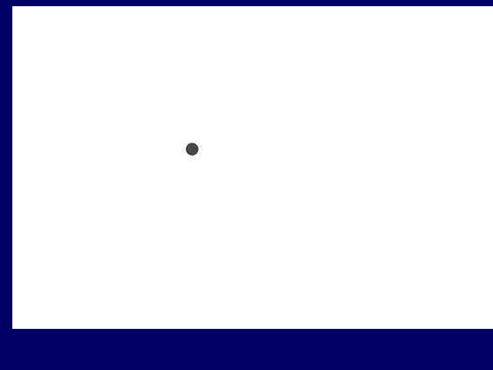
Stare at the black dot in the flag for half a minute..

15
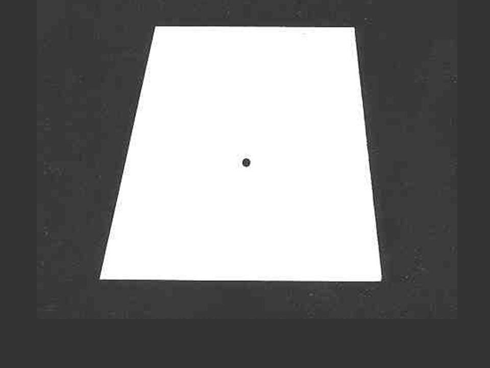
Stare for half a minute at the black dot in the green heart.

17
Day and Night Vision The red and blue flowers are equally visible but after the eye becomes accustomed to very dim light (in about 10 minutes) the red flower disappears and the blue flower looks light grey.
 the red flower disappears and the blue flower looks light grey.")
18
Advancing and Receding Colors The red wall at the end of the hall seems closer than the blue wall. Red is an advancing color and blue is a receding color.

19
Additive Spacial Fusion Alternating squares of yellow and blue are seen at reading distance. At a viewing distance of about 25 feet the yellow and blue squares are fused into a uniform gray.

20
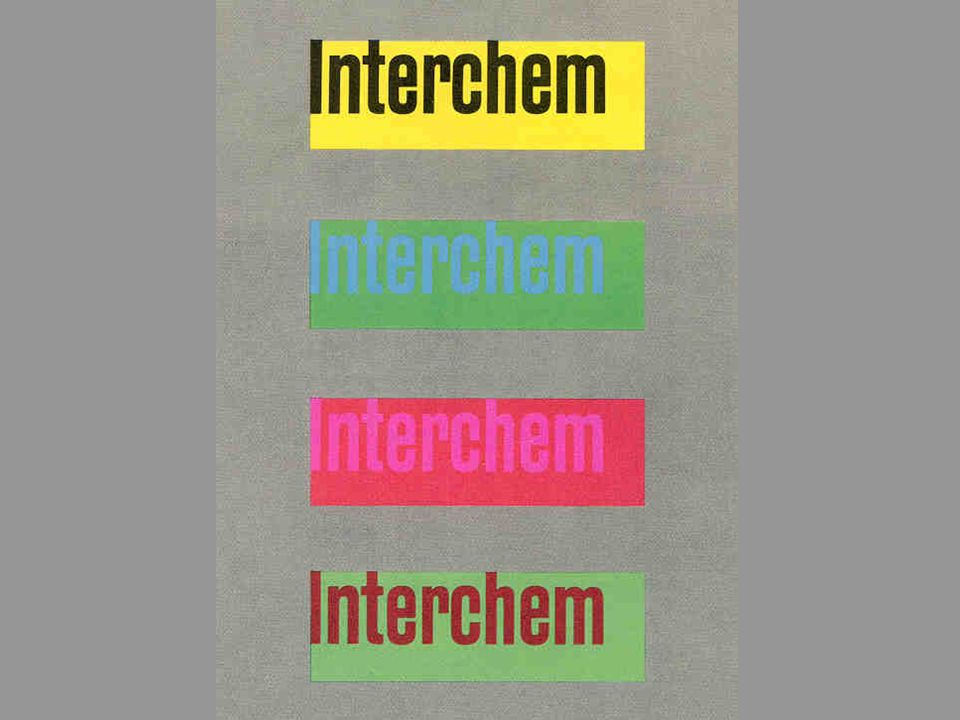
Legibility Two of the examples have good legibility. The others are hard to read at a distance or in dim light. Differences in hue or saturation are not as important in achieving good legibility as the difference in lightness between the letters and the background.

Similar presentations


 VALUE: is the lightness or darkness of a color (maroon is a dark value.>")

>")


 Lecture on Color for UI’s Use of Color in UI Design (not ready for distribution) laura leventhal.>")


