Download presentation
Presentation is loading. Please wait.

1
More Complex Graphics in R Fish 552: Lecture 8

2
Recommended Readings How to Display Data Badly (Howard Wainer, 1984) –http://www.jstor.org/stable/2683253http://www.jstor.org/stable/2683253 Fish 507H Beautiful Graphics in R (Trevor Branch) –https://catalyst.uw.edu/workspace/tbranch/24589/155403https://catalyst.uw.edu/workspace/tbranch/24589/155403
 – Fish 507H Beautiful Graphics in R (Trevor Branch) –")
3
Outline The aim of this lecture is to explore more of the options in par in order to create more informative plots and introduce other high-level plotting routines in R –Working with multiple layouts –Box plots –Bar plots

4
Possum Data The possum data frame consists of nine morphometric measurements on each of 104 mountain brushtail possums, trapped at seven sites from Southern Victoria to central Queensland Australia –Data comes from DAAG package in R –Available on class website > possum <- read.csv("http://courses.washington.edu/... > head(possum, n=3) case site Pop sex age hdlngth skullw totlngth taill... C3 1 1 Vic m 8 94.1 60.4 89.0 36.0... C5 2 1 Vic f 6 92.5 57.6 91.5 36.5... C10 3 1 Vic f 6 94.0 60.0 95.5 39.0...
 case site Pop sex age hdlngth skullw totlngth taill... C3 1 1 Vic m C5 2 1 Vic f C Vic f")
5
Possum Data Case - observation number Site - one of seven locations where possums were trapped Pop - a factor which classifies the sites as Vic Victoria, other New South Wales or Queensland Sex - a factor with levels f female, m male Age - age Hdlngth - head length Skullw - skull width Totlngth - total length Taill - tail length Footlgth - foot length Earconch - ear conch length Eye - distance from medial canthus to lateral canthus of right eye Chest - chest girth (in cm) Belly - belly girth (in cm)
 Belly - belly girth (in cm)")
6
Multiple graphs It’s often useful to put multiple graphs on the same active R Graphics device This is achieved with mfrow / mfcol specifications in par –Takes as input a vector specifying the number of rows and number of columns: c(nr, nc) –mfrow : multiple plots on one graph filled by row –mfcol : same but by column This command needs to be given prior to making the plots
 –mfrow : multiple plots on one graph filled by row –mfcol : same but by column This command needs to be given prior to making the plots")
7
Default way to make 3 plots (only specify mfrow)
")
8
Changing the margins When multiple graphs are laid out space can be optimized by modifying the default margins par(mar=c(bottom, left, top, right)) –Default is c(5, 4, 4, 2) + 0.1 Note that if these specifications are not chosen carefully each individual plot may not be the same size making plot comparisons on the same scale misleading
) –Default is c(5, 4, 4, 2) Note that if these specifications are not chosen carefully each individual plot may not be the same size making plot comparisons on the same scale misleading")
9
Make use of mar

10
What’s sub-optimal about this plot?

11
Hands-on Exercise 1 As a plotting review, make changes to the previous plot based on our discussion and the contributed suggestions. Some of the changes I had in mind were: –Redundant labeling and spacing –Optimize space –Putting the plots on the same scale

12
Making customized layouts The layout() function provides an alternative to the mfrow and mfcol settings. The primary difference is that the layout() function allows the creation of multiple figure regions of unequal sizes and is much more flexible The first argument (and the only required argument) to the layout() function is a matrix. The number of rows and columns in the matrix determines the number of rows and columns in the layout. The contents of the matrix are integer values that determine which rows and columns each figure will occupy.
 function allows the creation of multiple figure regions of unequal sizes and is much more flexible The first argument (and the only required argument) to the layout() function is a matrix. The number of rows and columns in the matrix determines the number of rows and columns in the layout. The contents of the matrix are integer values that determine which rows and columns each figure will occupy..")
13
layout() layout(mat, widths = rep(1, ncol(mat)), heights = rep(1, nrow(mat)), respect = FALSE) mat a matrix object specifying the location of the next N figures on the output device. Each value in the matrix must be 0 or a positive integer. If N is the largest positive integer in the matrix, then the integers {1,...,N-1} must also appear at least once in the matrix. widths a vector of values for the widths of columns on the device. Relative widths are specified with numeric values. Absolute widths (in centimetres) are specified with the lcm() function (see examples). heights a vector of values for the heights of rows on the device. Relative and absolute heights can be specified, see widths above. respect argument controls whether a unit column-width is the same physical measurement on the device as a unit row-height
 are specified with the lcm() function (see examples). heights a vector of values for the heights of rows on the device. Relative and absolute heights can be specified, see widths above. respect argument controls whether a unit column-width is the same physical measurement on the device as a unit row-height.")
14
Understanding layout() First create a matrix with numbers for each location to plot > ( lay1.mat <- matrix(c(1,1,0,2), 2, 2, byrow = TRUE) ) [,1] [,2] [1,] 1 1 [2,] 0 2 Assign and show the layout > lay1 <- layout(mat = lay1.mat) > layout.show(lay1)
![Understanding layout() First create a matrix with numbers for each location to plot > ( lay1.mat <- matrix(c(1,1,0,2), 2, 2, byrow = TRUE) ) [,1] [,2] [1,] 1 1 [2,] 0 2 Assign and show the layout > lay1 <- layout(mat = lay1.mat) > layout.show(lay1)](http://images.slideplayer.com/36/10605493/slides/slide_14.jpg "Understanding layout() First create a matrix with numbers for each location to plot > ( lay1.mat <- matrix(c(1,1,0,2), 2, 2, byrow = TRUE) ) [,1] [,2] [1,] 1 1 [2,] 0 2 Assign and show the layout > lay1 <- layout(mat = lay1.mat) > layout.show(lay1)")
15
Understanding layout() > ( lay2.mat <- matrix(c(1,1,3,2), 2, 2, byrow = TRUE) ) [,1] [,2] [1,] 1 1 [2,] 3 2 > lay2 <- layout(mat = lay2.mat) > layout.show(lay2)
![Understanding layout() > ( lay2.mat <- matrix(c(1,1,3,2), 2, 2, byrow = TRUE) ) [,1] [,2] [1,] 1 1 [2,] 3 2 > lay2 <- layout(mat = lay2.mat) > layout.show(lay2)](http://images.slideplayer.com/36/10605493/slides/slide_15.jpg "Understanding layout() > ( lay2.mat <- matrix(c(1,1,3,2), 2, 2, byrow = TRUE) ) [,1] [,2] [1,] 1 1 [2,] 3 2 > lay2 <- layout(mat = lay2.mat) > layout.show(lay2)")
16
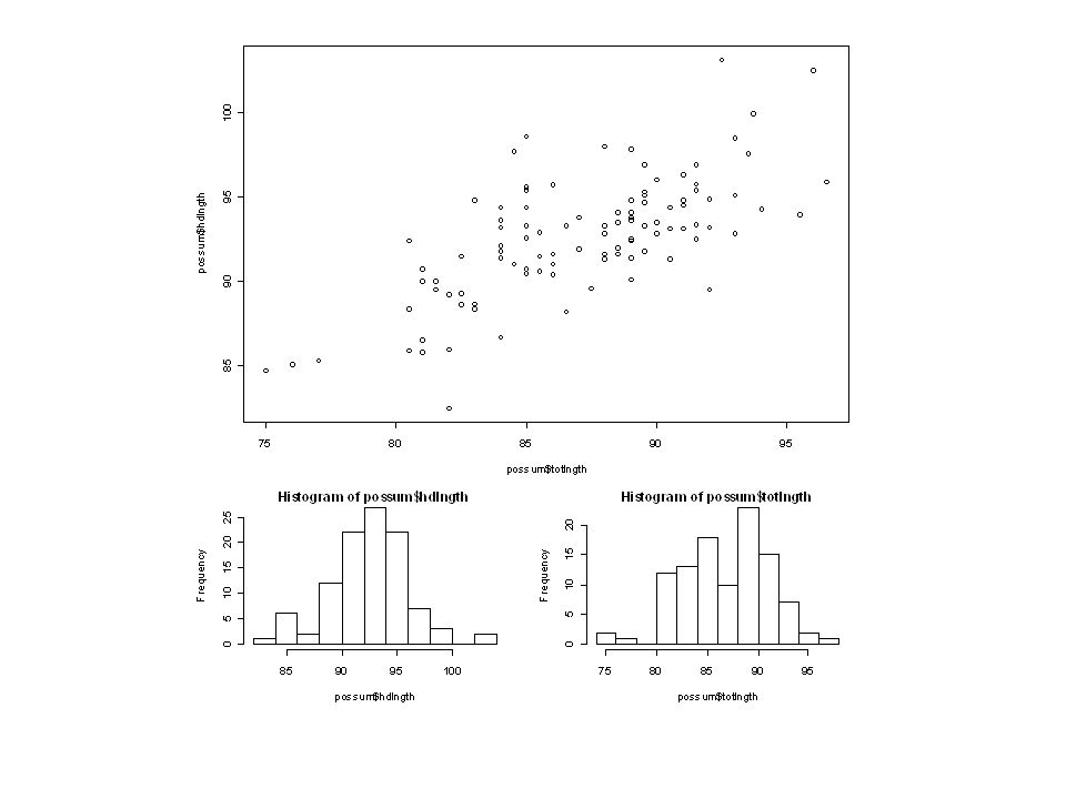
Understanding layout() > ( lay3.mat <- matrix(c(1,1,1,1,2,3), nrow=3, byrow = TRUE) ) [,1] [,2] [1,] 1 1 [2,] 1 1 [3,] 2 3 > lay3 <- layout(mat = lay3.mat) > layout.show(lay3) plot(possum$hdlngth ~ possum$totlngth) hist(possum$hdlngth) hist(possum$totlngth)
![Understanding layout() > ( lay3.mat <- matrix(c(1,1,1,1,2,3), nrow=3, byrow = TRUE) ) [,1] [,2] [1,] 1 1 [2,] 1 1 [3,] 2 3 > lay3 <- layout(mat = lay3.mat) > layout.show(lay3) plot(possum$hdlngth ~ possum$totlngth) hist(possum$hdlngth) hist(possum$totlngth)](http://images.slideplayer.com/36/10605493/slides/slide_16.jpg "Understanding layout() > ( lay3.mat <- matrix(c(1,1,1,1,2,3), nrow=3, byrow = TRUE) ) [,1] [,2] [1,] 1 1 [2,] 1 1 [3,] 2 3 > lay3 <- layout(mat = lay3.mat) > layout.show(lay3) plot(possum$hdlngth ~ possum$totlngth) hist(possum$hdlngth) hist(possum$totlngth)")
18
Understanding layout() In this example we will make a more custom layout > ( lay4.mat <- matrix(c(2,0,1,3),nrow = 2,byrow=TRUE) ) [,1] [,2] [1,] 2 0 [2,] 1 3 > lay4 <- layout(lay4.mat, c(3,1), c(1,3), respect=TRUE) > layout.show(lay4) Note the use of widths/heights to control the size of the regions
![Understanding layout() In this example we will make a more custom layout > ( lay4.mat <- matrix(c(2,0,1,3),nrow = 2,byrow=TRUE) ) [,1] [,2] [1,] 2 0 [2,] 1 3 > lay4 <- layout(lay4.mat, c(3,1), c(1,3), respect=TRUE) > layout.show(lay4) Note the use of widths/heights to control the size of the regions](http://images.slideplayer.com/36/10605493/slides/slide_18.jpg "Understanding layout() In this example we will make a more custom layout > ( lay4.mat <- matrix(c(2,0,1,3),nrow = 2,byrow=TRUE) ) [,1] [,2] [1,] 2 0 [2,] 1 3 > lay4 <- layout(lay4.mat, c(3,1), c(1,3), respect=TRUE) > layout.show(lay4) Note the use of widths/heights to control the size of the regions")
19
Putting it all together Design the layout –Note that the width / heights argument is now specified lay4.mat <- matrix(c(2,0,1,3),nrow = 2,byrow = TRUE) lay4 <- layout(lay4.mat, c(3,1), c(1,3), respect = TRUE) layout.show(lay4) Get histogram counts to use in barplot() hdlngth.hist <- hist(possum$hdlngth, plot = FALSE) totlngth.hist <- hist(possum$totlngth, plot = FALSE) Don’t plot anything
,nrow = 2,byrow = TRUE) lay4 <- layout(lay4.mat, c(3,1), c(1,3), respect = TRUE) layout.show(lay4) Get histogram counts to use in barplot() hdlngth.hist <- hist(possum$hdlngth, plot = FALSE) totlngth.hist <- hist(possum$totlngth, plot = FALSE) Don’t plot anything")
20
Putting it all together Specify margins and plot the figures –Note use of horizontal = TRUE par(mar = c(3,2.5,1,1)) plot(possum$hdlngth ~ possum$totlngth, main = "") par(mar = c(0,3,1,1)) barplot(totlngth.hist$counts) par(mar = c(3,0,1,1)) barplot(hdlngth.hist$counts, horiz = TRUE)
) plot(possum$hdlngth ~ possum$totlngth, main = ) par(mar = c(0,3,1,1)) barplot(totlngth.hist$counts) par(mar = c(3,0,1,1)) barplot(hdlngth.hist$counts, horiz = TRUE)")
22
Box plots Normally boxplots expect a vector for the response and another vector for a factor describing how to organize the response boxplot(FL ~ sex, data = crabs) What if your data isn’t in this form?
 What if your data isn’t in this form")
23
Habitat data > habitat = read.csv("http://.../sample.csv") > head(habitat) Animal Cropland Grassland Shrub_Scrub Percent 1 ZIP 0.00000 0.00000 38.25000 38.25000 2 OSC_b 35.83267 35.83267 35.83267 35.83267 3 OSC_b 0.00000 0.00000 0.00000 34.49500 4 OSC_b 0.00000 33.59067 0.00000 33.59067 5 OSC_b 33.53200 33.53200 0.00000 33.53200 6 OSC_b 0.00000 0.00000 0.00000 30.94667
 > head(habitat) Animal Cropland Grassland Shrub_Scrub Percent 1 ZIP OSC_b OSC_b OSC_b OSC_b OSC_b")
24
Organize data in format required > area = c(habitat$Cropland, habitat$Grassland, habitat$Shrub_Scrub) > type = factor( rep( names(habitat)[2:4], each = nrow(habitat) ) ) Combine columns into a single response vector Repeat column names for the number of rows This gives us a vector with the name of the column each observation came from
![Organize data in format required > area = c(habitat$Cropland, habitat$Grassland, habitat$Shrub_Scrub) > type = factor( rep( names(habitat)[2:4], each = nrow(habitat) ) ) Combine columns into a single response vector Repeat column names for the number of rows This gives us a vector with the name of the column each observation came from](http://images.slideplayer.com/36/10605493/slides/slide_24.jpg "Organize data in format required > area = c(habitat$Cropland, habitat$Grassland, habitat$Shrub_Scrub) > type = factor( rep( names(habitat)[2:4], each = nrow(habitat) ) ) Combine columns into a single response vector Repeat column names for the number of rows This gives us a vector with the name of the column each observation came from")
25
Create data frame > habitat = data.frame(area, type) > head(habitat) area type 1 0.00000 Cropland 2 35.83267 Cropland 3 0.00000 Cropland 4 0.00000 Cropland 5 33.53200 Cropland 6 0.00000 Cropland Now we have a new data frame with 3 times the rows
 > head(habitat) area type Cropland Cropland Cropland Cropland Cropland Cropland Now we have a new data frame with 3 times the rows")
26
boxplot(area ~ type, data = habitat, ylab = "area") What if we didn’t want to plot the 0 values?
 What if we didn’t want to plot the 0 values")
27
boxplot(area ~ type, data = habitat[habitat$area != 0,], ylab = "area") Select the data where area isn’t 0
![boxplot(area ~ type, data = habitat[habitat$area != 0,], ylab = area ) Select the data where area isn’t 0](http://images.slideplayer.com/36/10605493/slides/slide_27.jpg "boxplot(area ~ type, data = habitat[habitat$area != 0,], ylab = area ) Select the data where area isn’t 0")
28
Boxplots with continuous data > head(airquality) Ozone Solar.R Wind Temp Month Day 1 41 190 7.4 67 5 1 2 36 118 8.0 72 5 2 3 12 149 12.6 74 5 3 4 18 313 11.5 62 5 4 5 NA NA 14.3 56 5 5 6 28 NA 14.9 66 5 6
 Ozone Solar.R Wind Temp Month Day NA NA NA")
29
plot(Ozone ~ Temp, data = airquality, xlab = "Temperature", ylab = "Ozone")
")
30
plot(Ozone ~ cut(Temp, breaks = 4), data = airquality, xlab = "Temperature", ylab = "Ozone") Create factor from continuous data Bin sizes
, data = airquality, xlab = Temperature , ylab = Ozone ) Create factor from continuous data Bin sizes")
31
Plotting multiple box plots boxplot(len ~ dose, data = ToothGrowth, boxwex = 0.25, at = 1:3 - 0.2, subset = (supp == "VC"), col = "yellow", main="Guinea Pigs' Tooth Growth", xlab="Vitamin C dose mg", ylab="tooth length", ylim = c(0,35)) boxplot(len ~ dose, data = ToothGrowth, add = TRUE, boxwex = 0.25, at = 1:3 + 0.2, subset = (supp == "OJ"), col = "orange") legend("topleft", legend = c("Ascorbic acid", "Orange juice"), col = "black", pt.bg = c("yellow", "orange"), pch = 22) Add to same plot Specify which to plot Don’t overlap
, col = yellow , main= Guinea Pigs Tooth Growth , xlab= Vitamin C dose mg , ylab= tooth length , ylim = c(0,35)) boxplot(len ~ dose, data = ToothGrowth, add = TRUE, boxwex = 0.25, at = 1: , subset = (supp == OJ ), col = orange ) legend( topleft , legend = c( Ascorbic acid , Orange juice ), col = black , pt.bg = c( yellow , orange ), pch = 22) Add to same plot Specify which to plot Don’t overlap")
33
Barplots Expect data to be in a vector or a table Row names and/or column names are used by default (or you can specify) > VADeaths Rural Male Rural Female Urban Male Urban Female 50-54 11.7 8.7 15.4 8.4 55-59 18.1 11.7 24.3 13.6 60-64 26.9 20.3 37.0 19.3 65-69 41.0 30.9 54.6 35.1 70-74 66.0 54.3 71.1 50.0
 > VADeaths Rural Male Rural Female Urban Male Urban Female")
34
barplot(VADeaths, legend = TRUE, ylab = "Death rate per 1000") barplot(VADeaths, legend = TRUE, ylab = "Death rate per 1000", beside = TRUE)
 barplot(VADeaths, legend = TRUE, ylab = Death rate per 1000 , beside = TRUE)")
35
barplot(t(VADeaths),..., args.legend = list( x = "topleft")) barplot(t(VADeaths),..., args.legend = list( x = ”bottomright"), horiz = TRUE) Transpose the data
,..., args.legend = list( x = topleft )) barplot(t(VADeaths),..., args.legend = list( x = bottomright ), horiz = TRUE) Transpose the data")
36
barplot(VADeaths[,3], ylab = "Death rate per 1000", col = "azure", main = "Virginia rual female death rate by age") Color can also be a vector Plot single vector
![barplot(VADeaths[,3], ylab = Death rate per 1000 , col = azure , main = Virginia rual female death rate by age ) Color can also be a vector Plot single vector](http://images.slideplayer.com/36/10605493/slides/slide_36.jpg "barplot(VADeaths[,3], ylab = Death rate per 1000 , col = azure , main = Virginia rual female death rate by age ) Color can also be a vector Plot single vector")
37
What if data isn’t in table? Want to plot: # days good/moderate/unhealthy by month Data: ozone values for each day Ozone Solar.R Wind Temp Month Day 1 41 190 7.4 67 5 1 2 36 118 8.0 72 5 2 3 12 149 12.6 74 5 3 How do we get data in right format? Ozone (ppb)Index 0 - 59Good 60 - 75Moderate > 75Unhealthy
Index Good Moderate > 75Unhealthy.")
38
Table of ozone data ozoneIndex <- cut(airquality$Ozone, breaks = c(0, 59, 75, Inf), labels = c("Good", "Moderate", "Unhealthy")) ( ozoneIndexByMonth <- table(ozoneIndex, airquality$Month) ) ozoneIndex 5 6 7 8 9 Good 25 8 13 14 25 Moderate 0 1 4 3 1 Unhealthy 1 0 9 9 3
, labels = c( Good , Moderate , Unhealthy )) ( ozoneIndexByMonth <- table(ozoneIndex, airquality$Month) ) ozoneIndex Good Moderate Unhealthy")
39
barplot(ozoneIndexByMonth, ylab = "# days", beside = TRUE, legend = TRUE, args.legend = list(x = "top"), names.arg = c("May", "June", "July", "August", "September"), main = "New York Ozone Index 1973")
, names.arg = c( May , June , July , August , September ), main = New York Ozone Index 1973 )")
40
Hands-on Exercise 2 Create a box plot comparing sepal and petal lengths and widths from the iris data for all species combined Create a bar plot comparing the ozone index on days that are warm and cool using the airquality data –Use the median to define warm and cool days

Similar presentations


>")

pop1pop2pop3pop4pop5 3238273518 3143293419 2734223721 3440.>")


