Download presentation
Presentation is loading. Please wait.

1
CMS SAS Users Group Conference Learn more about THE POWER TO KNOW ® October 17, 2011 Using SAS® to Create Custom Healthcare Graphics Barbara B. Okerson

2
SAS Graphics Options SAS/GRAPH® procedures SAS/IML® graphics ODS Statistical Graphics Graph-N-Go Graphics primitives

3
Tools to Customize SAS Graphics Graph Template Language Style Templates SAS Graphics Editor ODS Graphics Editor

4
Examples Historical timelines Project timelines Waterfall charts Distance charts

5
Project and Proposal Timelines

6
Project Timelines Convenient for organizing tasks – Manage time and resources – Track progress – Tell project story Project proposals – What will happen – When

7
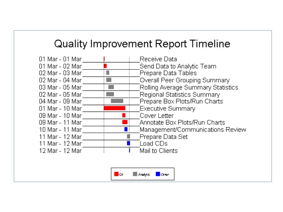
Report Timeline Single page view Color-coded areas of responsibility Graphic duration of each task Easy to read Scalable

9
Create the Report Timeline Proc GPLOT Long axis names stored in macro Task duration lines with annotate VREVERSE

10
Report Code /*Create Annotate Data Set to Draw Lines*/ data anno; length function color $8; retain xsys ysys '2' size 10; set process; line=linetype; color=color; function='move'; x=end+.3; y=nobs; output; function='draw'; x=begin; y=nobs; output; run; /* Set Titles Symbols and Axes*/ title1 h=4 c=black "Quality Improvement Report Timeline"; symbol1 i=none; axis1 label=none major=none minor=none style=0 ; axis2 label=none major=none minor=none style=0 order= "20Feb10"d to "16Mar10"d value=none length=45; axis3 label=none value=(j=l %longtasks) major=none minor=none style=0; /*Plot the Timeline*/ proc gplot annotate=anno; plot nobs*end/ vaxis=axis1 haxis=axis2 lhref=33 href="01MAR02"d "12MAR02"d vreverse; plot2 nobs*end/vaxis=axis3 haxis=axis2 vreverse; format nobs order.; footnote2 box=1 f=marker c=red h=1.5 'U' f='Arial' c=black h=1.5 ' QI ‘ f=marker c=gray h=1.5 'U' f='Arial' c=black h=1.5 ' Analytic ‘ f=marker c=blue h=1.5 'U' f='Arial' c=black h=1.5 ' Other ‘; Run; quit;
 major=none minor=none style=0; /*Plot the Timeline*/ proc gplot annotate=anno; plot nobs*end/ vaxis=axis1 haxis=axis2 lhref=33 href= 01MAR02 d 12MAR02 d vreverse; plot2 nobs*end/vaxis=axis3 haxis=axis2 vreverse; format nobs order.; footnote2 box=1 f=marker c=red h=1.5 U f= Arial c=black h=1.5 QI ‘ f=marker c=gray h=1.5 U f= Arial c=black h=1.5 Analytic ‘ f=marker c=blue h=1.5 U f= Arial c=black h=1.5 Other ‘; Run; quit;")
11
Proposal Timeline One page activity proposal Useful for grant applications with page limitations Color-coded by activity type

13
Create the Proposal Timeline Four axes Left axis indents created with format Tasks in formatted order Colors and symbols set in Annotate Annotate data set for top axis

14
Additional Uses

15
Historical Timelines

16
Timelines Convenient display for event progression Dates/times for any process or event Two examples – Training schedule – Medical History

17
Training Schedule Example Schedule of tasks for basic training sessions Tasks to be completed by due date Chronological order No hierarchy beyond calendar order

19
Create the Plot SAS/GRAPH® GPLOT procedure Needle interpolation Annotate labels and arrowheads True type font with bold and italic options Distance from axis stored in variable

20
The Code - Annotate data anno; length function color $ 8; retain when 'a' position '3' hsys '3' ysys '2' xsys '2'; set timeline; if space > 0 then do; function='label'; size=3; style ="'Calibri/it/bo'"; color='black'; text=cat(' ',label);x=date-5; y=space; cborder= 'black‘;cbox= 'beige'; output;end; if space < 0 then do; function='label‘; size=3; style ="'Calibri/it/bo'"; color='black'; text=cat(' ',label);x=date-5;y=space-2;cborder= 'black‘;cbox= 'beige'; output;end; if space > 0 then do; function="symbol"; color='black'; style='marker'; text='C'; size=2; angle=0; x=date; y=space-.001; end; if space < 0 then do; function="symbol"; color='black'; style='marker'; text='D'; size=2; angle=0; x=date; y=space+.32; end; cborder= ' '; cbox= ' ‘; output; run;
;x=date-5; y=space; cborder= black‘;cbox= beige ; output;end; if space < 0 then do; function= label‘; size=3; style = Calibri/it/bo ; color= black ; text=cat( ,label);x=date-5;y=space-2;cborder= black‘;cbox= beige ; output;end; if space > 0 then do; function= symbol ; color= black ; style= marker ; text= C ; size=2; angle=0; x=date; y=space-.001; end; if space < 0 then do; function= symbol ; color= black ; style= marker ; text= D ; size=2; angle=0; x=date; y=space+.32; end; cborder= ; cbox= ‘; output; run;")
21
The Code - GPLOT /*Set Symbols and Axes*/ title2 c=black h=2.5 f='Calibri/bo' "Prevention Agency Training Schedule 2010"; axis1 order=(-14 to 14 by 1) major=none minor=none value=none style=0 label=none; axis2 label=none order=(15235 to 15305 by 10) minor=none; symbol c=black i=needle; /*Plot the Timeline*/ proc gplot data=timeline annotate=anno; plot space*date/vaxis=axis1 haxis=axis2; format date mmddyy5.; run;
 major=none minor=none value=none style=0 label=none; axis2 label=none order=(15235 to by 10) minor=none; symbol c=black i=needle; /*Plot the Timeline*/ proc gplot data=timeline annotate=anno; plot space*date/vaxis=axis1 haxis=axis2; format date mmddyy5.; run;")
22
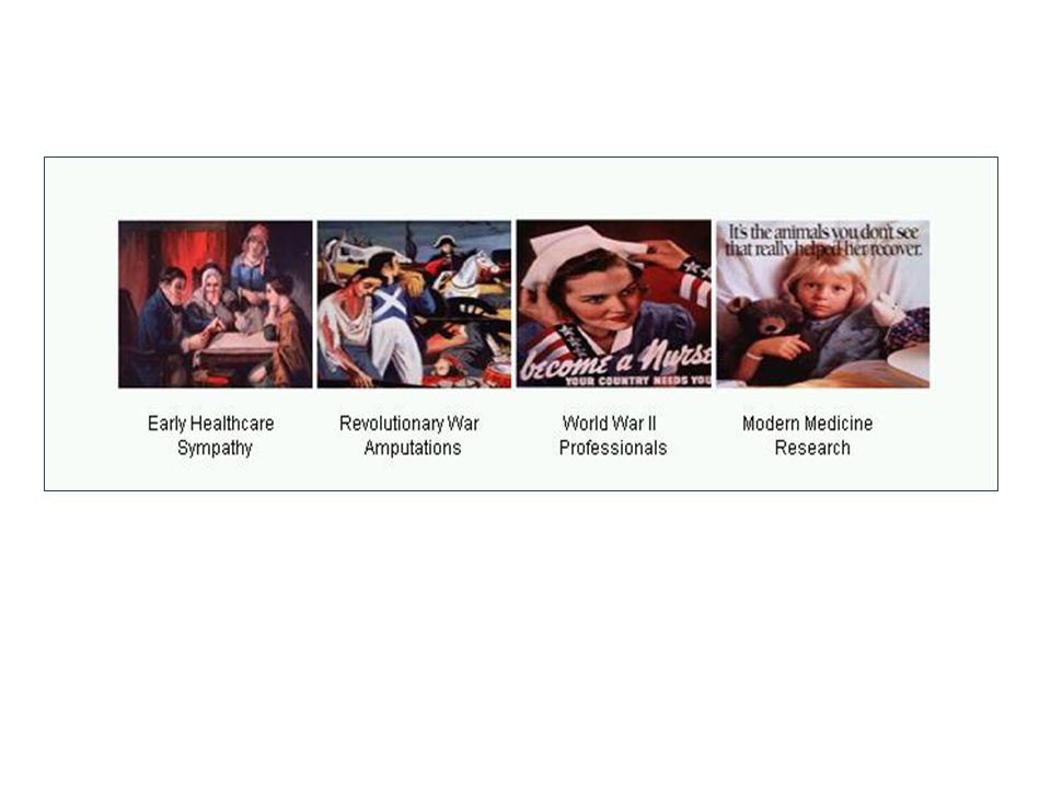
Medical History Example Medical history events in order of occurrence Event marked by illustrations Event labels – Timeframe and legend Images used by permission of U.S. National Library of Medicine and can be found at: www.nlm.nih.gov/hmd/ihm/.

24
Create the Timeline SAS/GRAPH® GPLOT procedure Images set as plot points Annotate image function IMGPATH variable Suppress normal plot axes, values and symbols

25
The Code - Annotate /*Create annotate data set to set images as plot points*/ data images; length function $ 8 style $ 15 imgpath $200.; retain xsys ysys '2' hsys '3' when 'a' position '4' style 'fit'; set wars; x=timeperiod-.5; y=level-1; if timeperiod=1 then do; function='move'; output; imgpath='r:\bokerson\sgf 2011\faiw.bmp'; x=x+1.1; y=y+1; function='image'; output; end; else if timeperiod=2 then do;....

26
The Code - GPLOT /*Set Symbols and Axes*/ symbol value=none; axis1 split='/' label=none minor=none major=none style=0 order=(0 to 5 by 1); axis2 label=none minor=none major=none order=(0 to 4 by 1) value=none style=0; /*Plot the timeline*/ proc gplot data=wars; plot level * timeperiod /annotate=images haxis=axis1 vaxis=axis2 noframe; format timeperiod wardate.; run; quit;
; axis2 label=none minor=none major=none order=(0 to 4 by 1) value=none style=0; /*Plot the timeline*/ proc gplot data=wars; plot level * timeperiod /annotate=images haxis=axis1 vaxis=axis2 noframe; format timeperiod wardate.; run; quit;")
27
Enhancements Color coding of events Pop-ups, roll-overs, and drill-downs Links to web pages Unlimited possibilities

28
Waterfall Charts

29
Flying bricks chart Display cumulative effect of sequential values Areas of loss and gain between start and end Isolation of categories

30
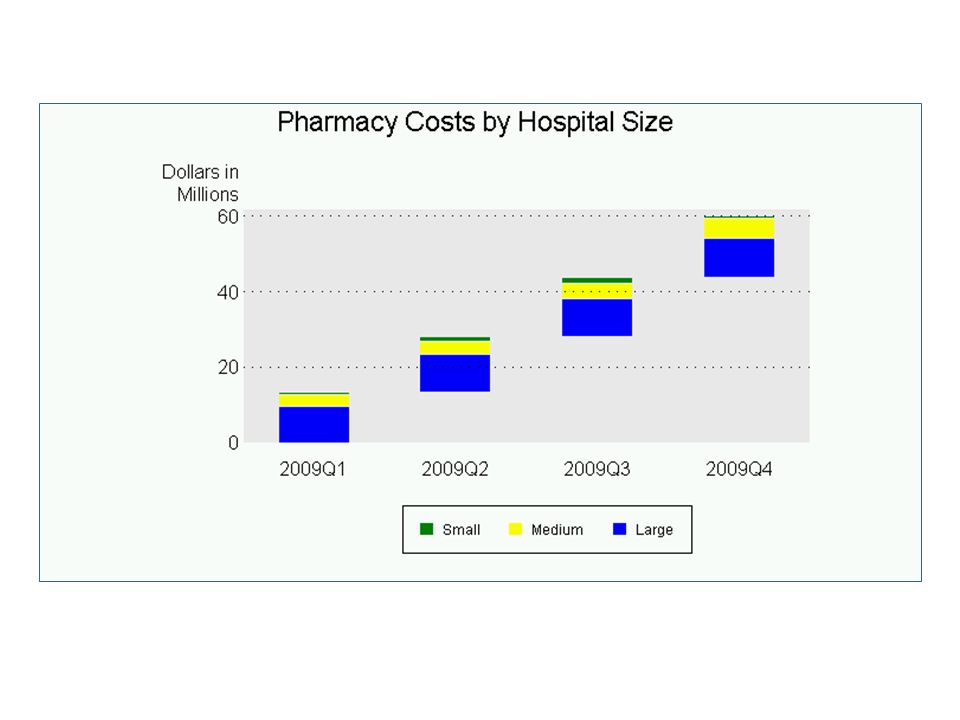
Proc GCHART Waterfall Quarterly political campaign contributions Cumulative and by category Categories color-coded Variation – – no ‘parts in a whole’

32
Create the Waterfall Chart SAS/GRAPH GCHART procedure Stacked bar Invisible bar for floating effect PATTERN color = CFRAME & COUTLINE color

33
The Code /*Set Patterns*/ pattern1 v=s c=cxe8e8e8; pattern2 v=s c=blue; pattern3 v=s c=yellow; pattern4 v=s c=green; /*Produce the Waterfall Chart */ proc gchart data=hospitals; vbar period / discrete sumvar=cost raxis=axis1 autoref lref=34 cref=black subgroup=class cframe=cxe8e8e8 width=15 space=15 coutline=cxe8e8e8 nolegend; format period yyq6. cost dollar4.0; footnote1 move=(-12,0) f='Arial' h=1.1 box=1 c=green f=Marker 'U' c=black f='Arial' ' Small' c=yellow f=Marker ' U' c=black f='Arial' ' Medium' c=blue f=Marker ' U' c=black f='Arial' ' Large'; run; quit;
 f= Arial h=1.1 box=1 c=green f=Marker U c=black f= Arial Small c=yellow f=Marker U c=black f= Arial Medium c=blue f=Marker U c=black f= Arial Large ; run; quit;.")
34
Proc GPLOT Waterfall Types of birth by risk factor Cumulative and by category Type color-coded Totals column

36
Create the Waterfall Plot Bars created in Annotate data set Axis offset option Symbol interpolation set to none

37
The Code - Annotate data anno; length function color $8; retain xsys ysys '2' size 40 color 'cx66CC33' when 'a'; set waterfall; line=line; if type="C" then color='cxFF9900'; else color='cx66CC33'; function='move'; y=begin; xc=Risk; output; function='draw'; y=end; xc=Risk; output; run

38
The Code - GPLOT /*Set Titles, Symbols and Axes*/ title "Type of Birth by Risk Factors"; symbol1 i=none; axis1 order=("Low Risk" "Hypertension" "Diabetes" "Smoking" "Total") offset=(10,0) label = none style=0 ; axis2 Order=(0 to 10000 by 2000) minor=none label=none; /*Plot the Waterfall*/ proc gplot annotate=anno; plot end*Risk/haxis=axis1 vaxis=axis2 autovref lvref=34 hminor=0; format end comma6.; run;quit;
 offset=(10,0) label = none style=0 ; axis2 Order=(0 to by 2000) minor=none label=none; /*Plot the Waterfall*/ proc gplot annotate=anno; plot end*Risk/haxis=axis1 vaxis=axis2 autovref lvref=34 hminor=0; format end comma6.; run;quit;")
39
SAS Support for Waterfall Charts SAS BI Dashboard 4.3 SAS Web Report Studio Proc SGPLOT with Vector and Scatter

40
Distance Charts

41
New Distance Tools in SAS 9.2 GEODIST Function—calculates distance from point to point ZIPCITYDISTANCE —calculates distances between centers of U.S. Zip codes. %REDUCE macro—reduces map data optimally for a desired resolution. PROC GINSIDE—applies regional (polygonal) values to a point.
 values to a point..")
42
Distance Maps Geographic – Tied to geographic coordinates – Distance between places – Elevation Non-geographic – distance relationships

44
Create the Distance Map GEOCODE for ZIP+4 centroid location Calculate distance between centroids Great Circle Distance Formula Plot with Proc GPLOT MemberMD1MD2MD3MD4MD5 00104.257.464.6818.78 0024.251.246.454.9217.78 0037.466.451.442.8724.21 0044.684.922.871.0122.42 00518.7817.7824.2122.420.03

45
The Code /*Geocode for distance calculation*/ proc geocode plus4 lookup=lookup.zip4 data=work.members out=work.geo_members run; quit; /*Plot the distance map*/ proc gplot data=provider2; plot p5*interval p4*interval p3*interval p2*interval p1*interval /overlay autovref autohref cvref=black chref=black lautovref=34 lautohref=34 haxis=axis1 vaxis=axis2 caxis=black vminor=3 areas=5; footnote2 box=1 f=marker c=ltgray 'U' f='Arial' c=black ‘ 1 Provider ‘ f=marker c=cxFFFF00 'U' f='Arial' c=black ‘ 2 Providers ‘ f=marker c=cx00CC66 'U' f='Arial' c=black ' 3 Providers ‘ f=marker c=cxD80000 'U' f='Arial' c=black ‘ 4 Providers ‘ f=marker c=cx7Ba7E1 'U' f='Arial' c=black ‘ 5 Providers '; run; quit;

46
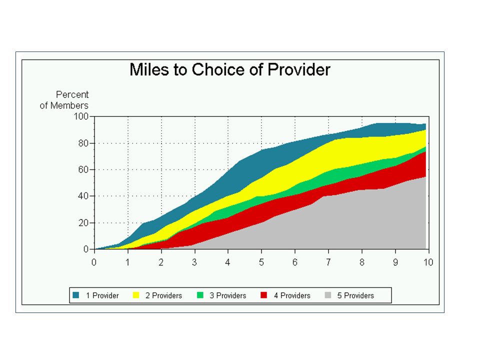
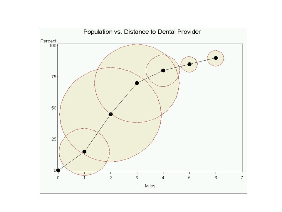
Distance Bubble Plot Bubble Plot available – custom use is as distance chart (use with geocoded data) Proportion of population within a distance Distance to dental provider example Bubble plot Annotate and Proc GPLOT
 Proportion of population within a distance Distance to dental provider example Bubble plot Annotate and Proc GPLOT")
48
Annotate Code data annoplot; set dental; length function $8 text \$1; retain XSYS YSYS '2' style 'Marker' function 'LABEL' when 'b' color 'cxF2F2DF'; size = size; X=distance; y=population; text='W'; output; run; data annoplot2; set dental; length function $8 text $1; retain XSYS YSYS '2' style 'Markere' function 'LABEL' when 'a' color 'brown'; size = size; X=distance; y=population; text='W'; output; run;

49
Plot Code goptions ftext='Arial' ftitle='Arial' htext=1.4; title h=2 'Population vs. Distance to Dental Provider'; axis1 order=0 to 7 by 1 minor=none label=("Miles"); axis2 minor=none order= 0 to 100 by 25 label=("Percent"); symbol i=join v=dot h=2; proc gplot data=dental anno=annoplot; plot population*distance/ vaxis=axis2 haxis=axis1 anno=annoplot2; run; quit;
; axis2 minor=none order= 0 to 100 by 25 label=( Percent ); symbol i=join v=dot h=2; proc gplot data=dental anno=annoplot; plot population*distance/ vaxis=axis2 haxis=axis1 anno=annoplot2; run; quit;.")
50
Conclusion Flexibility of SAS allows creation of custom graphics Current procedures and products as base Additional flexibility from: – ODS – SG procedures – Enterprise Guide

51
Contact Info Your comments and questions are valued and encouraged. For more information contact: Barbara B. Okerson, Ph.D., CPHQ, FAHM Senior Health Information Consultant WellPoint Enterprise Information Management 8831 Park Central Drive, Suite 100 Richmond, VA 23227 Office: 804-662-5287 Fax: 804-662-5364 Email: bokerson@choosehmc.combokerson@choosehmc.com

Similar presentations


 Excel Lessons 4 – 8 Press space bar to Advance Frame.>")


