Download presentation
Presentation is loading. Please wait.

1
Techniques for Decision-Making: Data Visualization Sam Affolter

2
Time-series Analysis Part-to-Whole and Ranking Analysis Deviation Analysis Intro to Dashboarding

4
The overall tendency of a series of values to increase, decrease, or remain relatively stable.

5
Upward trending data (positive slope) Downward trending data (negative slope) Flat trend - a.k.a., no trend (0 slope)
 Downward trending data (negative slope) Flat trend - a.k.a., no trend (0 slope)")
6
The average degree of change from one point in time to the next throughout a particular span of time. An individual change does not mean that the data set has a high degree of variability. Line graphs are a great way of assessing the level of variability – the smoother the line the less variability. Check the y-axis to ensure that the level of smoothness/jaggedness is not a result of narrow scale.

7
Low variability data set Data set with high degree of variability Data can appear to have greater/lesser variability depending on the y-axis

8
Percent change from one point in time to another. A good way to compare time series that may be on differing scales

9
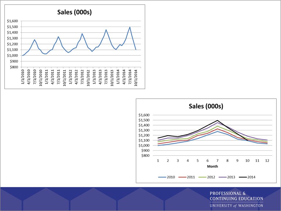
Domestic sales appear, at first blush, to increase at a quicker pace than foreign revenue. By looking that the monthly rate of change, we see that foreign revenue is actually growing more quickly, but is masked by the smaller numbers.

10
When changes in one time-series reflect in changes to the other series, either immediately or after some length. The corresponding change need not be in the same direction in both series. When changes in one set occur before or after related changes to the other set, we call these leading or lagging indicators respectively. When changes occur together, we call them coincident.

12
Patterns that repeat at regular intervals (daily, weekly, yearly, seasonally, etc.) Often easier to examine cyclical patterns non- linearly
 Often easier to examine cyclical patterns non- linearly")
14
Values that fall outside the norm. In time-series analysis, exceptions appear a values that are well above or below the typical range of the dataset.

16
Line graphs are best for making visible the sequential flow of values. Used for analyzing patterns and exploring exceptions in the data series. If you need to both see the shape that the series has over time as well as specific points in time, adding demarcations (dots, Xs, triangles, etc.) will make it easier to pinpoint exact locations for comparison.
 will make it easier to pinpoint exact locations for comparison..")
17
Useful when comparing individual values rather than holistic patterns. Allow for simple, accurate comparisons of individual values to one another.

18
Best used when the data to be displayed is at irregular intervals. Line graphs of irregular data give the visual impression of smoothness between the points, which may not be the case

20
Aggregating to various time intervals: Don’t restrict your view of time series to a single level of aggregation, especially when doing exploratory analysis. Viewing time periods in context: Develop the habit of occasionally extending your view to longer stretches of time. Grouping related time intervals: Grouping time at higher levels within a graph can highlight patterns Using running averages to enhance perception: Running (moving) averages are a useful means of visualizing higher level trends.
 averages are a useful means of visualizing higher level trends..")
21
Omitting missing values from display: Missing values should ALWAYS be omitted from a graph. Interpolating data also works. Optimizing a graph’s aspect ratio: Time series graphs usually work best when they are wider than they are tall Overlapping time scales to compare cyclical patterns: Cycles are more easily analyzed by using the cycle length as x-axis

22
Combining individual and cumulative values to compare actuals to a target: mixing bar and line graphs allow us to compare individual values while having visibility into the big picture. Expressing time as 0-100% to compare asynchronous processes: when comparing data sets with different start times, it is useful to begin them all at the same point (e.g., month 0) and work forward. Remember to adjust for inflation when examining currency over extended periods. Note differences in how information was collected and defined over time.
 and work forward. Remember to adjust for inflation when examining currency over extended periods. Note differences in how information was collected and defined over time..")
23
Cycle plots allow us to see two fundamental characteristics of time-series data in a single graph: The overall patter across the entire cycle The trend for each point in the cycle across the entire range of time

24
Using the data sets you have found for your project, explore a time-series. Do different variables act differently over time? Are there any obvious cyclical patters? Can you find leading/lagging indicators?

26
Uniform: All values are roughly the same. Uniformly different: Differences from one value to the next decrease by roughly the same amount. Non-uniformly different: Differences from one value to the next vary significantly.

27
Increasingly different: Differences from one value to the next increase Decreasingly different: Differences from one value to the next decrease

28
Alternating differences: Differences from one value to the next begin small then shift to large then shift back to small again Exceptional: One or more values are extraordinarily different from the rest

29
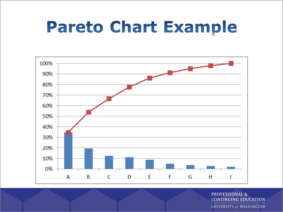
Bar chart: More effective than pie charts as length is used to visually encode size for comparisons. Dot plots: When values are far from zero, but within a narrow range, bar charts are not as effective as dot plots. Pareto chart: Used when we want to compare groups ranked by size, but also understand holistically how each group is contributing.

31
Grouping categorical items in an ad hoc manner: when exploring data, it is often useful to bucket data into new groups (e.g., price bins, sales ranks, customer tenure, etc.) Using Pareto charts with percentile scales: one ad hoc bucket method is to create percentile bins; allowing the analyst to compare interval scales rather than the typical ordinal scale. Re-expressing values to solve quantitative scaling issues: re-expressing through logarithm scales can help when some buckets are very small.

32
Using your data sets, build a Pareto chart in Excel. Get together with your group to discuss your findings and compare to their charts.

34
Current Target: Actual sales compared to the goal through the same period Future Target: Actual sales compared to the total goal (YE, month goal, etc.) Current Forecast: Actual sales compared to expectation
 Current Forecast: Actual sales compared to expectation")
35
Same point in time in the past: Current sales compared to LY sales Immediately prior period: Current sales versus last month Standard: Actual metric compared to a number that is considered acceptable.

36
Norm: Actual metric compared to average Other items in the same category: Actual metric versus comparable items Others in the same market: Actuals compared to competitors within the market

37
Best graphs for displaying deviations for analysis are bar and line graphs. Graphs should display the reference line from which the comparison is being made.

38
Expressing deviations as percentages: when we need to normalize between data sets, re-expressing as percentages can be helpful. Comparing deviations to other points of reference: as with time-series analysis, adding a reference line (e.g., acceptable deviation) can increase the data/ink ratio significantly.
 can increase the data/ink ratio significantly..")
Similar presentations