Download presentation
Presentation is loading. Please wait.

2
Line Graphs: are used to show something changing over time. Bar Graphs: are used to show a comparison between two or more variables. Pie Chart: are used to show a part of the whole (100%).
..")
3
1. Title 2. Both axes are numbered and have an equally spaced scale interval. a. Example: 1 box = 10 degrees Kelvin 3. Both axes are labeled. a. Example: X axis = Months Y axis = Degrees in Kelvin 4. If you have more than one line or several bars on the same graph, you need to have a legend that explains what each color represents. a. Example: Red Line = Temperature in High Point, NC Blue Line = Temperature in Greensboro, NC

4
Independent Variable is ALWAYS on the X AXIS. Dependent Variable is ALWAYS on the Y AXIS. **The Independent Variable causes a change in the Dependent Variable and it is NOT possible that the Dependent Variable could cause a change in the Independent Variable.**

5
The amount of time that you study for a test will affect your test score. Your test score will not affect the time that you study. So…. The time you study = Independent Variable (X Axis) The score on your test = Dependent Variable (Y Axis)
 The score on your test = Dependent Variable (Y Axis).")
6
Title: Student Success X Axis: Hours Spent Studying Y Axis: Average Test Score X Axis Scale: 1 box = 1 Hour Y Axis Scale: 1 box = 10 Points on the Test

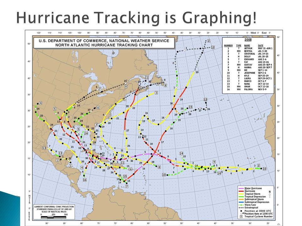
8
http://www.nhc.noaa.gov/AT_Track_chart.pd f http://www.nhc.noaa.gov/AT_Track_chart.pd f

9
http://weathereye.kgan.com/expert/hurrican e/index.html http://weathereye.kgan.com/expert/hurrican e/index.html

Similar presentations


>")
 Connect data points using a line or curve of best fit.>")

 The whole circle equals _____________ Because of this we.>")


 The Independent Variable. A change in this variable affects the y variable. >")


 Horizontal D – dependent R – responding.>")