Download presentation
Presentation is loading. Please wait.

1
COLOR THEORY Basic color schemes Introduction to Color Theory Basic color schemes Introduction to Color Theory

2
With colors you can set a mood, attract attention, or make a statement. You can use color to energize, or to cool down. By selecting the right color scheme, you can create an ambiance of elegance, warmth or tranquility, or you can convey an image of playful youthfulness. Color can be your most powerful design element if you learn to use it effectively.

3
Colors affect us in numerous ways, both mentally and physically. A strong red color has been shown to raise the blood pressure Blue color has a calming effect. Being able to use colors consciously and harmoniously can help you create spectacular results.

4
The color wheel or color circle is the basic tool for combining colors. The first circular color diagram was designed by Sir Isaac Newton in 1666.

5
The color wheel is designed so that virtually any colors you pick from will look good together. Over the years, many variations of the basic design have been made, but the most common version is a wheel of 12 colors based on the RYB (or artistic) color model. Traditionally, there are a number of color combinations that are considered especially pleasing. These are called color harmonies or color chords and they consist of two or more colors with a fixed relation in the color wheel.
 color model. Traditionally, there are a number of color combinations that are considered especially pleasing. These are called color harmonies or color chords and they consist of two or more colors with a fixed relation in the color wheel..")
6
Warm Colors appear to come forward, while Cool Colors appear to move back within compositions.

7
Colors that are opposite each other on the color wheel are considered to be complementary colors (example: red and green). The high contrast of complementary colors creates a vibrant look especially when used at full saturation. This color scheme must be managed well so it is not jarring. Complementary color schemes are tricky to use in large doses, but work well when you want something to stand out. Complementary colors are really bad for text.

8
Analogous color scheme Analogous color schemes use colors that are next to each other on the color wheel. They usually match well and create serene and comfortable designs. Analogous color schemes are often found in nature and are harmonious and pleasing to the eye. Make sure you have enough contrast when choosing an analogous color scheme. Choose one color to dominate, a second to support. The third color is used (along with black, white or gray) as an accent.
 as an accent..")
9
Triadic color scheme A triadic color scheme uses colors that are evenly spaced around the color wheel. Triadic color schemes tend to be quite vibrant, even if you use pale or unsaturated versions of your hues. To use a triadic harmony successfully, the colors should be carefully balanced - let one color dominate and use the two others for accent.

10
Split-Complementary color scheme The split-complementary color scheme is a variation of the complementary color scheme. In addition to the base color, it uses the two colors adjacent to its complement. This color scheme has the same strong visual contrast as the complementary color scheme, but has less tension. The split-complimentary color scheme is often a good choice for beginners, because it is difficult to mess up.

11
Rectangle (tetradic) color scheme The rectangle or tetradic color scheme uses four colors arranged into two complementary pairs. This rich color scheme offers plenty of possibilities for variation. Tetradic color schemes works best if you let one color be dominant. You should also pay attention to the balance between warm and cool colors in your design.

12
Square color scheme The square color scheme is similar to the rectangle, but with all four colors spaced evenly around the color circle. Square color schemes works best if you let one color be dominant. You should also pay attention to the balance between warm and cool colors in your design.

13
Four basic color schemes Primary Colors – for a strong feeling, a scheme of primary colors, red, blue, and yellow is an ideal choice. Each is a pure color that can’t be created by mixing other hues. Secondary Colors – green, orange, and purple are created by mixing two primaries in equal amounts. Like all colors, each secondary hue can be tinted with white or toned with black for variations. If a bold orange and green are to bold, think about pairing up their paler tints of peach and sage.

14
Tertiary Colors – these colors are intermediate colors which are an equal mix of a primary and it’s closest secondary color; blue-green, yellow-green, red-orange, red-purple, and blue purple. Combine these colors for a sophisticated look. Monochromatic – a single color or variations of that color by adjusting it’s intensity. For instance, orange, coral, and peach offer variety within the same family.

15
Colors creates mood Colors behave in three basic ways – active, passive, and neutral. Active Colors – On the warm side of the color wheel active colors include, yellow, orange, and red. These advancing extroverted hues stand out and dominate. They inspire an upbeat attitude. Red, the most intense of the warm colors wakes up emotions, while golden or lemon yellow unleashes creative juices.

16
Passive Colors – The cool colors, blue, green, and purple will pacify, staying quietly in the background to calm and restore depleted spirits. Neutral Colors – brown, beige, gray, white, and taupe are the neutralizers. They neither activate nor pacify, but combine and cooperate. They are good transition colors. Darker neutrals tone down other colors. Crisp white intensifies them.

17
There are cases when your own interpretations and preferences will determine which colors you use to create a mood. Blue can represent depression to one person and a peaceful serenity to another. The important thing to realize is how color effects the general public and how color theory is used by artists and designers to convey a message, attract attention, and generate interest.

18
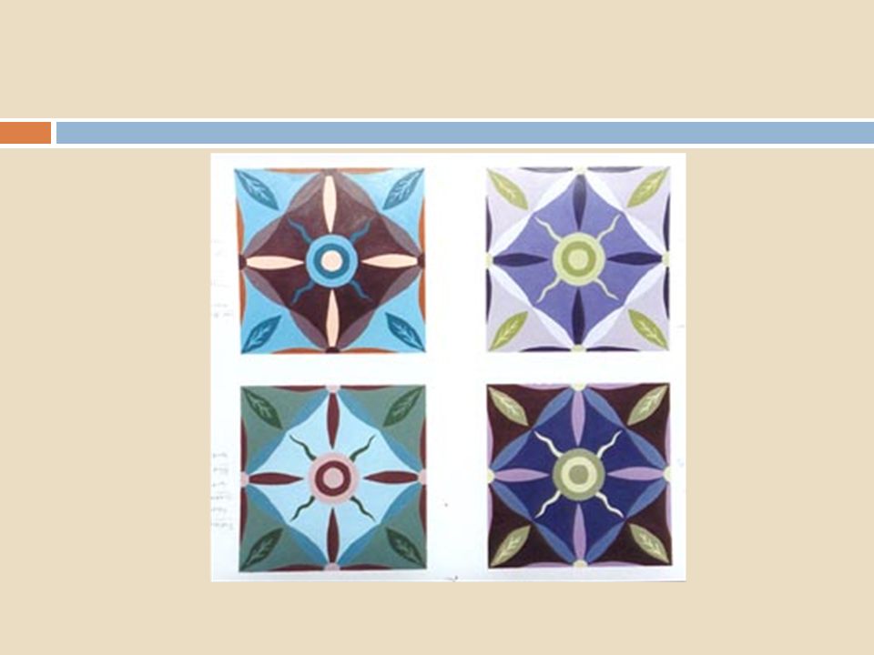
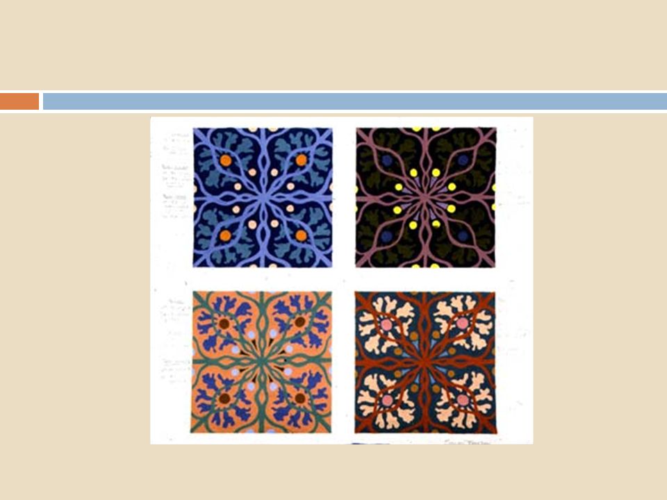
Color tile assignment : examples

Similar presentations


>")


