Download presentation
Presentation is loading. Please wait.

1
chapter 5 interaction design basics

2
design: –what it is, interventions, goals, constraints the design process –what happens when users –who they are, what they are like … scenarios –rich stories of design navigation –finding your way around a system iteration and prototypes –never get it right first time!

3
interactions and interventions design interactions not just interfaces not just the immediate interaction e.g. stapler in office – technology changes interaction style manual:write, print, staple, write, print, staple, … electric:write, print, write, print, …, staple designing interventions not just artefacts not just the system, but also … documentation, manuals, tutorials what we say and do as well as what we make

4
what is design?

5
achieving goals within constraints goals - purpose –who is it for, why do they want it constraints –materials, platforms trade-offs

6
golden rule of design understand your materials

7
for Human–Computer Interaction understand your materials understand computers –limitations, capacities, tools, platforms understand people –psychological, social aspects –human error and their interaction …

8
To err is human accident reports.. –aircrash, industrial accident, hospital mistake –enquiry … blames … ‘human error’ but … –concrete lintel breaks because too much weight –blame ‘lintel error’ ? … no – design error we know how concrete behaves under stress human ‘error’ is normal –we know how users behave under stress –so design for it! treat the user at least as well as physical materials!

9
Central message … the user

10
The process of design what is wanted analysis design implement and deploy prototype interviews ethnography what is there vs. what is wanted guidelines principles dialogue notations precise specification architectures documentation help evaluation heuristics scenarios task analysis

11
Steps … requirements –what is there and what is wanted … analysis –ordering and understanding design –what to do and how to decide iteration and prototyping –getting it right … and finding what is really needed! implementation and deployment –making it and getting it out there

12
… but how can I do it all ! ! limited time design trade-off usability? –finding problems and fixing them? –deciding what to fix? a perfect system is badly designed –too good too much effort in design

14
user focus know your user personae cultural probes

15
know your user who are they? probably not like you! talk to them watch them use your imagination

16
persona description of an ‘example’ user –not necessarily a real person use as surrogate user –what would Abdul Shakoor think details matter –makes him ‘real’

17
example persona Abdul Shakoor is 37 years old, He has been Warehouse Manager for five years and worked for Hamdard Laboratories for twelve years. He didn’t go to university, but has studied in his evenings for BComm. He has six children aged 15 and 2 and does not like to work late. He did part of an introductory in-house computer course some years ago, but it was interrupted when he was promoted and could no longer afford to take the time. His vision is perfect, but his right-hand movement is slightly restricted following a motorcycle accident 3 years ago. He is enthusiastic about his work and is happy to delegate responsibility and take suggestions from his staff. However, he does feel threatened by the introduction of yet another new computer system (the third in his time at Hamdard).
..")
18
cultural probes direct observation –sometimes hard in the home psychiatric patients, … probe packs –items to prompt responses e.g. glass to listen at wall, camera, postcard –given to people to open in their own environment they record what is meaningful to them used to … –inform interviews, prompt ideas, enculture designers

19
scenarios stories for design use and reuse

20
scenarios stories for design –communicate with others –validate other models –understand dynamics linearity –time is linear - our lives are linear –but don’t show alternatives

21
scenarios … what will users want to do? step-by-step walkthrough –what can they see (sketches, screen shots) –what do they do (keyboard, mouse etc.) –what are they thinking? use and reuse throughout design
 –what do they do (keyboard, mouse etc.) –what are they thinking. use and reuse throughout design.")
22
scenario – video lectures Mr. Khaliq is reading Physics at University of Karachi. He intends to view recordings of lectures in his free time, at his own learning pace. Along with listening to recordings, he is also interested in inserting extra notes, tags and bookmarks on the recordings. He further wants to share his annotations with his class fellows. Ms. Ruby is taking several distance learning courses. She is deaf. She had little trouble with the curriculum until the university upgraded their on-line courseware to a multimedia approach, using an extensive collection of audio lectures and podcasts. The University developed a system to transcribe the lectures through speech processing software and made this information available with all the audio lectures and podcasts.

23
The University had the lectures transcribed and made this information available through their Web site along with audio versions of the lectures. The tutor for the course also set up a social- net (blog, chat, etc) on the Web site where students could exchange ideas about their coursework. Although she was the only deaf student in the class, she quickly found that the Web-based social-net setup, and the opportunity to provide Web-based text comments on classmates' work, ensured that she could keep up with class progress.
 on the Web site where students could exchange ideas about their coursework. Although she was the only deaf student in the class, she quickly found that the Web-based social-net setup, and the opportunity to provide Web-based text comments on classmates work, ensured that she could keep up with class progress..")
24
Requirements from Scenarios To search text transcripts for specific topics and then replay recordings. To read captions rather than listen to recorded speech to support deafness, learning at own pace, etc. To insert bookmark at a particular point in a recording. To link section of recordings to other recordings. To tag and highlight sections of recordings that they don’t fully understand. To provide web links for further references. To tag recordings using their own terms as a personal index.

25
Viewing annotations/tags of the students that are inserted on recordings, also getting the flexibility that the user can view annotations of selected users/groups. To participate in various feedback evaluations, this may later be used for assessments.

26
… explore the depths explore interaction –what happens when explore cognition –what are the users thinking explore architecture –what is happening inside

27
use scenarios to.. communicate with others –designers, clients, users validate other models –‘play’ it against other models express dynamics –screenshots – appearance –scenario – behaviour

28
linearity Scenarios – one linear path through system Pros: –life and time are linear –easy to understand (stories and narrative are natural) –concrete (errors less likely) Cons: –no choice, no branches, no special conditions –miss the unintended So: –use several scenarios –use several methods
 –concrete (errors less likely) Cons: –no choice, no branches, no special conditions –miss the unintended So: –use several scenarios –use several methods")
30
navigation design local structure – single screen global structure – whole site start the systems info and helpmanagementmessages add userremove user main screen remove user confirm add user

31
levels widget choice –menus, buttons etc. screen design application navigation design environment –other apps, O/S

32
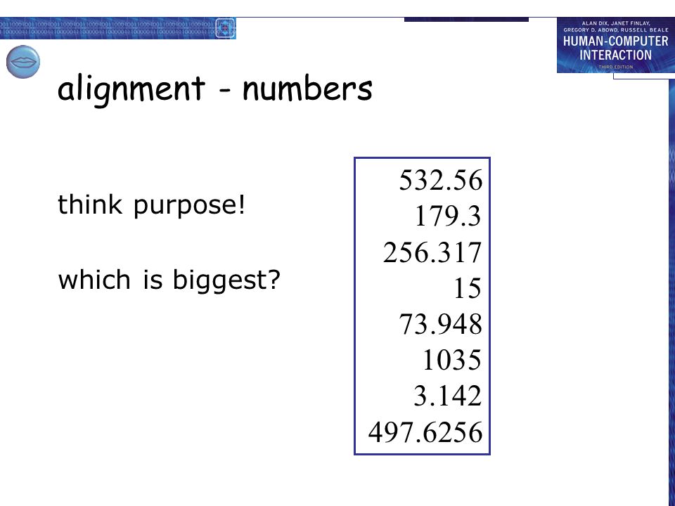
the web … widget choice screen design navigation design environment elements and tags – page design site structure the web, browser, external links

33
physical devices widget choice screen design navigation design environment controls –buttons, knobs, dials physical layout modes of device the real world

34
think about structure within a screen –later... local –looking from this screen out global –structure of site, movement between screens wider still –relationship with other applications

35
local from one screen looking out

36
goal seeking goal start

37
goal seeking start goal progress with local knowledge only...

38
goal seeking goal start … but can get to the goal

39
goal seeking … try to avoid these bits! goal start

40
four golden rules knowing where you are knowing what you can do knowing where you are going –or what will happen knowing where you’ve been –or what you’ve done

41
where you are – breadcrumbs shows path through web site hierarchy web site top level category sub-category this page live links to higher levels

42
beware the big button trap where do they go? –lots of room for extra text! things the thing from outer space more things other things

43
modes lock to prevent accidental use … –remove lock - ‘c’ + ‘yes’ to confirm –frequent practiced action if lock forgotten –in pocket ‘yes’ gets pressed –goes to phone book –in phone book … ‘c’ – delete entry ‘yes’ – confirm … oops !

44
global between screens within the application

45
hierarchical diagrams the system info and helpmanagementmessages add userremove user

46
hierarchical diagrams ctd. parts of application –screens or groups of screens typically functional separation the systems info and helpmanagementmessages add userremove user

47
navigating hierarchies deep is difficult! misuse of Miller’s 7 ± 2 –short term memory, not menu size optimal? –many items on each screen –but structured within screen see /e3/online/menu-breadth/

48
think about dialogue what does it mean in UI design? Minister: do you name take this woman … Man: I do Minister: do you name take this man … Woman: I do Minister: I now pronounce you man and wife

49
think about dialogue what does it mean in UI design? marriage service general flow, generic – blanks for names pattern of interaction between people computer dialogue pattern of interaction between users and system but details differ each time Minister: do you name take this woman …

50
network diagrams show different paths through system main screen remove user confirm add user

51
network diagrams ctd. what leads to what what happens when including branches more task oriented then hierarchy main screen remove user confirm add user

52
wider still between applications and beyond...

53
wider still … style issues: –platform standards, consistency functional issues –cut and paste navigation issues –embedded applications –links to other apps … the web

55
Interface types Many, many kinds now 1980s interfaces Command WIMP/GUI 1990s interfaces Advanced graphical (multimedia, virtual reality, information visualization) Web Speech (voice) Pen, gesture, and touch Appliance 2000s interfaces Mobile Multimodal Shareable Tangible Augmented and mixed reality Wearable Robotic
 Web Speech (voice) Pen, gesture, and touch Appliance 2000s interfaces Mobile Multimodal Shareable Tangible Augmented and mixed reality Wearable Robotic")
56
screen design and layout basic principles grouping, structure, order alignment use of white space ABCDEFGHIJKLMNOPQRSTUVWXYZABCDEFGHIJKLMNOPQRSTUVWXYZ Dix, Alan Finlay, Janet Abowd, Gregory Beale, Russell

57
Research and design issues Window management –enabling users to move fluidly between different windows (and monitors) How to switch attention between them to find information needed without getting distracted Design principles of spacing, grouping, and simplicity should be used
 How to switch attention between them to find information needed without getting distracted Design principles of spacing, grouping, and simplicity should be used")
58
basic principles ask –what is the user doing? think –what information, comparisons, order design –form follows function

59
available tools grouping of items order of items decoration - fonts, boxes etc. alignment of items white space between items

60
grouping and structure logically together physically together Billing details: Name Address: … Credit card no Delivery details: Name Address: … Delivery time Order details: item quantity cost/item cost size 10 screws (boxes) 7 3.71 25.97 …… … … …
 …… … … …")
61
order of groups and items think! - what is natural order should match screen order! –use boxes, space etc. –set up tabbing right! instructions –beware the cake recipie syndrome! … mix milk and flour, add the fruit after beating them

62
decoration use boxes to group logical items use fonts for emphasis, headings but not too many!! ABCDEFGHIJKLMNOPQRSTUVWXYZABCDEFGHIJKLMNOPQRSTUVWXYZ

63
alignment - text you read from left to right (English and European) align left hand side Willy Wonka and the Chocolate Factory Winston Churchill - A Biography Wizard of Oz Xena - Warrior Princess Willy Wonka and the Chocolate Factory Winston Churchill - A Biography Wizard of Oz Xena - Warrior Princess fine for special effects but hard to scan boring but readable!
 align left hand side Willy Wonka and the Chocolate Factory Winston Churchill - A Biography Wizard of Oz Xena - Warrior Princess Willy Wonka and the Chocolate Factory Winston Churchill - A Biography Wizard of Oz Xena - Warrior Princess fine for special effects but hard to scan boring but readable!")
64
alignment - names Usually scanning for surnames make it easy! Alan Dix Janet Finlay Gregory Abowd Russell Beale Alan Dix Janet Finlay Gregory Abowd Russell Beale Dix, Alan Finlay, Janet Abowd, Gregory Beale, Russell

65
alignment - numbers think purpose! which is biggest? 532.56 179.3 256.317 15 73.948 1035 3.142 497.6256
66
alignment - numbers visually: long number = big number align decimal points or right align integers 627.865 1.005763 382.583 2502.56 432.935 2.0175 652.87 56.34

67
multiple columns scanning across gaps hard: (often hard to avoid with large data base fields) sherbert75 toffee120 chocolate35 fruit gums27 coconut dreams85
 sherbert75 toffee120 chocolate35 fruit gums27 coconut dreams85")
68
multiple columns - 2 use leaders sherbert75 toffee120 chocolate35 fruit gums27 coconut dreams85

69
multiple columns - 3 or greying (vertical too) sherbert75 toffee120 chocolate35 fruit gums27 coconut dreams85
 sherbert75 toffee120 chocolate35 fruit gums27 coconut dreams85")
70
multiple columns - 4 or even (with care!) ‘bad’ alignment
 ‘bad’ alignment")
71
white space - the counter WHAT YOU SEE

72
white space - the counter WHAT YOU SEE THE GAPS BETWEEN

73
space to separate

74
space to structure

75
space to highlight

76
physical controls grouping of items –defrost settings –type of food –time to cook type of food time to cook defrost settings

77
physical controls grouping of items order of items 1)type of heating 2)temperature 3)time to cook 4)start 4 2 2)temperature 3 3)time to cook 1 1)type of heating
type of heating 2)temperature 3)time to cook 4)start 4 2 2)temperature 3 3)time to cook 1 1)type of heating")
78
physical controls grouping of items order of items decoration –different colours for different functions –lines around related buttons different colours for different functions lines around related buttons (temp up/down)
")
79
physical controls grouping of items order of items decoration alignment –centered text in buttons ? easy to scan ? ? easy to scan ? centred text in buttons

80
physical controls grouping of items order of items decoration alignment white space –gaps to aid grouping gaps to aid grouping

82
user action and control entering information knowing what to do affordances

83
entering information forms, dialogue boxes –presentation + data input –similar layout issues –alignment - N.B. different label lengths logical layout –use task analysis (ch15) –groupings –natural order for entering information top-bottom, left-right (depending on culture) set tab order for keyboard entry N.B. see extra slides for widget choice Name: Address: Alan Dix Lancaster Name: Address: Alan Dix Lancaster Name: Address: Alan Dix Lancaster ?
 –groupings –natural order for entering information top-bottom, left-right (depending on culture) set tab order for keyboard entry N.B. see extra slides for widget choice Name: Address: Alan Dix Lancaster Name: Address: Alan Dix Lancaster Name: Address: Alan Dix Lancaster .")
84
knowing what to do what is active what is passive –where do you click –where do you type consistent style helps –e.g. web underlined links labels and icons –standards for common actions –language – bold = current state or action

85
appropriate appearance presenting information aesthetics and utility colour and 3D localisation & internationalisation

86
presenting information purpose matters –sort order (which column, numeric alphabetic) –text vs. diagram –scatter graph vs. histogram use paper presentation principles! but add interactivity –softens design choices e.g. re-ordering columns ‘dancing histograms’ (chap 21) chap1 chap10 chap11 chap12 chap13 chap14 … 17 12 51 262 83 22 … sizename size chap10 chap5 chap1 chap14 chap20 chap8 … 12 16 17 22 27 32 … namesize
 chap1 chap10 chap11 chap12 chap13 chap14 … … sizename size chap10 chap5 chap1 chap14 chap20 chap8 … … namesize.")
87
aesthetics and utility aesthetically pleasing designs –increase user satisfaction and improve productivity beauty and utility may conflict –mixed up visual styles easy to distinguish –clean design – little differentiation confusing –backgrounds behind text … good to look at, but hard to read but can work together –e.g. the design of the counter –in consumer products – key differentiator (e.g. iMac)
.")
88
colour and 3D both often used very badly! colour –older monitors limited palette –colour over used because ‘it is there’ –beware colour blind! –use sparingly to reinforce other information 3D effects –good for physical information and some graphs –but if over used … e.g. text in perspective!! 3D pie charts

89
bad use of colour over use - without very good reason (e.g. kids’ site) colour blindness poor use of contrast do adjust your set! –adjust your monitor to greys only –can you still read your screen?
 colour blindness poor use of contrast do adjust your set. –adjust your monitor to greys only –can you still read your screen .")
90
across countries and cultures localisation & internationalisation –changing interfaces for particular cultures/languages globalisation –try to choose symbols etc. that work everywhere simply change language? –use ‘resource’ database instead of literal text … but changes sizes, left-right order etc. deeper issues –cultural assumptions and values –meanings of symbols e.g tick and cross … +ve and -ve in some cultures … but … mean the same thing (mark this) in others
 in others .")
92
prototyping

93
iteration and prototyping getting better … … and starting well

94
prototyping you never get it right first time if at first you don’t succeed … prototypeevaluatedesign re-design done! OK?

95
pitfalls of prototyping moving little by little … but to where Malverns or the Matterhorn? 1. need a good start point 2. need to understand what is wrong

Similar presentations


 design principles. Understand the process of UI design.>")


 Quite a bit of this is Language and culture dependent, Internationalization brings a whole new set of.>")
