Download presentation
Presentation is loading. Please wait.

1
Chapter 3 EXPLORATION DATA ANALYSIS 3.1 GRAPHICAL DISPLAY OF DATA 3.2 MEASURES OF CENTRAL TENDENCY 3.3 MEASURES OF DISPERSION

2
3.1 Graphical Display of Data Most of the statistical information in newspapers, magazines, company reports and other publications consists of data that are summarized and presented in a form that is easy for the reader to understand In this chapter we will discusses and displays several graphical tools for summarizing and presenting data, including histogram, frequency polygon, ogive, dot plot, bar chart, pie chart and the scatter plot for two- variable numerical data.

3
3.1 Graphical Display of Data: Ungroup Versus Group of Data Ungrouped data have not been summarized in any way are also called raw data Grouped data logical groupings of data exists i.e. age ranges (20-29, 30-39, etc.) have been organized into a frequency distribution
 have been organized into a frequency distribution.")
4
42 30 53 50 52 30 55 49 61 74 26 58 40 28 36 30 33 31 37 32 37 30 32 23 32 58 43 30 29 34 50 47 31 35 26 64 46 40 43 57 30 49 40 25 50 52 32 60 54 Ages of a Sample of Managers from Urban Child Care Centers in the United States 3.1 Graphical Display of Data Example of Ungrouped Data

5
3.1 Graphical Display of Data Frequency Distribution Frequency Distribution – summary of data presented in the form of class intervals and frequencies Vary in shape and design Constructed according to the individual researcher's preferences

6
Steps in Frequency Distribution Step 1 - Determine range of frequency distribution Range is the difference between the high and the lowest numbers Step 2 – determine the number of classes Don’t use too many, or two few classes Step 3 – Determine the width of the class interval Approx class width can be calculated by dividing the range by the number of classes Values fit into only one class Frequency Distribution

7
Class Interval Frequency 20-under 30 6 30-under 4018 40-under 5011 50-under 6011 60-under 703 70-under 801 Frequency Distribution of Child Care Manager’s Ages

8
Relative Class IntervalFrequencyFrequency 20-under 306.12 30-under 4018.36 40-under 5011.22 50-under 6011.22 60-under 703.06 70-under 80 1.02 Total501.00 The relative frequency is the proportion of the total frequency that is any given class interval in a frequency distribution. 3.1 Graphical Display of Data Relative Frequency

9
The cumulative frequency is a running total of frequencies through the classes of a frequency distribution. 3.1 Graphical Display of Data Cumulative Frequency Cumulative Class IntervalFrequencyFrequency 20-under 3066 30-under 401824 40-under 501135 50-under 601146 60-under 70349 70-under 80 150 Total50

10
Histogram -- vertical bar chart of frequencies Frequency Polygon -- line graph of frequencies Ogive -- line graph of cumulative frequencies Stem and Leaf Plot – Like a histogram, but shows individual data values. Useful for small data sets. Pareto Chart -- type of chart which contains both bars and a line graph. The bars display the values in descending order, and the line graph shows the cumulative totals of each category, left to right. The purpose is to highlight the most important among a (typically large) set of factors. Common Statistical Graphs – Quantitative Data
 set of factors. Common Statistical Graphs – Quantitative Data.")
11
3.1 Graphical Display of Data Histogram A histogram is a graphical summary of a frequency distribution The number and location of bins (bars) should be determined based on the sample size and the range of the data
 should be determined based on the sample size and the range of the data")
12
42 30 53 50 52 30 55 49 61 74 26 58 40 28 36 30 33 31 37 32 37 30 32 23 32 58 43 30 29 34 50 47 31 35 26 64 46 40 43 57 30 49 40 25 50 52 32 60 54 Smallest Largest Data Range

13
Number of Classes and Class Width The number of classes should be between 5 and 15. Fewer than 5 classes cause excessive summarization. More than 15 classes leave too much detail. Or use the formula no. of class = 1 + 3.3 log n (n = numbers set of data) Class Width Divide the range by the number of classes for an approximate class width Round up to a convenient number
 Class Width Divide the range by the number of classes for an approximate class width Round up to a convenient number.")
14
The midpoint of each class interval is called the class midpoint or the class mark. Class Midpoint

15
Relative Cumulative Class IntervalFrequencyMidpointFrequencyFrequency 20-under 30625.126 30-under 401835.3624 40-under 501145.2235 50-under 601155.2246 60-under 70365.0649 70-under 80 175.0250 Total501.00 Midpoints for Age Classes

16
Class IntervalFrequency 20-under 306 30-under 4018 40-under 5011 50-under 6011 60-under 703 70-under 801 Histogram

17
Class IntervalFrequency 20-under 306 30-under 4018 40-under 5011 50-under 6011 60-under 703 70-under 801 Frequency Polygon

18
Cumulative Class IntervalFrequency 20-under 306 30-under 4024 40-under 5035 50-under 6046 60-under 7049 70-under 8050 Ogive

19
Stem and Leaf plot: Safety Examination Scores for Plant Trainees 86 76 23 77 81 79 68 77 92 59 68 75 83 49 91 47 72 82 74 70 56 60 88 75 97 39 78 94 55 67 83 89 67 91 81 Raw Data Stem 2345678923456789 Leaf 3 9 7 9 5 6 9 0 7 7 8 8 0 2 4 5 5 6 7 7 8 9 1 1 2 3 3 6 8 9 1 1 2 4 7

20
Construction of Stem and Leaf Plot 86 76 23 77 81 79 68 77 92 59 68 75 83 49 91 47 72 82 74 70 56 60 88 75 97 39 78 94 55 67 83 89 67 91 81 Raw Data Stem 2345678923456789 Leaf 3 9 7 9 5 6 9 0 7 7 8 8 0 2 4 5 5 6 7 7 8 9 1 1 2 3 3 6 8 9 1 1 2 4 7 Stem Leaf Stem Leaf

21
Common Statistical Graphs – Qualitative Data Pie Chart -- proportional representation for categories of a whole Bar Chart – frequency or relative frequency of one more categorical variables

22
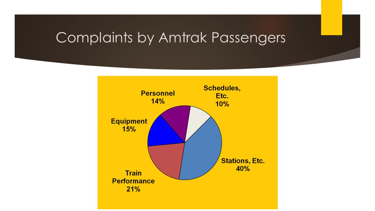
COMPLAINTNUMBERPROPORTION DEGREES Stations, etc.28,000.40 144.0 Train Performance 14,700.2175.6 Equipment10,500.1550.4 Personnel9,800.1450.6 Schedules, etc. 7,000.1036.0 Total70,0001.00360.0 Complaints by Amtrak Passengers

24
Second Quarter U.S. Truck Production Second Quarter Truck Production in the U.S. (Hypothetical values) 2d Quarter Truck Production Company A B C D E Totals 357,411 354,936 160,997 34,099 12,747 920,190
 2d Quarter Truck Production Company A B C D E Totals 357, , ,997 34,099 12, ,190.")
25
Second Quarter U.S. Truck Production

26
2d Quarter Truck Production ProportionDegreesCompany A B C D E Totals 357,411 354,936 160,997 34,099 12,747 920,190.388.386.175.037.014 1.000 140 139 63 13 5 360 Pie Chart Calculations for Company A

27
3.2 Measures of Central Tendency: Ungrouped Data Measures of central tendency yield information about “particular places or locations in a group of numbers.” Common Measures of Location Mode Median Mean Percentiles Quartiles

28
Mode - the most frequently occurring value in a data set Applicable to all levels of data measurement (nominal, ordinal, interval, and ratio) Can be used to determine what categories occur most frequently Sometimes, no mode exists (no duplicates) Bimodal – In a tie for the most frequently occurring value, two modes are listed Multimodal -- Data sets that contain more than two modes Mode
 Can be used to determine what categories occur most frequently Sometimes, no mode exists (no duplicates) Bimodal – In a tie for the most frequently occurring value, two modes are listed Multimodal -- Data sets that contain more than two modes Mode")
29
Median Median - middle value in an ordered array of numbers. Half the data are above it, half the data are below it Mathematically, it’s the (n+1)/2 th ordered observation For an array with an odd number of terms, the median is the middle number n=11 => (n+1)/2 th = 12/2 th = 6 th ordered observation For an array with an even number of terms the median is the average of the middle two numbers n=10 => (n+1)/2 th = 11/2 th = 5.5 th = average of 5 th and 6 th ordered observation
/2 th ordered observation For an array with an odd number of terms, the median is the middle number n=11 => (n+1)/2 th = 12/2 th = 6 th ordered observation For an array with an even number of terms the median is the average of the middle two numbers n=10 => (n+1)/2 th = 11/2 th = 5.5 th = average of 5 th and 6 th ordered observation.")
30
Arithmetic Mean Mean is the average of a group of numbers Applicable for interval and ratio data Not applicable for nominal or ordinal data Affected by each value in the data set, including extreme values Computed by summing all values in the data set and dividing the sum by the number of values in the data set

31
The number of U.S. cars in service by top car rental companies in a recent year according to Auto Rental News follows. Company Number of Cars in Service Enterprise 643,000; Hertz 327,000; National/Alamo 233,000; Avis 204,000; Dollar/Thrifty 167,000; Budget 144,000; Advantage 20,000; U-Save 12,000; Payless 10,000; ACE 9,000; Fox 9,000; Rent-A-Wreck 7,000; Triangle 6,000 Compute the mode, the median, and the mean. Demonstration Problem 3.1

32
Solutions Mode: 9,000 (two companies with 9,000 cars in service) Median: With 13 different companies in this group, N = 13. The median is located at the (13 +1)/2 = 7th position. Because the data are already ordered, median is the 7th term, which is 20,000. Mean: μ = ∑x/N = (1,791,000/13) = 137,769.23
/2 = 7th position. Because the data are already ordered, median is the 7th term, which is 20,000. Mean: μ = ∑x/N = (1,791,000/13) = 137,")
33
Which Measure Do I Use? Which measure of central tendency is most appropriate? In general, the mean is preferred, since it has nice mathematical properties (in particular, see chapter 7) The median and quartiles, are resistant to outliers Consider the following three datasets 1, 2, 3 (median=2, mean=2) 1, 2, 6 (median=2, mean=3) 1, 2, 30 (median=2, mean=11) All have median=2, but the mean is sensitive to the outliers In general, if there are outliers, the median is preferred to the mean
 The median and quartiles, are resistant to outliers Consider the following three datasets 1, 2, 3 (median=2, mean=2) 1, 2, 6 (median=2, mean=3) 1, 2, 30 (median=2, mean=11) All have median=2, but the mean is sensitive to the outliers In general, if there are outliers, the median is preferred to the mean.")
34
IntervalFrequency (f)Midpoint (M) f*M 20-under 30625150 30-under 401835630 40-under 501145495 50-under 601155605 60-under 70 365195 70-under 80 1 75 75 502150 Calculation of Grouped Mean Sometimes data are already grouped, and you are interested in calculating summary statistics
Midpoint (M) f*M 20-under under under under under under Calculation of Grouped Mean Sometimes data are already grouped, and you are interested in calculating summary statistics")
35
Cumulative Class IntervalFrequency Frequency 20-under 3066 30-under 401824 40-under 501135 50-under 601146 60-under 70349 70-under 80 150 N = 50 Median of Grouped Data - Example

36
Mode of Grouped Data Class IntervalFrequency 20-under 30 6 30-under 40 18 40-under 5011 50-under 6011 60-under 703 70-under 80 1 Midpoint of the modal class Modal class has the greatest frequency

37
3.3 Measures of Dispersion : Range The difference between the largest and the smallest values in a set of data Advantage – easy to compute Disadvantage – is affected by extreme values

38
3.3 Measures of Dispersion : Sample Variance Sample Variance - average of the squared deviations from the arithmetic mean Sample Variance – denoted by s2 X 2,398625390,625 1,844715,041 1,539-23454,756 1,311-462213,444

39
3.3 Measures of Dispersion : Sample Standard Deviation Sample standard deviation is the square root of the sample variance Same units as original data

Similar presentations


 MSIS 111 Prof. Nick Dedeke.>")
 2004 Brooks/Cole, a division of Thomson Learning, Inc. Chapter Two Treatment of Data.>")


. Statistical reasoning for the behavioral sciences (3 rd Ed.). Boston: Allyn & Bacon. Supplemental Material Ruiz-Primo,>")


