Download presentation
Presentation is loading. Please wait.

10
If you were to split the “ad” down the middle it would appear as if it were almost mirror image

11
If you were to split the “ad” down the middle it would NOT be mirror image

14
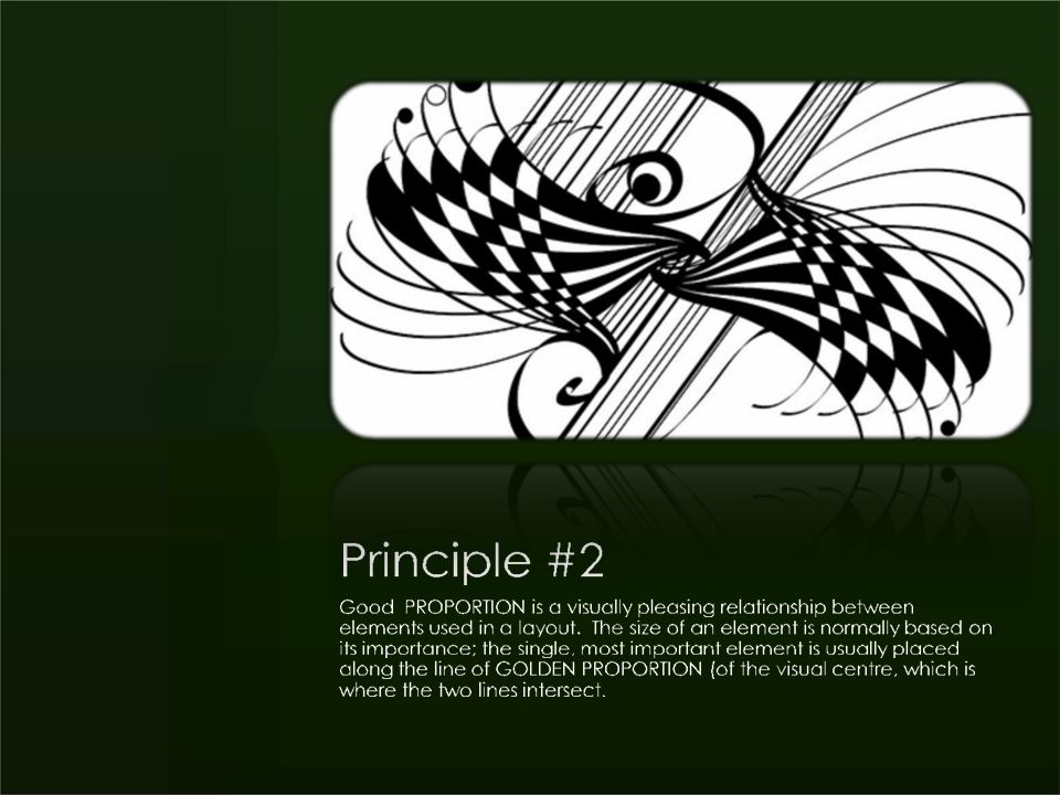
The VC (visual centre) The design is more pleasing if the main element is placed slightly to the left and towards the top, that is, at the visual centre, rather than at the exact centre of the page
 The design is more pleasing if the main element is placed slightly to the left and towards the top, that is, at the visual centre, rather than at the exact centre of the page")
16
The "Golden Proportion" formed the basis for many of man's creations. The rectangle is a basic form used in art, and the Greeks believed that the most "beautiful" rectangle must therefore utilize the ratio of length to width found in that proportion. Hence, the "Golden Rectangle" with length one, and width.618 exists.

17
Draw a diagonal within the "Golden Rectangle." Note that the interior is divided into 2 congruent triangles, each with congruent corresponding angles. The ratio of the short side to the long side of each triangle is.618 and the ratio of the long side to the short side is 1.618. These numbers, pretty familiar by now, indicate that these triangles are beautiful by Greek standards.

18
Now construct a perpendicular from the far vertex to the diagonal. The interior is now divided into several triangles of different size, but note that each is similar to the other, indicating that their corresponding sides are proportional and their corresponding angles are congruent. In fact all of the triangles are "Golden Triangles."

19
Draw another perpendicular and more of these beautiful triangles are produced within the interior of the "Golden Rectangle."

20
Note the points of intersection within the rectangle's interior. Each point, called a "saddle point", indicates a position within the interior that is placed in a spot pleasing to the eye. It pleases us as viewers in an abstract sense because it forces us to recognize the "Golden Proportion" within the framework of the rectangle.

21
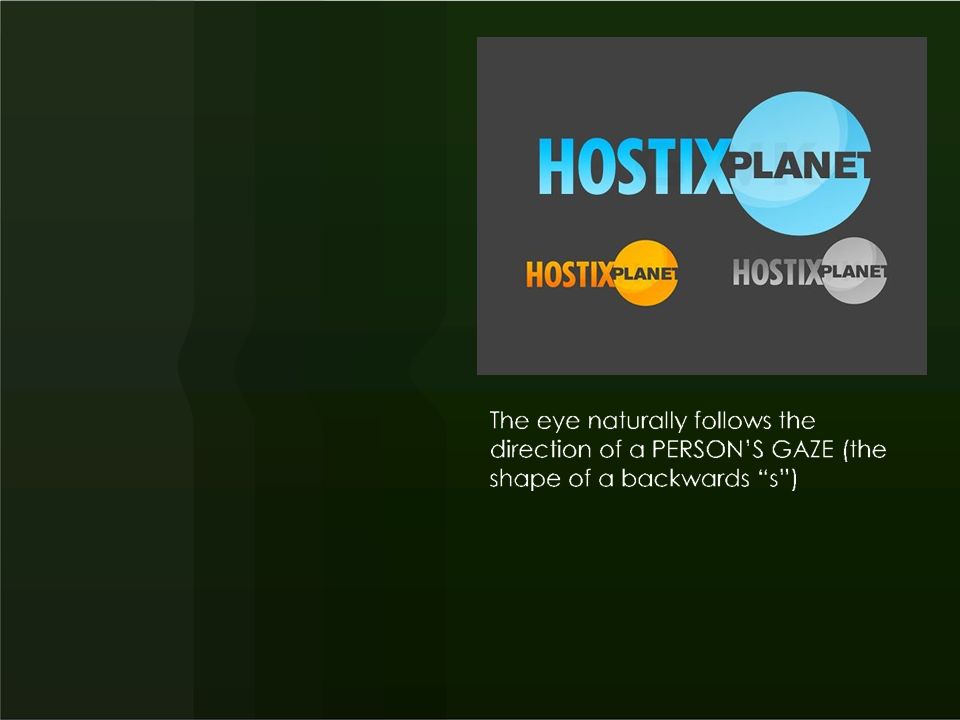
In fact there are 4 such "saddle points" available within the rectangle. Either one of these may be utilized as the location of the primary subject. Any secondary elements of the image should be placed at another saddle point or on a diagonal line that exists between saddle points. The arrows indicate the BACKWARDS “s” we will talk about later on

22
Time to test your knowledge. Look on line at the www.brotherahmed.weebly.com site and locate the BMW ad below. Using software of your choice indicate what the “balance” is, and pinpoint the VC and saddle points. www.brotherahmed.weebly.com

24
Colours, rules, shading, or reverse lettering.

33
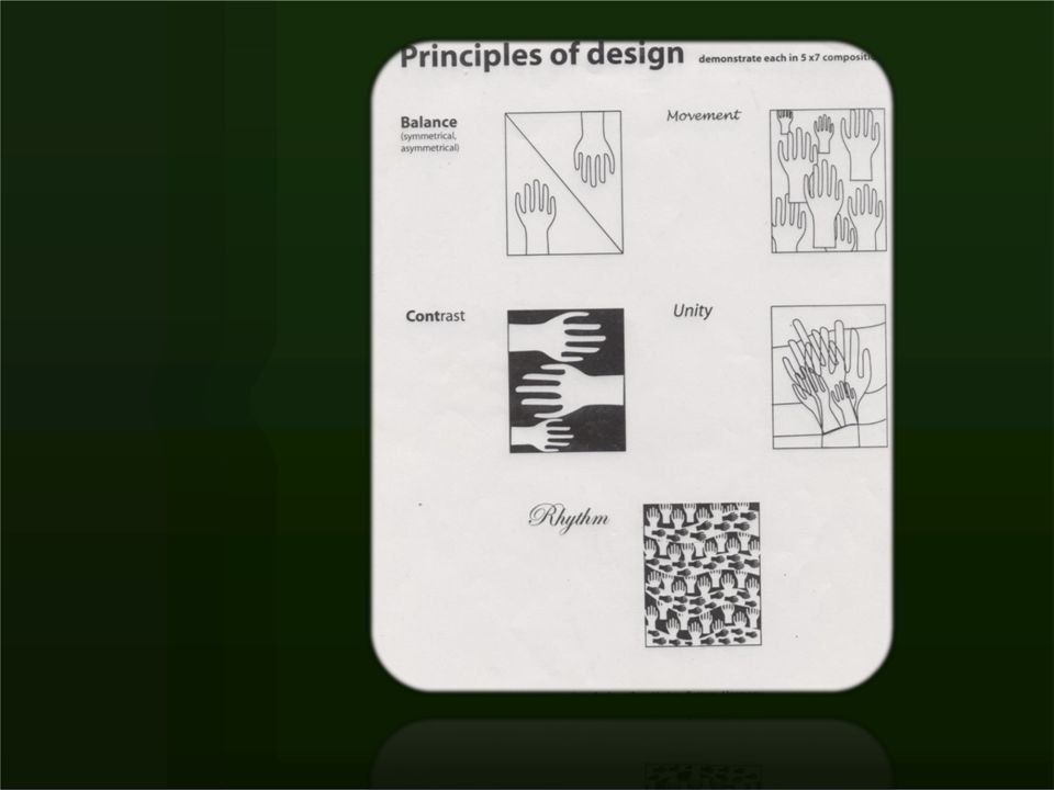
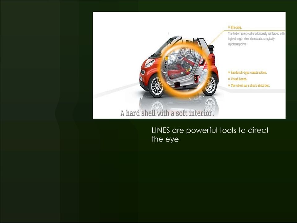
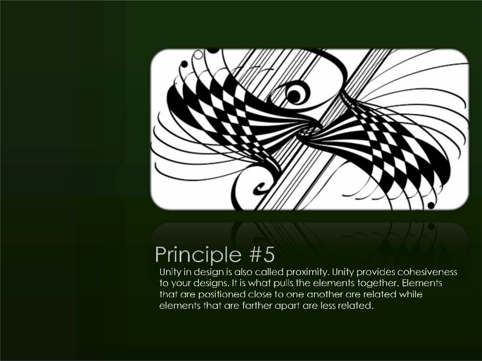
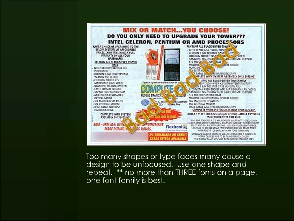
All parts of the design must work together to communicate the message. Build the page around a dominant element, Group similar elements (grouping techniques include BOXES, WHITE SPACE, SCREEN, COLOUR

36
Your assignment: See the assignment file attached in the graphic design section of the web page. This is an inclass assignment Please SAVE your files as requested!

Similar presentations


))>")


