Download presentation
Presentation is loading. Please wait.

1
CS 277, Data Mining Exploratory Data Analysis
Padhraic Smyth Department of Computer Science Bren School of Information and Computer Sciences University of California, Irvine

2
Outline of Today’s Lecture
Assignment 1: Questions? Overview of Exploratory Data Analysis Analyzing single variables Analyzing pairs of variables Higher-dimensional visualization techniques Dimension reduction methods Clustering methods

3
Exploratory Data Analysis: Single Variables

4
Summary Statistics Mean: “center of data”
Mode: location of highest data density Variance: “spread of data” Skew: indication of non-symmetry Range: max - min Median: 50% of values below, 50% above Quantiles: e.g., values such that 25%, 50%, 75% are smaller Note that some of these statistics can be misleading E.g., mean for data with 2 clusters may be in a region with zero data

5
Histogram of Unimodal Data
1000 data points simulated from a Normal distribution, mean 10, variance 1, 30 bins

6
Histograms: Unimodal Data
100 data points from a Normal, mean 10, variance 1, with 5, 10, 30 bins

7
Histogram of Multimodal Data
15000 data points simulated from a mixture of 3 Normal distributions, 300 bins

8
Histogram of Multimodal Data
15000 data points simulated from a mixture of 3 Normal distributions, 300 bins

9
Skewed Data 5000 data points simulated from an exponential distribution, 100 bins

10
Another Skewed Data Set
10000 data points simulated from a mixture of 2 exponentials, 100 bins

11
Same Skewed Data after taking Logs (base 10)
10000 data points simulated from a mixture of 2 exponentials, 100 bins

12
What will the mean or median tell us about this data?

13
Histogram Most common form: split data range into equal-sized bins
For each bin, count the number of points from the data set that fall into the bin. Vertical axis: frequency or counts Horizontal axis: variable values

14
Issues with Histograms
For small data sets, histograms can be misleading. Small changes in the data or to the bucket boundaries can result in very different histograms. For large data sets, histograms can be quite effective at illustrating general properties of the distribution. Can smooth histogram using a variety of techniques E.g., kernel density estimation Histograms effectively only work with 1 variable at a time Difficult to extend to 2 dimensions, not possible for >2 So histograms tell us nothing about the relationships among variables

15
US Zipcode Data: Population by Zipcode
K = 50 K = 500 K = 50

16
Histogram with Outliers
Pima Indians Diabetes Data, From UC Irvine Machine Learning Repository X values Number of Individuals

17
Histogram with Outliers
Pima Indians Diabetes Data, From UC Irvine Machine Learning Repository blood pressure = 0 ? Diastolic Blood Pressure Number of Individuals

18
Box Plots: Pima Indians Diabetes Data
Two side-by-side box-plots of individuals from the Pima Indians Diabetes Data Set Body Mass Index Healthy Individuals Diabetic Individuals

19
Box Plots: Pima Indians Diabetes Data
Two side-by-side box-plots of individuals from the Pima Indians Diabetes Data Set Body Mass Index Plots all data points outside “whiskers” Upper Whisker 1.5 x Q3-Q1 Q3 Q2 (median) Box = middle 50% of data Q1 Lower Whisker Healthy Individuals Diabetic Individuals
 Box = middle. 50% of data. Q1. Lower. Whisker. Healthy. Individuals. Diabetic. Individuals.")
20
Box Plots: Pima Indians Diabetes Data
Diastolic Blood Pressure 24-hour Serum Insulin Plasma Glucose Concentration Body Mass Index healthy diabetic healthy diabetic

21
Exploratory Data Analysis
Tools for Displaying Pairs of Variables

22
Relationships between Pairs of Variables
Say we have a variable Y we want to predict and many variables X that we could use to predict Y In exploratory data analysis we may be interested in quickly finding out if a particular X variable is potentially useful at predicting Y Options? Linear correlation r (X, Y) = E [ (X – mX) (Y – mY) ] , between -1 and +1 Scatter plot: plot Y versus X
 = E [ (X – mX) (Y – mY) ] , between -1 and +1. Scatter plot: plot Y versus X.")
23
Examples of X-Y plots and linear correlation values

24
Examples of X-Y plots and linear correlation values

25
Examples of X-Y plots and linear correlation values
Non-Linear Dependence Lack if linear correlation does not imply lack of dependence Linear Dependence

26
Anscombe, Francis (1973), Graphs in Statistical Analysis,
The American Statistician, pp

27
Guess the Linear Correlation Values for each Data Set
Anscombe, Francis (1973), Graphs in Statistical Analysis, The American Statistician, pp
, Graphs in Statistical Analysis, The American Statistician, pp")
28
Actual Correlation Values
Anscombe, Francis (1973), Graphs in Statistical Analysis, The American Statistician, pp
, Graphs in Statistical Analysis, The American Statistician, pp")
29
Summary Statistics for each Data Set
Summary Statistics of Data Set 1 N = 11 Mean of X = 9.0 Mean of Y = 7.5 Intercept = 3 Slope = 0.5 Correlation = 0.82 Summary Statistics of Data Set 2 N = 11 Mean of X = 9.0 Mean of Y = 7.5 Intercept = 3 Slope = 0.5 Correlation = 0.82 Summary Statistics of Data Set 3 N = 11 Mean of X = 9.0 Mean of Y = 7.5 Intercept = 3 Slope = 0.5 Correlation = 0.82 Summary Statistics of Data Set 4 N = 11 Mean of X = 9.0 Mean of Y = 7.5 Intercept = 3 Slope = 0.5 Correlation = 0.82 Anscombe, Francis (1973), Graphs in Statistical Analysis, The American Statistician, pp
, Graphs in Statistical Analysis, The American Statistician, pp")
30
Conclusions so far? Summary statistics are useful…..up to a point
Linear correlation measures can be misleading There really is no substitute for plotting/visualizing the data

31
Scatter Plot: No apparent relationship

32
Scatter Plot: Linear relationship

33
Scatter Plot: Quadratic relationship

34
Constant Variance Relationship
Variation of Y Does Not Depend on X

35
Increasing Variance variation in Y differs depending on the value of X
e.g., Y = annual tax paid, X = income

36
(from US Zip code data: each point = 1 Zip code)
units = dollars

37
Problems with Scatter Plots of Large Data
appears: later apps older; reality: downward slope (more apps, more variance) 96,000 bank loan applicants scatter plot degrades into black smudge ...
 96,000 bank loan applicants. scatter plot degrades into black smudge ...")
38
Problems with Scatter Plots of Large Data
appears: later apps older; reality: downward slope (more apps, more variance) 96,000 bank loan applicants scatter plot degrades into black smudge ...
 96,000 bank loan applicants. scatter plot degrades into black smudge ...")
39
Contour Plots Can Help recall: (same 96,000 bank loan apps as before)
shows variance(y) with x is indeed due to horizontal skew in density unimodal skewed skewed
 with x is indeed due to horizontal. skew in density. unimodal. skewed. skewed ")
40
Summary on Exploration/Visualization
Always useful and worthwhile to visualize data human visual system is excellent at pattern recognition gives us a general idea of how data is distributed, e.g., extreme skew detect “obvious outliers” and errors in the data gain a general understanding of low-dimensional properties Many different visualization techniques Limitations generally only useful up to 3 or 4 dimensions massive data: only so many pixels on a screen - but subsampling is useful

41
Exploratory Data Analysis
Tools for Displaying More than 2 Variables

42
Multivariate Visualization
Multivariate -> multiple variables 2 variables: scatter plots, etc 3 variables: 3-dimensional plots Look impressive, but often not used Can be cognitively challenging to interpret Alternatives: overlay color-coding (e.g., categorical data) on 2d scatter plot 4 variables: 3d with color or time Can be effective in certain situations, but tricky Higher dimensions Generally difficult Scatter plots, icon plots, parallel coordinates: all have weaknesses Alternative: “map” data to lower dimensions, e.g., PCA or multidimensional scaling Main problem: high-dimensional structure may not be apparent in low-dimensional views
 on 2d scatter plot. 4 variables: 3d with color or time. Can be effective in certain situations, but tricky. Higher dimensions. Generally difficult. Scatter plots, icon plots, parallel coordinates: all have weaknesses. Alternative: map data to lower dimensions, e.g., PCA or multidimensional scaling. Main problem: high-dimensional structure may not be apparent in low-dimensional views.")
43
Scatter Plot Matrix For interactive visualization
the concept of “linked plots” is generally useful

44
Using Icons to Encode Information, e.g., Star Plots
Each star represents a single observation. Star plots are used to examine the relative values for a single data point The star plot consists of a sequence of equi-angular spokes, called radii, with each spoke representing one of the variables. Useful for small data sets with up to 10 or so variables Limitations? Small data sets, small dimensions Ordering of variables may affect perception 1 Price 2 Mileage (MPG) Repair Record (1 = Worst, 5 = Best) Repair Record (1 = Worst, 5 = Best) 5 Headroom 6 Rear Seat Room 7 Trunk Space 8 Weight 9 Length
 Repair Record (1 = Worst, 5 = Best) Repair Record (1 = Worst, 5 = Best) 5 Headroom. 6 Rear Seat Room. 7 Trunk Space. 8 Weight. 9 Length.")
45
Chernoff Faces Limitations?
Described by ten facial characteristic parameters: head eccentricity, eye eccentricity, pupil size, eyebrow slant, nose size, mouth shape, eye spacing, eye size, mouth length and degree of mouth opening Limitations? Only up to 10 or so dimensions Overemphasizes certain variables because of our perceptual biases

46
Parallel Coordinates Method
Epileptic Seizure Data 1 (of n) cases (this case is a “brushed” one, with a darker line, to standout from the n-1 other cases) Interactive “brushing” is useful for seeing distinctions
 cases. (this case is. a brushed one, with a. darker line, to standout. from the n-1. other cases) Interactive. brushing is useful. for seeing. distinctions.")
47
More elaborate parallel coordinates example (from E. Wegman, 1999).
12,000 bank customers with 8 variables Additional “dependent” variable is profit (green for positive, red for negative)
")
48
Interactive “Grand Tour” Techniques
“Grand Tour” idea Cycle continuously through multiple projections of the data Cycles through all possible projections (depending on time constraints) Projects can be 1, 2, or 3d typically (often 2d) Can link with scatter plot matrices (see following example) Asimov (1985) Example on following 2 slides 7 dimensional physics data, color-coded by group, shown with Standard scatter matrix 2 static snapshots of grand tour
 Projects can be 1, 2, or 3d typically (often 2d) Can link with scatter plot matrices (see following example) Asimov (1985) Example on following 2 slides. 7 dimensional physics data, color-coded by group, shown with. Standard scatter matrix. 2 static snapshots of grand tour.")
51
Exploratory Data Analysis
Visualizing Time-Series Data

52
Time-Series Data: Example 1
Historical data on millions of miles flown by UK airline passengers …..note a number of different systematic effects Summer “double peaks” (favor early or late) Summer peaks steady growth trend New Year bumps
 Summer. peaks. steady growth. trend. New Year bumps.")
53
Time-Series Data: Example 2
Data from study on weight measurements over time of children in Scotland Experimental Study: More milk -> better health? 20,000 children: 5k raw, 5k pasteurize, 10k control (no supplement) mean weight vs mean age for 10k control group Weight Would expect smooth weight growth plot. Plot shows an unexpected pattern (steps), not apparent from raw data table. Why do the children appear to grow in spurts? Age
 mean weight vs mean age. for 10k control group. Weight. Would expect smooth weight growth plot. Plot shows an unexpected pattern (steps), not apparent from raw data table. Why do the children appear to grow in spurts Age.")
54
Time-Series Data: Example 3 (Google Trends)
Search Query = whiskey

55
Time-Series Data: Example 4 (Google Trends)
Search Query = NSA

56
Spatial Distribution of the Same Data (Google Trends)
Search Query = whiskey

57
Non-Stationarity in Temporal Data
(loose definition) A probability distribution p (x | t) is stationary with respect to t if p (x | t ) = p (x) for all t, where x is the set of variables of interest, and t is some other varying quantity (e.g., usually t = time, but could represent spatial information, group information, etc) Examples: p(patrient demographics today) = p(patient demographics 10 years ago)? p(weights in Scotland) = p(weights in US) ? p(income of customers in Bank 1) = p(income of customers in Bank 2)? Non-stationarity is common in real data sets Solutions? Model stationarity (e.g., increasing trend over time) and extrapolate Build model only on most recent/most similar data
 A probability distribution p (x | t) is stationary with respect to t if. p (x | t ) = p (x) for all t, where x is the set of variables of interest, and. t is some other varying quantity (e.g., usually t = time, but could represent spatial information, group information, etc) Examples: p(patrient demographics today) = p(patient demographics 10 years ago) p(weights in Scotland) = p(weights in US) p(income of customers in Bank 1) = p(income of customers in Bank 2) Non-stationarity is common in real data sets. Solutions Model stationarity (e.g., increasing trend over time) and extrapolate. Build model only on most recent/most similar data.")
58
Exploratory Data Analysis
Cluster Analysis

59
Clustering “automated detection of group structure in data”
Typically: partition N data points into K groups (clusters) such that the points in each group are more similar to each other than to points in other groups descriptive technique (contrast with predictive) for real-valued vectors, clusters can be thought of as clouds of points in d-dimensional space
 such that the points in each group are more similar to each other than to points in other groups. descriptive technique (contrast with predictive) for real-valued vectors, clusters can be thought of as clouds of points in d-dimensional space.")
60
and sometimes in between
Clustering Sometimes easy Sometimes impossible and sometimes in between

61
Why is Clustering Useful?
“Discovery” of new knowledge from data Contrast with supervised classification (where labels are known) Long history in the sciences of categories, taxonomies, etc Can be very useful for summarizing large data sets For large n and/or high dimensionality Applications of clustering Clustering of documents produced by a search engine Segmentation of patients in a medical stidy Discovery of new types of galaxies in astronomical data Clustering of genes with similar expression profiles Cluster pixels in an image into regions of similar intensity …. many more
 Long history in the sciences of categories, taxonomies, etc. Can be very useful for summarizing large data sets. For large n and/or high dimensionality. Applications of clustering. Clustering of documents produced by a search engine. Segmentation of patients in a medical stidy. Discovery of new types of galaxies in astronomical data. Clustering of genes with similar expression profiles. Cluster pixels in an image into regions of similar intensity. …. many more.")
62
General Issues in Clustering
Clustering algorithm = Representation + Score + Optimization Cluster Representation: What “shapes” of clusters are we looking for? What defines a cluster? Score: A clustering = assignment of n objects to K clusters Score = quantitative criterion used to evaluate different clusterings Optimization and Search Finding the optimal (minimal/maximal score) clustering is typically NP-hard Greedy algorithms to optimize the score are widely used
 clustering is typically NP-hard. Greedy algorithms to optimize the score are widely used.")
63
Other Issues in Clustering
Distance function, d[x(i),x(j)] critical aspect of clustering, both distance of individual pairs of objects distance of individual objects from clusters How is K, number of clusters, selected? Different types of data Real-valued versus categorical Input data: N vectors or an N2 distance matrix?
,x(j)] critical aspect of clustering, both. distance of individual pairs of objects. distance of individual objects from clusters. How is K, number of clusters, selected Different types of data. Real-valued versus categorical. Input data: N vectors or an N2 distance matrix")
64
Different Types of Clustering Algorithms
partition-based clustering Represent points as vectors and partition points into clusters based on distance in d-dimensional space probabilistic model-based clustering e.g. mixture models [both work with measurement data, e.g., feature vectors] hierarchical clustering Builds a tree (dendrogram) starting from an N x N distance matrix graph-based clustering represent inter-pointdistances via a graph and apply graph algorithms
 starting from an N x N distance matrix. graph-based clustering. represent inter-pointdistances via a graph and apply graph algorithms.")
65
The K-Means Clustering Algorithm
Input: N vectors x of dimension d K = number of clusters required (K > 1) Output: K cluster centers, c(1)…… c(K), each of dimension d A list of cluster assignments (values 1 to K) for each of the N input vectors
 Output: K cluster centers, c(1)…… c(K), each of dimension d. A list of cluster assignments (values 1 to K) for each of the N input vectors.")
66
Squared Errors and Cluster Centers
Squared error (distance) between a data point x and a cluster center c: d [ x , c ] = Sj ( xj - cj )2 Sum is over the d components/dimensions of the vectors
 between a data point x and a cluster center c: d [ x , c ] = Sj ( xj - cj )2. Sum is over the d components/dimensions of the vectors.")
67
Squared Errors and Cluster Centers
Squared error (distance) between a data point x and a cluster center c: d [ x , c ] = Sj ( xj - cj )2 Total squared error between a cluster center c(k) and all Nk points assigned to that cluster: Sk = Si d [ x (i) , c(k) ] Sum is over the d components/dimensions of the vectors Sum is over the Nk points assigned to cluster k
 between a data point x and a cluster center c: d [ x , c ] = Sj ( xj - cj )2. Total squared error between a cluster center c(k) and all Nk points assigned to that cluster: Sk = Si d [ x (i) , c(k) ] Sum is over the d components/dimensions of the vectors. Sum is over the Nk points assigned to cluster k.")
68
Squared Errors and Cluster Centers
Squared error (distance) between a data point x and a cluster center c: d [ x , c ] = Sj ( xj - cj )2 Total squared error between a cluster center c(k) and all Nk points assigned to that cluster: Sk = Si d [ x (i) , c(k) ] Total squared error summed across K clusters S = Sk Sk Sum is over the d components/dimensions of the vectors Sum is over the Nk points assigned to cluster k Sum is over the K clusters
 between a data point x and a cluster center c: d [ x , c ] = Sj ( xj - cj )2. Total squared error between a cluster center c(k) and all Nk points assigned to that cluster: Sk = Si d [ x (i) , c(k) ] Total squared error summed across K clusters. S = Sk Sk. Sum is over the d components/dimensions of the vectors. Sum is over the Nk points assigned to cluster k. Sum is over the K clusters.")
69
K-means Objective Function
K-means: minimize the total squared error, i.e., find the K clusters centers m(k), and assignments, that minimize S = Sk Sk = Sk ( Si d [ x (i) , c(k) ] ) K-means seeks to minimize S, i.e., find the cluster centers such that the total squared error is smallest will place cluster centers strategically to “cover” data similar to data compression (in fact used in data compression algorithms)
, and assignments, that minimize. S = Sk Sk = Sk ( Si d [ x (i) , c(k) ] ) K-means seeks to minimize S, i.e., find the cluster centers such that the total squared error is smallest. will place cluster centers strategically to cover data. similar to data compression (in fact used in data compression algorithms)")
70
Example of Running Kmeans

71
Example MSE Cluster 1 = 1.31 MSE Cluster 2 = 3.21 Overall MSE = 2.57

72
Example MSE Cluster 1 = 1.31 MSE Cluster 2 = 3.21 Overall MSE = 2.57

73
Example MSE Cluster 1 = 0.84 MSE Cluster 2 = 1.28 Overall MSE = 1.05

74
Example MSE Cluster 1 = 0.84 MSE Cluster 2 = 1.28 Overall MSE = 1.04

75
K-means Algorithm Select the initial K centers randomly, e.g., pick K out of the N input vectors randomly Iterate: Assignment Step: Assign each of the N input vectors to their closest mean Update the K Means Compute updated centers: the average value of the vectors assigned to k New c (k) = 1/Nk Si x(i) Convergence: Are all new c(k) = old c(k)? Yes: terminate No: return to Iterate step Sum is over the Nk points assigned to cluster k
 = 1/Nk Si x(i) Convergence: Are all new c(k) = old c(k) Yes: terminate. No: return to Iterate step. Sum is over the Nk points assigned to cluster k.")
76
K-means Ask user how many clusters they’d like. (e.g. K=5)
(Example is courtesy of Andrew Moore, CMU)
")
77
K-means Ask user how many clusters they’d like. (e.g. K=5)
Randomly guess K cluster Center locations

78
K-means Ask user how many clusters they’d like. (e.g. K=5)
Randomly guess K cluster Center locations Each datapoint finds out which Center it’s closest to. Thus each Center “owns” a set of datapoints)
")
79
K-means Ask user how many clusters they’d like. (e.g. K=5)
Randomly guess k cluster Center locations Each datapoint finds out which Center it’s closest to. Each Center finds the centroid of the points it owns

80
K-means Ask user how many clusters they’d like. (e.g. K=5)
Randomly guess k cluster Center locations Each datapoint finds out which Center it’s closest to. Each Center finds the centroid of the points it owns New Centers => new boundaries Repeat until no change

81
Properties of the K-Means Algorithm
Time complexity?? O( N K d ) in time This is good: linear time in each input parameter Convergence? Does K-means always converge to the best possible solution? No: always converges to *some* solution, but not necessarily the best Depends on the starting point
 in time. This is good: linear time in each input parameter. Convergence Does K-means always converge to the best possible solution No: always converges to *some* solution, but not necessarily the best. Depends on the starting point.")
82
Local Search and Local Minima
Hard (non-convex) TSE K-means
 TSE. K-means.")
83
Local Search and Local Minima
Hard (non-convex) TSE a K-means Global Minimum
 TSE. a. K-means. Global. Minimum.")
84
Local Search and Local Minima
Hard (non-convex) TSE K-means Local Minima
 TSE. K-means. Local Minima.")
85
Local Search and Local Minima
TSE Hard (non-convex) a K-means TSE a K-means
 a. K-means. TSE. a. K-means.")
86
Issues with K-means clustering
Simple, but useful tends to select compact “isotropic” cluster shapes can be useful for initializing more complex methods many algorithmic variations on the basic theme e.g., in signal processing/data compression is similar to vector-quantization Choice of distance measure Euclidean distance Weighted Euclidean distance Many others possible Selection of K “screen diagram” - plot SSE versus K, look for “knee” of curve Limitation: may not be any clear K value

87
Issues Representing non-numeric data? Standardizing the data
E.g., color = {red, blue, green, ….} Simplest approach: represent as multiple binary variables, one per value Standardizing the data Say we have Length of a person’s arm in feet Width of a person’s foot in millimeters In kmeans distance calculations, the measurements in millimeters will dominate the measurements in feet Solution? Try to place all the variables on a similar scale E.g., z = (x – mean(x) )/ std(x) Or, y = (x – mean(x) ) / interquartile_range(x)
 )/ std(x) Or, y = (x – mean(x) ) / interquartile_range(x)")
88
Hierarchical Clustering
Representation: tree of nested clusters Works from a distance matrix advantage: x’s can be any type of object disadvantage: computation two basic approachs: merge points (agglomerative) divide superclusters (divisive) visualize both via “dendograms” shows nesting structure merges or splits = tree nodes Applications e.g., clustering of gene expression data Useful for seeing hierarchical structure, for relatively small data sets
 divide superclusters (divisive) visualize both via dendograms shows nesting structure. merges or splits = tree nodes. Applications. e.g., clustering of gene expression data. Useful for seeing hierarchical structure, for. relatively small data sets.")
89
Simple example of hierarchical clustering

90
Agglomerative Methods: Bottom-Up
algorithm based on distance between clusters: for i=1 to n let Ci = { x(i) }, i.e. start with n singletons while more than one cluster left let Ci and Cj be cluster pair with minimum distance, dist[Ci , Cj ] merge them, via Ci = Ci Cj and remove Cj time complexity = O(n2) to O(n3) n iterations (start: n clusters; end: 1 cluster) 1st iteration: O(n2) to find nearest singleton pair space complexity = O(n2) accesses all distances between x(i)’s interpreting large n dendrogram difficult anyway (like decision trees) large n idea: partition-based clusters at leafs
 }, i.e. start with n singletons. while more than one cluster left. let Ci and Cj be cluster pair with minimum distance, dist[Ci , Cj ] merge them, via Ci = Ci Cj and remove Cj. time complexity = O(n2) to O(n3) n iterations (start: n clusters; end: 1 cluster) 1st iteration: O(n2) to find nearest singleton pair. space complexity = O(n2) accesses all distances between x(i)’s. interpreting large n dendrogram difficult anyway (like decision trees) large n idea: partition-based clusters at leafs.")
91
Distances Between Clusters
single link / nearest neighbor measure: D(Ci,Cj) = min { d(x,y) | x Ci, y Cj } can be outlier/noise sensitive
 = min { d(x,y) | x Ci, y Cj } can be outlier/noise sensitive.")
92
Distances Between Clusters
single link / nearest neighbor measure: D(Ci,Cj) = min { d(x,y) | x Ci, y Cj } can be outlier/noise sensitive complete link / furthest neighbor measure: D(Ci,Cj) = max { d(x,y) | x Ci, y Cj } enforces more “compact” clusters
 = min { d(x,y) | x Ci, y Cj } can be outlier/noise sensitive. complete link / furthest neighbor measure: D(Ci,Cj) = max { d(x,y) | x Ci, y Cj } enforces more compact clusters.")
93
Distances Between Clusters
single link / nearest neighbor measure: D(Ci,Cj) = min { d(x,y) | x Ci, y Cj } can be outlier/noise sensitive complete link / furthest neighbor measure: D(Ci,Cj) = max { d(x,y) | x Ci, y Cj } enforces more “compact” clusters intermediates between those extremes: average link: D(Ci,Cj) = avg { d(x,y) | x Ci, y Cj } centroid: D(Ci,Cj) = d(ci,cj) where ci , cj are centroids Wards’s SSE measure (for vector data): Merge clusters than minimize increase in within-cluster sum-of-squared-dists Note that centroid and Ward require that centroid (vector mean) can be defined Which to choose? Different methods may be used for exploratory purposes, depends on goals and application
 = min { d(x,y) | x Ci, y Cj } can be outlier/noise sensitive. complete link / furthest neighbor measure: D(Ci,Cj) = max { d(x,y) | x Ci, y Cj } enforces more compact clusters. intermediates between those extremes: average link: D(Ci,Cj) = avg { d(x,y) | x Ci, y Cj } centroid: D(Ci,Cj) = d(ci,cj) where ci , cj are centroids. Wards’s SSE measure (for vector data): Merge clusters than minimize increase in within-cluster sum-of-squared-dists. Note that centroid and Ward require that centroid (vector mean) can be defined. Which to choose Different methods may be used for exploratory purposes, depends on goals and application.")
94
Dendrogram Using Single-Link Method
Old Faithful Eruption Duration vs Wait Data Notice how single-link tends to “chain”. dendrogram y-axis = crossbar’s distance score

95
Add pointer to Nature clustering paper for Text

97
Approach Hierarchical clustering of genes using average linkage method
Clustered time-course data of 8600 human genes and 2467 genes in budding yeast This paper was the first to show that clustering of expression data yields significant biological insights into gene function

98
“Heat-Map” Representation
(human data)
")
99
“Heat-Map” Representation
(yeast data)
")
100
Evaluation

101
Clustered display of data from time course of serum stimulation of primary human fibroblasts.
Clustered display of data from time course of serum stimulation of primary human fibroblasts. Experimental details are described elsewhere (11). Briefly, foreskin fibroblasts were grown in culture and were deprived of serum for 48 hr. Serum was added back and samples taken at time 0, 15 min, 30 min, 1 hr, 2 hr, 3 hr, 4 hr, 8 hr, 12 hr, 16 hr, 20 hr, 24 hr. The final datapoint was from a separate unsynchronized sample. Data were measured by using a cDNA microarray with elements representing approximately 8,600 distinct human genes. All measurements are relative to time 0. Genes were selected for this analysis if their expression level deviated from time 0 by at least a factor of 3.0 in at least 2 time points. The dendrogram and colored image were produced as described in the text; the color scale ranges from saturated green for log ratios −3.0 and below to saturated red for log ratios 3.0 and above. Each gene is represented by a single row of colored boxes; each time point is represented by a single column. Five separate clusters are indicated by colored bars and by identical coloring of the corresponding region of the dendrogram. As described in detail in ref. 11, the sequence-verified named genes in these clusters contain multiple genes involved in (A) cholesterol biosynthesis, (B) the cell cycle, (C) the immediate–early response, (D) signaling and angiogenesis, and (E) wound healing and tissue remodeling. These clusters also contain named genes not involved in these processes and numerous uncharacterized genes. A larger version of this image, with gene names, is available at Eisen M B et al. PNAS 1998;95: ©1998 by National Academy of Sciences
. Briefly, foreskin fibroblasts were grown in culture and were deprived of serum for 48 hr. Serum was added back and samples taken at time 0, 15 min, 30 min, 1 hr, 2 hr, 3 hr, 4 hr, 8 hr, 12 hr, 16 hr, 20 hr, 24 hr. The final datapoint was from a separate unsynchronized sample. Data were measured by using a cDNA microarray with elements representing approximately 8,600 distinct human genes. All measurements are relative to time 0. Genes were selected for this analysis if their expression level deviated from time 0 by at least a factor of 3.0 in at least 2 time points. The dendrogram and colored image were produced as described in the text; the color scale ranges from saturated green for log ratios −3.0 and below to saturated red for log ratios 3.0 and above. Each gene is represented by a single row of colored boxes; each time point is represented by a single column. Five separate clusters are indicated by colored bars and by identical coloring of the corresponding region of the dendrogram. As described in detail in ref. 11, the sequence-verified named genes in these clusters contain multiple genes involved in (A) cholesterol biosynthesis, (B) the cell cycle, (C) the immediate–early response, (D) signaling and angiogenesis, and (E) wound healing and tissue remodeling. These clusters also contain named genes not involved in these processes and numerous uncharacterized genes. A larger version of this image, with gene names, is available at Eisen M B et al. PNAS 1998;95: ©1998 by National Academy of Sciences.")
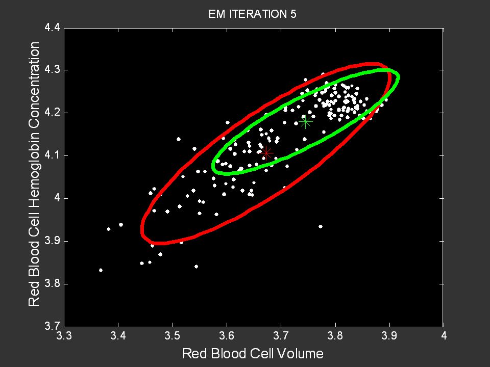
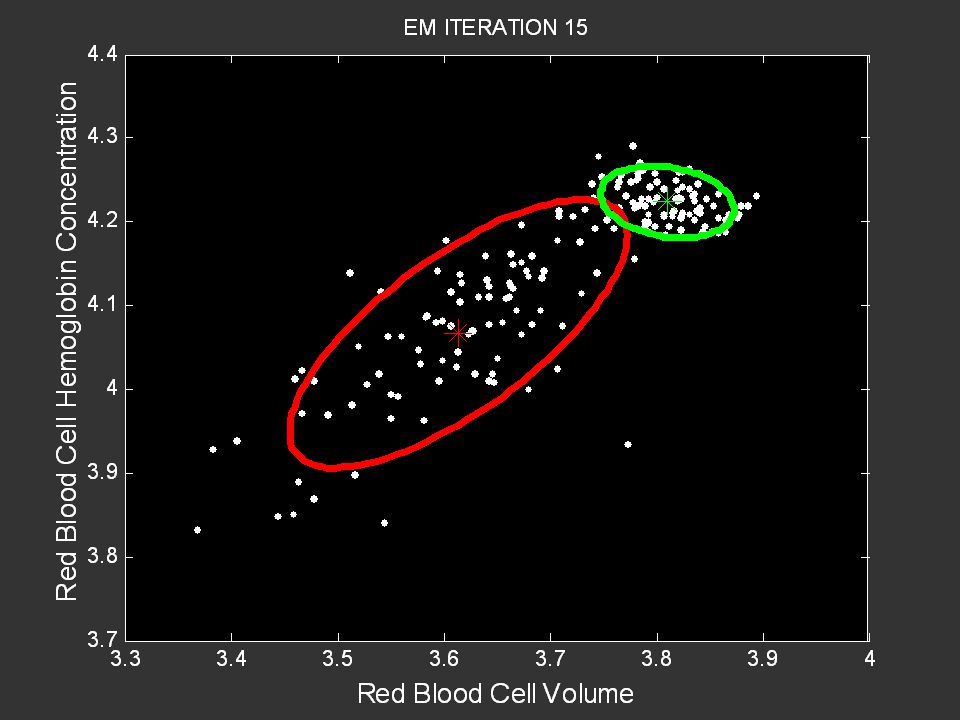
102
Probabilistic Clustering
Hypothesize that the data are being generated by a mixture of K multivariate probability density functions (e.g., Gaussians) Each density function is a cluster Data vectors have a probability of belonging to a cluster rather than 0-1 membership Clustering algorithm Learn the parameters (mean, covariance for Gaussians) of the K densities Learn the probability memberships for each input vector Can be solved with the Expectation-Maximization algorithm Can be thought of as a probabilistic version of K-means
 Each density function is a cluster. Data vectors have a probability of belonging to a cluster rather than 0-1 membership. Clustering algorithm. Learn the parameters (mean, covariance for Gaussians) of the K densities. Learn the probability memberships for each input vector. Can be solved with the Expectation-Maximization algorithm. Can be thought of as a probabilistic version of K-means.")
110
Control Group Anemia Group

111
Summary Many different approaches and algorithms
What type of cluster structure are you looking for? Computational complexity may be an issue for large n Data dimensionality can also be an issue Validation/selection of K is often an ill-posed problem

112
References: Data Sets and Case Studies
GEO Database Barrett et al, NCBI GEO: mining tens of millions of expression profiles – database and tools update, Nucl Acids Res. (2007) 35(suppl 1): D , doi: /nar/gkl887 Clustering expression data Eisen, Spellman, Brown, Botstein, Cluster analysis and display of genome-wide expression patterns, PNAS, Dec 2998, 95(25), Link:
 35(suppl 1): D , doi: /nar/gkl887. Clustering expression data. Eisen, Spellman, Brown, Botstein, Cluster analysis and display of genome-wide expression patterns, PNAS, Dec 2998, 95(25), Link:")
113
General References on Clustering
Cluster Analysis (5th ed), B. S. Everitt, S. Landau, M. Leese, and D. Stahl, Wiley, 2011 (broad overview of clustering methods and algorithms) Algorithms for Clustering Data, A. K. Jain and R. C. Dubes, 1988, Prentice Hall. (a bit outdated but has many useful ideas and references on clustering) How many clusters? which clustering method? answers via model-based cluster analysis, C. Fraley and A. E. Raftery, the Computer Journal, (good overview article on probabilistic model-based clustering)
, B. S. Everitt, S. Landau, M. Leese, and D. Stahl, Wiley, 2011 (broad overview of clustering methods and algorithms) Algorithms for Clustering Data, A. K. Jain and R. C. Dubes, 1988, Prentice Hall. (a bit outdated but has many useful ideas and references on clustering) How many clusters which clustering method answers via model-based cluster analysis, C. Fraley and A. E. Raftery, the Computer Journal, (good overview article on probabilistic model-based clustering)")
114
Exploratory Data Analysis
Dimension Reduction Methods

115
Class Projects Project proposal due Wednesday May 2nd
Final project report due Monday May 21st Details at We will discuss in more detail next week

116
Software Packages Commercial packages Free packages
SAS Statistica Many others – see kdnuggets.org Free packages Weka Programming environments R MATLAB (commercial) Python
 Python.")
117
Concepts in Multivariate Data Analysis

118
An Example of a Data Set 18261 92697 55 83 1 42356 19 -99 00219 90001
Patient ID Zipcode Age …. Test Score Diagnosis 18261 92697 55 83 1 42356 19 -99 00219 90001 35 77 83726 24351 65 ….. 12837 40 70 Notation: Columns may be called “measurements”, “variables”, “features”, “attributes”, “fields”, etc Rows may be individuals, entities, objects, samples, etc

119
Vectors and Data Beyond 3 dimensions we cannot manually see our data
Consider a data set of 10 measurements on 100 patients We can think of each patient’s data as a “tuple” with 10 elements If the variable values are numbers, we can represent this as a 10-dimensional vector e.g., x = ( x1, x2, x3, ……. , x9, x10 ) Our data set is now a set of such vectors We can imagine our data as “living” in a 10-dimensional space Each patient is represented as a vector, with a 10-dimensional location Sets of patients can be viewed as clouds of points in this 10d space
 Our data set is now a set of such vectors. We can imagine our data as living in a 10-dimensional space. Each patient is represented as a vector, with a 10-dimensional location. Sets of patients can be viewed as clouds of points in this 10d space.")
120
High-dimensional data
(David Scott, Multivariate Density Estimation, Wiley, 1992) Hypersphere in d dimensions Hypercube Volume of sphere relative to cube in d dimensions? Rel. Volume 0.79 ? ? ? ? ? Dimension
 Hypersphere. in d dimensions. Hypercube. Volume of sphere relative to cube in d dimensions Rel. Volume 0.79 Dimension")
121
High-dimensional data
(David Scott, Multivariate Density Estimation, Wiley, 1992) Hypersphere in d dimensions Hypercube Volume of sphere relative to cube in d dimensions? Rel. Volume Dimension
 Hypersphere. in d dimensions. Hypercube. Volume of sphere relative to cube in d dimensions Rel. Volume Dimension")
122
The Geometry of Data Geometric view: data set = set of vectors in a d-dimensional space This allows us to think of geometric constructs for data analysis, e.g., Distance between data points = distance between vectors Centroid = center of mass of a cloud of data points Density = relative density of points in a particular region of space Decision boundaries -> partition the space into regions (Note that not all types of data can be naturally represented geometrically)
")
123
Basic Concepts: Distance
D(x, y) = distance between 2 vectors x and y How should we define this? E.g., Euclidean distance Manhattan distance Jaccard distance And more….
 = distance between 2 vectors x and y. How should we define this E.g., Euclidean distance. Manhattan distance. Jaccard distance. And more….")
124
Basic Concepts: Center of Mass
What is the “center” of a set of data points Multidimensional mean Defined as: What happens if there is a “hole” in the center of the data?

125
Geometry of Data Analysis

126
Basic Concepts: Decision Boundaries
In 2 dimensions we can partition the 2d space into 2 regions using a line or a curve, e.g., In d-dimensions, we can defined a (d-1)dimensional hyperplane or hypersurface to partition the space into 2 pieces
dimensional hyperplane or hypersurface to partition the space into 2 pieces.")
127
Geometry of Data Analysis
Good boundary? Better boundary?

128
Example: Assigning Data Points to Two Exemplars
Say we have 2 exemplars, e.g., 1 data point that is the prototype of healthy patients 1 data point that is the prototype of non-healthy patients Now we want to assign all individuals to the closest prototype Lets use Euclidean distance as our measure of distance This is equivalent to having a decision boundary that lies exactly halfway between the two exemplar points The decision boundary is at right angles to the line between the two exemplars (see next slide for a 2-dimensional example)
")
129
Geometry of Data Analysis

130
Geometry of Data Analysis

131
High Dimensional Data Example: 100 dimensional data
Visualization is of limited value Although can still useful to look at variables 1 or 2 at a time “Curse of dimensionality” Hypercube/hypersphere example (Scott) Number of samples need for accurate density estimate in high-d Question How would you find outliers (if any) with 1000 data points in a 100 dimensional data space?
 Number of samples need for accurate density estimate in high-d. Question. How would you find outliers (if any) with 1000 data points in a 100 dimensional data space")
132
Clustering: Finding Group Structure

Similar presentations


>")


 Vipin Kumar Army High Performance.>")


.>")

