Download presentation
Presentation is loading. Please wait.

1
This is my “focus” slide, used to make sure that I’m getting the sharpest possible picture on the projection screen. It is the 1954 Freeway Plan for the City and County of San Francisco – viewers might note that it is not yet completely implemented.

2
Transportation and Transit For Scottsdale
Thomas A. Rubin, CPA, CMA, CMC, CIA, CGFM, CFM February 10, 2007

3
What to do About Scottsdale Road?
“First, do no harm.” Hippocrates, Epidemics This is not, as is commonly stated, from the Hippocratic Oath, either the “ancient” version or the “modern” one that is traditionally administered to new physicians. In the best known form, as shown above, it derives from the Latin translation of one of Hippocrates published works.

4
Scottsdale Road is a Unique Transportation Asset
Scottsdale is a very long and narrow city, with only a very few continuous N-S roads Scottsdale Road is by far the most important of these, with both the highest capacity and most key trip generators If ill-conceived transportation “improvements” reduce its carrying capacity, there are no fixes possible

5
Scottsdale Road is the Designated “High Capacity Transit Corridor”
Mode Options: Light Rail Transit (LRT) Bus Rapid Transit (BRT) “Modern” Streetcar Other options, including several that may have far greater potential benefits for Scottsdale, are not part of this study. These include vanpools, “rapid bus,” demand-responsive, point- and route-variation “rubber tire” transit service, and jitneys. Studying only high-capacity transit (which is a questionable use of the term, as “Modern” Streetcar is very difficult to justify as a high-capacity transit mode – is putting the cart before the horse – or, perhaps, putting the supplier (transit panning consultants, A/E firms, construction companies and suppliers) – before the riders and the taxpayers.
 Bus Rapid Transit (BRT) Modern Streetcar. Other options, including several that may have far greater potential benefits for Scottsdale, are not part of this study. These include vanpools, rapid bus, demand-responsive, point- and route-variation rubber tire transit service, and jitneys. Studying only high-capacity transit (which is a questionable use of the term, as Modern Streetcar is very difficult to justify as a high-capacity transit mode – is putting the cart before the horse – or, perhaps, putting the supplier (transit panning consultants, A/E firms, construction companies and suppliers) – before the riders and the taxpayers.")
6
Maricopa County “Transit Modal Splits”
Home-to-Work/Work-to-Home: Maricopa County % City of Phoenix % City of Scottsdale % Maricopa County w/o Phoenix 1.3% Even if transit share would triple, it would still be very minor – don’t mess what needs to be done on Scottsdale Road to carry people on the existing “rubber tire” modes. Source: Census Bureau, American Community Survey 2005. Note that total transit modal split is generally well under half of the home-to-work percentage.

7
Light Rail Transit What is now being constructed in Phoenix
Exclusive guideway for trains, either entire length or very close This may be exclusive lanes for trains or city streets or freeways, or separate right-of-way off street Stations generally approximately one mile apart

8
Light Rail Transit II Generally two-three car trains Operating speeds:
When street-running, normally street speed limit Exclusive ROW, generally 55 mph National average: approximately 17 mph Top “normal” LRT, ~ 24 mph Exception – LA Green Line, over 30 mph Exclusive lanes are vital to be able to operate two-three car trains, with each car commonly feet long. If light rail shared lanes with rubber tire vehicles, than whenever a light rail train had to stop for a red light, the extra length of even one small car would often mean that the intersection that the train had just gone through would be blocked by the train. There are blocks in the historic downtown core of Scottsdale that appear to be very questionable for light rail, even with dedicated lanes. Keep in mind that it is not the block length that is the measure, but the distance between the “limit lines” – the lines that are drawn before the painted crosswalks crossing the street in front of and behind the trains – that is important. For the 90-foot (nominal length) cars that Valley Transit is procuring, a two-car train requires 180 feet and a three-car train 270 feet. Even if there was no intention to operate three-car trains on Scottsdale Road, the shortened train consists would impose capacity reductions on trains that would start on the current line from downtown Phoenix and then branch to Scottsdale.
 cars that Valley Transit is procuring, a two-car train requires 180 feet and a three-car train 270 feet. Even if there was no intention to operate three-car trains on Scottsdale Road, the shortened train consists would impose capacity reductions on trains that would start on the current line from downtown Phoenix and then branch to Scottsdale.")
9
Light Rail Transit III Costs/Mile – Varies significantly, but from under $20 million to hundreds of millions per mile, with most in range of approximately $40-80 million Cost of Phoenix first line: $1, million for 19.6 miles $72 million/mile Safety issue – Grade crossings, particularly at speeds over 35 mph Source for Phoenix Cost and light data: U.S. Department of Transportation/Federal Transit Administration, Annual Report on New Starts – Proposed Allocations of Funds for Fiscal Year 2007, “Central Phoenix/East Valley Light Rail,” (November 2005). (Prepared by Valley Metro for FTA.) Generally, the costs per mile shown for projects of this type do not/may not include costs of items such as: System-wide transportation/transit plans and public relations campaigns The specific corridor plans for the project Capitalized interest during construction (under Generally Accepted Accounting Practices [GAAP], the net interest costs for borrowing to fund construction projects is a capital cost of that project up to the revenue operations date or other designed point) Interest expense on debt used for financing construction after the line goes into service (which, under GAAP, is not a capital cost of the project, but is most certainly a demand on system revenues for what is generally decades) Capital renewal and replacement costs, which can be high percentages of the initial capital cost over first two-three decades of service Costs borne by governmental entities other than the transit entity Costs not borne by public entities (for example, in some states, certain types of utility relocation costs are borne by the utility rate-payers and not reimbursed out of the transit project funding) Tax losses to various governmental entities from property taken off the tax rolls, real estate tax abatements, etc. Such unstated costs/revenue loses vary widely by project, but are generally at least 5-10% of the stated project costs. In a few extreme cases – such as the Los Angeles Green Line showing over $100 million for the costs of the rail cars to operate the service as a separate line item from the rail line proper – the unstated costs can approach or exceed 20% of the stated costs. Also, of course, cost overruns on such projects are hardly rare occurances.
. (Prepared by Valley Metro for FTA.) Generally, the costs per mile shown for projects of this type do not/may not include costs of items such as: System-wide transportation/transit plans and public relations campaigns. The specific corridor plans for the project. Capitalized interest during construction (under Generally Accepted Accounting Practices [GAAP], the net interest costs for borrowing to fund construction projects is a capital cost of that project up to the revenue operations date or other designed point) Interest expense on debt used for financing construction after the line goes into service (which, under GAAP, is not a capital cost of the project, but is most certainly a demand on system revenues for what is generally decades) Capital renewal and replacement costs, which can be high percentages of the initial capital cost over first two-three decades of service. Costs borne by governmental entities other than the transit entity. Costs not borne by public entities (for example, in some states, certain types of utility relocation costs are borne by the utility rate-payers and not reimbursed out of the transit project funding) Tax losses to various governmental entities from property taken off the tax rolls, real estate tax abatements, etc. Such unstated costs/revenue loses vary widely by project, but are generally at least 5-10% of the stated project costs. In a few extreme cases – such as the Los Angeles Green Line showing over $100 million for the costs of the rail cars to operate the service as a separate line item from the rail line proper – the unstated costs can approach or exceed 20% of the stated costs. Also, of course, cost overruns on such projects are hardly rare occurances.")
10
Bus Rapid Transit Most physical and operating characteristics generally similar to LRT, but with “rubber tire,” vice steel-on-steel, wheels/tires Speeds and carrying capacities roughly comparable to LRT Capital cost of BRT generally <50% of LRT, operating cost comparison varies but BRT generally lower You will commonly hear statements such as, “we’ll start with Rapid Bus in this corridor and, later, if the ridership grows, we’ll convert to light rail. This is difficult to understand – Rapid Bus and Light Rail have, pretty much, the same passenger capacity, assuming that both modes are properly designed and constructed as appropriate for the same corridor. The biggest problem with BRT is, when presenting a plan for BRT to transit interest groups in a corridor, there is a frequent response that, in essence, is “How come the people over there get a train and all we get is this stinkin’ bus?” (In other words, transportation issues and the biggest bang for the taxpayer buck may not be the driving considerations in such decisions.) For the Los Angeles Orange Line in San Fernando Valley, the total stated capital cost, including a short track addition and new station that was under construction before the original project opened, and the pedestrian/bicycle lane that was part of the project, was approximately $350 million for 13.7 miles, of which about one-half mile is actually not on a dedicated busway. This is approximately $27 million a mile. This cost reported by MTA, however, does not include the approximately $170 million that MTA paid (overpaid) for a very little used freight track over a decade previously, which MTA has intended to build a subway under. Including this cost in the total would bring the total cost per mile up to slightly under $40 million per mile, which is still well under half of what MTA is currently paying for light rail construction.
 For the Los Angeles Orange Line in San Fernando Valley, the total stated capital cost, including a short track addition and new station that was under construction before the original project opened, and the pedestrian/bicycle lane that was part of the project, was approximately $350 million for 13.7 miles, of which about one-half mile is actually not on a dedicated busway. This is approximately $27 million a mile. This cost reported by MTA, however, does not include the approximately $170 million that MTA paid (overpaid) for a very little used freight track over a decade previously, which MTA has intended to build a subway under. Including this cost in the total would bring the total cost per mile up to slightly under $40 million per mile, which is still well under half of what MTA is currently paying for light rail construction.")
11
Bus Rapid Transit II With BRT, unlike LRT, guideway buses can operate off the guideway, serving as their own feeder/distributors Safety concern – intersections, particularly with “ostridge” approach

12
Modern Streetcar Unlike LRT, streetcar tracks are in rubber tire traffic lanes on street – streetcars, cars, and trucks use same lanes Generally, stops every block or two Speeds – generally, 5-9 mph; capable of higher speeds where traffic allows and stops are further apart Fairly short, generally about five miles There are three limiting factors on Modern Streetcar speeds, compared to light rail. One is the vehicle itself – the Portland/Tacoma Skoda car, for example, is rated with a top operating speed of 47 mph, compared to 65 mph for most light rail vehicles. This makes a top operating speed much over 35 questionable. The second is the distance between stations – light rail averages about one mile, modern streetcar can be as short as every block or two. The more frequent the station stops, the lower the speed, all else equal. The third is the right-of-way (ROW)– some light rail lines have ROW off city streets, or on freeways, where 55 mph (or, in a few cases, even higher) speeds are possible. Even on city streets, light rail generally means coordinated traffic signals to quickly get trains between stations. It is rare to see modern streetcar anywhere but on city streets and the very frequent stops make traffic signal coordination difficult.
– some light rail lines have ROW off city streets, or on freeways, where 55 mph (or, in a few cases, even higher) speeds are possible. Even on city streets, light rail generally means coordinated traffic signals to quickly get trains between stations. It is rare to see modern streetcar anywhere but on city streets and the very frequent stops make traffic signal coordination difficult.")
13
Modern Streetcar II Generally, less frequent service (~10-15 minutes) than LRT or BRT Far lower overall carrying capacity Generally used as downtown circulator, not really usable as “main line” transit Capital costs vary widely, from as low as a under $1 million/mile (Kensoha) to ~$25 million per (one-way) mile (Tacoma) Tacoma Link is $89 million capital cost for 3.6 directional route miles $24.7 million/directional route mile.
 to ~$25 million per (one-way) mile (Tacoma) Tacoma Link is $89 million capital cost for 3.6 directional route miles $24.7 million/directional route mile.")
14
Impacts of Guideway Transit on Scottsdale Road
LRT and BRT both require approximately 26 feet for two lanes of straight track Station platforms require an additional 20 feet, with 10 foot station requirement possible with some compromises in station “quality” Intersections with left turn lanes can become very complex, particularly two-laners Many minor thru streets become “T’s” The “normal” added twenty feet for stations assumes either side or center stations that are pretty much opposite each other, which is the preference. To do ten foot stations, the normal configuration is to put the stations between the tracks with the station for one direction offset from the station in the other direction. This may mean that the stations for different directions are in different blocks. It also generally requires duplication of certain station amenities, such as ticket vending machines, closed circuit TT, etc. Streetcar stops are often incorporated with the sidewalks, which reduces the space required, but, unless the sidewalks were pretty wide to start with (unlike what we see in the core historic downtown of Scottsdale), then some additional width is either highly suggested or just about mandatory.
, then some additional width is either highly suggested or just about mandatory.")
15
Impacts of Guideway Transit on Scottsdale Road II
LRT and BRT generally require traffic signal cycle changes for best transit results Streetcar generally operates on same lanes as rubber tire vehicles, but there are many impacts due to slow speeds, frequent stops, turn requirements, and inability to get around obstacles such as collisions and power outages

16
What Would Guideway Transit Mean for Scottsdale Road
Potential LRT/BRT Impacts: Conversion of traffic lanes for exclusive light rail use Reallocations of traffic signal cycle time to transit Elimination of left turn lanes at some intersections, conversion of two-laners back to one-laners at others

17
What Would Guideway Transit Mean for Scottsdale Road II
Elimination of most/all of non-intersection left turn lanes, such as at shopping malls Elimination of street parking Conversion of most/all non-arterial street crossings into “T” intersections “No stopping” zones – no pick-ups, drop-offs LRT and Streetcar would have overhead “catenary” wires

18
What Would Guideway Transit Mean for Scottsdale Road III
In certain locations along the ROW, potentially: Wiping out every structure and parking lot on the East side of the street Wiping out every structure and parking lot on the West side of the street Wiping out every structure and parking lot on both sides of the street

19
What Would Guideway Transit Mean for Scottsdale Road IV
Modern Streetcar impacts would be less drastic: Modern Streetcar would likely operate for only a relatively short distance along Scottsdale Road because it really isn’t much of a transportation system Although it would probably not require traffic lane takes, there would be negative impacts on road capacity

20
What Would Guideway Transit Mean for Scottsdale Road V
For the core traditional downtown area, LRT/BRT would require so much street width that rubber tire traffic would be extremely limited – or entire blocks of existing structures would have to be removed The consideration of any of guideway transit option for this section of Scottsdale Road could lead to consideration of entire elimination of rubber tire traffic

21
Modern Streetcar is NOT a “Main Line” Transportation System
I took or computed annual passenger-miles for six streetcar systems that are either fully “modern” or similar in how they operate: Kenosha, Little Rock, Memphis, Portland, Tacoma, Tampa A four-mile stretch of six-lane Scottsdale Road carries about the same amount of passenger-miles in a day And none of these streetcars carry freight For five of these, data is National Transit Database for 2005: Kenosha, 68,209; Little Rock, 249,060; Memphis, 891,968; Tampa, 919,513; Tacoma, 982,233 Total, 3,110,983. NTDB data for Portland Streetcar not available because it is combined with Tri-Met light rail in report to FTA. Estimate is as follows: Daily Ridership = 8,500 (from Portland Streetcar web site, it has exceeded 8,500 in two months in 2006); average trip length is 1.5 miles (which is on the long side, compared to the other five). 8,500 x 1.5 x 365 = 4,653,750. This is almost certainly on the high side. Add them up, round up, this is 7.7 million passenger miles per year. Use four-mile stretch of Scottsdale Road because that is approximately length of streetcar systems. Figure six lanes, 600 vehicles per hour, average vehicle occupancy 1.1, average speed 20 mph, that’s 79,200 passenger miles per mile/hour of traffic. (These values are, on average, on the low side.) Divide the 7.7 million annual streetcar miles by the 79,200, and we’d need about 97 mile/hours. If we use a four-mile stretch, divide the 97 by four, and we have hours – about a day.
; average trip length is 1.5 miles (which is on the long side, compared to the other five). 8,500 x 1.5 x 365 = 4,653,750. This is almost certainly on the high side. Add them up, round up, this is 7.7 million passenger miles per year. Use four-mile stretch of Scottsdale Road because that is approximately length of streetcar systems. Figure six lanes, 600 vehicles per hour, average vehicle occupancy 1.1, average speed 20 mph, that’s 79,200 passenger miles per mile/hour of traffic. (These values are, on average, on the low side.) Divide the 7.7 million annual streetcar miles by the 79,200, and we’d need about 97 mile/hours. If we use a four-mile stretch, divide the 97 by four, and we have hours – about a day.")
22
Modern Streetcar Real Estate Development Stories
Little Rock – $1.2 billion in real estate development generated from $20 million investment in streetcar system Portland Streetcar – $2.28 billion from $89 million Tacoma – $1 billion from $89 million Tampa -- $1 billion from $56 million

23
Modern Streetcar Real Estate Development Stories II
City Development $ Daily Riders $/Rider Portland $2,280,000, ,500 $ 268,000 Tacoma 1,000,000, , ,000 Tampa 1,000,000, , ,000 Little Rock 1,200,000, ,800,000

24
Modern Streetcar Real Estate Development Stories III
What Can we Learn From This? A rooster crowing at dawn may believe that it is causing the sun to come up, but you shouldn’t be taking real estate investment advice from a rooster. … or a light rail/streetcar booster. Some of the “development” claims verge on the hilarious. In Portland, the $2.28 million includes $10 million for a project at a church – namely, an underground parking lot. Also in Portland, there is $142.2 million for projects at Portland State University, such as $30 million for a new Science classroom building and $47.5 million for a student dormitory. Unless there is demonstrable proof that this development is driven by the streetcar, the alternative rationale – that the University would be spending this money regardless of the existence of the streetcar – has a lot more credibility. In Dallas, a report commissioned by and for DART included several major new developments in the area of DART’s new light rail system, but somehow failed to mention at all the major expansion project of the North Central Freeway (US 75) – which added far more transportation capacity.
 – which added far more transportation capacity.")
25
Freeway “Level of Service” (LOS) Criteria
Level of Service Max Speed Max Service Flow A B ,200 C ,704 D ,080 E ,400 F < >2,400 (Above is for Free-Flow Speed, which has nothing to do with the speed limit, of 75 mph.) We’ll be using the transportation engineering concept of “level of service,” so let’s spend a few minutes on it now. There are LOS tables for just about every transportation use, from freeway lanes – which are the best known – to signalized intersections to transit service. Free-flow speed is LOS, the speed that traffic will flow in conditions where the number of vehicles on the road and the utilized capacity are not limiting factors. LOS is actually determined by the percentage of the road, or other transportation system element, capacity that is utilized. The speed is what results when the LOS lettered grade of capacity is reached. As a general rule, for roads, each reduction of a grade from A down reduces the speed by about 5% – LOS “D” is three levels down from LOS “A,” so it is about 15% slower, although, as you can see from this schedule, the 5% rule is only an approximation. In this schedule, note that the Maximum Service Flow is defined by passenger car equivalents, or “pc.” For example, on a straight and level freeway, a truck of bus is rated at 1.5 “pc,” but on a 6% grade – the highest for an Interstate Highway – of one mile or longer, it is rated at 15. LOS “E” is the highest capacity, and the slowest travel speed, before the breakdown into stop-and-go. Very frequently, what might appear to be a minor factor is sufficient to cause an LOS “E” condition to go to “F” – things like a hill, a sharp term, an inadequately planned or designed on- or off-ramp, or even the sun coming up at the wrong place certain days each year.
 We’ll be using the transportation engineering concept of level of service, so let’s spend a few minutes on it now. There are LOS tables for just about every transportation use, from freeway lanes – which are the best known – to signalized intersections to transit service. Free-flow speed is LOS, the speed that traffic will flow in conditions where the number of vehicles on the road and the utilized capacity are not limiting factors. LOS is actually determined by the percentage of the road, or other transportation system element, capacity that is utilized. The speed is what results when the LOS lettered grade of capacity is reached. As a general rule, for roads, each reduction of a grade from A down reduces the speed by about 5% – LOS D is three levels down from LOS A, so it is about 15% slower, although, as you can see from this schedule, the 5% rule is only an approximation. In this schedule, note that the Maximum Service Flow is defined by passenger car equivalents, or pc. For example, on a straight and level freeway, a truck of bus is rated at 1.5 pc, but on a 6% grade – the highest for an Interstate Highway – of one mile or longer, it is rated at 15. LOS E is the highest capacity, and the slowest travel speed, before the breakdown into stop-and-go. Very frequently, what might appear to be a minor factor is sufficient to cause an LOS E condition to go to F – things like a hill, a sharp term, an inadequately planned or designed on- or off-ramp, or even the sun coming up at the wrong place certain days each year.")
26
Reason Foundation Galvin Mobility Project
A series of professional papers on mobility First ones have been published, available at: Many more now in works I’m doing one on the relationship between transit and traffic congestion

27
Interim Report I had my associate do the analysis for two UZA’s to test the data Figured, what-the-heck, do the regressions and see what we get Overall expectation? Not much connection – congestion is basically a supply-and-demand thing and transit is just a small percentage of total transportation in most UZA’s. So, here’s the results – for Portland, Oregon

28
(May I have a drum roll, please?)
")
29
Passenger-Miles are for all the transit systems in the greater Portland area, from National Transit Database. “TTI” is the Texas Transportation Institute (Texas A&M) Travel Time Index, which is the ratio of (travel time at peak periods):(travel time at mid-day). Although not prefect, it is the generally accepted metric for congestion.
 Travel Time Index, which is the ratio of (travel time at peak periods):(travel time at mid-day). Although not prefect, it is the generally accepted metric for congestion.")
30
THERE YOU HAVE IT FOLKS: PROOF POSITIVE THAT TRANSIT CAUSES CONGESTION

31
not

32
Well, Why Not? Rule 1: “Correlation is not causation.”
20 data points for one UZA is just a bit thin for drawing this type of conclusion. Most important, what possible direct causation could there be between, all else equal, an increase in transit usage – presumably, taking vehicles off the streets – and congestion getting worse?

33
But, All Else Isn’t Equal in Portland
First Portland Light Rail Line was largely funded with Federal “Interstate Transfer” funds – Portland (or, more properly, the Mayor of Portland, with assistance from other officials) decided to give up an urban Interstate that had already been approved and funded to build this line. An urban freeway has several times more “transportation work” capacity than any light rail line
 decided to give up an urban Interstate that had already been approved and funded to build this line. An urban freeway has several times more transportation work capacity than any light rail line.")
34
But, All Else Isn’t Equal in Portland II
Building this light rail line required taking out a pre-existing HOV lane from a freeway that had higher transportation work values than the light rail line Building light rail on surface streets has reduced road capacity on these arterials and made crossing movements more difficult

35
But, All Else Isn’t Equal in Portland III
Portland (Metro, Tri-Met, State, et al) have largely decided to not implement road capacity improvements – as demand increases Portland et al have adopted LOS “F” as the official target – while this is the result in many UZA’s, at least the others are officially trying to do better, not worse
 have largely decided to not implement road capacity improvements – as demand increases. Portland et al have adopted LOS F as the official target – while this is the result in many UZA’s, at least the others are officially trying to do better, not worse.")
36
So, can transit actually cause congestion to increase
So, can transit actually cause congestion to increase? No, not by itself. But, as a component of an officially adopted program of “interesting” transportation decisions, a case can be made.

37
Measurement Metrics Number of Lanes or Tracks x
Vehicles or Trains per Hour per Lane/Track x Vehicles per Train x Passengers per Vehicle = PASSENGERS PASS A POINT x Speed = TRANSPORTATION WORK (Passenger Miles Index)
")
38
How to “Tilt” a Modal Comparison
There are many different methodologies, and variations, for comparisons Almost all are valid, and useful – when properly utilized by people who know what they are doing It is very easy to misuse metrics to make them appear to show that your desired result, your modal selection, is the “right” one WATCH OUT FOR PEOPLE WHO PLAY GAMES WITH DATA AND METHODS

39
How to “Tilt” a Modal Comparison II
To make your favored mode look better, show: Road………..…. …………….…Rail………..…..… Location Entire Metro Area Length Peak Load Point Time Frame All Day Peak Hour Metric Transportation Work Passengers Past a Point Methodology Actual Theoretical f/Rail, Actual f/Road Freight Include Exclude

40
Examples of What to Watch Out For
Cynthia Sullivan, Chair, (Seattle) Central Link (light rail system) Oversight Committee, “When this system is up and running, Northgate to SeaTac, in 2020, it will carry as many people every day as I-5 does today.” Center for Transportation Excellence: “It would take a twelve lane freeway going in one direction to equate the same amount of capacity of one light rail line.”
 Central Link (light rail system) Oversight Committee, When this system is up and running, Northgate to SeaTac, in 2020, it will carry as many people every day as I-5 does today. Center for Transportation Excellence: It would take a twelve lane freeway going in one direction to equate the same amount of capacity of one light rail line.")
41
Credit Jim MacIsaac, P.E., who meticulously researched the on’s, off’s, and thru traffic for this entire length of I-5. The “blue” is I-5 – which is approximately 12 lanes near Seattle CBD. “Red” is the ultimate expected “Central Link” build-out, the ridership projections, not actual. “Orange” is the same for the first segment, now in construction. The Central Link project will have more carrying capacity than any other modern light rail line, being designed to operate four-car trains at relatively short headways on a guideway that is exclusive for much of its length – and, even if the proponent’s projections prove correct, it still won’t carry, in 2020, 25% of what I-5 is carrying today.

42
Passenger Carrying Capacity Modal Comparisons
..L.A. Blue Line.. ……..CFTE....…. Peak Peak El Monte/ NY Port Light …Real World…. Load Trip Busway Authority LOS “E” ..Rail.. LOS “E” LOS “F” .Point. ..Ave.. HOV Lane Bus Term Trains/Hour Cars/Train Cars/Hour 2, , , , Occupancy Passengers ,187- Past a Point 2,500 15, , , , , , ,685 Speed Transportation Work Index 113,850 60,375 37,500 56, ,166 “E” Index “F” Index LA Blue Line is the most utilized light rail line in U.S. – and it can’t hit capacity of one freeway lane under the most expansive assumptions. (Note: there are light rail systems, such as the MBTA Green Line in Boston and San Francisco Muni Metro, that have subways under the central business district where several lines merge. This are not light rail lines, but systems, and are not included in what I am comparing the LA Blue Line to.) The CFTE freeway lane factors are a bit off from what I would use, but, within the reasonable range. Their light rail trains/hour and cars/train numbers simply do not exist in the U.S. 20 trains/hour is a train every three minutes; there is no light rail line that operates three-minute, or even four-minute, headways; it would simply screw up the cross-traffic too much with a train coming through intersections up to forty times per hour (20 in each direction), every minute-and-one-half. (Note: Again, I am discussing individual light rail lines, not what is know as a “pre-Metro” configuration like Muni Metro.) Five-minute headways, twelve trains an hour, is the maximum currently operated in the U.S., and many light rail lines have longer headways. There are no six-car light rail trains in the U.S., nor five-car, nor very many four-car, and even these are exceptions. For years, Sacramento Regional Transit’s first light rail line, through the downtown, was designed and built as a “single-track” system in some key sections, which limited the headways to fifteen minutes. To compensate for this, Sac RT spent decades, and a lot of money, to complete double tracking this line so that it could run shorter headways with shorter trains. Service on the Sound Transit (Seattle) Central link, now in construction, is planned to be four-car trains at some future point in time. However, assuming a 90-foot car length (most light rail cars are between 80 and 96 feet long), a four-car train would be 360 feet long, too long for many city blocks, particularly in central business districts, and a six-car train would be 540 feet long – more than a tenth of a mile.
 The CFTE freeway lane factors are a bit off from what I would use, but, within the reasonable range. Their light rail trains/hour and cars/train numbers simply do not exist in the U.S. 20 trains/hour is a train every three minutes; there is no light rail line that operates three-minute, or even four-minute, headways; it would simply screw up the cross-traffic too much with a train coming through intersections up to forty times per hour (20 in each direction), every minute-and-one-half. (Note: Again, I am discussing individual light rail lines, not what is know as a pre-Metro configuration like Muni Metro.) Five-minute headways, twelve trains an hour, is the maximum currently operated in the U.S., and many light rail lines have longer headways. There are no six-car light rail trains in the U.S., nor five-car, nor very many four-car, and even these are exceptions. For years, Sacramento Regional Transit’s first light rail line, through the downtown, was designed and built as a single-track system in some key sections, which limited the headways to fifteen minutes. To compensate for this, Sac RT spent decades, and a lot of money, to complete double tracking this line so that it could run shorter headways with shorter trains. Service on the Sound Transit (Seattle) Central link, now in construction, is planned to be four-car trains at some future point in time. However, assuming a 90-foot car length (most light rail cars are between 80 and 96 feet long), a four-car train would be 360 feet long, too long for many city blocks, particularly in central business districts, and a six-car train would be 540 feet long – more than a tenth of a mile.")
43
Vehicle Carrying Capacity
The number of persons in a vehicle is key to carrying capacity. The Kinkisharyo light rail vehicle selected for Phoenix light rail are described on the Valley Metro web site as, “have a capacity of 200.” The Skoda “modern streetcar” used in Portland and Tacoma is shown with a maximum load of 140. Yes, you can get this many people in each car – but, would anyone really want to be one of these people? Do the “Square Meter” demonstration, with three-four standees to show a “scheduled” load (if you start getting past three standees per square meter, passengers begin to be delayed in accessing doors, which slows down dwell times, so most transit operators prefer to keep peak loads under this factor at peak load point, if they can. Eight standees per square meter is “crush” load – and hardly the type of service that is going to attract people out of their cars.

44
Cost Metrics Federal Transit Administration Financial Capacity Analysis: 1. Is there funding to operate existing transit system? 2. Is there funding for capital renewal and replacement of existing transit system? 3. If answers to 1. and 2. are yes, then, and only then, is there funding to construct and operate the proposed system expansion?

45
FTA 49 USC 5309 “New Start” Tests
The “new” metric is “Incremental Cost Divided by Transportation System User Benefit.” “Incremental Cost” is calculated in accordance with detailed procedures. “Transportation System User Benefit” is expressed in “time equivalent units,” which is basically travel hours saved. The “old” metric, which is still reported, is “Incremental Cost per Incremental Passenger,” aka “Cost per New Passenger.”

46
Annualized Project Cost
Simplified, the “Cost” for old and new metrics is: Annualized Capital Cost + Annual Operating Cost + Other Cost Changes (such as savings in operating costs for pre-existing transit lines) = Annual Cost (usually, 20 years out) “Annualized Capital Cost” spreads original capital costs of assets over their specified useful lives.
 = Annual Cost (usually, 20 years out) Annualized Capital Cost spreads original capital costs of assets over their specified useful lives.")
47
Annualized Capital Cost
Asset Type Useful Lives Factor 40-foot Bus years Pavement years Rail Cars years Track, Electric, Structures years Land years “Factors” math is the same as for a 7% mortgage for the designated number of years of life.

48
Benefits “User Benefits” and “New Passengers” are outputs of transportation planning models, which must be approved by FTA. “Cost per New Passenger” was implemented because Feds believed the same riders were being shifted to more expensive transit modes, for no real transportation benefit. Change was made to “new” metric because opponents of many “new starts” projects were use “cost per new passenger” values to show it would be cheaper to least each new rider a car – often a luxury car. If you figure $20 cost per new rider – and many projects that have been funded have not done this well – then, multiply by two for round-trip and 255 for the number of working weekdays in a year, and you get $10,200 per year – which will pay for the annual costs of many small cars. Note that this calculation does include the costs of the vehicle replacement for many years out – say, 30 or so, about the life expectancy of the rail system without major renewal and replacement. It also includes the cost of the roadway, because the per gallon fuel charges (Federal: $ state, varies widely, but often close to the Federal, plus sales tax on fuel, which most of the larger states have) go for road maintenance and expansion.
 go for road maintenance and expansion.")
49
Example of Cost/New Passenger Confusion
“Frankly, light rail is very expensive. With respect to virtually all new systems, it would have been less expensive to lease each new commuter a car in perpetuity – in some cases, a luxury car, such as a Jaguar XJ8 or a BMW 740i.” – Wendell Cox, 2000 “This one is a real howler. To put it into perspective, a new BMW 740i goes for $62,900. APTA estimates that approximately 13,000,000 people use transit on a typical weekday. 13,000,000 times $62,900 would be $817.7 billion – almost half of the annual federal budget.” Paul M. Wyerich and William S. Lind

50
This response is extremely disquieting – while the difference between “cost per passenger” and “cost per new passenger” may not be readily apparent to lay persons, for people who are set forward as experts by the primary public transit industry association in the U.S. to not understand the distinction is somewhat akin to listening to a sermon by a priest who has never heard of the Ten Commandments. And then for that industry association to actually publish this comment under its own name, …

51
The Role of Transportation Modeling
Transportation Modeling, as performed for purposes including “new starts” projects refinement and analysis, is a highly complex process that can be almost impossible for lay persons, or even decision-makers, to understand. The “cost per user benefit” metric, and even the older “cost per new passenger” metric, are also often very difficult for even some people who should know better to comprehend.

52
The State of the Art in Transportation Modeling
Not good. Following are from a presentation the 2004 Transportation Research Board Annual Meeting, by James Ryan, FTA Deputy Associate Administrator for Planning, who was, in essence, the FTA “chief modeling techie.”

53
Results from the 1990 Assessment of Ridership Forecasts

54
Results from the Updated Assessment of Ridership Forecasts
Well, better, but eight of the 19 were 50% or more low and three more were at least 24% low.

55
This is the history of ridership projections for the Los Angeles “Red Line,” a 15.9 mile subway system from Union Station near downtown Los Angels to North Hollywood in the San Fernando Valley. The original 1983 projection, the one that was used to “sell” the project to the funding bodies, was 376,000 riders a day, in the year 2000. After some very strange events I won’t bore you with, the Red Line was given a new alignment and, in 1989, a new ridership projection – 298,000 in the year Of these, 38,000 were for the last segment to be constructed, the final leg to North Hollywood. Once the line opened, MTA quickly realized that the ridership was far below expectations. In April of 1999, prior to the opening of the second to last leg, to Hollywood and Vine, MTA projected ridership of 125,000 – for the year 2000 – including 45,000 on the last leg. The line opened and actual ridership to Hollywood and Vine was very steady around 60,000. In March of 2000, prior to the opening of the final leg, MTA projected 100,000 riders a day, under the assumption that the express bus lines from the Valley, which were direct competitors with the Red Line, would not be cancelled. In May of 2000, in its annual budget, MTA projected 80,000 daily – after the express lines were cancelled. The line opened to North Hollywood in July 2000, with somewhat under 120,000 riders opening month – and MTA immediately issued delighted reports that ridership had exceeded expectations. After reporting 132,400 average daily riders in 2002, MTA discovered that it had been using an improper passenger counting methodology – and, under the revised counting plan, reported 95,100 daily riders for 2003. By the way, the 1983 and 1989 ridership projections were done assuming a “zone fare” system, with the longest rides having cash fares slightly over twice that of short rides. The actual fare that was implemented was a “flat” fare, the same regardless of trip length – which may explain why the only portion of the line to reach its ridership projections was trips to/from North Hollywood and the second most distant station from downtown.

56
Other Problems with Plans
Case Study – Los Angeles County Metropolitan Transportation Authority Bus Rapid Transit “Orange Line” The entire “transportation” reason for a $325+ Million, 13-mile Guideway Bus Rapid Transit, instead of Rapid Bus – which does not have any exclusive/ semi exclusive guideway and would have cost <$500,000 per mile– was to save run time. Or was it?

57
The Los Angeles powers-that-be decided that BRT was what the Valley needed and the MTA planners and consultants then set out to justify that decision. The logical alternative to BRT in the Valley was what MTA pioneered in the U.S., “Rapid Bus” or “Metro Rapid” (MTA has announced that it is now using the service mark, and should be referred to, as “Metro” – but they are not fooling anybody), aka “Enhanced Bus.” Unlike BRT, Rapid Bus does not have dedicated lanes, but it does have a limited number of stops – generally approximately one per mile – generally has limited traffic signal preference, which speeds it through traffic signals, and other simple, low cost devices to help increase speed. When MTA implemented Rapid Bus service on Wilshire Blvd., bus speed increased by 25% and ridership increased by over 40% – and over two-thirds of the increase was either trips taken by people who had never used transit before or former transit riders who were making additional trips. MTA did not want to compare BRT in the Valley – what later became known as the “Orange Line” – to Rapid Bus, at least, not to “good” Rapid Bus. In the Draft EIS/EIR, MTA showed that BRT would make the end-to-end trip from North Hollywood to Warner Center in 28.8 minutes and that Rapid Bus would take 50 minutes. Many people – myself included – found this incredulous from the start. Detailed review showed that: (1) The BRT speed of 29 mph was only slightly slower than the Red Line speed of 30 mph, but the Red Line has a 75 mph top speed to 55 mph for the Orange Line, the Red Line trains accelerate faster, and the Red Line has no at-grade intersections at all. In addition, the speed used to calculate the Orange Line travel times exceeded what MTA had agreed to limit its buses to going through certain neighborhoods. As it turned out, although the DESI/DEIR was very specific that the Rapid Bus alignment was North Hollywood-Warner Center, MTA was actually showing the travel time for Universal City-Warner Center, the second Rapid Bus line it had implemented, which was over a mile longer than the North Hollywood-Warner Center route, on a road with far traffic and traffic signals, and a slower speed limit – and MTA’s schedule showed a 45-minute travel time on this route for this Rapid Bus Line during peak hours. MTA was also shown that the scheduled bus travel time between North Hollywood and Warner Center for regular (non-Rapid) bus was 50 minutes and, presumably, Rapid Bus would be faster than non-Rapid Bus in this corridor. When challenged on all the above, MTA did make some changes to the BRT travel time when it issued the FEIR, but not because of any of the above reasons. However, MTA has assumed that BRT buses would get almost total traffic signal pre-emption – which the City of Los Angeles DOT had consistently informed it that it would never get. So, MTA published a minute travel time for BRT, the former if it did, somehow, someday, get the traffic signal pre-emption it wanted, the 40 minutes if it didn’t. MTA made no change to the 50 minute Rapid Bus travel time, reasoning that, because it had no intention of operating Rapid Bus between North Hollywood and Warner Center, the valid comparison for BRT on this alignment was Rapid Bus between Universal City and Warner Center – and the time was 50 minutes by actual MTA measurement, never mind what the MTA schedule said. We challenged the FEIR in court and won, forcing MTA to compare the BRT to a network of Rapid Bus lines. MTA then got extremely imaginative in designing and modeling what may have been the three worst Rapid Bus systems ever developed. In the revised EIR’s, draft and final, MTA made no change to the BRT travel times, but did reduce the Rapid bus travel times to a range of 41.7 to minutes. After extensive comments on MTA ”errors” and logic flaws in this calculation (such as routing the Rapid Bus line from Warner Center to North Hollywood in the opposite direction of North Hollywood for no reason), MTA finally reduced the Rapid Bus running time to a range of 34.4 to 38.7 minutes – thereby showing the Rapid Bus line as faster than BRT. Unfortunately, MTA made this change by an “errata” posting on its web site late on the Friday before the Monday morning MTA Board meeting when the final action to readopt the Orange Line BRT was made. There was no announcement of any type, the only way to find this was to drill down several layers through the MTA web site and then be curious enough to click the errata tab to see what might be there. Before the Orange Line opened, it quickly became apparent that even the 40-minute end-to-end run time was impossible, and MTA originally showed a 42 minute end-to-end schedule time. When even this proved too fast, MTA later changed the schedule to 44 minutes – or 53% longer than the original 28.8 minute run time that was the entire justification for building this line.
, aka Enhanced Bus. Unlike BRT, Rapid Bus does not have dedicated lanes, but it does have a limited number of stops – generally approximately one per mile – generally has limited traffic signal preference, which speeds it through traffic signals, and other simple, low cost devices to help increase speed. When MTA implemented Rapid Bus service on Wilshire Blvd., bus speed increased by 25% and ridership increased by over 40% – and over two-thirds of the increase was either trips taken by people who had never used transit before or former transit riders who were making additional trips. MTA did not want to compare BRT in the Valley – what later became known as the Orange Line – to Rapid Bus, at least, not to good Rapid Bus. In the Draft EIS/EIR, MTA showed that BRT would make the end-to-end trip from North Hollywood to Warner Center in 28.8 minutes and that Rapid Bus would take 50 minutes. Many people – myself included – found this incredulous from the start. Detailed review showed that: (1) The BRT speed of 29 mph was only slightly slower than the Red Line speed of 30 mph, but the Red Line has a 75 mph top speed to 55 mph for the Orange Line, the Red Line trains accelerate faster, and the Red Line has no at-grade intersections at all. In addition, the speed used to calculate the Orange Line travel times exceeded what MTA had agreed to limit its buses to going through certain neighborhoods. As it turned out, although the DESI/DEIR was very specific that the Rapid Bus alignment was North Hollywood-Warner Center, MTA was actually showing the travel time for Universal City-Warner Center, the second Rapid Bus line it had implemented, which was over a mile longer than the North Hollywood-Warner Center route, on a road with far traffic and traffic signals, and a slower speed limit – and MTA’s schedule showed a 45-minute travel time on this route for this Rapid Bus Line during peak hours. MTA was also shown that the scheduled bus travel time between North Hollywood and Warner Center for regular (non-Rapid) bus was 50 minutes and, presumably, Rapid Bus would be faster than non-Rapid Bus in this corridor. When challenged on all the above, MTA did make some changes to the BRT travel time when it issued the FEIR, but not because of any of the above reasons. However, MTA has assumed that BRT buses would get almost total traffic signal pre-emption – which the City of Los Angeles DOT had consistently informed it that it would never get. So, MTA published a minute travel time for BRT, the former if it did, somehow, someday, get the traffic signal pre-emption it wanted, the 40 minutes if it didn’t. MTA made no change to the 50 minute Rapid Bus travel time, reasoning that, because it had no intention of operating Rapid Bus between North Hollywood and Warner Center, the valid comparison for BRT on this alignment was Rapid Bus between Universal City and Warner Center – and the time was 50 minutes by actual MTA measurement, never mind what the MTA schedule said. We challenged the FEIR in court and won, forcing MTA to compare the BRT to a network of Rapid Bus lines. MTA then got extremely imaginative in designing and modeling what may have been the three worst Rapid Bus systems ever developed. In the revised EIR’s, draft and final, MTA made no change to the BRT travel times, but did reduce the Rapid bus travel times to a range of 41.7 to minutes. After extensive comments on MTA errors and logic flaws in this calculation (such as routing the Rapid Bus line from Warner Center to North Hollywood in the opposite direction of North Hollywood for no reason), MTA finally reduced the Rapid Bus running time to a range of 34.4 to 38.7 minutes – thereby showing the Rapid Bus line as faster than BRT. Unfortunately, MTA made this change by an errata posting on its web site late on the Friday before the Monday morning MTA Board meeting when the final action to readopt the Orange Line BRT was made. There was no announcement of any type, the only way to find this was to drill down several layers through the MTA web site and then be curious enough to click the errata tab to see what might be there. Before the Orange Line opened, it quickly became apparent that even the 40-minute end-to-end run time was impossible, and MTA originally showed a 42 minute end-to-end schedule time. When even this proved too fast, MTA later changed the schedule to 44 minutes – or 53% longer than the original 28.8 minute run time that was the entire justification for building this line.")
58
Problems with Construction Cost Projections
There have been many cases of very significant cost overruns on transit guideway projects. While, in recent years, the cost increases following the execution of a “Full Funding Grant Agreement” between the Federal government and the grantee, have been moderated greatly (but not completely), there have still been major problems with increases between the first and most important decision point – which is usually when the voters are asked to approve a tax for transit facility construction – and the ultimate construction cost. The following page shows one of the most massive such cost increases for a transit guideway.
, there have still been major problems with increases between the first and most important decision point – which is usually when the voters are asked to approve a tax for transit facility construction – and the ultimate construction cost. The following page shows one of the most massive such cost increases for a transit guideway.")
59
From the first informal cost estimate of $125 million provided to the (then) U.S. Urban Mass Transportation Administration to the final actual cost of in excess of $1 billion, there was an eight-times cost increase. The Los Angeles Green Line, which went from an original estimate of $178 million to approximately $1 billion, appears to have nailed down second place in this competition.

60
What are the Costs – and Impacts – of Attempting to Increase Transit Ridership by Alternative Means?
Over the past 25 years, Los Angeles has been a huge case study re the impact of radically different transit investment programs. From FY82-FY85, a program of rolling back the then 85¢ cash fare to 50¢ produced a 40+% ridership increase in three years, by far the most successful such demonstration in modern American transit history. Over the next 11 years, to FY96, the fare were increased back to 85¢, then to $1.10, and finally to $1.35, as over 60% of the MTA transit subsidies went for rail construction and operations – and ridership fell.

61
What are the Costs – and Impacts – of Attempting to Increase Transit Ridership by Alternative Means (concluded)? At the end of December, 1996, MTA entered into a Consent Decree to settle a Federal Title VI (discrimination in the utilization of Federal Funds) lawsuit, requiring it to drop the price of monthly passes back to $42, add bus service to relieve the most overcrowded buses of any major U.S. city, and add new routes. Ridership rose quickly and substantially, despite MTA efforts to fight the implementation of what it had agreed to do all the way to the U.S. Supreme Court – and losing in every one of the seven decisions along the way.
 lawsuit, requiring it to drop the price of monthly passes back to $42, add bus service to relieve the most overcrowded buses of any major U.S. city, and add new routes. Ridership rose quickly and substantially, despite MTA efforts to fight the implementation of what it had agreed to do all the way to the U.S. Supreme Court – and losing in every one of the seven decisions along the way.")
62
From 1982 to 1985, as required by the passage of Proposition A (LA’s first one-half cent sales tax) in 1980, the bus fares were reduced from $.85 (1982) to $.50 – and ridership increased over 40% in three years, and was still going up in the last quarter of the third year. At this point, following what was, without any question, the greatest ridership growth demonstration in U.S. transit since WWII, the then-Los Angeles County Transportation Commission decided – OK, that appeared to work fairly well, so, let’s cancel that and try something else. Over the next eleven years, as the fare increased from $.50 to $1.35, ridership dropped 27%, at a time when the low-income minority population of Los Angeles was skyrocketing. In 1996, the Consent Decree was entered. Over the next six years, ridership increased an average of 13+ million each year. When compared to the 12+ million per year rate of loss of the prior eleven years, this was a turn around of 152 million riders a year – equal to the seventh largest transit system in the U.S.

63
The majority of the increase was in bus ridership – which was even more amazing considering that, during this period, MTA opened several rail extensions, which got most of their ridership from former bus passengers.

64
The “Efficient Frontier”
Before beginning a search for new solutions, first see how your are doing now. The following graph shows subsidy per passenger and subsidy per passenger-mile for the 24 largest bus operators in the U.S. The next one shows the cost per new boarding (not rider) for the main MTA guideway transit lines and for bus.
 for the main MTA guideway transit lines and for bus.")
65
Note the three agencies connected by the lines at lower left – these three, MTA-HC in Houston, MTA in Los Angeles, and the New York City Transit Authority were the best; no agency beat any of them on both of these measures. This should be taken as evidence that, if something were to be changed in transit in these cities, consideration should be given to expansion of bus services. This is not a slam dunk, automatic decision, but, when you are doing this good, expansion should be kept in mind as an option.

66
MTA, of course, has never seen it this way
MTA, of course, has never seen it this way. MTA believes that rail is the answer (no one is quite sure what the question is), which is why it feels that spending over 20 times the subsidy per new rider of the Consent Decree bus improvements to gain a new rail rider is a good idea.
, which is why it feels that spending over 20 times the subsidy per new rider of the Consent Decree bus improvements to gain a new rail rider is a good idea.")
67
Answer: A failed syllogism.
If Light Rail and Other Expensive Guideway Transit Projects Produce Such Negative Results, Than Why Are So Many Areas So Interested In Them? Answer: A failed syllogism. You remember syllogisms, from high school or college – if A, then B; if B, then C; therefore, if A, then C?

68
The Failed Syllogism If we do nothing, things will get worse.
Building rail is doing something. Therefore, we must build rail. Technically, this is a class logic error called, “denying the antecedent.” Like a lot of things in transportation decision-make, perhaps the best way to explain this is through some really, really, really bad romantic poetry.

69
Really, Really, Really Bad Romantic Poetry
If I had forever, my darling, I could convince you of my love. But, my darling, I must be off to battle in the morning, so we do not have forever. Since we may never have tomorrow, let us reap the glory of our love tonight. (This, by the way, never worked for me when I was shipping out to Vietnam.)
")
70
Edited Version If I had enough time, I could convince you to do it.
Let’s take a very well-deserved blue pencil to that piece of literary trash and reduce it to its essential elements.

71
Edited Version (continued)
If I had enough time, I could convince you to do it. I don’t have enough time.

72
Edited Version (concluded)
If I had enough time, I could convince you to do it. I don’t have enough time. Therefore, let’s do it. This is the type of logic that you warn your daughters about. Take heed, because, if you fall for this type of logic, for love or for love of light rail – well, then, someone is going to get screwed.

73
Cost and Related Considerations
Will it Work? Is it the Best Option? Can we Afford to Build it? Can we Afford to Operate it? Will it Negatively Impact Other Transportation System Components? Schedule – How Long to Get It Going? Risk – Financial, Political, Technical, Management? It is not enough to be “doing something” about a transportation problem; what we are looking for is something that works, is worth doing, and is the best available option, after consideration of risk factors.

74
How Much Should Light Rail Cost?
“In most cases, Light Rail should not cost more than $20 million per mile.” Weyrich/Lind, page 42 Let’s have some more fun with two of my favorite authors on rail subjects. Let’s test this hypothesis against the actual light rail projects that were proposed to the Federal Transit Administration in the year that this statement was made.

75
Yeah, I guess, it is possible to come in under $20 million a mile.
The one is Little Rock is not really light rail, it is the streetcar system we were talking about, and it actually came in at $20 million for 2.4 miles, which is $8.33 million a mile, and those were one-way miles, so double it to get $16.67 million a mile. Baltimore was a rebuild job, not a new line, and the Saint Louis extension was, literally, run through corn fields. There are a couple of “real” light rail systems that did come in within reasonable spitting distance of $20 million a mile, but not many. You might note Phoenix at the extreme right, at $53.0 million a mile? Per the most recent U.S. DOT report to Congress on “new starts,” the total cost is $1, million for 19.2 miles of revenue track, or $72.0 million per mile.

76
Here’s page two. Note the averages
Here’s page two. Note the averages. If you take total costs for all the miles for all projects, it is an average of $62.9 million per mile. If you take the average of the costs/mile for the all the projects, it is $81.9 million a mile. Admittedly, the San Francisco “Central Subway” project does tip the scales towards the high side just a bit. By the way, it is now coming in at $1,412.5 million for 1.5 miles, or $941.7 per mile.

77
How About Operating Costs?
“The Critics also claim that buses cost less than rail. This is true of capital costs, but not of operating costs” Weyrich/Lind, page 18 If one examines national statistics, or those for bus and rail for most transit operators, one will generally find that the average bus cost and subsidy per passenger and per passenger-mile are slightly higher than those for rail. However, the main reason for this is that the capital costs for rail are so large that no one but a fool would ever build a new rail transit line anywhere but on a heavily utilized transit corridor.

78
How About Operating Costs (continued)?
If one compares comparable types of transit service in comparable transit corridors – for example, if light rail is presented as a grade-separated guideway with one station per mile, consider the same type of bus service – one generally finds that bus is, at worst, extremely competitive and, very often, will have a huge operating cost/subsidy advantage. And this is only on the operating side – it is almost impossible to come up with any type of bus transit guideway that costs even half the cost of a rail line with comparable service characteristics. And there is the “mean is the median” factoid.

79
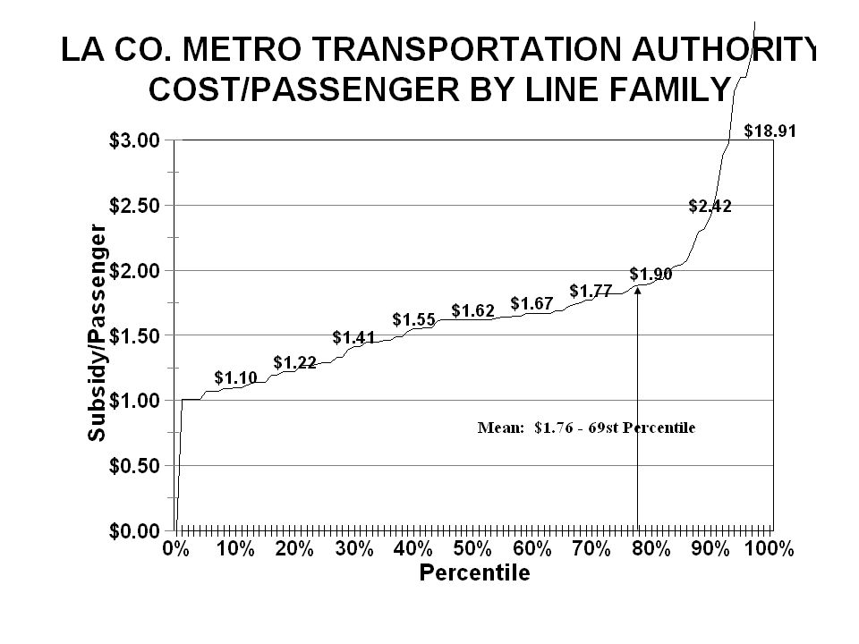
How About Operating Costs (concluded)?
The following slide shows the cost per passenger for every bus line the Los Angeles MTA operated. As might be expected, it costs more to carry passengers on some lines than others. Note that the mean, the overall average, is $1.76 per passenger – but this is the 69th percentile cost, which means that over two-thirds of the rides cost less. The median – the ride in the middle – cost $1.62, far less. Move important, the 30th percentile ride cost $1.41, the 20th percentile ride cost $1.22, and the 10th percentile ride cost $1.10 – and this is not as low as bus can go. When you properly compare rail to highly productive bus lines, rail is rarely less expensive to operate.

81
How Bad Are Commutes – Really?
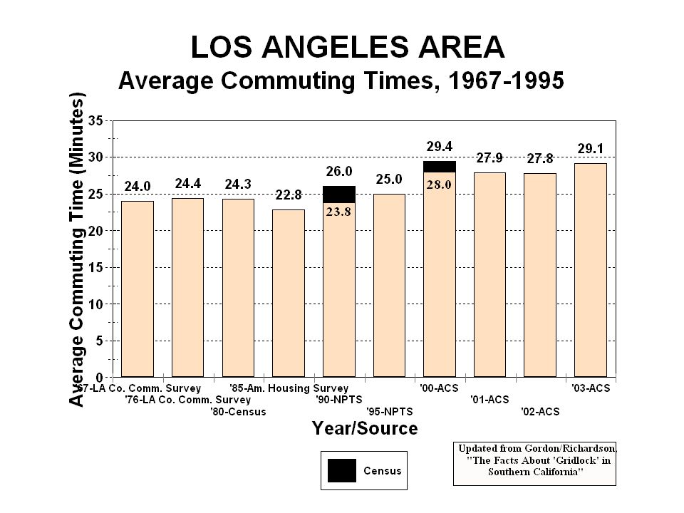
We all hear about how overcrowded our roads are getting and how trips are taking longer. The following slide shows the home-to-work trip lengths for greater LA, the poster child for traffic congestion, from 1967 to 2003 – over this 36 year period, the average increased 5.1 minutes – 21%, from 24.0 to 29.1 minutes. Human beings are outstanding at adjusting to changes. As their travel situation changes, they change – new routes, move closer to work, new job closer to home, employer moves to where there are more workers, etc. There is, most certainly, a road capacity problem in this nation – but home-to-work commute times are not increasing significantly.

Similar presentations


 Be familiar with mass transit classifications and characteristics Know how urban transport demands.>")


