Download presentation
Presentation is loading. Please wait.

1
Arnaud Legout INRIA, Sophia Antipolis EPI Planète
How to Give a Good Talk? Arnaud Legout INRIA, Sophia Antipolis EPI Planète cel , version 6 October 2013 This work is licensed under the Creative Commons BY-NC-SA License. To view a copy of this license, visit

2
Presentations are a fundamental part of research excellence
Why? Presentations are a fundamental part of research excellence Why should you bother giving talks?

3
Research and Marketing
The best researchers in the world learned how to sell their work To the community: visibility, impact To students: attract graduate students To commissions: funding, promotion To the public: increase attraction of your field, fame

4
Goals of a Presentation
Give the audience the intuition of your idea Make the audience eager To read your paper To ask you questions To discuss with you Build relationship Create a reputation Get feedback

5
Goals of a Presentation
Show you can make great presentations Big plus in a career Conversely, a poor presentation can kill an application to a new position Each talk is an interview talk

6
Can You Trust Me? Make your own opinion
Attend/watch presentations Mimic presentations you understand/like Big plus if it is not your field Never ever consider simplicity and clarity as a proof of weakness: this is talent You can violate the rules if you have a very good reason to do so

7
Focus of This Talk Broadly applicable advices for any kind of talks
Some specifics for scientific talks Complex figures Equations Methodology Proof

8
Outline Why should you bother doing talks? How to structure your talk?
How to make your slides? How to give your talk? Great talks examples

9
Tell a Clear and Convincing Story

10
Define First Your Message
The audience will remember at most one single message Which message you want to audience to remember? Can you express this message in less than a minute in an elevator? Tailor you talk according to this message Don’t sell more, but sell it well It is marketing: Useless to do great research if nobody knows about it

11
Do Not Present Too Much Common pitfall
“I did a lot and I will present every single bit of my work. They will be impressed!” That shows you are unable to deliver a message Do not hesitate to cut your results Better to present 10% the entire audience gets than 90% nobody gets

12
Adapt to the Audience The entire audience must understand your talk
Better to explain notions a part of the audience already knows than to lose another part during the talk Do not overestimate the knowledge of the audience in your field

13
Give a Structure to Your Talk
Give a background Adapt to the audience Adapt the technical granularity of your presentation Make it fun and catchy Motivate your work Why is the subject important and interesting? Focus of your work What is this presentation/work about in a single sentence? What is the problem? Background is so that the entire audience understands your talk

14
Give a Structure to Your Talk
Show methodology and tools Show results Clearly show your contributions Conclude with a summary of contributions Impact of this work Future work rarely makes sense unless you are really planning future work Tell a story from the background to the conclusion

15
Give a Structure to Your Talk
Give an outline You can give it first before or after (better) the background Repeat the outline before each new part Use color to show where you are Make clear the structure of your talk to the audience No suspense
 the background. Repeat the outline before each new part. Use color to show where you are. Make clear the structure of your talk to the audience. No suspense.")
16
Give a Structure to Your Talk
No need to go deep into related work (unless it is a survey) Your contributions must be the core But, be prepared to discuss related work
 Your contributions must be the core. But, be prepared to discuss related work.")
17
Alternate Structures You need to know what you are doing
More original means more risks Alternate questions and answers Appropriate for tutorials and general talks Less appropriate for technical talks But, can be used to introduce the problem and each contribution

18
Alternate Structures No slides Need to be a very strong speaker
Need a very well structured presentation Need a very high effort from the audience You must transmit energy Some (lazy) people don’t like such presentation
 people don’t like such presentation.")
19
Clearly show the take home messages
Make Summaries For each important result At the end of each part of your talk Clearly show the take home messages

20
Anticipate Q&A Q&A are part of the talk, don’t underestimate its importance Prepare backup slides Very impressive when it works You can put technical details or results you did not have time to address in them Be prepared to answer questions Rehearse with colleagues Be prepared to hard questions Q&A are part of the talk, don’t underestimate its importance

21
Questions You Must Ask Before You Prepare Your Talk
My goal? My single message? Audience? Background, knowledge, size, expectations Duration? For the talk, for the questions Room characteristics? Size, position of the screen, my position Adapt your talk and material to each context My goal is “why I am giving this talk”. It is orthogonal to the message you convey in the talk.

22
Outline Why should you bother doing talks? How to structure your talk?
How to make your slides? How to give your talk? Great talks examples

23
Clarity and simplicity
“You give the talk, slides support it. Never compete with them, you will lose!” Simplicity is a lot of work: first versions of the slides are always too complex Clarity is even more work

24
The Story Before the Slides
Define first your story before making any slide The slides must not define or constrain the story Make slides to illustrate and support your story

25
Slide Template Avoid overloaded templates
How to give a good talk > How to make your slides > Slide Template Slide Template Avoid overloaded templates Frequent with some companies that like to justify a costly graphical identity Unless you have a graphical talent, keep it simple Make a clear distinction between the title and the rest Do not use complex headers or footers No need to give the presentation title, affiliation, authors list, company logo, etc. on each slide Arnaud Legout – How to Give a Good Talk March 2013 - 25

26
Use Slide Numbers How do you know which slide it is over 30?
“The slide whose title is ‘Use Slide Numbers’” “The slide after ‘Presentation Guidelines’” “I don’t remember, go back, again, again, again, again, stop… yes this one!” Used to ask questions and to practice Used during audio or video conferences At least 20 pt Even at the back someone may ask a question

27
Use Slide Numbers In some cases, it is useful to also add the total number of slides For a defense or a short talk Easy way for the jury or the audience to assess whether you are close to the conclusion and will not exceed your allocated time For longer talks don’t show the total number A large number of remaining slides might be discouraging

28
Use non-serif fonts (times)
Serif fonts are hard to read Line width is not uniform Thin lines may not render well with all projector types Hard to read from the back Use Arial: looks formal, very (may be too) popular Tahoma: plain Calibri: good alternative to arial Century Gothic: elegant
 popular. Tahoma: plain. Calibri: good alternative to arial. Century Gothic: elegant.")
29
Use non-serif fonts (Arial)
Serif fonts hard to read Line width is not uniform Thin lines may not render well with all projector types Hard to read from the back Use Arial: looks formal, very (may be too) popular Tahoma: plain Calibri: good alternative to arial Century Gothic: Elegant
 popular. Tahoma: plain. Calibri: good alternative to arial. Century Gothic: Elegant.")
30
Use non-serif fonts (Tahoma)
Serif fonts hard to read Line width is not uniform Thin lines may not render well with all projector types Hard to read from the back Use Arial: looks formal, very (may be too) popular Tahoma: plain Calibri: good alternative to arial Century Gothic: Elegant
 popular. Tahoma: plain. Calibri: good alternative to arial. Century Gothic: Elegant.")
31
Use non-serif fonts (Calibri)
Serif fonts hard to read Line width is not uniform Thin lines may not render well with all projector types Hard to read from the back Use Arial: looks formal, very (may be too) popular Tahoma: plain Calibri: good alternative to arial Century Gothic: Elegant
 popular. Tahoma: plain. Calibri: good alternative to arial. Century Gothic: Elegant.")
32
Use non-serif fonts (Century G.)
Serif fonts hard to read Line width is not uniform Thin lines may not render well with all projector types Hard to read from the back Use Arial: looks formal, very (may be too) popular Tahoma: plain Calibri: good alternative to arial Century Gothic: Elegant
 popular. Tahoma: plain. Calibri: good alternative to arial. Century Gothic: Elegant.")
33
The Ban Comic Sans Campaign
Some people hate the comic sans font Reasons Ubiquitous Childish, immature, naïve Inappropriately used Designed at Microsoft

34
The Ban Comic Sans Campaign
Safe side to do not use it Be aware you might upset the audience Don’t use it for a job application I used it in my lectures starting in 2005 I believed it looks less scary than Arial for students Dropped it in late 2011 (I prefer Calibri now) It is very rare today in academic presentations
 It is very rare today in academic presentations.")
35
Use Large Fonts Font must be larger than 24pt (here it is 32pt)
Where do you stop to read it from the back? Consider poor projectors, poor screens, poor eyes

36
Be neaT Do YOU like slides with sppell check erors Bullet. Struture,
Inconsistant: Capitalisation Bullet. Struture, font; Ugly slides poor use of symbol !!! Poor layout

37
Be Neat Do you like Slides with spell check errors Inconsistent
Capitalization Bullets Structure Font Ugly slides Poor use of symbols Poor layout

38
No Punctuation Mark. No punctuation mark: At the end of sentences:
Period (.) , Colon (:), Semi-colon (;), Comma (,). Apart from: Question marks (?), Exclamation marks (!).
 , Colon (:), Semi-colon (;), Comma (,). Apart from: Question marks ( ), Exclamation marks (!).")
39
No Punctuation Mark No punctuation mark At the end of sentences
Period (.) Colon (:) Semi-colon (;) Comma (,) Apart from Question marks (?) Exclamation marks (!)
 Colon (:) Semi-colon (;) Comma (,) Apart from. Question marks ( ) Exclamation marks (!)")
40
Use Meaningful Titles The title should summarize the slide content
Do not use a same title with an increasing number Introduction 1/5 Introduction 2/5 Etc. Poor variant “cont.”

41
How Many Colors? No more than three colors on a slide
Here I have four Use easy to distinguish colors like dark Blue, Red, and Green Use colors to emphasize an important word May be used to remind you to develop keypoints What is green for?

42
How Many Colors? No more than three colors on a slide
Here I have three Use easy to distinguish colors like dark Blue, Red, and Black Use colors to emphasize an important word May be used to remind you to develop keypoints One color for the title, one for the text, and one to stress words. You may use more colors, but in this case you have to explain the meaning of each color (in this case is it really clearer to use colors)
")
43
Background Colors Never use light colors or low contrast
They may not render well No Never use light colors or low contrast They may not render well No Never use light colors or low contrast They may not render well Yes Never use light colors or low contrast They may not render well Yes, but ugly

44
Background Colors I like this one Seems to work well with colors too
Quite relaxing to look at such slides Looks clean and simple Seems to work well with colors too Red, Blue, Green (favor light colors) Be careful with contrast When there is light in the room, contrast is lower You don’t have control on it, consider the worst case
 Be careful with contrast. When there is light in the room, contrast is lower. You don’t have control on it, consider the worst case.")
45
Background Colors Don’t use thin fonts
They may not render well I don’t have much experience with this background Seems to become more popular Try it and make your own opinion

46
Colors and Projectors The universal rule Be prepared to
Projectors never render colors as you expect Be prepared to Red that looks pink or orange Blue that looks purple Yellow that is invisible (never use yellow) Never use colors that are too close Dark green, red, and blue is the safe side
 Never use colors that are too close. Dark green, red, and blue is the safe side.")
47
Be Concise Do not write complete sentences as they make your message obfuscated in long lines of text Never forget that nobody can read your slides and listen to you at the same time unless you are reading what is in your slides. But, you must not read your slides, this is boring Omit technical details, there is no chance to explain everything in a single presentation. Instead, you should make the audience eager to read your work Do not believe complexity will impress your audience, it will simply make you look unable to express your idea

48
Be Concise Write small sentences Do not compete with your slides
You give the message, the slides support it Do not dig into details Just deliver a message Give a preview of your work/paper Be simple in your explanations

49
Should I Show One Bullet at a Time?
Perfectly fine to show the entire slide if it is concise No need to over animate When appropriate, I like to show the title alone to introduce the slide But, if you feel you compete with your slides, show one (or a few bullets) at a time Rule of thumb: do not animate bullets (or block of bullets) on which you discuss less than 20 to 30s
 at a time. Rule of thumb: do not animate bullets (or block of bullets) on which you discuss less than 20 to 30s.")
50
Should I Show One Bullet at a Time?
But, never ever Animate Bullets Too Fast Best way to compete with your slide In case of doubt, don’t animate Safe side

51
Figures, pictures, animations
“Replace text with illustrations” Simplicity is a lot of work: first versions of the slides are always too complex Clarity is even more work

52
Use Large Symbols

53
Use Thick Solid Lines and Colors
You can name the colors, which is faster than naming line styles. Also the eye catch faster a color than a line style.

54
Never Use Camera Ready Figures

55
Use Pictures High quality and full screen Illustrate concrete idea

56
The Solar System (Poor)
8 planets Mercury Venus Earth Mars Jupiter Saturn Uranus Neptune Poor

57
The Solar System (Still Poor)
8 planets Mercury Venus Earth Mars Jupiter Saturn Uranus Neptune Slightly better

58
The Solar System (Good)
")
59
Evolution of Communication (Poor)
Radio TV Web Smartphones Assume I want to convey that communication improved with the device

60
Evolution of Communication (Still Poor)
Radio TV Web Smartphones I mix text and pictures, which is useless and disturbing Pictures are just used as an illustration, not as the core of the slide The picture are not chosen with care, they do not convey a sense of progress in modernity (the flat screen looks more modern than the blackberry device)
")
61
Evolution of Communication (Good)
The device pictures convey the evolution of technology along with the evolution of communication (old radio, CRT TV, Firefox on windows XP, iphone 5 with Twitter). The talk should build on this visual support.
. The talk should build on this visual support.")
62
Do Not Over Illustrate Do not use Irrelevant illustrations
Weak metaphors Animated images The case of a student using the image of a missile launcher targeting the BitTorrent logo Reused the large missile launcher image everywhere Using a road map on the left half of each outline slides (mac feature) leaving me wondering what is was for.
 leaving me wondering what is was for.")
63
Use Semantic Animations
Use with caution

64
Use Illustrations Make your point clear and simple
Give a mental image people are more likely to remember Always use a figure instead of a table

65
Without Illustrations (Poor)
Prior to distribution Content split multiple pieces Metainfo file created by the content provider To join a torrent Peer P retrieves metainfo file from a well-known website P contacts the tracker The tracker responds back with a peer set of randomly selected peers P contacts peers in this set and start requesting different pieces of the content

66
With Illustrations (Better)
coolContent.torrent Web server random peer set Tracker coolContent.xvid P1 P2 P3

67
Use Enlightening Animations
Animations must make complex idea simple to grasp No magic, it is a lot of work to make Here are two examples

68
Use Enlightening Animations: P2P case
Client-server

69
Use Enlightening Animations: Sieve of Eratosthenes
A number is prime if it can only be divided by 1 or by itself 69 Credit: G. Berry, Collège de France, 25/01/08

70
Use Enlightening Animations:
Sieve of Eratosthenes 70 Credit: G. Berry, Collège de France, 25/01/08

71
Use Enlightening Animations:
Sieve of Eratosthenes 71 Credit: G. Berry, Collège de France, 25/01/08

72
Use Enlightening Animations:
Sieve of Eratosthenes We are done when the square of the smallest remaining integer (here 11) is larger than the largest remaining integer (here 71) 72 Credit: G. Berry, Collège de France, 25/01/08
 is larger than the largest remaining integer (here 71) 72. Credit: G. Berry, Collège de France, 25/01/08.")
73
Use Enlightening Animations:
Sieve of Eratosthenes We are done when the square of the smallest remaining integer (here 11) is larger than the largest remaining integer (here 71) 73 Credit: G. Berry, Collège de France, 25/01/08
 is larger than the largest remaining integer (here 71) 73. Credit: G. Berry, Collège de France, 25/01/08.")
74
Do Not Over Animate It is disturbing Annoying Useless
You cannot keep the audience focused

75
Design and Presentation Zen
Should you focus on the design of the slides? Question of time and money Address issues by order of priority A well defined and clear message A well structured (and fun) story Adapt to the audience Tell your story with passion (you are already top 1%) Make beautiful slides Presentation Zen. Garr Reynolds Money is not only about buying the material, but also about the time you spent (your time is money for a company) on the slides. You cannot afford 3 days making perfect slides if you need to make weekly presentations about progress of your project (otherwise, when would you work on your project). In that case foster simplicity instead of design (it will already be a lot of work) Slides are not the talk, they just support it
 story. Adapt to the audience. Tell your story with passion (you are already top 1%) Make beautiful slides. Presentation Zen. Garr Reynolds. Money is not only about buying the material, but also about the time you spent (your time is money for a company) on the slides. You cannot afford 3 days making perfect slides if you need to make weekly presentations about progress of your project (otherwise, when would you work on your project). In that case foster simplicity instead of design (it will already be a lot of work) Slides are not the talk, they just support it.")
76
Design and Presentation Zen
You cannot compete with Steve Jobs He had an army of collaborators working on the keynotes He had a visionary designer talent and stunning charisma But, you can get close by targeting clarity and simplicity To improve your design skills read Presentation zen by Garr Reynolds Slide:ology by Nancy Duarte

77
Clarity and simplicity (Poor)
You give the talk slides support it Never compete with them, you will lose! This is the regular powerpoint way to convey idea. Not really good

78
Clarity and simplicity
(good) Clarity and simplicity “You give the talk, slides support it. Never compete with them, you will lose!” We get rid of bullets and just focus on the message
 Clarity and simplicity. You give the talk, slides support it. Never compete with them, you will lose! We get rid of bullets and just focus on the message.")
79
Clarity and simplicity
(good) Clarity and simplicity “You give the talk, slides support it. Never compete with them, you will lose!” Same with an illustration giving a feel of simplicity and clarity
 Clarity and simplicity. You give the talk, slides support it. Never compete with them, you will lose! Same with an illustration giving a feel of simplicity and clarity.")
80
Why You Have So Much Text in Your Slides?
I am giving a lecture There is not a single or a few messages, but a lot of technical details that you have to learn I am using my slides as the material for my lecture This can be disputed, the other option is to use a companion text document But, I am putting in slides what I would write on a board (I have horrible hand written skills, believe me!)
")
81
Why You Have So Much Text in Your Slides?
For any other public talk from 5 to 30 minutes (that is, 99% of the talks you will have to give) Very few text A lot of illustrations See annex 1 (at the end of the slide set) for one of my 20 minutes talk For longer talks (tutorial, lectures…) You might need text But, focus on clarity, simplicity, and illustrations
 Very few text. A lot of illustrations. See annex 1 (at the end of the slide set) for one of my 20 minutes talk. For longer talks (tutorial, lectures…) You might need text. But, focus on clarity, simplicity, and illustrations.")
82
Outline Why should you bother doing talks? How to structure your talk?
How to make your slides? How to give your talk? Great talks examples

83
Practice Practice Practice Practice Have fun

84
How to Show Something on a Slide?
You can touch the screen Really touch the screen Don’t shake the hand 5 meters in front of the screen Not always possible Screen might be too high or too far Not the most professional solution

85
How to Show Something on a Slide?
You can use neat animations Works in any case Safe side Many excellent options Square, circles, ovals, arrows, etc. See examples in the following But, never use a laser pointer Show you are lazy and unprofessional Aren’t you shaking?

86
Use Thick Lines 36kB/s

87
Use Thick Lines 20 19 Peer 27 seed slow medium fast

88
Use Arrows 11.6 PB Cumulated inter-AS traffic (TB) 41% savings
Torrent ID (sorted by decreasing inter-AS traffic, log scale)
")
89
Use Semi-Transparent Squares
Focus of [42] Credit: Zhang et al. [42]

90
Don’t Use 3D Charts Reduce the noise in the charts. Tend toward simplicity.

91
Use 2D Charts with Legend Inside

92
Explain All Slides Never present a slide you do not explain in details
Always drop a slide if you present it for less than 30 seconds Spend time on complex figures or drop them Spend time on equations or drop them Talk on transition slides (e.g., outline reminders) or drop them Use transition to summarize the previous part and introduce the next one
 or drop them. Use transition to summarize the previous part and introduce the next one.")
93
Minimum Explanation For each figure you must
Give for each of the x-axis, y-axis, and z-axis Label, unit, scale (if log scale) Give the legend Explain all symbols Take an example to illustrate a specific point in the figure Very useful if the figure is complex
 Give the legend. Explain all symbols. Take an example to illustrate a specific point in the figure. Very useful if the figure is complex.")
94
Example for a Figure High peer availability
Increasing number of seeds Increasing peer availability High peer availability Low peer availability 3 to seeds 0 to 1 seed 20th 50th 80th This is not a graphical art presentation

95
Example for an Equation
You will not look more clever if you show equations and don’t explain them

96
But, Prefer the Figure to the Equation

97
Introduce and Summarize Slides
For each important slide Say a one sentence introduction What you are going to discuss now Say a one sentence summary If the audience has to remember a single sentence it is this one For very important results, show the take home message

98
Be Redundant Repeat several times Never too much redundancy
I’m going to explain… My explanation is… I just explained… Never too much redundancy

99
Never Go Back It is bad habit to go back to a previous slide
If you forgot something, just tell it If you need a previously shown image, add it again Navigating within slides will lose your audience

100
Never Exceed Your Allocated Time
This is a lack of respect for the audience and the next speakers Not admissible, not professional Should never happen if you are well prepared Case of best paper award starting with poorly explained equations that was still speaking after 45 minutes (20 minutes talk including questions) in front of 400 people. I just remind the pain.
 in front of 400 people. I just remind the pain.")
101
Never Exceed Your Allocated Time
In case you feel you will exceed the allocated time Drop slides No problem to drop a full part Never drop summary of contributions Never stop in the middle of somewhere

102
One Slide Every Two Minutes
Usually everybody agrees Now, count! 10 minutes means 5 slides 20 minutes means 10 slides How many slides do you have for a 20 minutes talk? I have seen for 20 minutes people with more than 50 slides full of text!

103
One Slide Every Two Minutes
You can violate this rule if You have time to explain in details all slides You will not exceed your allocated time You will not speak much faster Hard to spend on average per slide less than 1 minute (really short) more than 3 minutes (start to be boring)
 more than 3 minutes (start to be boring)")
104
Use a Watch On a room wall, in front of you On your desk On PowerPoint
So that you can see it, but not the audience On your desk Digital one with large enough numbers On PowerPoint Presenter mode Very convenient, you can get comments and a few slides before and after the current one

105
For Long Talks Several hours to several days Make often summaries
At the end of each part After each break At the beginning of each new day Involve the audience “Jon, what do you remember from the last hour?” “Jim, can you in few words explain me this part?” But, don’t be too pushy: it is not an exam! And, always make again the summary yourself

106
Q&A Reformulate questions Be concise in your answer
Make sure you understood them Make sure everybody hear them Be concise in your answer Do not start a discussion “I propose to continue this interesting discussion during the break. Another question?”

107
Q&A Never bluff or lie Acknowledge when you don’t have the answer
“Thank you for that point, I don’t have an answer now. We will definitely look at it.” “I don’t know this article, but it looks similar to what we did. Can you send me the pointer?” Never forget to send back your answer by

108
Q&A Questions might be In any case never Aggressive
Stupid (most of the time, such questions show you made a poor presentation) Hard to answer Showing you are wrong In any case never Lie, aggress, or complain complain: it is not my fault, I had a problem with my laptop/supervisor/family/etc.
 Hard to answer. Showing you are wrong. In any case never. Lie, aggress, or complain. complain: it is not my fault, I had a problem with my laptop/supervisor/family/etc.")
109
Q&A During a conference, if you don’t understand the question
Try to reformulate based on what you got If after one try you still don’t understand it Ask the session chair If after two tries nobody got it Don’t start a discussion at that point Propose to take it off-line after the talk

110
Use Your Body Use eye contact Use your hands You can walk, but
Do not stare (no more than 10 seconds) Do not avert or switch fast Use your hands To support visually what you say You can walk, but Do not stand in front of your slides Do not continuously walk along a line Walk on a triangle and stop at each vertex Show how to merge to sets with hands (ant rostrow) Show how to designate two users (one per hand)
 Do not avert or switch fast. Use your hands. To support visually what you say. You can walk, but. Do not stand in front of your slides. Do not continuously walk along a line. Walk on a triangle and stop at each vertex. Show how to merge to sets with hands (ant rostrow) Show how to designate two users (one per hand)")
111
Use Your Body Stay in front of the audience
Aside the slides, but not in front of them Do not show your back or your side Do not persistently move while speaking

112
Use Your Voice Make a short pause before each important message
In the order of a few seconds Pauses are even more effective than raising voice The rhythm of the speech is what makes a big difference to catch the attention

113
Use Your Voice Vary your voice level Never read your slides or notes
Speaking softly catch better the attention than speaking even louder Alternating loud and soft speech catch the best the attention You need to practice a lot to find the right balance My rule of thumb Make a pause and speak softly before a very important result Never read your slides or notes

114
Show Enthusiasm If you don’t show enthusiasm presenting your own work, do you really believe that the audience will be enthusiastic Listening to you Reading your work Inviting you Discussing with you

115
Use a Second Screen Do not look at your slides on the primary screen
You must not show your back to the audience Hard to keep the eye contact this way Use instead a second screen (in clone or extended view) Place it appropriately Stay in front of the audience when you look at the slides Hard to see you are looking at the slides
 Place it appropriately. Stay in front of the audience when you look at the slides. Hard to see you are looking at the slides.")
116
Use a Remote Controller
Seamlessly synchronize your talk with your slides Freedom to move Most professional Use a simple remote controller Forward, backward, hide slides (black screen) Small enough to fit well in the hand Never use a wireless mouse Do not shake or point-toward-the-slides the hand when you switch slides
 Small enough to fit well in the hand. Never use a wireless mouse. Do not shake or point-toward-the-slides the hand when you switch slides.")
117
Practice Best speakers practice the most
No improvisation or spontaneity To look spontaneous you even need to practice more Stand up and speak with loud voice to practice Practice at least once using a projector Practice with colleagues (once well trained) The shorter the talk the more you have to practice Be prepared to answer hard/aggressive questions
 The shorter the talk the more you have to practice. Be prepared to answer hard/aggressive questions.")
118
Practice To prepare a 20 minutes talk
Three days for a first version of the slides Around 10 rehearsal in front of my desk Around 5 “in situation” rehearsal Final version of the slides Stand up Speak loud May use a real projector Stringent time constraint In front of colleagues

119
Practice vs. Energy How to project energy if you lost it during rehearsals? Don’t repeat the day of your presentation and only once the day before Sleep well the night before Convert your stress into energy

120
Practice vs. Energy Practice permits to control the energy
Theatre actors performing on stage every day have to project a lot of energy The more they perform, the more the energy they project is appropriate The less you practice the more you will use your energy to Keep the focus Find what to say Fight against your stress

121
Practice and Experienced Speakers
Experienced means +50 presentations or +100 hours of presentations If it is not your case, you will never practice too much If you are that experienced, you will probably not have time to practice that much Your experience will somewhat compensate a lack of practice But, if you have a tight schedule and want to impress, you will have to practice

122
Dress Well Always dress better than the audience
Show that you respect the audience If you don’t care for your presentation or of the audience, how will you dress? As every day! But, do not be overdressed Ask the dressing convention of your community/audience

123
Avoid Bad Surprises Ask weeks before your talk to your session chair or organizer Talk duration, questions duration Presence of a projector If you have a laptop Can you use it or do you have to use the computer of the conference? If you don’t have a laptop Is there a computer that you can use? Which OS, which version of PowerPoint, PDF only?

124
Avoid Bad Surprises Ask weeks before your talk to your session chair or organizer Audience If it is a well known conference, better ask your colleagues/advisor If it is not a regular talk at a conference (tutorial, interview, visit, etc.) you must ask
 you must ask.")
125
Avoid Bad Surprises Make backup copies of your slides on two different supports Don’t put everything in a same luggage Make your slides available on-line Make copies in several versions In addition to the latest version, for compatibility issues, use backups in older versions (for PowerPoint it is usually ) Check that all copies are the last version of your presentation
 Check that all copies are the last version of your presentation.")
126
Avoid Bad Surprises Introduce yourself to the session chair or organizer well before your talk begins Might be hard to find during big conferences You have to give a short biography to the session chair 3 sentences Arrive early in the conference room Don’t hesitate to move chairs or tables to make you more comfortable

127
Avoid Bad Surprises Test your presentation Test the remote controller
Go through all slides to see if everything is ok Must check colors and animations Test the remote controller Batteries

128
Avoid Bad Surprises If you use your laptop
Restart it half an hour before your presentation Stop all applications Avoid popups Stop wifi Avoid system update popups or reboot Use a power cable Deactivate sleep mode, screen saver

129
Avoid Bad Surprises Sleep well and eat enough to do not pass out
A small bottle of water might help

130
Some Facts on the Audience
They want to be elsewhere Early in the morning: in their bed Around noon: eating Early in the afternoon: sleeping at the swimming pool Late in the afternoon: dinner or social event In the middle: waiting for the coffee break

131
Some Facts on the Audience
They don’t know you They don’t know your work They don’t know your field They have no reason to like your work They have no reason to listen to you

132
Some Facts on the Audience
They have already ingested boring presentations They are laptop addicts They are reading their s, browsing the web, reading online newspapers, skyping, etc. You have to wake them up and catch their attention

133
How to react to…? People you lost
You lost them, so work for the ones you haven’t lost yet Don’t repeat what you feel the lost audience didn’t get You will lose the last ones that follow you Nasty people (aggressive, commenting…) Focus on other people Don’t give them the opportunity to disrupt you even more
 Focus on other people. Don’t give them the opportunity to disrupt you even more.")
134
Outline Why should you bother doing talks? How to structure your talk?
How to make your slides? How to give your talk? Great talks examples

135
Wonderful Examples Technical talks
Scott Shenker: The Future of Networking, and the Past of Protocols, Open Networking Summit 2011 Try Hans Rosling: Stats that reshape your worldview, TED 2006. Try See

136
Wonderful Examples General talks (not scientific)
Randy Pausch Last Lecture (in english) How to communicate passion? Try Or search google for “Randy Pausch Last Lecture”
 How to communicate passion Try v=ji5_MqicxSo. Or search google for Randy Pausch Last Lecture")
137
Wonderful Examples General talks (not scientific)
Michel Serres aux 40 ans de l’INRIA (in french) How to keep an audience of specialists focused during one hour? Remember: a clear, well structured and fun story adapted to the audience and told with passion are way more important than any visual support Try
 How to keep an audience of specialists focused during one hour Remember: a clear, well structured and fun story adapted to the audience and told with passion are way more important than any visual support. Try v=kRFXFDmqCqY&list=PL6E3E1B24787ECD62.")
138
Wonderful Examples Watch talks on http://www.ted.com/
Extremely high quality standard Elizabeth Gilbert on nurturing creativity

139
How to Give a Good Talk Arnaud Legout arnaud.legout@inria.fr
Thank you! Put here title and contact Everything that facilitates access to your work , URL, etc. How to Give a Good Talk Arnaud Legout

141
Annex 1 Example of one of my talk (with annotated slides) You can access the video recording of the talk (in French) here:
 You can access the video recording of the talk (in French) here:")
142
Check List My goal? My single message? Audience?
Convince the audience that I am doing interesting and strong researches with practical impact My single message? We collected the entire Twitter social graph and extracted its macrostructure Audience? 200 computer scientists, but not in my field

143
Check List Duration? Room characteristics? 20 minutes for the talk
Theatre, impossible to move (fixed mic) or touch the screen
 or touch the screen.")
144
Macroscopic Exploration of the Twitter Social Graph
Arnaud Legout EPI DIANA, Sophia Antipolis My first challenge is to explain what Twitter is. For sure, everybody already heards about it, but when it comes at modeling it with a directed social graph (which is what we did), the audience needs to have a good feel of the Twitter specificities and of what is a directed social relationship. The talk should be fun and entertaining from the beginning, I cannot start with abstract definitions or graph drawings. I decided to start with full screen picture illustrating the two main social relationships in the real life: friends and producer/consumer.
, the audience needs to have a good feel of the Twitter specificities and of what is a directed social relationship. The talk should be fun and entertaining from the beginning, I cannot start with abstract definitions or graph drawings. I decided to start with full screen picture illustrating the two main social relationships in the real life: friends and producer/consumer.")
145
Friends A single high quality photography and a single word.
This picture introduces well the notion of symmetric communication among a group of friends/colleagues/etc.

146
Producer Consumer A single high quality photography and a single word.
I gave this talk in front of a French audience. TF1 is the number one (in terms of audience) TV channel in France and Claire Chazal (the lady in the picture) the most famous TV journalist in France. This picture gives immediately the feeling she produces news and we consume them, without any way to send back information to her. At that step, everybody should agree that the mode producer/consumer widely influences what we know, so it is central to understand information propagation. So I claim that Twitter, unlike facebook and other widely used social networks, allows this notion of producer/consumer and friends.
 TV channel in France and Claire Chazal (the lady in the picture) the most famous TV journalist in France. This picture gives immediately the feeling she produces news and we consume them, without any way to send back information to her. At that step, everybody should agree that the mode producer/consumer widely influences what we know, so it is central to understand information propagation. So I claim that Twitter, unlike facebook and other widely used social networks, allows this notion of producer/consumer and friends.")
147
Follow Relationship in Twitter
Bob follows Alice Alice follows Bob Alice Bob Now I need to make the link between the social relationships friends and producer/consumer, and a graph. I take a very simple example with a simple animation clearly emphasizing the flow of information.

148
Twitter Social Graph Alice Bob
And I conclude by saying that Twitter is a mix of both friends and producer/consumer relationships. So Twitter is really close to how information propagates in real life. It is therefore, very interesting and important to study it, because it will improve our understanding of real life information propagation.

149
Give a physical meaning to the decomposition
+500 million nodes +24 billion edges Challenges Collect the graph Decompose the graph Give a physical meaning to the decomposition Now, I need to explain that it is complex to make this study. So I start with the size of the graph and stress that it is huge. Then I present each of the three challenges explaining that we overcame all three. Due to the limited time, I cannot present all three challenges, so I explain that in the following I only focus on the last one. I decided to focus on the last one because it is the one with the clearer practical impact, so I believe it is the one with the strongest impact on the audience.

150
Macrostructure of the Twitter social graph
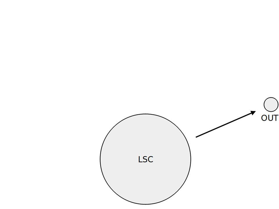
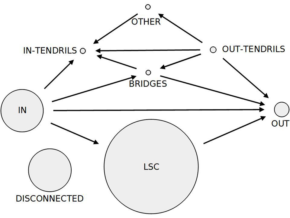
Directed acyclic Graph SCC Decomposition Here I explain with a very simple drawing how we decompose the graph. SCC is in red so that I remember to take time to explain what it is. The directed acyclic graph is a graph in which each node is an SCC. Out of all SCCs there is one that is larger than the others, the Largest SCC (LSCC). This is my transition to the next slide in which I present the Twitter macrostucture starting with the LSCC
. This is my transition to the next slide in which I present the Twitter macrostucture starting with the LSCC.")
151
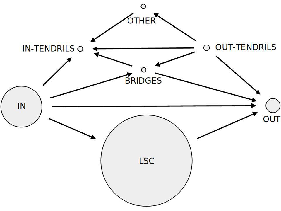
Instead of presenting the macrostructure in one shot (which will either scare the audience or distract them from what I am explaining because they will focus on a complex slide), I explain how we built it. This is simple to follow.

156
1% accounts <0.01% edges <0.01% tweets
Then I focus on each component of the macrostructure and give it a physical meaning

157
98% tweets 98% edges 50% accounts Regular activity

158
1,5% tweets 5,3% accounts 0% outgoing edges “selfish” celebrities

159
21,4% accounts 0,25% tweets Passive users

160
21,6% accounts 99% no edge 80% no tweet Spammers

161
Macroscopic Exploration of the Twitter Social Graph
Arnaud Legout EPI DIANA, Sophia Antipolis Finally I wrap up on that slide, remind the three main challenges, explain we overcame the two first, and argue that I just show the we overcame the last one.

163
Annex 2 Credit

164
Credit How to give a bad talk? By David A. Patterson, Rolf Riedi, John Ousterhout, Tom Anderson Browse google for an instance of the presentation Presentation Zen by Garr Reynolds How to give a good research talk by Simon Peyton Jones, Microsoft Research, Cambridge

165
Credit Colleagues The wonderful and awful presentations I attended
Much better to be ashamed in front of a colleague than in front of 300 peers The wonderful and awful presentations I attended My students, their mistakes and their successes Many thanks to TCCC mailing list people who helped me fix typos in the slides and made good suggestions

Similar presentations